
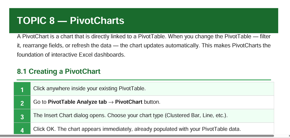
From Raw Data to Real Decisions: The Week 3 PivotTable Breakthrough 🚀
Hello, Future Data Analysts! 👋
In Week 3 of our Excel @msexcel journey, we moved beyond simple data entry. We unlocked the most powerful tool in Excel for business intelligence: PivotTables and PivotCharts.
To show you why this is a game-changer, let’s look at a real scenario. Imagine you are the HR Manager for a mid-sized company. You have a massive spreadsheet with 120 employees, their salaries, allowances, and departments. The CEO walks in and asks three questions:
1. "Where is our payroll budget actually going?"
2. "Which department has the highest average salary?"
3. "Are our allowance costs spiking in certain states?"
If you were using just formulas, you’d be writing SUMIFS and COUNTIFS for the next hour. But with PivotTables, we had the answers in under 60 seconds.
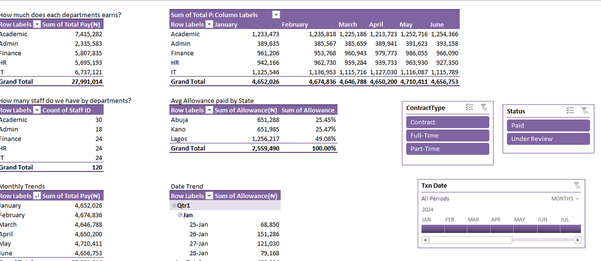
📊 The Story in the Data
Let’s look at what our PivotTables revealed:
1. The Financial Reality Check
We summarized the total pay by department:
· Academic: ₦7.4M (The biggest expense—makes sense, they are the core of the business).
· IT: ₦6.7M (A close second—critical for infrastructure).
· Finance: ₦5.8M
But wait—raw totals can be misleading. We needed to ask: Is this fair?
2. The Efficiency Insight (Avg Salary per Dept)
We inserted a second PivotTable to count staff:
· Academic: 30 staff
· IT: 24 staff
· Finance: 24 staff
Now, let's do the mental math (or let the PivotTable do it via Value Field Settings):
· Academic Avg: ₦247k per person
· IT Avg: ₦280k per person
· Finance Avg: ₦241k per person
Insight: While Academic spends the most total money, IT actually has the highest average salary per employee. This is crucial for budget planning and retention strategies.
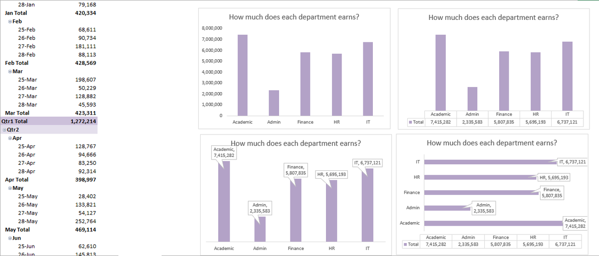
3. The Geographic Pattern (PivotChart)
We visualized the allowance data by State using a PivotChart (Bar Chart).
· Lagos: 49% of total allowances.
· Kano & Abuja: Splitting the remaining 51%.
Story: Why is Lagos consuming nearly half the allowance budget? Is it due to a higher cost of living adjustment (COLA), or does Lagos have a higher concentration of senior staff? A PivotChart makes that question obvious instantly.
🎨 Why PivotCharts?
In the screenshots, you saw the "Monthly Trends" and "Date Trend" visuals. Here is the magic of PivotCharts:
Unlike a static chart, a PivotChart is alive.
· If I filter the PivotTable to show only "IT" department, the chart instantly updates to show only the IT salary trends.
· If I want to see the breakdown by Quarter instead of Month, I simply drag the field in the PivotChart—no rebuilding the graph from scratch.
This interactivity is what separates an Excel user from an Excel Analyst.
📝 Your Turn to Practice
Take a look at the data tables attached. Try to build the following:
1. A PivotTable showing Sum of Total Pay by Department.
2. A PivotChart (Line Chart) showing the Monthly Trends to see if payroll spikes at the end of the year.
3. A Slicer to toggle between "Paid" and "Under Review" statuses.
🚀 Ready to Master Excel?
If you enjoyed this breakdown and want to go from scared of spreadsheets to building dynamic dashboards like this, you need to be in my next cohort.
We are currently building the WAITLIST for the upcoming Excel Basic Masterclass. We will cover:
. ✅ Introduction to Excel , Data Analysis/ Data Cleaning
. ✅ Excel Basic Functions and Logical Functions
. ✅ Conditional formatting from basic to intermediate level.
. ✅ Error Handling & Conditional Functions
· ✅ PivotTables & Advanced Charts
· ✅ Interactive Dashboards
· ✅ Real-world Case Studies (like the one above)
Don’t miss out on the early-bird access and bonus materials.
👉 CLICK HERE TO JOIN THE WAITLIST 👈
docs.google.com/forms/d/e/1F……
Let’s turn your data into decisions.
#ExcelCourse #DataAnalytics #PivotTables #LearnExcel #ExcelForBusiness #DataStorytelling #ExcelTips #CareerGrowth #WaitlistAlert #MicroLearning #ExcelDashboard
1
12
2,679
Headline: From Raw Data to Real Decisions: The Week 3 PivotTable Breakthrough 🚀
Hello, Future Data Analysts! 👋
In Week 3 of our Excel @msexcel journey, we moved beyond simple data entry. We unlocked the most powerful tool in Excel for business intelligence: PivotTables and PivotCharts.
To show you why this is a game-changer, let’s look at a real scenario. Imagine you are the HR Manager for a mid-sized company. You have a massive spreadsheet with 120 employees, their salaries, allowances, and departments. The CEO walks in and asks three questions:
1. "Where is our payroll budget actually going?"
2. "Which department has the highest average salary?"
3. "Are our allowance costs spiking in certain states?"
If you were using just formulas, you’d be writing SUMIFS and COUNTIFS for the next hour. But with PivotTables, we had the answers in under 60 seconds.
📊 The Story in the Data
Let’s look at what our PivotTables revealed:
1. The Financial Reality Check
We summarized the total pay by department:
· Academic: ₦7.4M (The biggest expense—makes sense, they are the core of the business).
· IT: ₦6.7M (A close second—critical for infrastructure).
· Finance: ₦5.8M
But wait—raw totals can be misleading. We needed to ask: Is this fair?
2. The Efficiency Insight (Avg Salary per Dept)
We inserted a second PivotTable to count staff:
· Academic: 30 staff
· IT: 24 staff
· Finance: 24 staff
Now, let's do the mental math (or let the PivotTable do it via Value Field Settings):
· Academic Avg: ₦247k per person
· IT Avg: ₦280k per person
· Finance Avg: ₦241k per person
Insight: While Academic spends the most total money, IT actually has the highest average salary per employee. This is crucial for budget planning and retention strategies.
3. The Geographic Pattern (PivotChart)
We visualized the allowance data by State using a PivotChart (Bar Chart).
· Lagos: 49% of total allowances.
· Kano & Abuja: Splitting the remaining 51%.
Story: Why is Lagos consuming nearly half the allowance budget? Is it due to a higher cost of living adjustment (COLA), or does Lagos have a higher concentration of senior staff? A PivotChart makes that question obvious instantly.
🎨 Why PivotCharts?
In the screenshots, you saw the "Monthly Trends" and "Date Trend" visuals. Here is the magic of PivotCharts:
Unlike a static chart, a PivotChart is alive.
· If I filter the PivotTable to show only "IT" department, the chart instantly updates to show only the IT salary trends.
· If I want to see the breakdown by Quarter instead of Month, I simply drag the field in the PivotChart—no rebuilding the graph from scratch.
This interactivity is what separates an Excel user from an Excel Analyst.
📝 Your Turn to Practice
Take a look at the data tables attached. Try to build the following:
1. A PivotTable showing Sum of Total Pay by Department.
2. A PivotChart (Line Chart) showing the Monthly Trends to see if payroll spikes at the end of the year.
3. A Slicer to toggle between "Paid" and "Under Review" statuses.
🚀 Ready to Master Excel?
If you enjoyed this breakdown and want to go from scared of spreadsheets to building dynamic dashboards like this, you need to be in my next cohort.
We are currently building the WAITLIST for the upcoming Excel Basic Masterclass. We will cover:
. ✅ Introduction to Excel , Data Analysis/ Data Cleaning
. ✅ Excel Basic Functions and Logical Functions
. ✅ Conditional formatting from basic to intermediate level.
. ✅ Error Handling & Conditional Functions
· ✅ PivotTables & Advanced Charts
· ✅ Interactive Dashboards
· ✅ Real-world Case Studies (like the one above)
Don’t miss out on the early-bird access and bonus materials.
👉 CLICK HERE TO JOIN THE WAITLIST 👈
docs.google.com/forms/d/e/1F…
Let’s turn your data into decisions.
#ExcelCourse #DataAnalytics #PivotTables #LearnExcel #ExcelForBusiness #DataStorytelling #ExcelTips #CareerGrowth #WaitlistAlert #MicroLearning #ExcelDashboard


1
2
8
475

25 Aug 2025
New #excelusers should get a copy of this #shortbook It explains so much in an accessible way amazon.com/dp/B08JDXBQD7 #msexcel #excel @msexcel @MSExcelJedi #ExcelForBeginners #ExcelTips #ExcelBasics #ExcelCourse #Spreadsheet #MicrosoftExcel #LearnExcel #ExcelSkills #ExcelTraining
1
20

12 Aug 2025
From interview to opportunity.
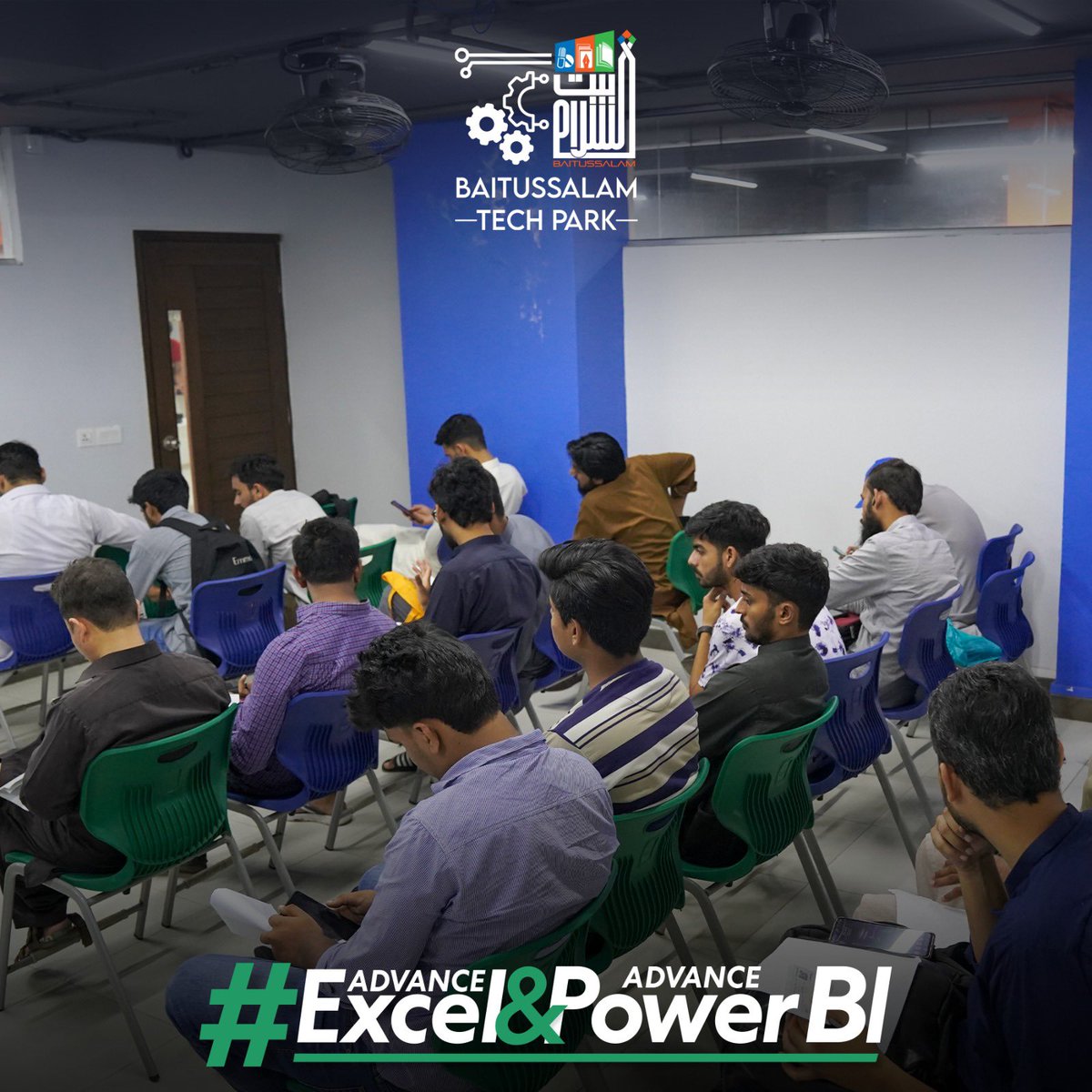
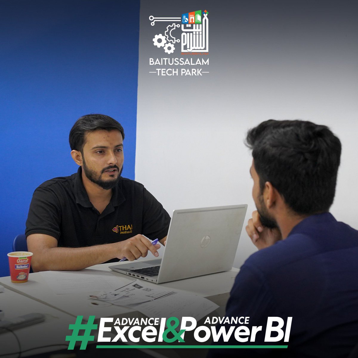
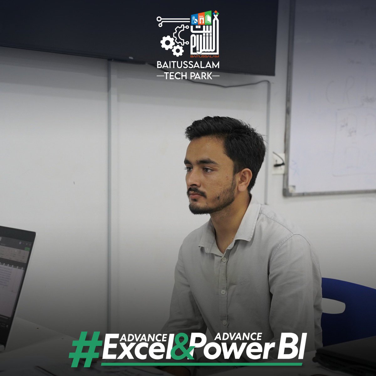
We’re selecting talented young minds to join our Advance Excel & Power BI course and unlock their professional potential.
#BaitussalamWelfareTrust #BaitussalamTechPark #BWT #ExcelCourse #DataSkills #Interviews #BWTInitiative #BTP #SkillDevelopment #DigitalGrowth #EcommerceSkills #InterviewSuccess
2
107
7 Aug 2025
Registration is Now Closed!
Thank you to everyone who applied for the Excel & Power BI Course at Baitussalam Tech Park.
Congratulations to all shortlisted candidates!
Interview Date: Saturday, 9th August 2025
Time: 3:00 PM
For any queries: 92 333 0189367
Please check your email & messages for updates and further instructions.
#BaitussalamWelfareTrust #BaitussalamTechPark #BWT #ExcelCourse #DataSkills #InterviewCall #BWTInitiative #BTP #SkillDevelopment #DigitalGrowth #EcommerceSkills #InterviewSuccess

2
6
207

28 Feb 2025
🎙️ Excel MVP Tip Alert! 🎯
On my latest Excel podcast, I had the pleasure of interviewing Bryan Hong, a Microsoft Excel Expert! During our chat, he revealed an incredible tip that can transform how you use Excel. 🚀
🎧 You can listen to the their tip now or view the full episode here: myexcelonline.com/podcast/ex…
❓Want to learn this tip and other pro-level tricks to boost your Excel productivity in 2025?
🔥 For just $1, you'll get instant access to my exclusive Academy online course, where I'll break down these expert tips step-by-step so you can level up your skills and save hours on your work.
🔗 Sign up now for ONLY $1: join.myexcelonline.com/one-d…
Best Regards,
John Michaloudis
Microsoft MVP
Creator - The MyExcelOnline Academy
#ExcelTips #ExcelMVP #LearnExcel #ExcelCourse
3
144
27 Feb 2025
🎙️ Excel MVP Tip Alert! 🎯
On my latest Excel podcast, I had the pleasure of interviewing Cristian Angyal, a Microsoft Excel MVP! During our chat, he revealed an incredible tip that can transform how you use Excel. 🚀
🎧 You can listen to the their tip now or view the full episode here: myexcelonline.com/podcast/ex…
❓Want to learn this tip and other pro-level tricks to boost your Excel productivity in 2025?
🔥 For just $1, you'll get instant access to my exclusive Academy online course, where I'll break down these expert tips step-by-step so you can level up your skills and save hours on your work.
🔗 Sign up now for ONLY $1: join.myexcelonline.com/one-d…
Best Regards,
John Michaloudis
Microsoft MVP
Creator - The MyExcelOnline Academy
#ExcelTips #ExcelMVP #LearnExcel #ExcelCourse
2
3
334
25 Feb 2025
🎙️ Excel MVP Tip Alert! 🎯
On my latest Excel podcast, I had the pleasure of interviewing Yolanda Cuesta, a Microsoft Excel MVP! During our chat, she revealed an incredible tip that can transform how you use Excel. 🚀
🎧 You can listen to the their tip now or view the full episode here: myexcelonline.com/podcast/ex…
❓Want to learn this tip and other pro-level tricks to boost your Excel productivity in 2025?
🔥 For just $1, you'll get instant access to my exclusive Academy online course, where I'll break down these expert tips step-by-step so you can level up your skills and save hours on your work.
🔗 Sign up now for ONLY $1: join.myexcelonline.com/one-d…
Best Regards,
John Michaloudis
Microsoft MVP
Creator - The MyExcelOnline Academy
#ExcelTips #ExcelMVP #LearnExcel #ExcelCourse
1
2
286
21 Feb 2025
🎙️ Excel MVP Tip Alert! 🎯
On my latest Excel podcast, I had the pleasure of interviewing Wyn Hopkins, a Microsoft Excel MVP! During our chat, he revealed an incredible tip that can transform how you use Excel. 🚀
🎧 You can listen to the their tip now or view the full episode here: myexcelonline.com/podcast/ex…
❓Want to learn this tip and other pro-level tricks to boost your Excel productivity in 2025?
🔥 For just $1, you'll get instant access to my exclusive Academy online course, where I'll break down these expert tips step-by-step so you can level up your skills and save hours on your work.
🔗 Sign up now for ONLY $1: join.myexcelonline.com/one-d…
Best Regards,
John Michaloudis
Microsoft MVP
Creator - The MyExcelOnline Academy
#ExcelTips #ExcelMVP #LearnExcel #ExcelCourse
3
153
20 Feb 2025
🎙️ Excel MVP Tip Alert! 🎯
On my latest Excel podcast, I had the pleasure of interviewing Andrew Moss, a Microsoft Excel MVP! During our chat, he revealed an incredible tip that can transform how you use Excel. 🚀
🎧 You can listen to the their tip now or view the full episode here: myexcelonline.com/podcast/ex…
❓Want to learn this tip and other pro-level tricks to boost your Excel productivity in 2025?
🔥 For just $1, you'll get instant access to my exclusive Academy online course, where I'll break down these expert tips step-by-step so you can level up your skills and save hours on your work.
🔗 Sign up now for ONLY $1: join.myexcelonline.com/one-d…
Best Regards,
John Michaloudis
Microsoft MVP
Creator - The MyExcelOnline Academy
#ExcelTips #ExcelMVP #LearnExcel #ExcelCourse
3
174
14 Feb 2025
🎙️ Excel MVP Tip Alert! 🎯
On my latest Excel podcast, I had the pleasure of interviewing Puneet Gogia, a Microsoft Excel MVP! During our chat, he revealed an incredible tip that can transform how you use Excel. 🚀
🎧 You can listen to the their tip now or view the full episode here: myexcelonline.com/podcast/ex…
❓Want to learn this tip and other pro-level tricks to boost your Excel productivity in 2025?
🔥 For just $1, you'll get instant access to my exclusive Academy online course, where I'll break down these expert tips step-by-step so you can level up your skills and save hours on your work.
🔗 Sign up now for ONLY $1: join.myexcelonline.com/one-d…
Best Regards,
John Michaloudis
Microsoft MVP
Creator - The MyExcelOnline Academy
#ExcelTips #ExcelMVP #LearnExcel #ExcelCourse
3
140
7 Feb 2025
🎙️ Excel MVP Tip Alert! 🎯
On my latest Excel podcast, I had the pleasure of interviewing David Fortin @PiggyAccountant , a Microsoft Excel MVP! During our chat, he revealed an incredible tip that can transform how you use Excel. 🚀
🎧 You can listen to the their tip now or view the full episode here: myexcelonline.com/podcast/ex…
❓Want to learn this tip and other pro-level tricks to boost your Excel productivity in 2025?
🔥 For just $1, you'll get instant access to my exclusive Academy online course, where I'll break down these expert tips step-by-step so you can level up your skills and save hours on your work.
🔗 Sign up now for ONLY $1: join.myexcelonline.com/one-d…
Best Regards,
John Michaloudis
Microsoft MVP
Creator - The MyExcelOnline Academy
#ExcelTips #ExcelMVP #LearnExcel #ExcelCourse
2
226
5 Feb 2025
🎙️ Excel MVP Tip Alert! 🎯
On my latest Excel podcast, I had the pleasure of interviewing Paul Barnhurst @thefpandaguy , a Microsoft Excel MVP! During our chat, he revealed an incredible tip that can transform how you use Excel. 🚀
🎧 You can listen to the their tip now or view the full episode here: myexcelonline.com/podcast/ex…
❓Want to learn this tip and other pro-level tricks to boost your Excel productivity in 2025?
🔥 For just $1, you'll get instant access to my exclusive Academy online course, where I'll break down these expert tips step-by-step so you can level up your skills and save hours on your work.
🔗 Sign up now for ONLY $1: join.myexcelonline.com/one-d…
Best Regards,
John Michaloudis
Microsoft MVP
Creator - The MyExcelOnline Academy
#ExcelTips #ExcelMVP #LearnExcel #ExcelCourse
1
178
29 Jan 2025
🎙️ Excel MVP Tip Alert! 🎯
On my latest Excel podcast, I had the pleasure of interviewing @mrexcelbill, a Microsoft Excel MVP!
During our chat, they revealed an incredible tip that can transform how you use Excel. 🚀
You can listen to the their tip now or view the full
episode here: myexcelonline.com/podcast/ex…
❓Want to learn this tip and other pro-level tricks to boost your Excel productivity in 2025?
🔥 For just $1, you'll get instant access to my exclusive Academy online course, where I'll break down these expert tips step-by-step so you can level up your skills and save hours on your work.
🔗 Sign up now for ONLY $1: https://
join.myexcelonline.com/one-d…
Best Regards,
John Michaloudis
Microsoft MVP
Creator - The MyExcelOnline Academy
#ExcelTips #ExcelMVP #LearnExcel #ExcelCourse
1
5
151

16 Jan 2025
Excel isn’t just a tool—it’s your secret weapon. From complex formulas to powerful analytics, master the art of efficiency with Advanced Excel.
.
#excel #excelcourse #advancedexceltraining #Job #courses #skills #softcrayons #tools #BasicToAdvanced

14

27 Sep 2024
Boost your Excel skills with our Advanced Excel course!
🌐karthikeyaacademy.com/
📞9121104574
📧 Info@Karthikeyaacademy.Com
.
.
#karthikeyaacademy #TallyPrime #Accounting #ExcelCourse #SmartAccounting #Software #ExcelFormulas #ExcelTips #TaxPlanning #IncomeTax #MicrosoftOffice

8
29
9 Sep 2024
Stay up-to-date with the latest Excel trends📈
🌐karthikeyaacademy.com/
📞9121104574
📧 Info@Karthikeyaacademy.Com
#KarthikeyaAcademy #AdvancedExcel #DataAnalysis #LeadGeneration #ExcelTraining #CareerGrowth #DataVisualization #ExcelSkills #ExcelCourse #TallyPrime #Accounting

1
10
27
15 Jul 2024
Join our Advanced Excel course and learn advanced formulas, macros, and data analysis techniques.
🌐: karthikeyaacademy.com/
📞: 9121104574
📧 Info@Karthikeyaacademy.Com
#karthikeyaacademy #tallycourseinhyderabad #ExcelTraining #ExcelCourse #ExcelSkills #ExcelCertification

8
22

11 Dec 2023
Available (for free) from Tiger:
📺30-part structured programming course to help you learn VBA from absolute beginner level
📺30-part structured Excel course to help you learn general Excel from absolute beginner level
#Excel #ExcelTraining #ExcelHelp #ExcelCourse #Tiger30DEA

5
490

27 Nov 2023
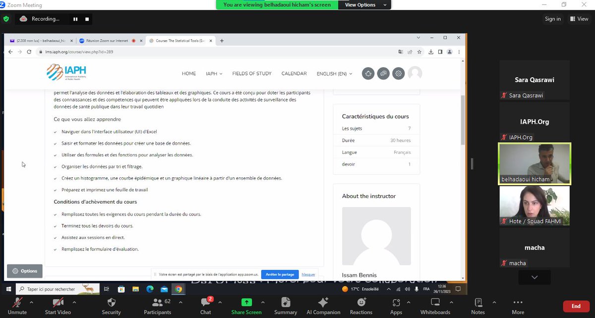
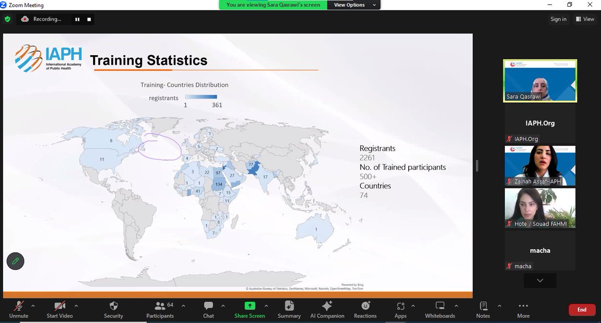
Exciting news! IAPH launches "Statistical Tools-Excel" course at Mohammed VI University of Health Sciences.
Tailored for Public Health master students, this course equips students with essential statistical analysis skills.
#StatisticalAnalysis #ExcelCourse #HealthResearch #IAPH
1
57