
Today, I walked into class expecting the usual “Where’s the formula?” panic.
What I got instead was a room full of curiosity, a few skeptical eyebrows, and one student who whispered, “Is this… magic?”
It wasn’t magic. It was a PivotTable.
We started with raw data staff records, departments, allowances, and transaction types.
Rows and columns stretched endlessly. Eyes started glazing over.
Then came the shift.
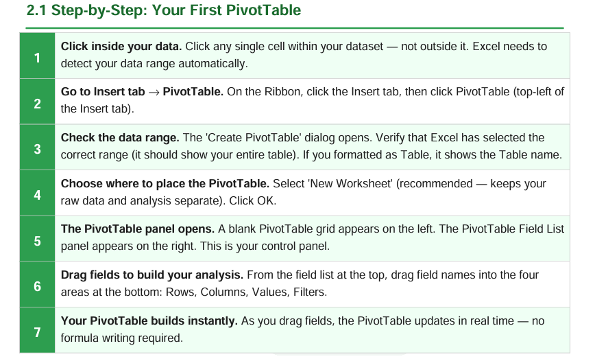
Step 1: Click inside the data.
Step 2: Insert → PivotTable.
Step 3: Let Excel find the range.
Step 4: New worksheet—because clean data deserves a clean canvas.
That’s when the real story began.
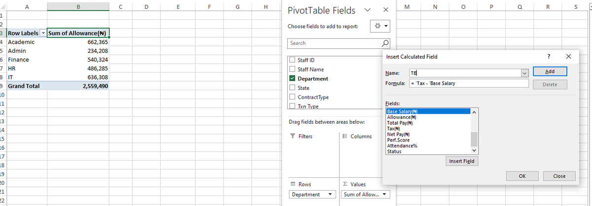
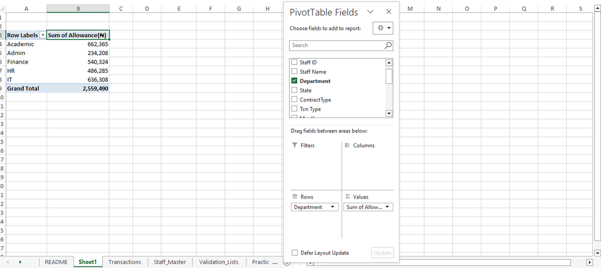
I showed them how to drag fields like building blocks:
· Departments into Rows
· Allowances into Values
Within seconds, the chaos turned into clarity.
Academic: ₦662,365.
IT: ₦636,308.
Grand Total: ₦2,559,490.
No formulas. No stress. Just insight.
One student said, “Wait… so I don’t have to filter and sum manually anymore?”
Another opened their own file and built a summary before lunch.
By the end of the session, they weren’t just using PivotTables, they were thinking in them.
What clicked?
· They saw how dragging fields = asking questions of the data.
· They learned that analysis isn’t about complexity, it’s about structure.
· And they realized they already had the skills; they just needed the right tool.
To every educator, analyst, or leader teaching data skills:
Don’t underestimate the power of that first PivotTable moment.
It’s not just a tool—it’s a mindset shift.
If you’re new to PivotTables, try it today.
One drag at a time, you’ll see your data tell a story you never knew was there.
#DataAnalytics #Excel #PivotTables #TeachingData #StorytellingWithData #ExcelForAnalytics
1
13
5,956
Most courses don't show you the structure.
They just say "join" and hope you trust them.
Here's mine — openly.
─────────────────────
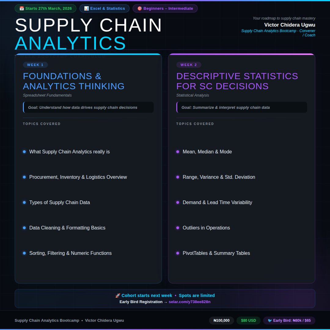
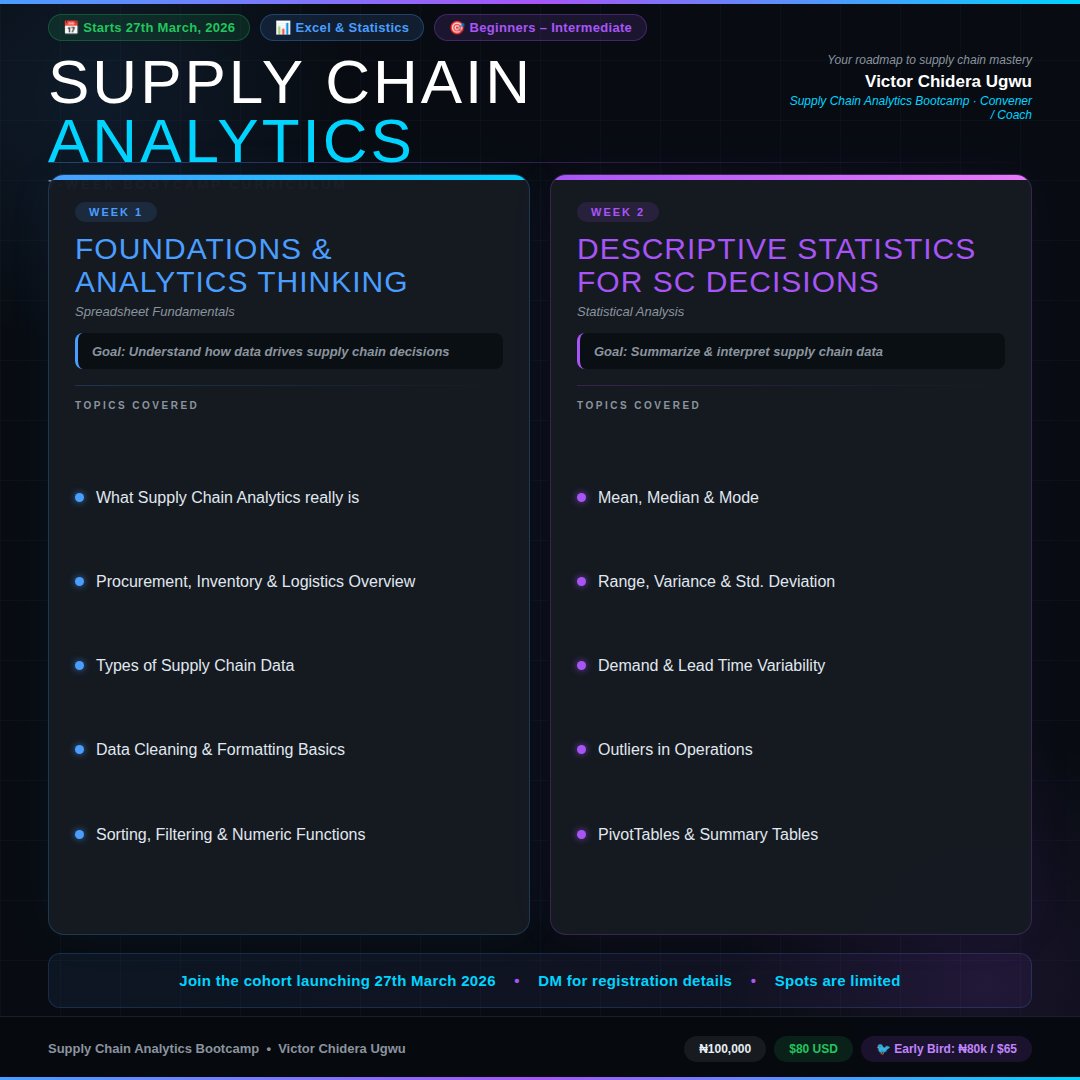
The Supply Chain Analytics Bootcamp runs 7 weeks.
Here's exactly what Weeks 1 & 2 look like:
─────────────────────
WEEK 1 — Foundations & Analytics Thinking
Before you touch a single formula, you need to understand why data matters in supply chain.
Goal: Understand how data drives supply chain decisions.
We cover:
✦ What Supply Chain Analytics really is
✦ Procurement, Inventory & Logistics Overview
✦ Types of Supply Chain Data
✦ Data Cleaning & Formatting Basics
✦ Sorting, Filtering & Numeric Functions
─────────────────────
WEEK 2 — Descriptive Statistics for SC Decisions
Now we go deeper. Numbers mean nothing without context. Week 2 teaches you how to read them.
Goal: Summarize & interpret supply chain data.
We cover:
✦ Mean, Median & Mode
✦ Range, Variance & Std. Deviation
✦ Demand & Lead Time Variability
✦ Outliers in Operations
✦ PivotTables & Summary Tables
─────────────────────
This is what structured learning looks like.
Not a dump of topics.
A deliberate progression — from thinking, to analysis, to decision-making.
─────────────────────
Every week builds on the last.
By the time we hit Week 7, you won't just know Excel.
You'll know how to think like a supply chain analyst.
─────────────────────
This is not theory. It's structured, hands-on learning.
─────────────────────
Investment
₦100,000 · $80 USD
🐦 Early Bird: ₦80,000 / $65
50% installment payment is guaranteed if you can pay full.
🚀 Cohort starts next week.
Spots are limited.
Early Bird Registration → selar.com/y738ee828n
─────────────────────
#SupplyChainAnalytics #DataAnalytics #ExcelForAnalytics #Bootcamp #AfricaTech #SupplyChain #DataSkills #Analytics


1
3
9
1,431
Here's how the first 2 weeks of the Supply Chain Analytics Bootcamp are structured.
Most people think analytics training means endless slides and jargon.
This bootcamp is built differently.
─────────────────────
WEEK 1 — Foundations & Analytics Thinking
Goal: Understand how data drives supply chain decisions.
✦ What Supply Chain Analytics really is
✦ Procurement, Inventory & Logistics Overview
✦ Types of Supply Chain Data
✦ Data Cleaning & Formatting Basics
✦ Sorting, Filtering & Numeric Functions
─────────────────────
WEEK 2 — Descriptive Statistics for SC Decisions
Goal: Summarize & interpret supply chain data.
✦ Mean, Median & Mode
✦ Range, Variance & Std. Deviation
✦ Demand & Lead Time Variability
✦ Outliers in Operations
✦ PivotTables & Summary Tables
─────────────────────
By Week 2, you're not just learning Excel.
You're learning how to read supply chain data and make decisions with it.
This is not theory. It's structured, hands-on learning.
─────────────────────
Investment
₦100,000 · $80 USD
🐦 Early Bird: ₦80,000 / $65
🚀 Cohort starts next week.
Spots are limited.
Early Bird Registration → selar.com/y738ee828n
─────────────────────
#SupplyChainAnalytics #DataAnalytics #ExcelForAnalytics #Bootcamp #AfricaTech #SupplyChain #DataSkills
3
13
35
1,821


📊 Free Workshop: Excel for Data Analytics
🔗 Register Link: tr.ee/Stx2HD
👨🏫 Mr. Sai | 🗓️ 8 Feb | ⏰ 11:00 AM IST
#ExcelForAnalytics #DataAnalytics #FreeWorkshop #NareshIT #CareerSkills #SkillUpgrade

ALT Free online workshop on Excel for Data Analytics by Mr. Sai on 8th February at 11:00 AM IST. Register now: https://tr.ee/Stx2HD.
30

📊 FREE Online Workshop on Excel for Data Analytics
🔗 Register Now: t.ly/FWSEXCELDA-8F
👨🏫 By Mr. Sai
📅 8th February 2026
⏰ 11:00 AM (IST)
#FreeWorkshop #ExcelForAnalytics #DataAnalytics #BusinessAnalytics #AnalyticsCareers #NareshIT

41

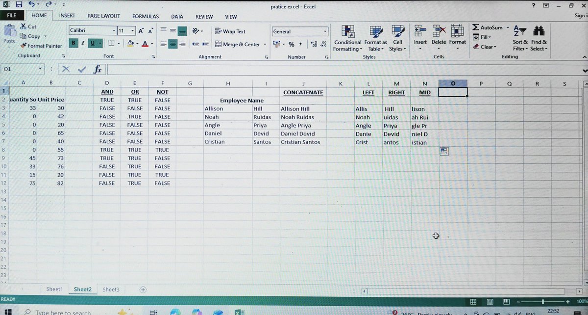
Day 5 of my Data Analytics journey 🚀
Learned Excel formulas used in real-world data prep:
✔ AND, OR, NOT for logic
✔ CONCATENATE for combining fields
✔ LEFT, RIGHT, MID for text extraction
#ExcelForAnalytics #DataAnalyst
49

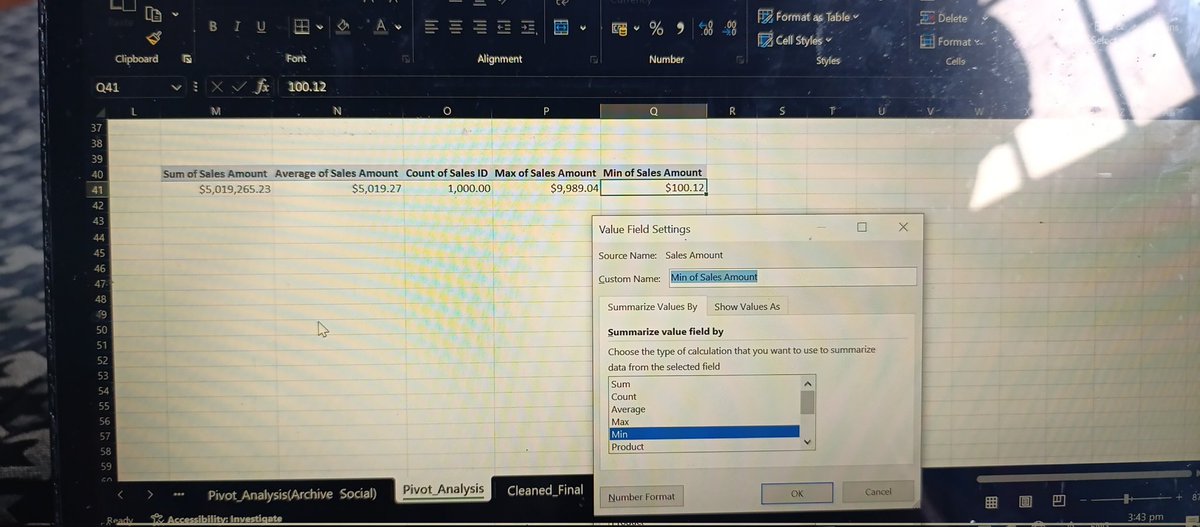
Building KPI tables today.
Learning how totals, averages, counts, min & max are calculated — not just displayed.
#DataAnalytics #ExcelForAnalytics #PivotTables #DataAnalysisJourney #AnalyticsInProgress #LearningInPublic #AspiringDataAnalyst #ExcelTips #AnalyticsThinking
7

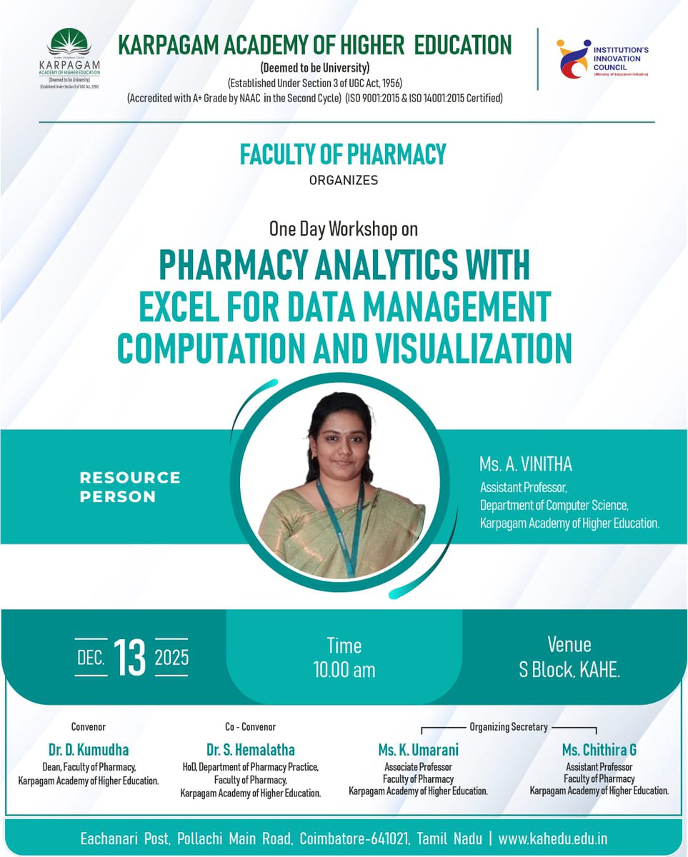
13 Dec 2025
KAHE - The Faculty of Pharmacy is organizing a One-Day Workshop on “Pharmacy Analytics with Excel for Data Management, Computation, and Visualization” on 13th December 2025 at 10.00 AM, at S Block.
#FacultyOfPharmacy #OneDayWorkshop #PharmacyAnalytics #ExcelForAnalytics #KAHE
22

22 Nov 2025
₦58M revenue loss, and even long-tenure “loyal” customers are leaving.
Full breakdown dashboard on my GitHub (link in bio). Don’t forget to leave a ⭐️
#DataAnalytics #ExcelDashboard #ChurnAnalysis #BusinessIntelligence #DataStorytelling #AnalyticsExtra #ExcelForAnalytics
1
7

3 Nov 2025
🚀 Transform Data into Decisions!
📲 Register Now:tr.ee/4BO2gp
📅 Date: 06th November
⏰ Time: 07:00 AM (IST)
📍 Mode: Classroom & Online
#DataAnalytics #BusinessIntelligence #AshokIT #PowerBI #Tableau #PythonForDataAnalytics #SQLTraining #ExcelForAnalytics

14

5 Apr 2025
Want to make trends POP in your Excel sheets? Discover Sparklines in Lesson 16 of our Excel series! 🎥 youtu.be/XCnOIbWm7q8?t=4 #ExcelForAnalytics
11

7 Dec 2024
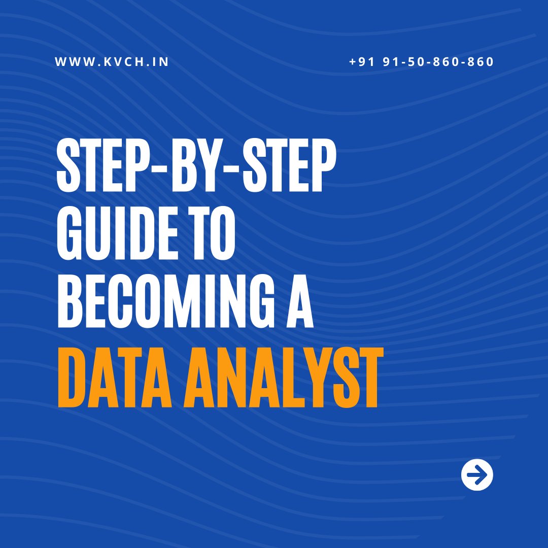
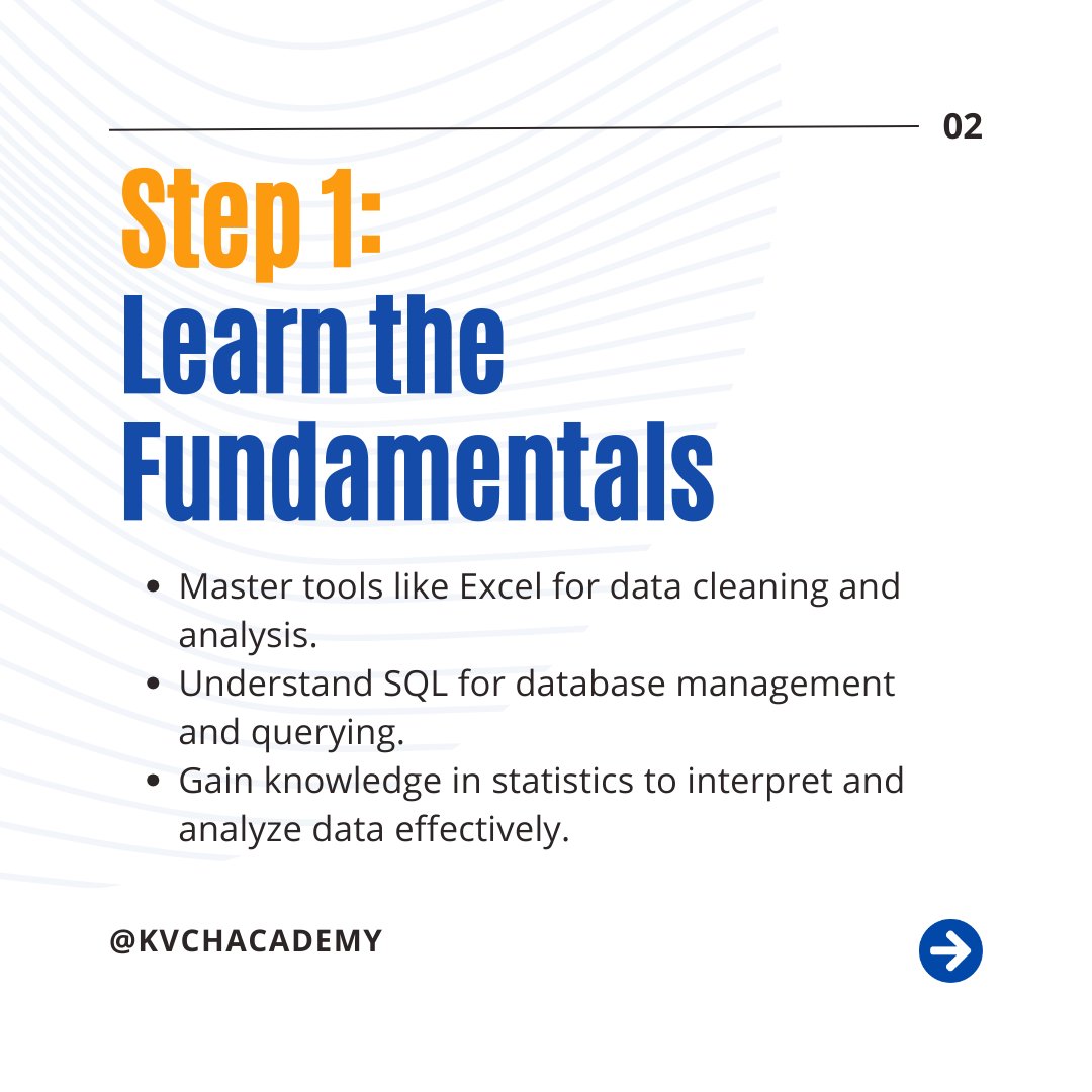
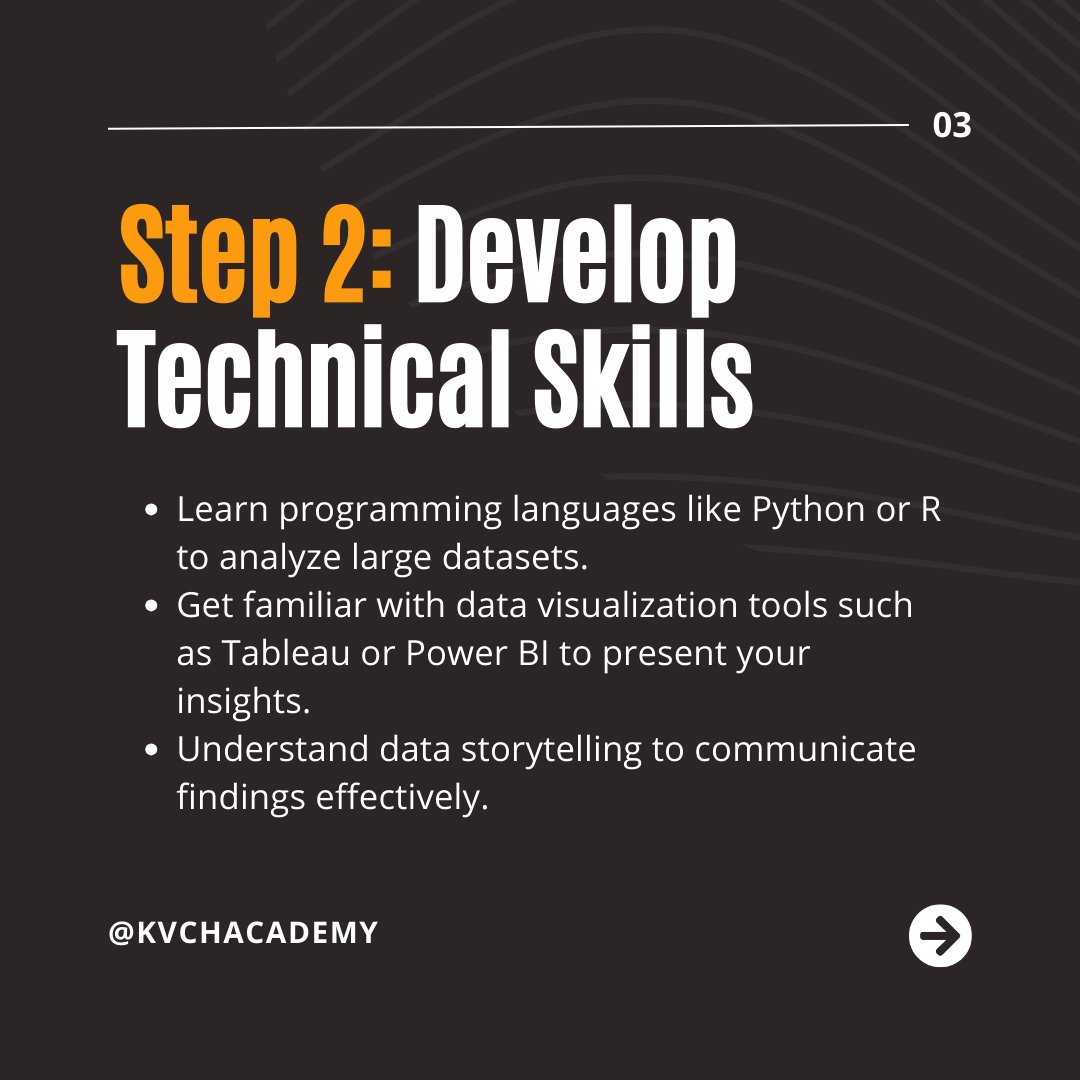
🚀 Your Step-by-Step Guide to Becoming a Data Analyst!
#DataAnalytics #DataAnalyst #LearnAnalytics #CareerGrowth #AnalyticsTraining #KVCH #ExcelForAnalytics #SQLTraining #PythonForData #DataVisualization #Tableau #CareerInData #DataScience #DataScienceTraining #DataDriven
1
6
6 Dec 2024
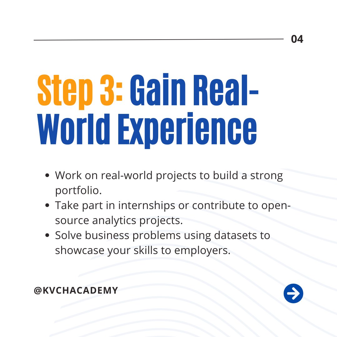
Why Analytics Skills Are in High Demand Across Industries! 🌟
#KVCH #AnalyticsSkills #DataAnalytics #DataDriven #AnalyticsCareer #LearnAnalytics #TechFuture #DataVisualization #CareerInAnalytics #PythonForData #ExcelForAnalytics #AnalyticsTraining #IndustryTrends #TechCareers
1
1
4 Dec 2024
🚀 Become a Data Analytics Expert and Transform Your Career!
#KVCH #DataAnalytics #DataAnalyst #LearnDataAnalytics #AnalyticsCareer #DataVisualization #CareerInData #PythonForData #Tableau #ExcelForAnalytics #datasciencetraining #datascience #datascientist #datasciencetraining

1
2

2 Nov 2024
When you are working as a data analyst, you will use Excel much more than you think.
Let's discuss a really interesting feature that you can use in Excel for your reports and dashboards in this thread.
#DataAnalyst #ExcelTips #DataProtection #ExcelForAnalytics #ExcelDashboard #DataReports #DataVisualization #ExcelSkills #AnalystTips #DataAnalysis #BusinessReporting #AnalyticsCommunity #DataSecurity #SpreadsheetTips #TechTips #USDataAnalyst #UKDataAnalyst #EuropeAnalytics #GlobalDataAnalyst #AnalyticsWorldwide #DataScienceCommunity #UKTech #AnalyticsUSA #DataCareers #UKDataCareers #DataAnalystUK #UKTechJobs #AnalyticsUK #BritishDataScience #UKBusinessIntelligence #UKAnalytics #EuropeAnalytics #DataCareersEurope #EuropeanDataScience #DataJobsEurope #EuropeTech #EUDataAnalyst #EuropeanTechCommunity #DataWorldwide #GlobalAnalytics #InternationalDataScience #AnalyticsCommunity #GlobalTech #DataAnalystGlobal #DataCareersWorldwide

1
2
56
12 Oct 2024
As a data analyst and part of the data community, I have seen that people have polarizing opinions on Excel. Some love it, while others don't like it much.
I am not saying that opinion of someone is wrong, I am just sharing my opinion.
Let's discuss it in few threads
#ExcelForAnalytics #DataAnalysis #ExcelTips #ExcelInData #ExcelLimitations #DataAnalyticsTools #ExcelProsAndCons #DataVisualization #DataCleaning #PowerBI #Tableau #AnalyticsCommunity #USDataAnalysts #UKDataAnalysts #EuropeDataAnalysts #AnalyticsCareer #USDataJobs #UKTechJobs #EuropeTechCareers #ExcelForBusiness #DataAnalystSkills #TechInEurope #DataJobsUSA #UKDataProfessionals #ExcelEfficiency #TechInUS #USAnalytics #UKTechTalent #EuropeAnalytics #DataAnalystsUSA #UKBusinessIntelligence #DataInEurope #USDataScience #TechJobsUK #EUDataProfessionals #AnalyticsInEurope #USEmployment #UKJobMarket #EuropeanTechCareers #USTechOpportunities #UKDataSpecialists #EuropeBusinessData #AnalyticsTalentUK #USAnalyticsCareer #DataProfessionalsEurope #EuropeanAnalyticsExperts #DataCareersUS #UKAnalystCommunity #EuropeTechGrowth #USDataIndustry
1
2
41

13 Jul 2022
Excel is a crucial part of the job for Data Analysts. This certificate is open to all levels of analysts and will cover all aspects of Excel as it pertains to data analytics.
mors.org/Events/Certificates…
#excel #excelforanalytics #probability #statistics #dashboards


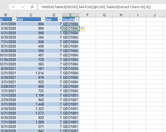
1 Apr 2022
Sorted...
So what went wrong?
In the MATCH part of the formula,
I mixed up the value I was supposed to match with the entire range Excel was supposed to look in...
Once I resolved it, the formula behaved as expected
the result is this:
#30dayofExcel #ExcelforAnalytics
1
1 Apr 2022
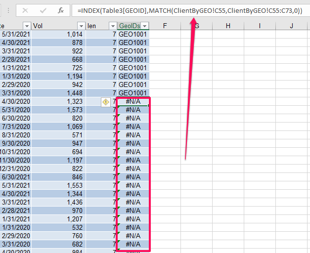
Omo, wetin dey occurlate here... 😳😳😳
This thing is acting up gan
No worry, na me n u today
#30dayofExcel #ExcelforAnalytics #TransitioningtoDataAnalytics
1
1