
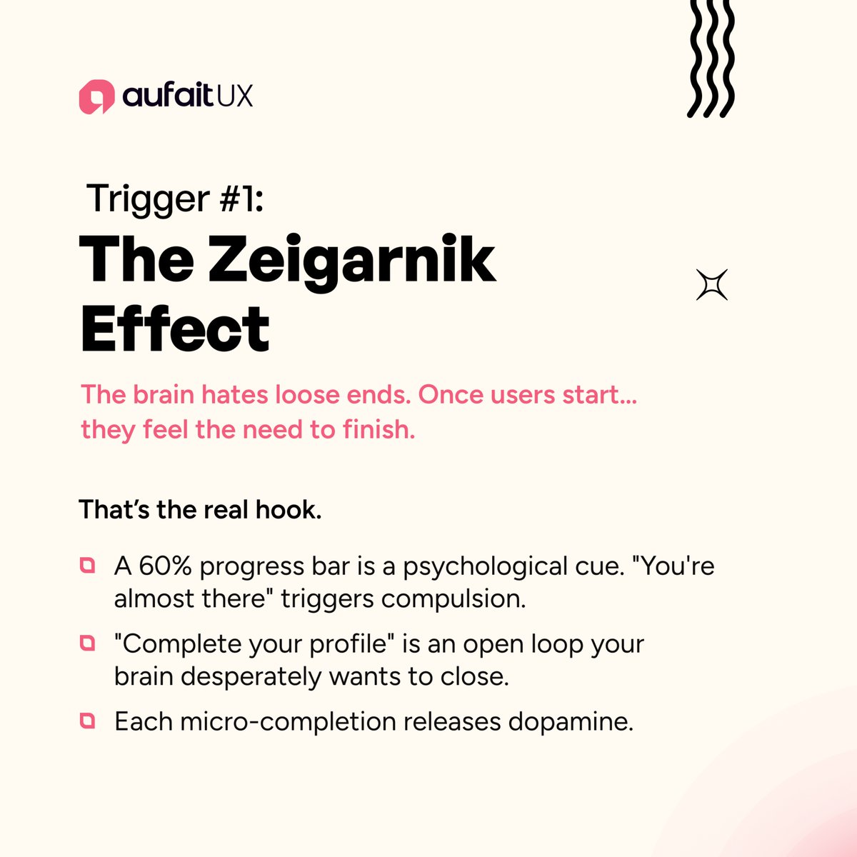
“Frictionless UX” is killing conversions.
The best products use psychological triggers:
• Open loops
• Progress tension
• Ambient proof
Users don’t just interact.
They feel.
3 UX triggers shaping conversion behavior 👇
#UXDesign #GrowthDesign #aufaitux


1
3
7

Day 21 of 21 days Design Challenge with David Samson
And it's a wrap
#iDesign
#idesignedthis
#designers#CreativeDesign#creativedesignerschallenge #designchallenge#growthdesign#designers#graphicdesigner#graphicdesigner#davidsamson
#21daysdesignchallenge

2
13
Day 16 of 21 days Design Challenge with David Samson
Just 5 days to go.
#IDESIGN
#creativedesign #creativedesignerschallenge #designchalleng #growthdesign #designers #graphicdesigner #graphicdesign #Davidsamson
#21daysdesignchallenge

4
8
Day 06 of 21 days Design Challenge with David Samson
Today is Sunday.
We get ready for day 07
#creativedesign #creativedesignerschallenge #designchalleng #growthdesign #designers #graphicdesigner #graphicdesign #Davidsamson
#21daysdesignchallenge
2
9


Syndicate Boutique is a "Private Investment OS" designed for high-net-worth individuals & investment clubs who want to manage collective capital without the friction of traditional banking.
Tool used|: @MagicPathAI #ProductDesign #SaaSDashboard #GrowthDesign #SyndicateBoutique


4
66
Day 04 of 21 days Design Challenge with David Samson
4 days into the growth challenge.
We keep going, we keep growing.
Would you like to join the challenge?
#creativedesign #creativedesignerschallenge #designchalleng #growthdesign #designers #graphicdesigner #graphicdesign


3
12
Day 03 of 21 days Design Challenge with David Samson
3 day into the growth challenge.
We are not tired, we will keep pushing.
Would you like to join the challenge?
#creativedesign #creativedesignerschallenge #designchalleng #growthdesign #designers #graphicdesigner #design


3
16
Day 02 of 21 days Design Challenge with David Samson
Another day of learning growing and pushing limits.
Would you like to join the challenge?
#creativedesign #creativedesignerschallenge #designchalleng #growthdesign #designers #graphicdesigner #graphicdesign #Davidsamson

3
17
Day 01 of 21 days Design Challenge with David Samson
Big appreciation to the organizers of the design challenge, thank you for creating the space to learn, grow, and push our skills further.
#creativedesign #creativedesignerschallenge #designchalleng #growthdesign #designers


2
21

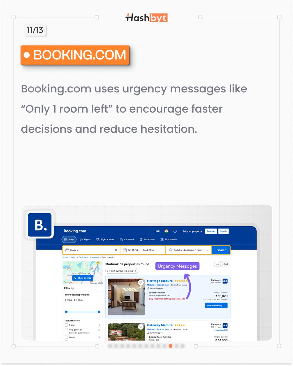
Booking.com UX pattern:
Urgency.
Messages like:
“Only 1 room left”
Encourage faster decisions.
@bookingcom
#Booking #ConversionUX #GrowthDesign
3
3
28


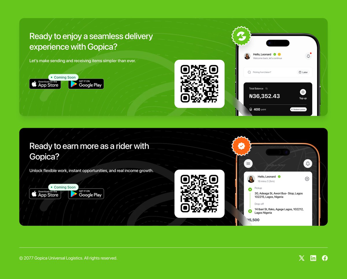
Feb 22
Pomaline Moses Olanrewaju - Product Designer building growth-ready digital products with strategy, systems thinking, and execution depth.
#ProductDesign #MarketplaceDesign #UXStrategy
#GrowthDesign #LogisticsTech #StartupNigeria #UIUX #ProductThinking


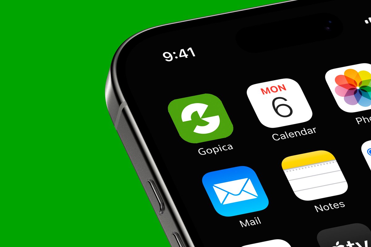

2
28

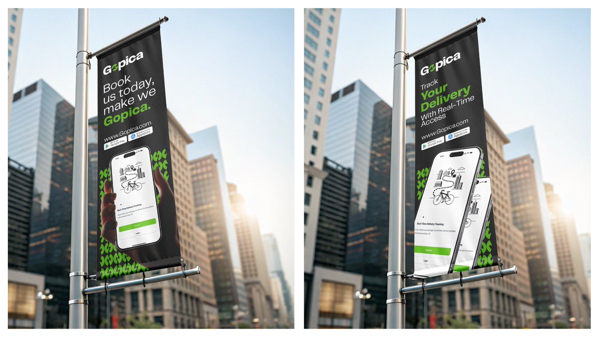
Feb 22
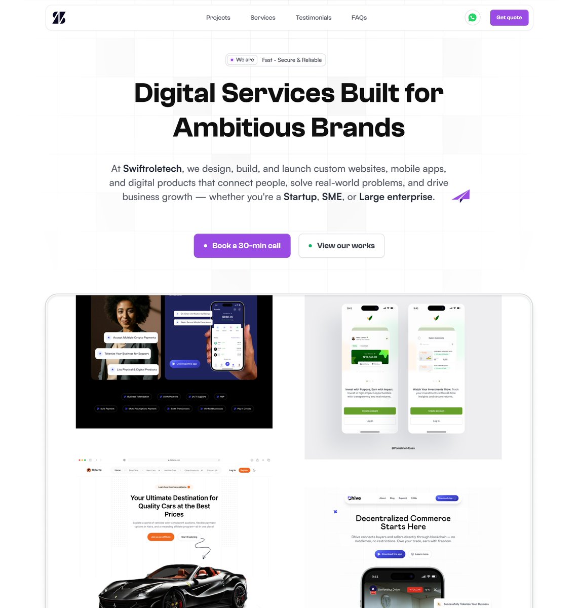
@SwiftRole, we are always building growth-ready digital products with strategy, systems thinking, and execution depth.
swiftroletech.com/
#ProductDesign #MarketplaceDesign #UXStrategy
#GrowthDesign #LogisticsTech #StartupNigeria #UIUX #ProductThinking


2
9
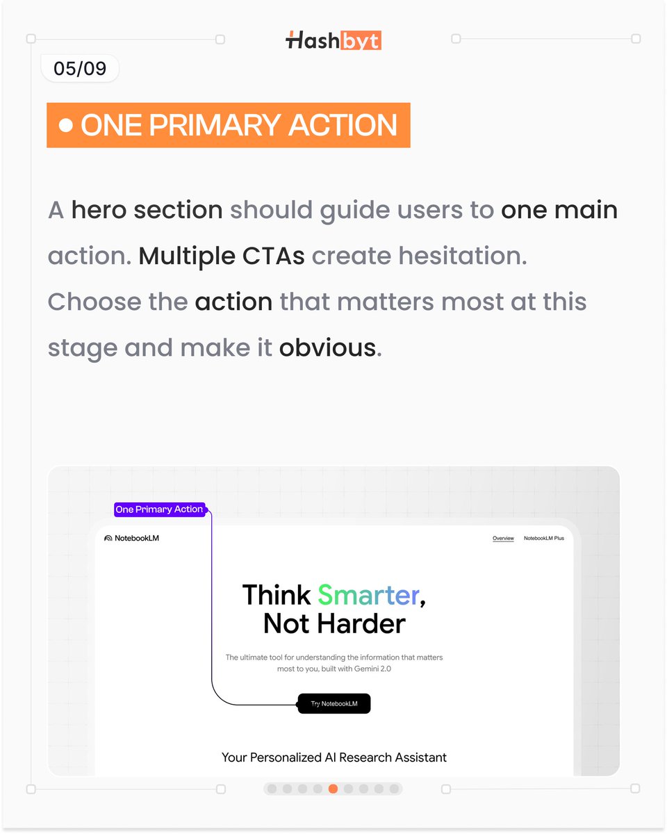
Pick ONE primary action.
Multiple CTAs = hesitation.
Make the next step obvious.
#GrowthDesign
1
3
3

Feb 2
With CORE, I’m focusing on the essentials. Get the foundation right and the growth happens naturally.
Pure digital architecture. 🛠️
Stay tuned for more!🔜
#WebDesign #GrowthDesign #Minimalism #CreativeDirection #DesignTwitter #BuildInPublic #Digitaled

1
3
40

Most hero sections look clean, but they don’t do enough heavy lifting. In the current version, the message is broad, the product feels distant, and there’s no immediate reason to trust or act. In the updated hero, everything is intentional: the product is front and center, social proof instantly builds trust, benefits are scannable within seconds, and the CTA is supported by a risk-reversal. The result? Clear value, faster understanding, and a stronger push toward conversion. This is what happens when a hero section stops being decorative and starts doing its real job selling.
#WebDesign #LandingPageDesign #EcommerceDesign #ConversionRateOptimization #CRO #UXDesign #UIDesign #ProductPage #ShopifyDesign #DTCBrands #WebDesigner #GrowthDesign

1
27
334

Jan 14
Most trading-first L1s lose users in the first 5 seconds on the homepage—when cold traffic asks: “What is this, for me, right now?”
Today’s #AdoptionTweaks spotlight: @fogo
A couple of things that already work well:
– Strong, confident brand posture (clear “built for traders” energy).
– Fast, efficient ecosystem browsing once you’re inside the site.
Two adoption tweaks you might test next:
→ Tweak 1: the current hero is almost pure positioning (“Zero Compromise”) with a minimal gradient background.
For new visitors, that’s a bounce-rate amplifier because it doesn’t answer what Fogo is fast enough.
The next section already contains the “purpose-built L1 / 40ms / confirmation” substance, so you’re close. Pull that definition line into the hero and pair it with a functional visual (not decoration): a compact “spec / proof” module that encodes your strengths (e.g., 40ms blocks, ~1s confirmation, SVM compatibility, Sessions), or a simple “latency tax receipt” panel that makes the promise legible in one glance.
Branding stays bold—comprehension becomes instant.
→ Tweak 2: replace “Fogo Sessions” with “Solutions / Why Fogo” linking to the differentiators (Sessions, colocation, performance, SVM compatibility) and then consider a clearer name change (“Fogo Sessions” → “Gasless Sessions”).
Replacing the label is more important than renaming.
Also consider moving low-intent items (Blog, maybe Explorer) to the footer to keep primary nav conversion-led.
Why it matters for users:
– Less “scroll to understand,” more instant clarity → lower bounce, higher first-action rate.
– Faster self-selection (“this is for traders/devs/institutions”) → fewer wrong-click journeys.
– Trust lift: a meaningful hero (copy proof module) reduces the “marketing fog” penalty.
PS: congrats on the Binance listing. Big distribution moment.
If you’re on the @fogo team (Hi @RobertSagurton) and want to sharpen this flow, I can turn this into 2–3 concrete experiments your team can ship quickly.
#Web3UX #GrowthDesign #OnchainTrading #Solana

1
1
3
750
30 Dec 2025
Web3 homepages try to speak to users devs institutions at the same time → and end up converting none of them.
#AdoptionImports 👇
In Web2 (fintech/SaaS), products like Revolut run segmented “homepages” by persona:
Personal vs Business (separate hero, proof, CTA, entire content and sections) on dedicated URLs you can drop into ads, emails, and sales.
How to port it to Web3 (L1/L2, wallet, DeFi protocol):
1️⃣ Ship 3 entry pages, not 1
/users • /developers • /institutions
Each page answers one job-to-be-done. No compromises.
2️⃣ Match promise CTA to the persona
Users: “Start in 60 seconds” → Connect wallet / first action
Devs: “Build in 15 minutes” → Quickstart / SDK / sample app
Institutions: “Decision-grade risk ops pack” → Talk to sales / request access
3️⃣ Build a real funnel behind each page
Users → onboarding activation checklist
Devs → docs sequence integration milestones
Institutions → compliance, custody, redemption, reporting, SLA, disclosures
(And yes: analytics UTM CRM routing.)
A “Get Started” modal (common in Web3) is a directory. A persona homepage is a conversion asset.
Decades of Web2 experience are free alpha for Web3 adoption - if you’re willing to import it.
#Web3UX #ProductMarketing #GrowthDesign #DeFi

2
11
1,039