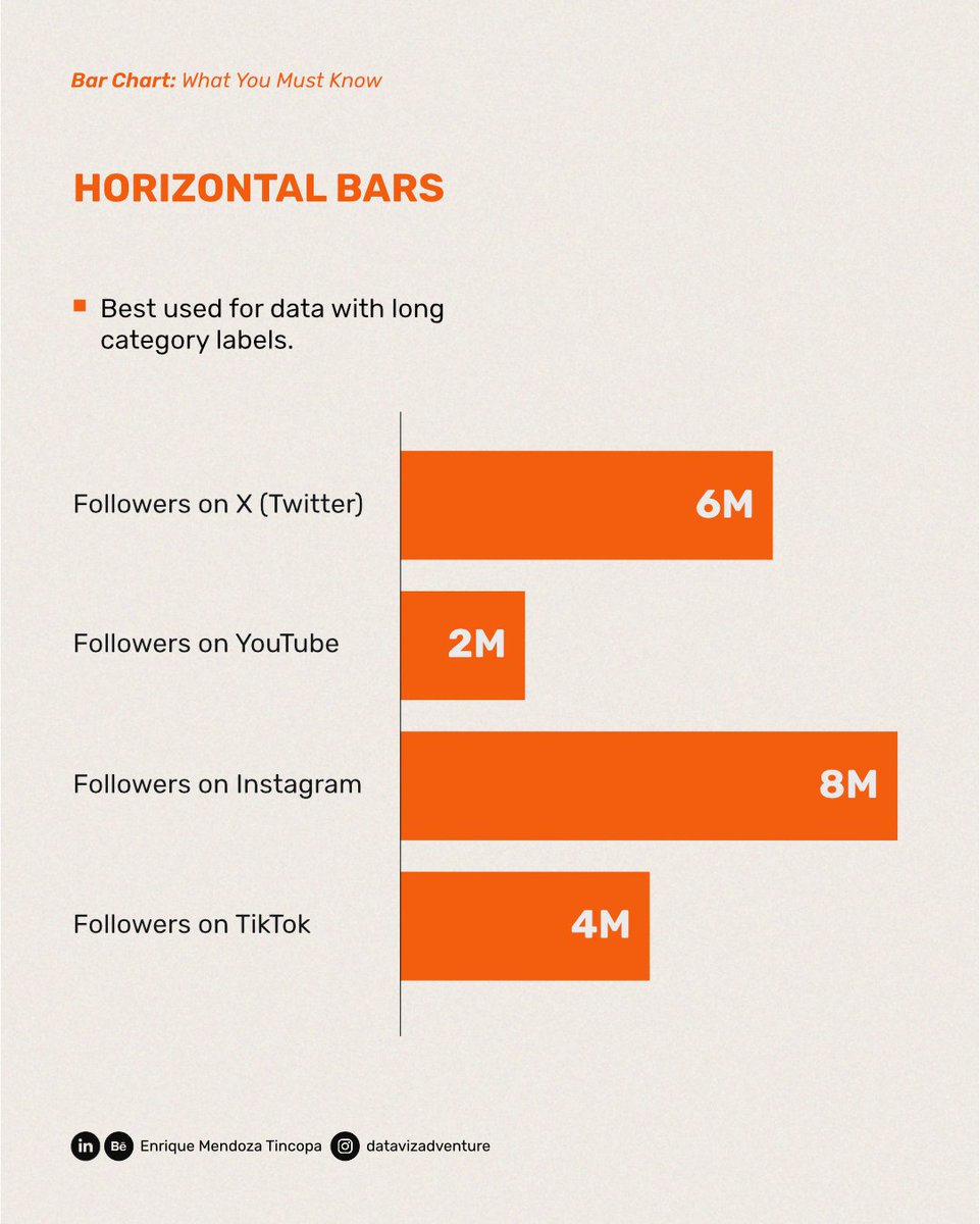
ALT Radial tree diagram titled “Threatened Australian Fauna”. The centre node branches into major fauna groups including Birds, Mammals, Reptiles, Fish, Frogs, and Hidden lives. Each group branches into smaller user-friendly subgroups such as Skinks, Shorebirds, Bats, Tree frogs, and Insects. The visual uses fine grey lines, small circular nodes, and a pale background.


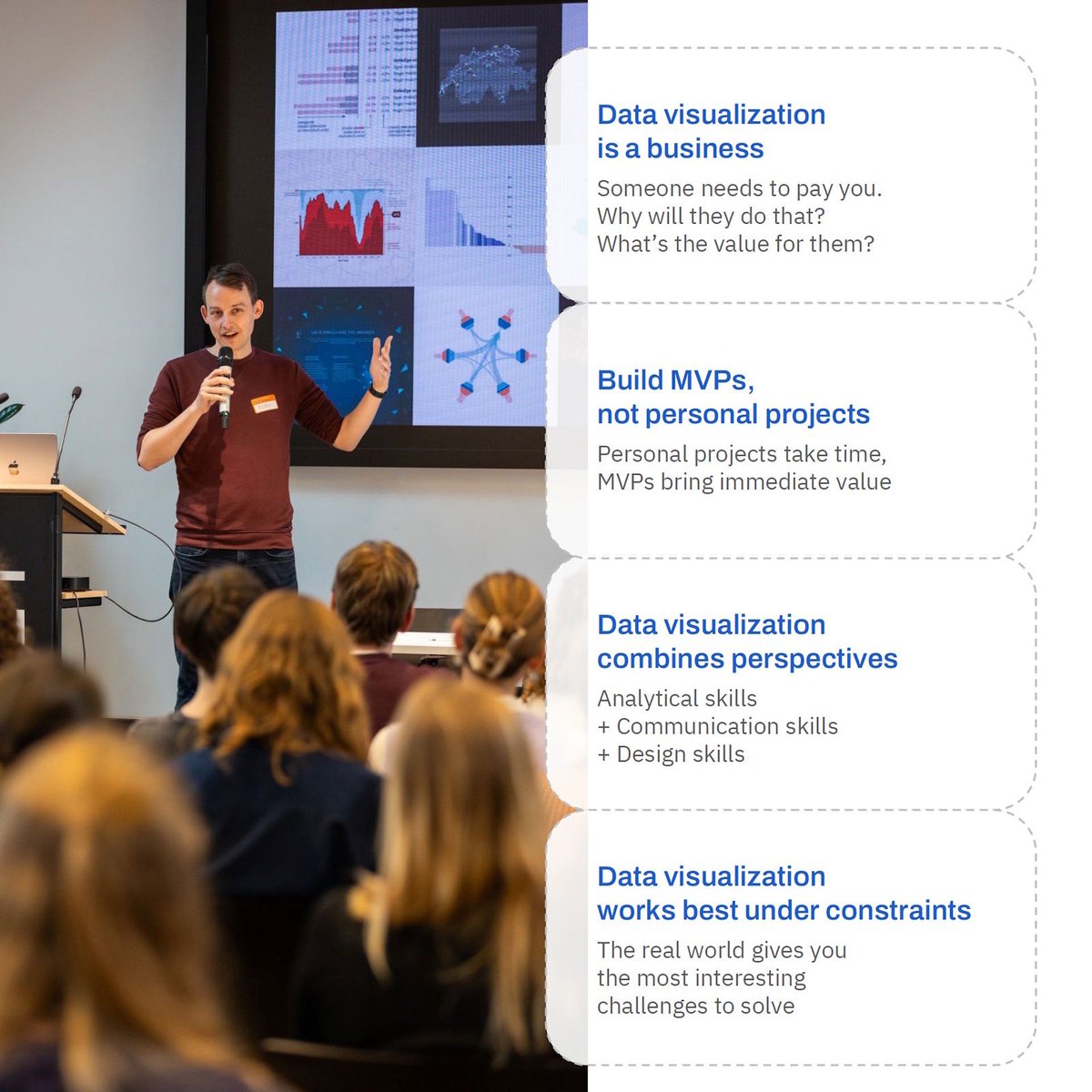
ALT Koen Van den Eeckhout addresses an audience at a small conference. He stands in front of a large screen displaying various data visualizations — including charts, maps, and a network diagram — holding a microphone and gesturing with one hand. Several attendees are visible from behind in the foreground, seated and facing the presenter. A laptop and podium are visible to his left. Overlaid on the right side of the image are four key lessons in rounded dashed boxes, with blue headings: Data visualization is a business — Someone needs to pay you. Why will they do that? What's the value for them? Build MVPs, not personal projects — Personal projects take time, MVPs bring immediate value. Data visualization combines perspectives — Analytical skills Communication skills Design skills. Data visualization works best under constraints — The real world gives you the most interesting challenges to solve.


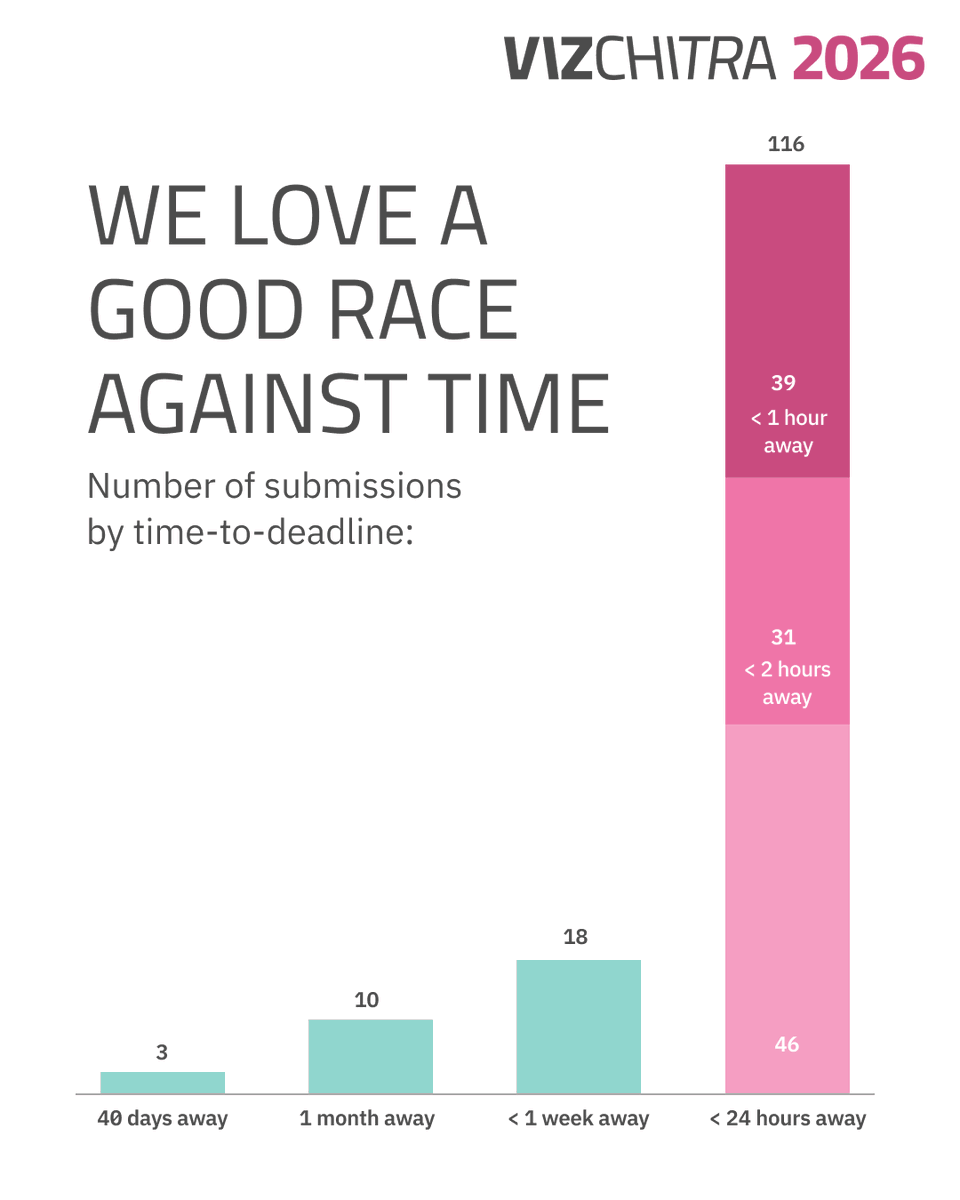
ALT A bar chart with the title: We love a good race against time. First bar is 40 days away with 3 submissions. Second bar is 1 month away with 10 submissions. Third bar is <1 week away with 18 submissions. Last bar is <24 hours away stacked with bottom section being 46 submissions, 2 hours away with 31 and <1 hour away with 39.