当所有人都在让 AI 出更复杂、更逼真、更炸裂的图时——试试反过来:只给它三种颜色。
黑线、一抹蓝、一点红。一个物件、一个动词、一句小字。没了。
结果?越少,越像「某个人画的」。因为克制本身就是风格——它在说「我知道可以加更多,但我选择不加」。这种「选择不加」的感觉,就是 AI 图最难伪造的东西:审美判断。
Prompt 的高阶操作不是往里塞更多描述,是知道该删掉什么。
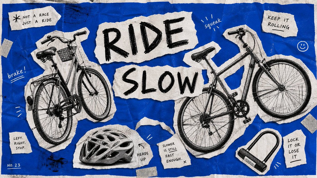
而这 4 张还是同一套模板:风格锁死(奶白纸底 手绘黑线框 蓝色填充 红色手写标签 单个日常物件 右下角小字注释 版画颗粒感),换的只是「画什么物件、配哪个动词」。模板抄走直接用——
{
"style_name": "Loose Scribble Riso Print Style",
"style_slug": "loose-scribble-riso-print-style",
"style_version": "1.0.0",
"style_summary": "A sparse handmade riso or screenprint poster style with one large simplified subject, wavering black contour drawing, rough off-white paper, flat blue and coral-red overprint accents, handwritten margin text, and visible print grain.",
"environment_variables": {
"SUBJECT": "The new main subject or simplified object for the print.",
"SUBJECT_ACTION": "The simple pose, placement, or action of the subject.",
"PRODUCT_OR_PROP": "A small supporting prop or object detail that is not the original source prop.",
"LOCATION": "A minimal setting or surface that grounds the subject.",
"BACKGROUND_ELEMENTS": "Sparse background details such as a border, ground line, paper speckles, or one small accent mark.",
"MAIN_TEXT": "A short handmade phrase to place near the margin.",
"SECONDARY_TEXT": "Tiny supporting handwritten text or edition-like microcopy that does not mimic the source identity marks.",
"ACCENT_SYMBOL": "One small decorative mark, scribble, star, arrow, dot, or stamp-like accent.",
"WARDROBE_STYLE": "Styling direction for any character or object treatment, kept flat and handmade.",
"STYLE_FIDELITY_ANCHORS": "Observable style traits that must remain visible in the generated sample.",
"SOURCE_CONTENT_TO_AVOID": "Literal source content that generated samples must not recreate.",
"ASPECT_RATIO": "9:16 or 16:9"
},
雨后的伞、深夜的灯、桌上的收音机、一包种子——哪个最像你此刻的状态?
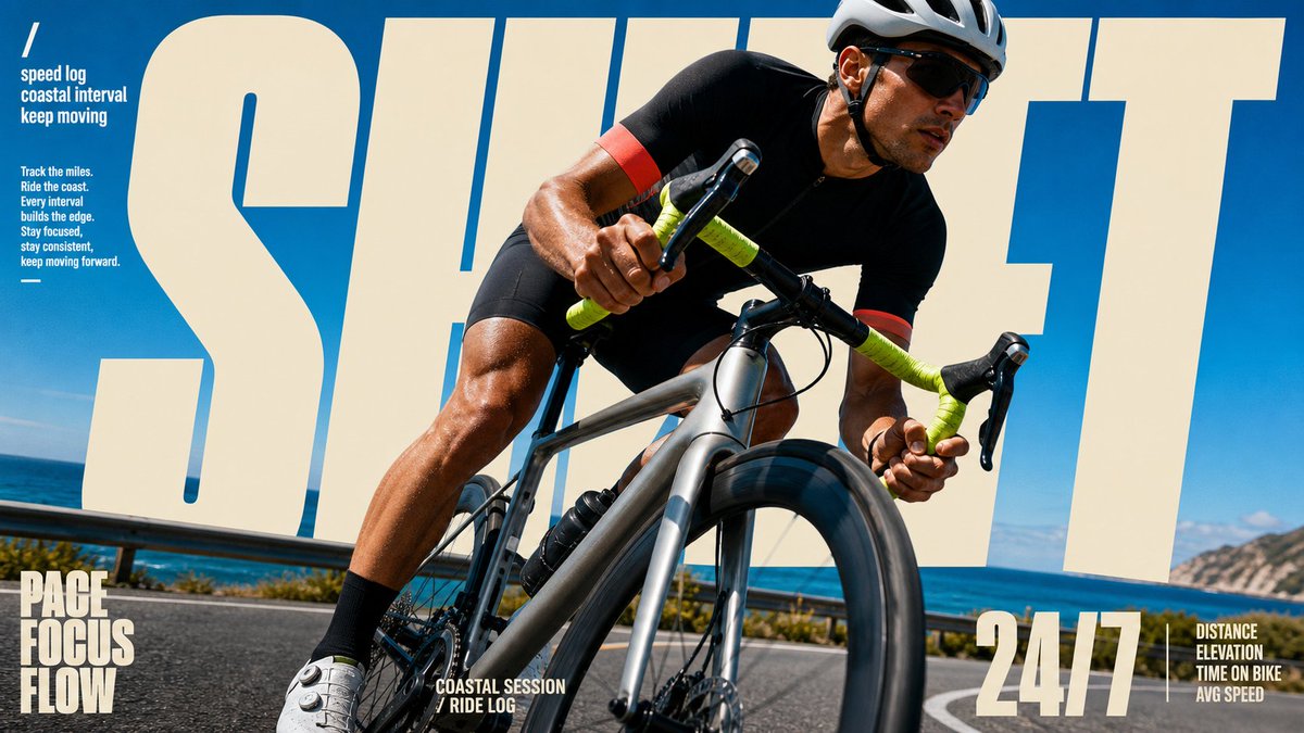
这 4 张海报为什么看着像 Nike 广告?不是因为模特帅、不是因为红色猛——是因为一个设计圈的老手法:破框。
照片框在上半截,但人物的身体「冲出」了照片边界,闯进了下面的色块和字母区。你的眼睛会瞬间产生「这个人正在跳出画面」的 3D 错觉——所有运动品牌的广告总监都靠这一招制造力量感。
传统做法:摄影师拍完 → 设计师 Photoshop 抠图 → 手动分层 → 加投影 → 报价五位数。
现在的做法:一个模板,一次生成,照片、破框、字母、投影全在里面。
而这 4 张还是同一套模板:风格锁死(正红底 蓝调动作照片框 人物破框 超大金色单词 侧栏竖排文字 底部三词 tagline 地面硬影),换的只是「谁在动、动作是什么、配哪个词」。模板抄走直接用——
{
"style_name": "Scarlet Court Photo Type Poster",
"style_slug": "scarlet-court-photo-type-poster-style",
"style_version": "2.1.0",
"style_summary": "A saturated action-ad poster style built from a flat scarlet field, a hard-edged blue photographic sports panel, one cutout subject crossing between those zones, oversized warm-cream display typography, vertical side microcopy, and gritty printed-poster texture.",
"environment_variables": {
"SUBJECT": "main subject",
"SUBJECT_ACTION": "main action",
"PRODUCT_OR_PROP": "object, product, or prop",
"LOCATION": "environment or setting",
"BACKGROUND_ELEMENTS": "secondary scene details",
"MAIN_TEXT": "main headline or graphic text",
"SECONDARY_TEXT": "small repeated supporting text",
"ACCENT_SYMBOL": "separator or decorative symbol",
"WARDROBE_STYLE": "styling direction",
"STYLE_FIDELITY_ANCHORS": "observable style traits that must remain visible",
"SOURCE_CONTENT_TO_AVOID": "literal source content that generated samples must not recreate",
"ASPECT_RATIO": "9:16 or 16:9"
},
RISE / MOVE / FRESH / READY——如果让你给自己选一个词印成海报,你选哪个?