
Jun 11
66:
Design Style:
Name: "Citrus Neumo"
Concept: >
次世代UIデザインとして注目される
ニューモーフィズム(Soft UI)をベースにした、
ミニマルかつプレミアムなインフォグラフィックスタイル。
背景と同系色の立体要素、
柔らかな陰影、
浮き出し・押し込み表現を組み合わせ、
インターフェースそのものをデザインモチーフとして活用する。
ダッシュボード、SaaS説明資料、
AIプロダクト紹介、アプリ提案書、
UI/UXケーススタディに適した、
洗練された未来的な世界観を表現する。
Canvas:
Ratio: "16:9"
Mood:
- Minimal
- Futuristic
- Premium
- Elegant
- Soft
- Technological
- Calm
- Intelligent
Color Palette:
Background:
Primary: "#EEF0F4"
Secondary: "#F4F5F8"
Text:
Primary: "#646A82"
Secondary: "#A5ABBA"
Light: "#C9CED8"
Accent:
Orange: "#FF9E2C"
Neutral:
White: "#FFFFFF"
Gray: "#E5E7ED"
DarkGray: "#8B92A3"
Typography:
Headings:
Font: "Modern Sans Serif"
Weight: 300
LetterSpacing: "0.25em"
Transform: "Uppercase"
Color: "#646A82"
Display:
Font: "Geometric Sans Serif"
Weight: 500
Color: "#646A82"
Subheadings:
Font: "Sans Serif"
Weight: 400
LetterSpacing: "0.12em"
Color: "#A5ABBA"
Body:
Font: "Sans Serif"
Weight: 400
Color: "#8B92A3"
LineHeight: 1.7
Numbers:
Font: "Geometric Sans Serif"
Weight: 600
Color: "#646A82"
Layout:
Structure:
- Interface-inspired composition
- Modular dashboard arrangement
- Large negative space
- Symmetrical balance
- Floating UI components
Grid:
Columns: 12
Gutters: "Medium"
Margins:
Outer: "Extra Large"
Components:
Dashboard:
- Metric cards
- Status panels
- Control widgets
- Message panels
- Settings sections
Forms:
- Input fields
- Dropdown menus
- Text areas
- Selection boxes
- Toggle groups
Controls:
- Sliders
- Toggle switches
- Checkboxes
- Radio buttons
- Buttons
- Navigation tabs
Notifications:
- Floating alerts
- Success states
- Call-to-action cards
Metrics:
- Progress indicators
- Minimal bar charts
- Value highlights
- Percentage displays
Illustration:
Style:
Functional UI Components
Rendering:
Soft extrusions
Rounded geometry
Minimal detail
Consistent depth
Interface realism
Icons:
Style:
Thin outline icons
Characteristics:
- Rounded terminals
- Uniform stroke width
- Monochrome appearance
- Minimal symbolism
- Functional purpose
Subjects:
- User
- Home
- Chart
- Thermometer
- Heart
- Message
- Check
- Settings
Neumorphism:
Surface:
Background: "#EEF0F4"
Radius:
Small: "12px"
Medium: "20px"
Large: "32px"
Raised:
Highlight:
Color: "rgba(255,255,255,0.95)"
Offset: "-8px -8px"
Blur: "16px"
Shadow:
Color: "rgba(163,177,198,0.35)"
Offset: "8px 8px"
Blur: "16px"
Pressed:
Highlight:
Color: "rgba(255,255,255,0.8)"
Inset: true
Shadow:
Color: "rgba(163,177,198,0.25)"
Inset: true
Controls:
Buttons:
Style: "Raised"
Inputs:
Style: "Inset"
Toggles:
Track: "Inset"
Knob: "Raised"
Sliders:
Track: "Inset"
Thumb: "Raised"
Cards:
Style: "Raised"
Accent Usage:
Strategy:
Use sparingly
ApplyTo:
- Active states
- Slider progress
- Toggle ON state
- Key actions
- Important metrics
Effects:
Shadows:
Usage: "Essential"
Characteristics:
- Soft diffusion
- Low contrast
- Same direction
- Multi-layered
Borders:
Usage: "Avoid"
Gradients:
Usage: "Minimal"
Style:
- Very subtle
- Same color family
Textures:
Usage: "None"
Decorations:
BackgroundElements:
- None
VisualLanguage:
- Interface first
- Function over decoration
- Calm surfaces
Spacing:
SectionGap: "Extra Large"
ComponentGap: "Large"
InternalPadding: "Generous"
Rules:
- Maintain a monochromatic surface language.
- Use orange as the single accent color.
- Ensure every component follows the same neumorphic depth system.
- Prioritize usability and clarity over visual complexity.
- Avoid sharp corners and heavy outlines.
- Use whitespace generously to create a calm atmosphere.
- Keep typography lightweight and elegant.
- Limit charts to simple metrics and status indicators.
- Preserve a premium, tactile interface aesthetic.
- Suitable for SaaS presentations, AI product decks, dashboard showcases, UX case studies, app concepts, and digital product proposals.
1
3
2,771

May 3
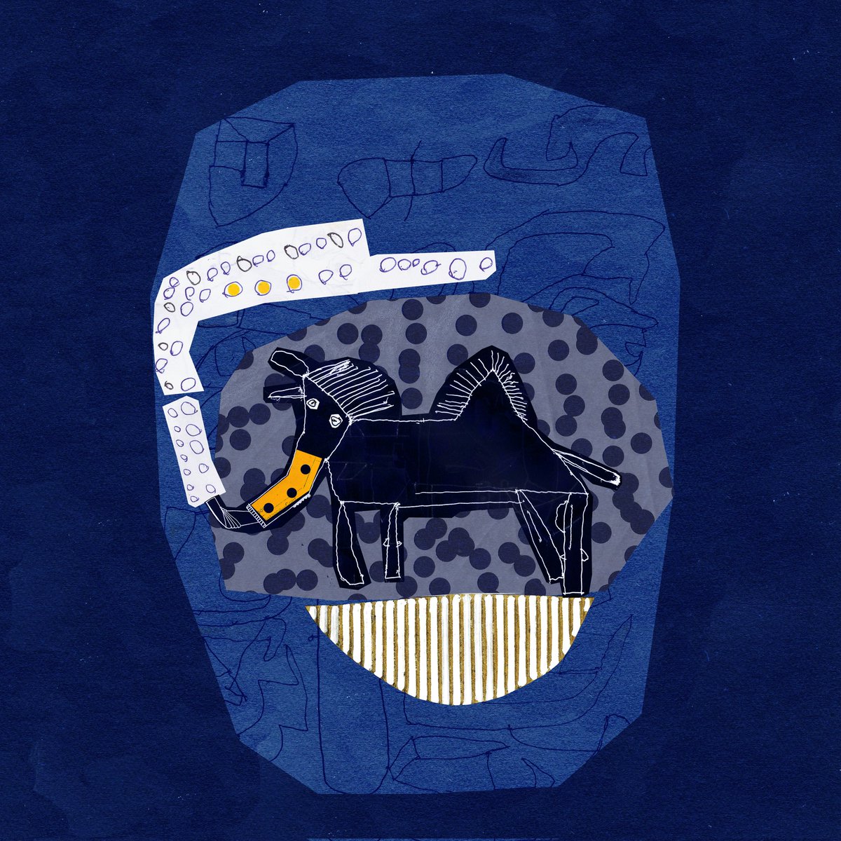
••• For example "ZIGOOR" •••
MAZDAK says it, and I collage the image that comes to my mind.
It's a visual conversation between two worlds.
💛
#Zigoor #VisualLanguage #UniqueArt #TezosColectibls

1
4
366

Apr 1
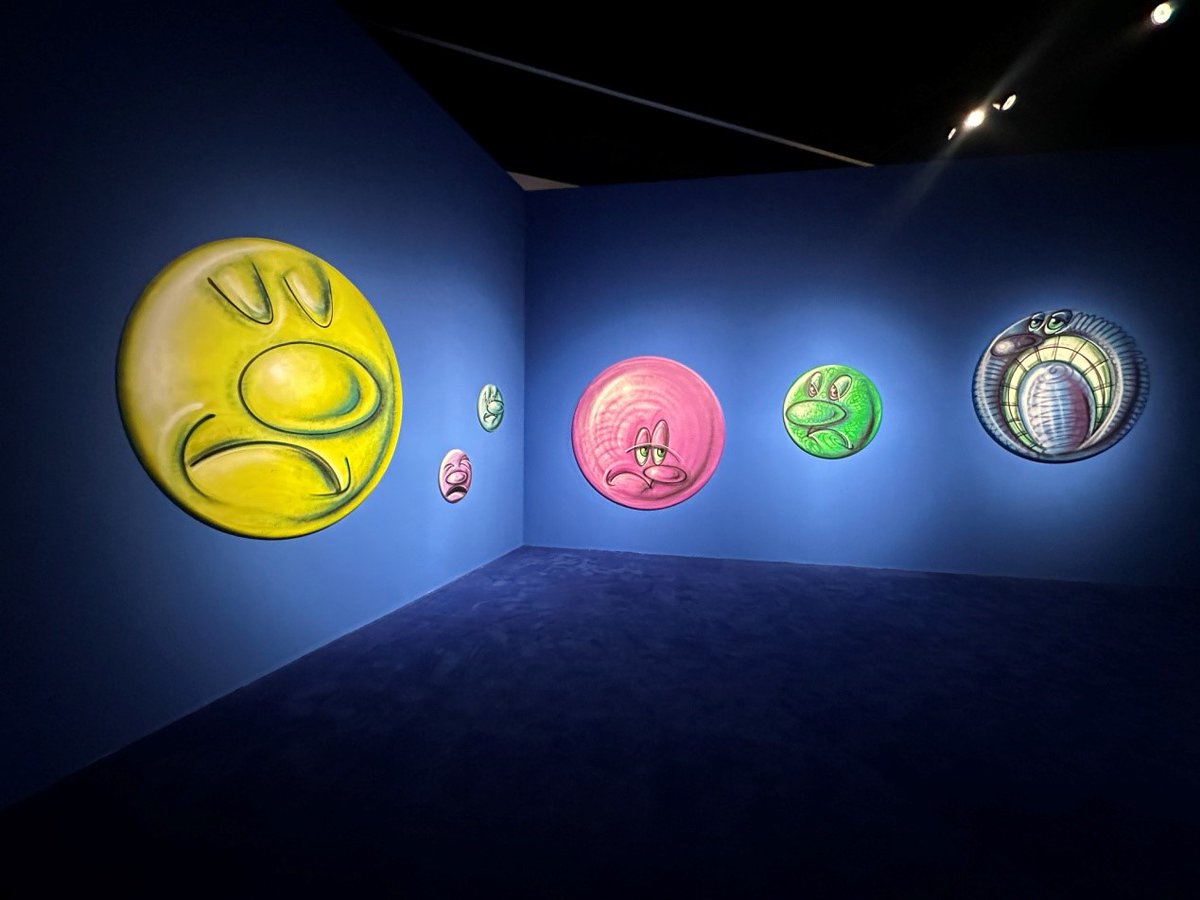
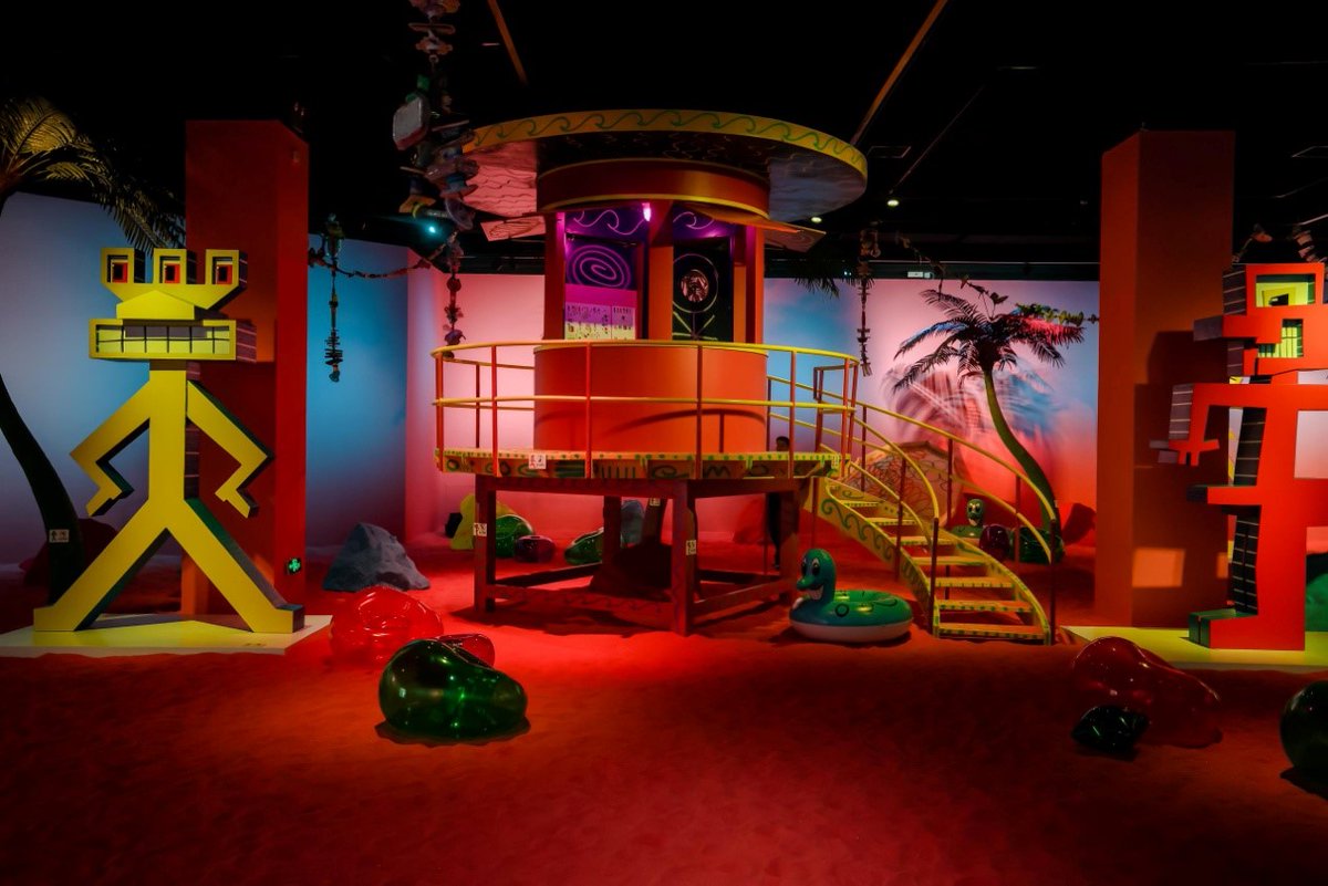
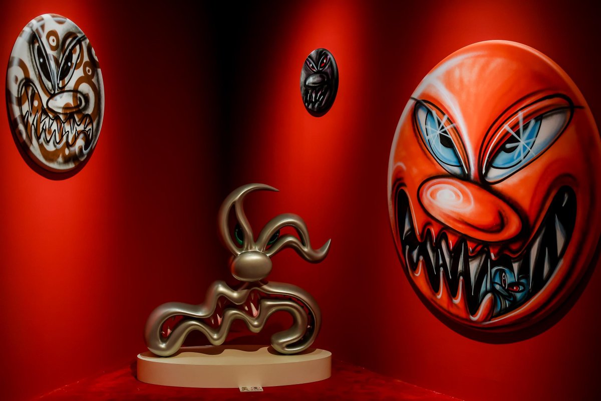
The immersive exhibition Kenny Scharf: Emotional Universe has arrived at the Hubei Museum of Art in Wuhan, Hubei province. 🎉 Through paintings, sculptures, and installations, Kenny Scharf transforms six major emotions — anger, disgust, fear, joy, sadness, and awe — into a vibrant visual language. 😠😞😨😊😥😮 Based on the long history of emotional expression in art, this exhibition reveals Scharf's bold and unique interpretation of emotions. ✨
📆Dates: March 31-June 21
#WhatsOn #HubeiMuseumofArt #KennyScharf #Emotion #VisualLanguage #Artworks

4
190

Mar 27
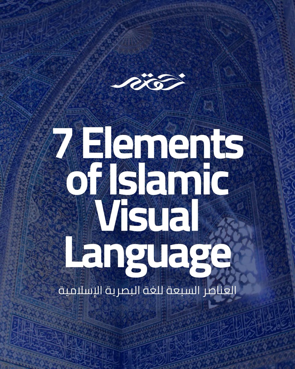
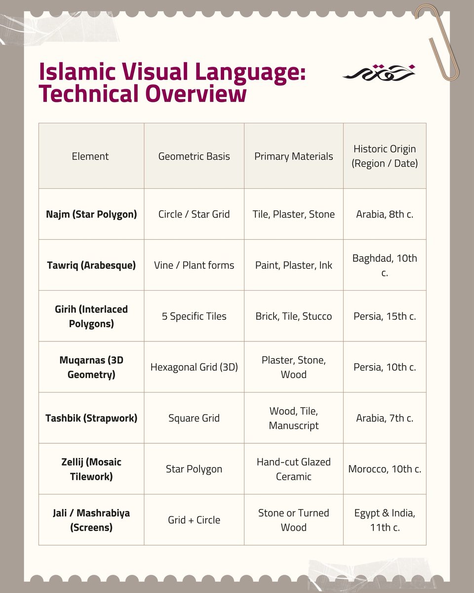
من الهندسة إلى الخط، ومن التكرار إلى التناظر, اللغة البصرية الإسلامية ليست مجرد زخرفة، بل فلسفة تُعبَّر عنها بالشكل. هذه العناصر السبعة توضّح كيف يصبح الفن جسراً بين المادي والروحي.
#IslamicArt #VisualLanguage #DesignInspiration #KhawlaArtandCulture
1
2
3
279

Mar 9
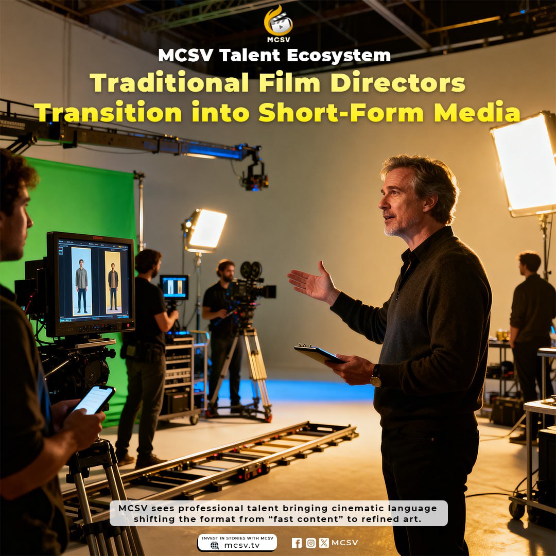
MCSV Talent Ecosystem: Film Directors Enter Short-Form
Pro directors join MCSV, trading "fast-food" tropes for cinematic art.
🔗 mcsv.tv
#DirectorTransition #VisualLanguage #PerformanceStandards #ArtisticEvolution #TalentStructure #IndustryUpgrade
9
9
1,524
Feb 26
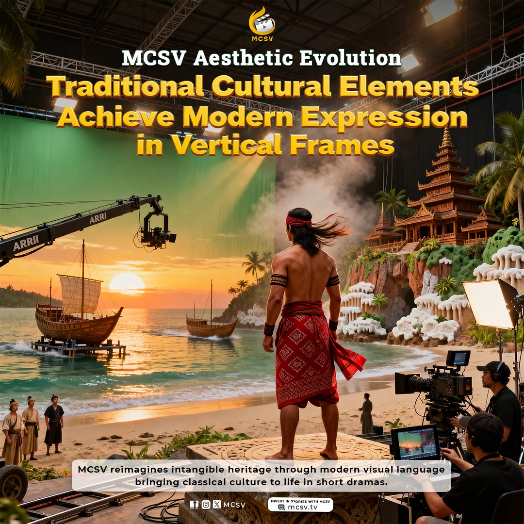
MCSV Aesthetic Evolution: Traditional Culture in Vertical Frames
MCSV blends heritage with digital lighting for a modern "New Oriental" look.
🔗 mcsv.tv
#OrientalAesthetics #CulturalHeritage #NarrativeArt #VisualLanguage #DigitalWindow #CulturalPreservation
9
9
1,447

Check my new chapter in the book ‘La gramática de la interacción’ about how comics create meaning through visual inferences. A cognitive look at how we read an interpret sequences of images.
Open access> peterlang.com/document/15974…
#comics #implicatures #visuallanguage

1
4
163

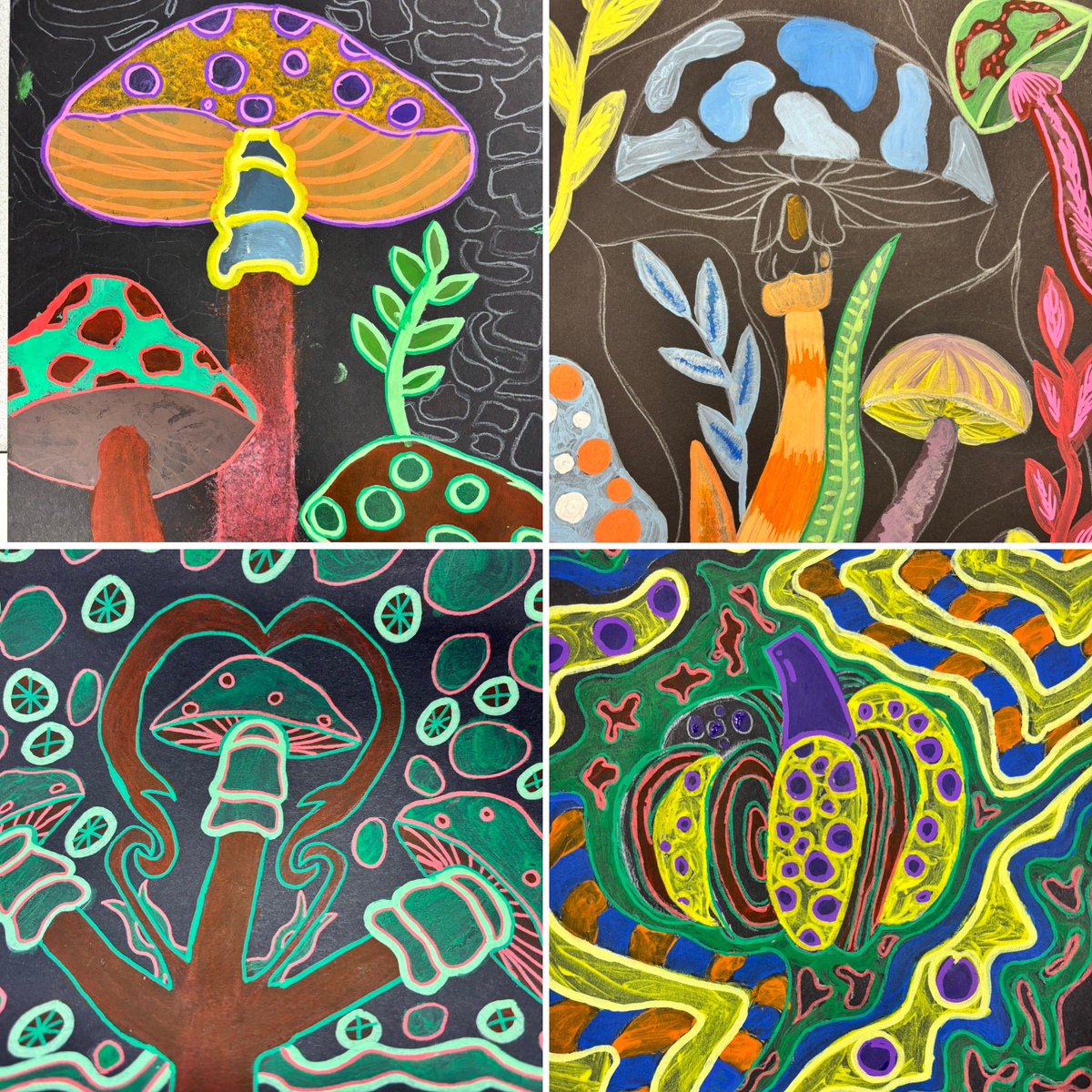
Fantastic to see students translating artist influences into bold, psychedelic nature imagery—exploring pattern, composition, and expressive colour with real intent. #ArtEducation #VisualLanguage #GCSEArt #YoungArtists
1
4
633

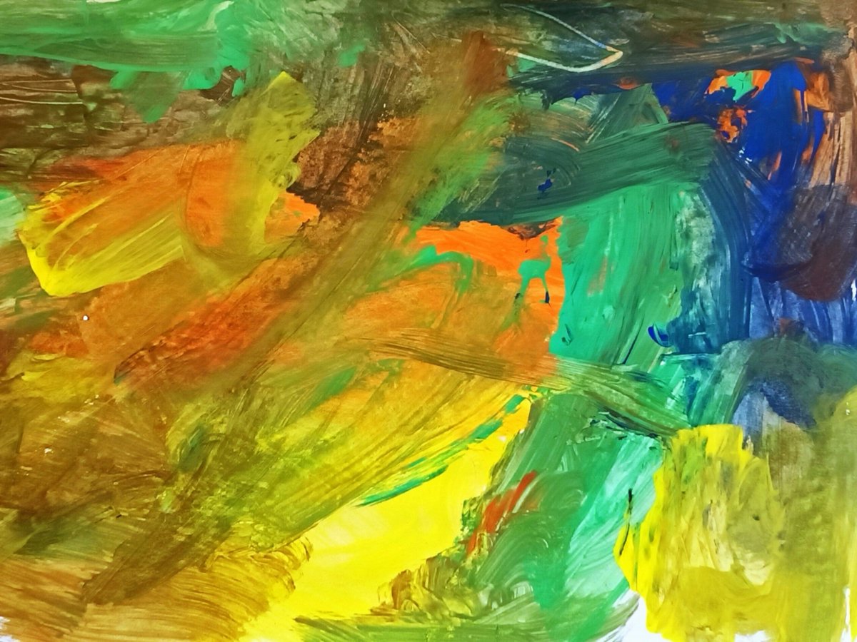
Free painting using poster paints, by a Reception Year boy. A beautiful expression of childhood wonder & creativity.
#Art #ArtActivity #ArtEducation #Arts #ChildrensArt #Colour #Creative #Hue #IndependentLearning #MartinKay #MrK #Painting #TeachingArt #VisualArt #VisualLanguage
3
45

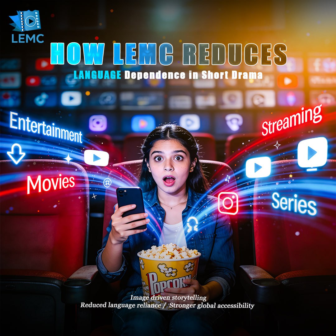
How LEMC Reduces Language Dependence in Short Drama
✅ Image driven storytelling
✅ Reduced language reliance
✅ Stronger global accessibility
#VisualLogic #SilentStorytelling #ShortDrama #UniversalNarrative #GlobalContent #VisualLanguage #CinematicFlow
12
2
5
702

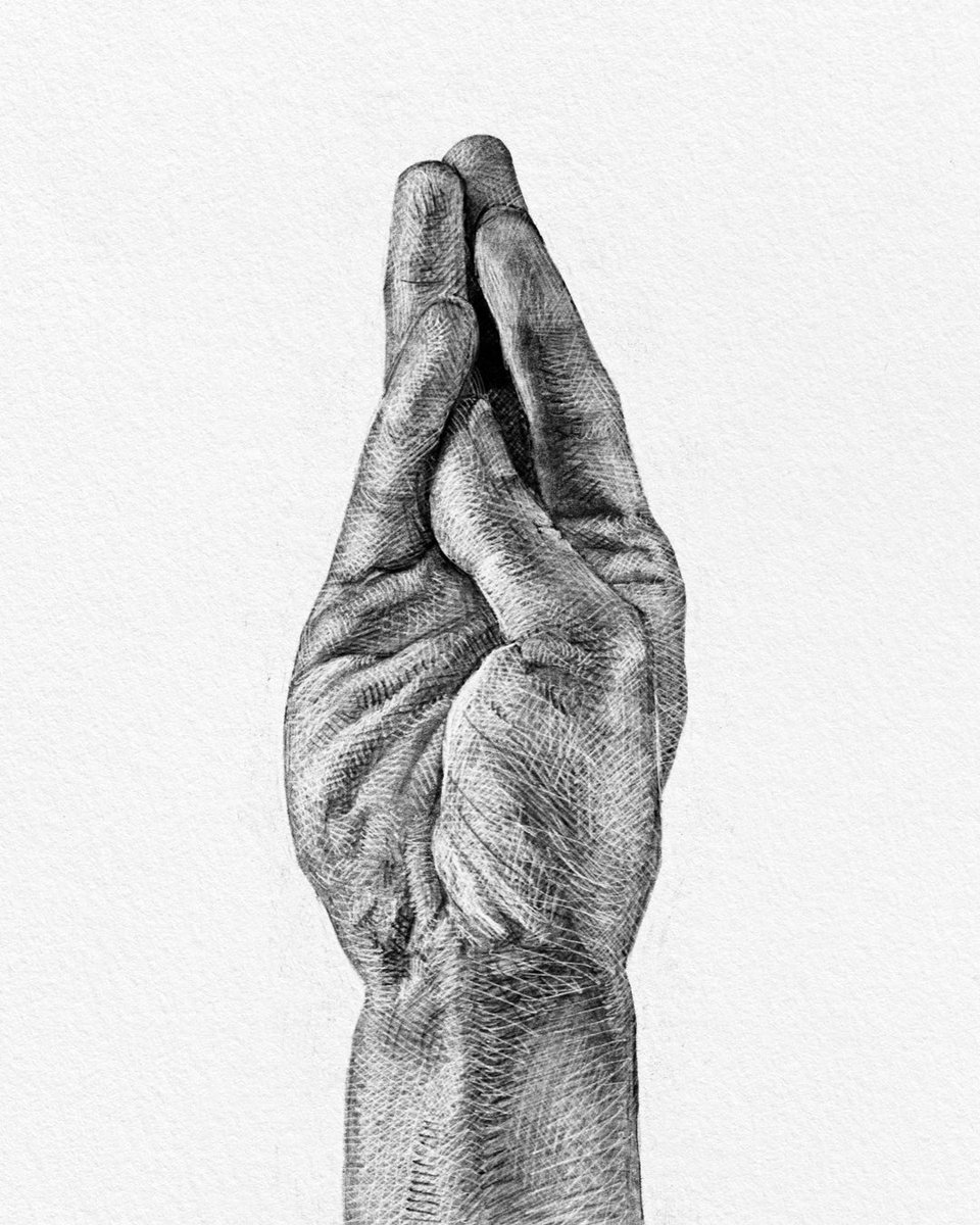
Yes… I do sign language ✍️😏
#HandStyle #VisualLanguage #Ironic #DDirt #DirtyCode #Pleasure #Proposition #Proposal #HandDrawing
2
196

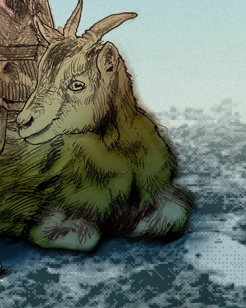
Where the digital meets the pastoral. 👾
The standout detail here is the dithered, pixelated ground beneath the ram. It suggests a world that is literally decompressing or failing to load, contrasting beautifully with the classic cross-hatching on the child’s dress. By blending 19th-century etching techniques with 8-bit digital artifacts, hersoid visualizes the collapse of time. Look at the ram's eye—calm, knowing, and rendered with a softness that makes the child's commanding gesture feel all the more eerie.
Visit hersoid.com to collect each piece.
#PixelArt #Etching #MixedMedia #DigitalSurrealism #ArtInspiration #ArtMicro #Hersoid #VisualLanguage


1
5
166

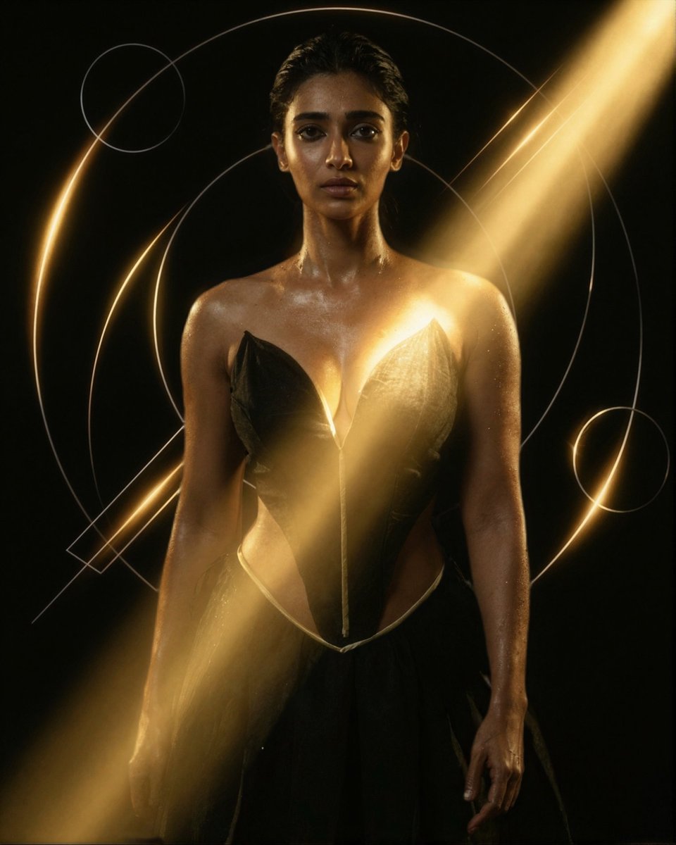
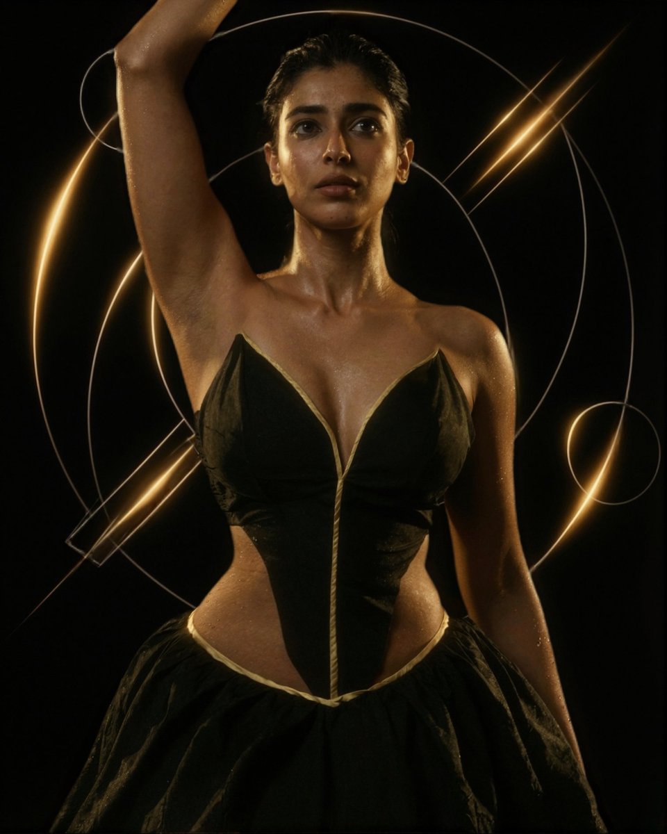
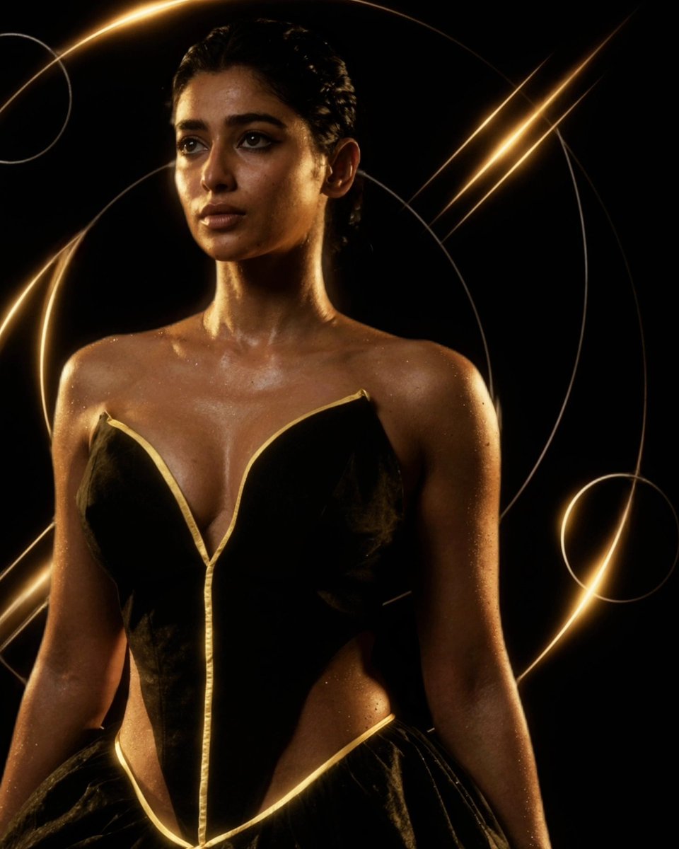
14 Dec 2025
Silence. Structure. Light.
Just form, structure, and restraint.
Black absorbs.
Gold defines.
Light decides what stays.
#MayaLeela
#MayaLeelaAI
#HighFashionEditorial
#LuxuryAesthetic
#CoutureMood
#FashionCampaign
#EditorialStyle
#AvantGardeFashion
#VisualLanguage
#ArtDirected

4
4
240

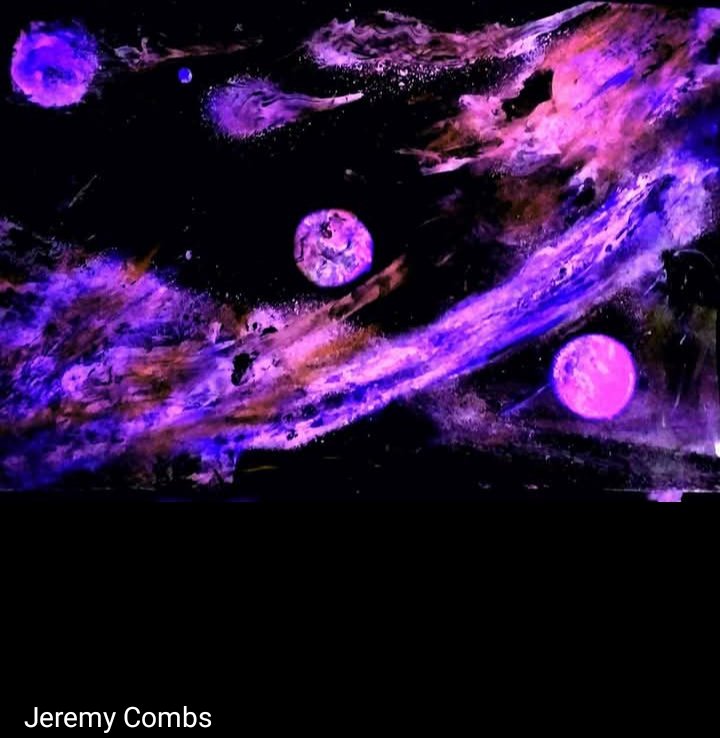
15 Nov 2025
#Abstract #art isn’t just random splashes of #paint—it’s a visual language of emotions, ideas, and imagination. #WassilyKandinsky and #PietMondrian, and continues to inspire creativity worldwide. #PaintingbyJeremycombs #ModernArt #ArtFacts #Kandinsky #Mondrian #VisualLanguage
2
6
70

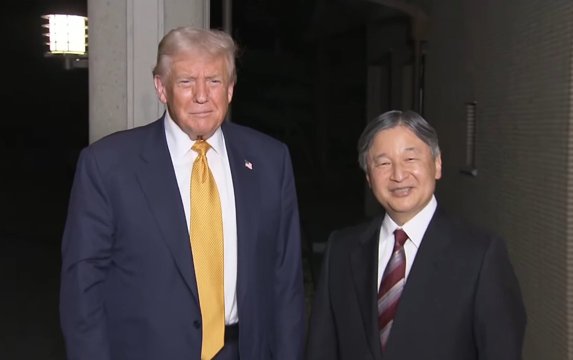
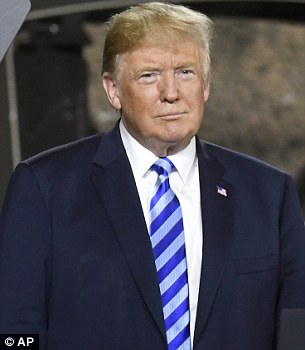
27 Oct 2025
🟡🔴🔵トランプのネクタイ「コード」を解読:ファッションじゃなく、メッセージ!
今日、東京で今上天皇陛下との会談で、金色/黄色のネクタイを選んだ – 米日関係の楽観と繁栄のサイン。
でも、彼の好きな色の意味は?
赤: 完全な力と支配力。熱い演説や厳しい交渉の「秘密兵器」。
青/白ストライプ: 信頼と安定、愛国的なタッチ (星条旗風)。外交や結束の瞬間にぴったり。
金色/黄色: 楽観とポジティブなエネルギー – 選挙勝利や有望な合意に、今日の日本訪問みたい!
文化のニュアンスが大好きな私として、色が言葉なく語るのが魅力的。
あなたは、次に習近平との会談でどの色だと思う?😏🇺🇸🇯🇵
#トランプ来日 #TrumpInJapan #TieColors #VisualLanguage
5
14
14,029

23 Oct 2025
AI is creating a new visual language: prompts as syntax, aesthetics of the impossible, generative storytelling. Not imitation of human art, but emerging visual grammar redefining communication and creativity.
labussoladellia.com/linguagg…
#AIArt #VisualLanguage
2
39

23 Sep 2025
Sign Language Day with 🎙 Doubting Thomas
▶ youtu.be/uEkw0qdMcnM
#doubtingthomas #breakfast #foodheaven #dream #bluedress #tinybook #curlyhair #embarrassing #podcast #internationaldayofsignlanguages #signlanguages #communication #language #visuallanguage #handsthatspeak
1
2
29

Script of the Silence
Lines fragment like scattered calligraphy — a secret alphabet suspended in stillness, waiting to be felt rather than read.
#AbstractCalligraphy #DigitalArt #VisualLanguage #SilentCode#MinimalLines #ContemporaryExpression#artheonv #MysticArt#FragmentedBeauty

2
1
188

22 Jul 2025
Cinematic and restrained color tones can be louder than punchy colors, as seen in Kendrick Lamar’s “HUMBLE,” with its well-designed symbolism and cinematography. #CreativeDirection #VisualLanguage #KendrickLamar @kendricklamar
youtu.be/tvTRZJ-4EyI
2
214

15 Jun 2025
Web3 Design | How to Make Task Platforms More Refreshing?
Pixel titles black - mint contrast: Keep blockchain tech vibe, use fresh tones for instant user recall.
#WebDesign #VisualLanguage #Web3Design #ProductExperience #MotoDesign #Web3 #NFT #Crypto
1
2
40