
Clear visualizations are essential in bioinformatics, where datasets often contain high dimensional biological data such as gene expression levels, microbiome composition, or correlations between thousands of variables.
The tidyplots R package provides a convenient framework for creating such visualizations using a consistent and readable workflow. Because tidyplots follows a tidyverse style syntax, complex plots can be constructed step by step using clear function calls.
This approach helps create informative graphics while keeping the underlying code structured and easy to maintain.
Common bioinformatics visualizations that can be created with tidyplots include:
🔹 Volcano plots to identify significantly regulated genes
🔹 Principal component plots (PCA) to visualize sample clustering
🔹 Correlation heatmaps for exploring relationships between variables
🔹 Microbiome composition charts to display relative abundances
The visual below shows several examples of bioinformatics visualizations created with tidyplots in R. The examples are taken from the tidyplots website: tidyplots.org/
For regular tips on statistics, data science, AI, and programming with R and Python, you can join my newsletter. More info: statisticsglobe.com/newslett…
#RStats #programming #programmer #R #tidyverse #VisualAnalytics #datavis #Rpackage #datastructure #Data

10
53
1,370

📊 Direct labeling beats legends. When labels sit on or next to data points, readers spend less time matching colors to legend entries. Fewer eye jumps = faster comprehension. 💡 #DataViz #analytics #datafam #VisualAnalytics
28

Jun 14
Create clear and informative box plots with added statistical insights using ggpubr! This package makes it easy to design polished plots that effectively showcase group comparisons and data distributions.
✔️ Visualize Group Comparisons: Box plots are ideal for comparing distributions across categories, showing medians, quartiles, and outliers. Combined with dot plots, they provide a detailed view of individual data points and variability.
✔️ Comprehensive Statistical Annotations: Add statistical comparisons, such as p-values and significance brackets, directly on the plot. The example here includes results from a Kruskal-Wallis test, with pairwise comparisons displayed above to indicate where significant differences exist between groups.
✔️ Customizable Design: Adjust colors, shapes, and labels to make your plots visually appealing and easy to interpret, ensuring they convey the right message.
✔️ Seamless Integration with ggplot2: Works directly with ggplot2, letting you build on your existing plots and enhance them with statistical details without the need for complex syntax.
The visualization shown here is from the package website, demonstrating how ggpubr can create polished, publication-ready plots with detailed statistical annotations: rpkgs.datanovia.com/ggpubr/
Ready to master ggplot2 and its powerful extensions to create stunning visualizations? Enroll in my online course, “Data Visualization in R Using ggplot2 & Friends!”
Learn more: statisticsglobe.com/online-c…
#database #VisualAnalytics #Data #DataAnalytics #RStats

15
74
2,073
Jun 13
The "Grammar of Graphics" is a powerful concept that ggplot2 in R is built on. It breaks down the process of data visualization into layers, making it easier to customize and understand how to build effective charts.
The visualization illustrates the essential layers used to create a plot:
1️⃣ Data: The foundation, where you start by defining the dataset.
2️⃣ Aesthetics: Map variables to visual aspects like color, size, and position.
3️⃣ Geometries: Specify the type of plot you want, such as bar, line, or scatter.
4️⃣ Facets: Create subplots for different subsets of your data.
5️⃣ Statistics: Add statistical transformations, like mean lines or trend lines.
6️⃣ Coordinates: Control the plot’s coordinate system, such as flipping axes.
7️⃣ Theme: Adjust the overall appearance, like grid lines, font styles, and background.
In the code example shown, each of these layers is combined to produce the boxplot visualization. The process starts with defining the data and aesthetics, then moves through geometries, adding facets to split the data by groups, and even applying statistical transformations to highlight the mean value of each group. Finally, it configures the coordinates and finishes with a clean theme.
Want to dive deeper into creating beautiful and informative visuals with ggplot2? Check out my online course on "Data Visualization in R Using ggplot2 & Friends!" Learn more by visiting this link: statisticsglobe.com/online-c…
#DataScience #RStats #VisualAnalytics #Rpackage #tidyverse #database #Data #programming #datavis
4
68
1,623
Jun 12
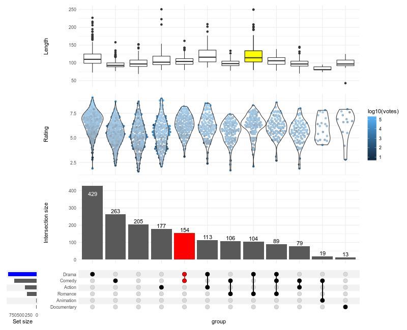
Struggling to visualize complex intersections in your data? ComplexUpset, an extension of ggplot2, makes it easy to create advanced UpSet plots, offering a clear way to display overlapping sets and their relationships.
✔️ Visualize complex set intersections with clarity.
✔️ Customize plot layouts, colors, and annotations for better readability.
✔️ Integrate additional data layers for deeper insights.
✔️ Handle large and intricate data sets effortlessly.
Whether you're analyzing gene sets, customer segments, or survey responses, ComplexUpset helps you uncover meaningful patterns in intersecting groups.
The visualization shown here is taken from the package website: github.com/krassowski/comple…
Explore how to create impactful visualizations with ggplot2 and its extensions in my online course "Data Visualization in R Using ggplot2 & Friends." See this link for additional information: statisticsglobe.com/online-c…
#DataScientist #tidyverse #RStats #rstudioglobal #datavis #programming #VisualAnalytics #DataAnalytics #ggplot2
1
12
73
1,966
Jun 7
The Wilcoxon Signed-Rank Test is a non-parametric statistical test used to compare two related samples or repeated measurements to determine if their population distributions differ. Unlike the paired t-test, which assumes normal distribution, the Wilcoxon Signed-Rank Test is suitable for non-normally distributed data or data with outliers.
Advantages:
✔️ Suitable for non-normally distributed, ordinal data, or data with outliers.
✔️ Ideal for small sample sizes, providing robust results where the paired t-test may not be reliable.
✔️ Uses rank differences instead of actual values, reducing the impact of outliers and making fewer assumptions about the data.
Limitations:
❌ Compares ranks of differences, not specific measures like means or medians, potentially losing information about the magnitude of differences.
❌ Results can be misleading if data isn’t truly paired or if the assumptions, such as symmetry of differences around the median, are not met.
❌ Less powerful than the paired t-test when data is normally distributed.
Important Considerations:
While often used to assess differences between medians, the Wilcoxon Signed-Rank Test actually tests for differences in ranks of paired observations. This means it is sensitive to various aspects of the data, including the distribution's shape. If the data isn’t symmetric or doesn’t meet the test's assumptions, the test may not compare medians accurately and could lead to increased Type I error. For direct median comparisons, especially with non-symmetric data, consider alternatives like quantile regression or Mood's median test. Permutation tests also offer a flexible, non-parametric option for testing hypotheses about various statistics without relying on rank transformations.
Visualization Explanation:
The visualization compares the distributions of two skewed samples, "Time 1" and "Time 2," using density plots with dashed lines indicating their medians. Although the medians are displayed, the Wilcoxon Signed-Rank Test actually assesses the ranks of paired differences, rather than directly comparing medians. The test can only be used to compare medians if the samples are independent and identically distributed (IID), have the same dispersion and shape, and are symmetric about their medians. If these conditions are not met, the test may not accurately compare medians. In such cases, consider alternatives like quantile regression or permutation tests, which do not depend on rank transformations.
Explore more on this topic and other statistical methods in my online course on Statistical Methods in R!
Learn more by visiting this link: statisticsglobe.com/online-c…
#RStats #VisualAnalytics #datascienceeducation #DataViz #datastructure

12
83
2,374
Jun 7
Creating visualizations in R can sometimes require quite a lot of code, especially when building more complex plots step by step.
The tidyplots package provides a structured and consistent approach that can make this process much easier. It follows a tidyverse-style workflow in which plots are built through a sequence of clear and readable functions. This often results in shorter code that is easier to understand and maintain.
To make the workflow easier to learn, the tidyplots developers provide a cheat sheet that summarizes the most important functions and plotting steps. More information about tidyplots and the cheat sheet: tidyplots.org/
The cheat sheet highlights:
🔹 The tidyplots workflow from dataset to finished plot
🔹 Functions for adding data layers and summary statistics
🔹 Tools for annotations and statistical tests
🔹 Options to adjust axes, labels, colors, and layout
🔹 Plot splitting and export functions
If you would like to learn more about topics like this, you can join my newsletter where I regularly share tips on statistics, data science, AI, and programming with R and Python. More info: statisticsglobe.com/newslett…
#VisualAnalytics #coding #RStats #DataAnalytics #Rpackage #datastructure

14
78
1,993
Jun 6
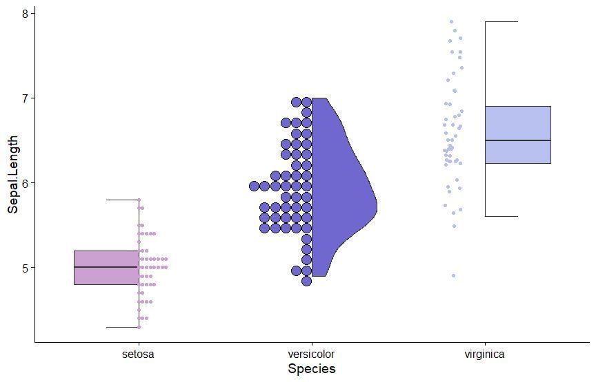
The gghalves package is a handy extension for ggplot2 that enables you to create half-geometries, such as half-violin plots, half-dot plots, and more. It allows you to compare two data sets side-by-side, using one plot instead of two, for clearer and more compact visualizations.
✔️ Efficient Data Comparison: gghalves makes it easy to compare two groups by displaying their data in a single, merged plot, saving space and reducing clutter.
✔️ Flexible Plotting Options: Supports various geometries, including half-violin and half-box plots, making it versatile for different kinds of visual comparisons.
✔️ Smooth Integration: Works seamlessly with ggplot2, allowing you to enhance your existing visualizations without major code changes.
Whether you’re analyzing experimental results, survey responses, or any other type of grouped data, gghalves helps to keep your visualizations clean and insightful. The example visualization shown here is taken from the package website: cran.r-project.org/web/packa…
If you’re eager to improve your data visualization skills, consider joining my online course, Data Visualization in R Using ggplot2 & Friends. We’ll cover ggplot2 and its extensions, helping you create clearer, more effective visuals. See this link for additional information: statisticsglobe.com/online-c…
#ggplot2 #RStudio #VisualAnalytics #tidyverse #database #coding #RStats #DataAnalytics #datascienceenthusiast #Rpackage #datavis
10
55
1,803
Jun 6
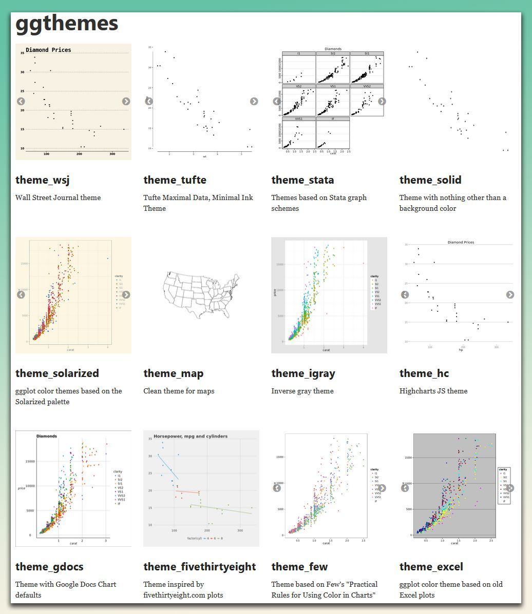
Make your plots more stylish and visually appealing! The ggthemes package offers a variety of pre-built themes that help you customize the look of your ggplot2 visualizations, drawing inspiration from popular design standards.
✔️ Diverse Range of Themes: Choose from themes based on styles from well-known sources like the Wall Street Journal, Excel, and Tufte's minimal ink design. It provides flexibility to match the aesthetic to your presentation needs.
✔️ Easy Theme Application: Simply add a theme layer to your existing ggplot2 plot, and it will transform the look without requiring complex adjustments.
✔️ Customizable Elements: Modify individual elements of the themes to further refine your plots, ensuring consistency and professionalism in your visualizations.
✔️ Easy Integration with ggplot2: Works seamlessly with ggplot2, allowing you to add stylish, pre-designed themes to your plots with minimal effort.
The visualization shown here is from the package website, showcasing some of the available themes you can use to enhance your plots: yutannihilation.github.io/al…
Want to master ggplot2 and its powerful extensions to make your visualizations stand out? Enroll in my online course, “Data Visualization in R Using ggplot2 & Friends!” See this link for additional information: statisticsglobe.com/online-c…
#ggplot2 #datascienceeducation #programmer #Rpackage #VisualAnalytics #DataViz
9
59
1,878
Jun 5
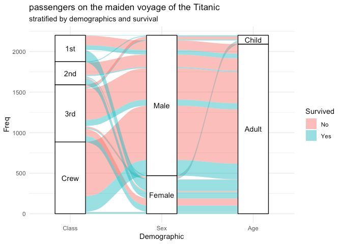
Need to visualize multi-dimensional categorical data in R? ggalluvial, an extension of ggplot2, makes it easy to create alluvial diagrams and Sankey plots, helping you uncover patterns and flows across categories.
✔️ Plot alluvial diagrams to represent relationships between categorical variables.
✔️ Create Sankey plots to visualize flows and transitions.
✔️ Customize aesthetics, including colors, labels, and node arrangements.
✔️ Handle both wide and long-format data sets with ease.
Whether you're analyzing survey responses, tracking user behavior, or exploring categorical trends, ggalluvial simplifies the creation of clear and informative visualizations.
The visualization shown here is taken from the package website: corybrunson.github.io/ggallu…
Learn more about ggplot2 and its extensions in my online course "Data Visualization in R Using ggplot2 & Friends." More info: statisticsglobe.com/online-c…
#tidyverse #ggplot2 #R #programmer #RStats #VisualAnalytics #DataAnalytics #Rpackage #datasciencetraining
7
76
2,296
Jun 5
Factorial experiments are a powerful statistical method used to study the effects of multiple factors simultaneously. They help uncover not only how individual factors influence outcomes but also how these factors interact with each other. This approach is widely applied in fields like manufacturing, agriculture, pharmaceuticals, and engineering for process optimization and quality improvement.
✔️ Efficiently test multiple factors with fewer experiments.
✔️ Reveal interactions between variables that single-factor tests might miss.
✔️ Optimize processes by identifying the most influential factors.
✔️ Provide a comprehensive understanding of both main effects and interaction effects.
❌ Designs can become overly complex as the number of factors increases.
❌ Risk of misinterpretation without proper statistical validation and model diagnostics.
❌ Higher-order interactions may overfit the model if data is insufficient.
❌ Requires careful planning to ensure factor levels are appropriately chosen and results are reproducible.
When a full factorial design is too resource-intensive, fractional factorial designs offer a practical alternative. These designs reduce the number of experimental runs while still capturing the most critical main and interaction effects, though at the cost of potential aliasing (confounding effects).
The image shows two key visualizations from a factorial experiment (Source: en.wikipedia.org/wiki/Factor…):
1️⃣ On the left, a scatter plot represents a full factorial design, displaying combinations of welding length (l), welding depth (h), and their effect on fabrication cost (f1). Each point represents an experimental run, showing how these factors interact.
2️⃣ On the right, a response surface plot models the relationship between welding length, welding depth, and fabrication cost. The smooth surface helps visualize optimal conditions and understand how the response variable changes across different factor levels.
Stay informed with insights on Statistics, Data Science, R, and Python in my newsletter! Learn more by visiting this link: statisticsglobe.com/newslett…
#Data #programming #datavis #VisualAnalytics #RStats #database

5
46
1,369
Jun 3
When working with proportional data, selecting an appropriate visualization is important to clearly show how different categories contribute to a whole.
The tidyplots R package provides several convenient functions for visualizing this type of data within a consistent and readable workflow. Because tidyplots follows a tidyverse-style syntax, different plot types can be created using similar function structures, which makes it easy to switch between visualizations.
Common options for visualizing proportional data with tidyplots include:
🔹 Bar charts for comparing category totals
🔹 Stacked bar charts for showing contributions within groups
🔹 Pie charts for displaying shares of a whole
🔹 Donut charts as an alternative to pie charts
🔹 Area stacks for visualizing how proportions change over time
The visual below shows several examples of proportional data visualizations created with tidyplots in R. The examples are taken from the tidyplots website: tidyplots.org/
If you enjoy learning about topics like this, consider joining my newsletter where I regularly share practical tips on statistics, data science, AI, and programming in R and Python.
Take a look here for more details: statisticsglobe.com/newslett…
#Statistics #datascienceenthusiast #VisualAnalytics #Rpackage #RStats

12
52
1,644
Jun 1
When planning a statistical study, it is important to find a balance between a large enough sample size to detect meaningful effects and the efficient use of resources. Sample size calculation using power analysis is a key tool for achieving this balance.
Power analysis allows you to determine how many observations are needed to detect an effect of interest with a given probability while controlling the significance level. It shows how quantities such as effect size, alpha level, statistical power, and sample size are related, making it an essential method for study planning.
Advantages of power analysis:
🔹 Helps determine an appropriate sample size before collecting data
🔹 Clarifies the relationship between effect size, alpha level, power, and sample size
🔹 Supports efficient use of time, budget, and other resources
🔹 Reduces the risk of underpowered studies
🔹 Makes study planning more transparent and scientifically sound
I recently released a new module in the Statistics Globe Hub that explains how to perform sample size calculation using power analysis. The module includes a video lecture, practical examples, and exercises to help you apply the method step by step in R.
The image below illustrates these relationships. On the left, you can see the connection between the null hypothesis, the alternative hypothesis, the critical value, and statistical power. On the right, the charts show how the required sample size changes depending on the effect size. In general, smaller effects require larger samples to be detected reliably.
If you are interested in topics like this, subscribe to my newsletter to receive practical tips on statistics, data science, AI, and programming with R and Python. Learn more by visiting this link: statisticsglobe.com/newslett…
#VisualAnalytics #DataViz #statisticians #RStats #database #datastructure #StatisticalAnalysis
9
50
1,614
May 30
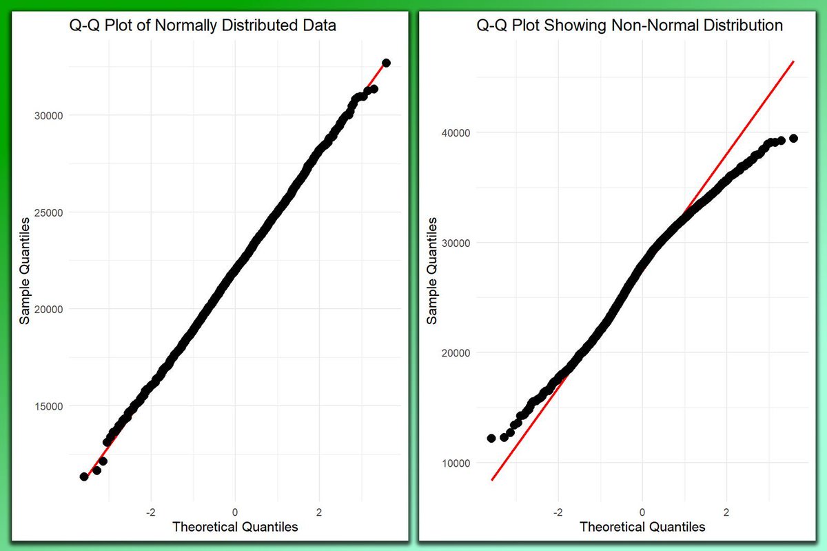
Evaluating the normality of your data is crucial in statistical analysis, as many techniques assume that the data and/or residuals follow a normal distribution. The QQ plot (Quantile-Quantile plot) is a simple yet powerful tool to visually assess this.
✔️ When used correctly, QQ plots help verify that your data meet the assumptions required by many statistical methods, resulting in more reliable outcomes.
✔️ Enhanced Data Insights: By detecting deviations from normality, you can make informed decisions about data transformations or the choice of statistical methods.
❌ Misleading Results: If normality is not checked, you may apply inappropriate statistical techniques, leading to incorrect conclusions.
❌ Overlooked Data Issues: Failing to evaluate normality might cause you to miss out on important patterns or outliers in your data.
When interpreting a QQ plot, you are looking for how closely the points follow the reference line.
🔹 Normal Distribution: If the data follows a normal distribution, the points will align closely with the diagonal reference line.
🔹 Non-Normal Distribution: If the points significantly deviate from the line, this indicates that the data is not normally distributed. The nature of the deviation can provide insights into whether the data is skewed, has heavy tails, or other issues.
The visualization in the post contrasts two QQ plots: the left plot shows a data set following a normal distribution, where the points align closely with the reference line. The right plot displays a data set with non-normal distribution, where points deviate significantly from the line.
Curious about how to create QQ plots in R? Check out this tutorial: statisticsglobe.com/r-qqplot…
If you want to learn more about statistical methods in R, check out my online course on Statistical Methods in R, which covers this topic and others in further detail.
Learn more by visiting this link: statisticsglobe.com/online-c…
#RStats #VisualAnalytics #datascienceeducation #DataViz #datastructure
1
12
64
2,513
May 29
Principal Component Analysis (PCA) is an essential technique for reducing the dimensionality of data sets while maintaining their key characteristics.
By transforming original variables into a new set of uncorrelated principal components, PCA captures the most significant variance in the data, making analysis and visualization simpler.
Implementing PCA in R is straightforward using the prcomp() function from the stats package. This function efficiently computes the principal components and summarizes their importance. For visual insights, the ggplot2 package can be used to plot the results.
Steps to Implement PCA in R:
1️⃣ Load Data: Import your data set with read.csv() or read.table().
2️⃣ Perform PCA: Use prcomp() to calculate the principal components.
3️⃣ Standardize Data: Enable standardization directly in prcomp() by setting scale. = TRUE.
4️⃣ Analyze Results: Review the variance captured by each component with summary() and visualize using ggplot2.
For a comprehensive, step-by-step guide to performing PCA in R, including practical examples, check out my tutorials created in collaboration with Paula Villasante Soriano & @Cansu_SG.
Article: statisticsglobe.com/principa…
Video: youtube.com/watch?v=mNpBrHwO…
Furthermore, I have developed an extensive online course on PCA, covering both the theoretical concepts and practical application in R programming. More info: statisticsglobe.com/online-c…
#tidyverse #ggplot2 #R #programmer #RStats #VisualAnalytics #DataAnalytics #Rpackage #datasciencetraining

7
55
1,688
May 28
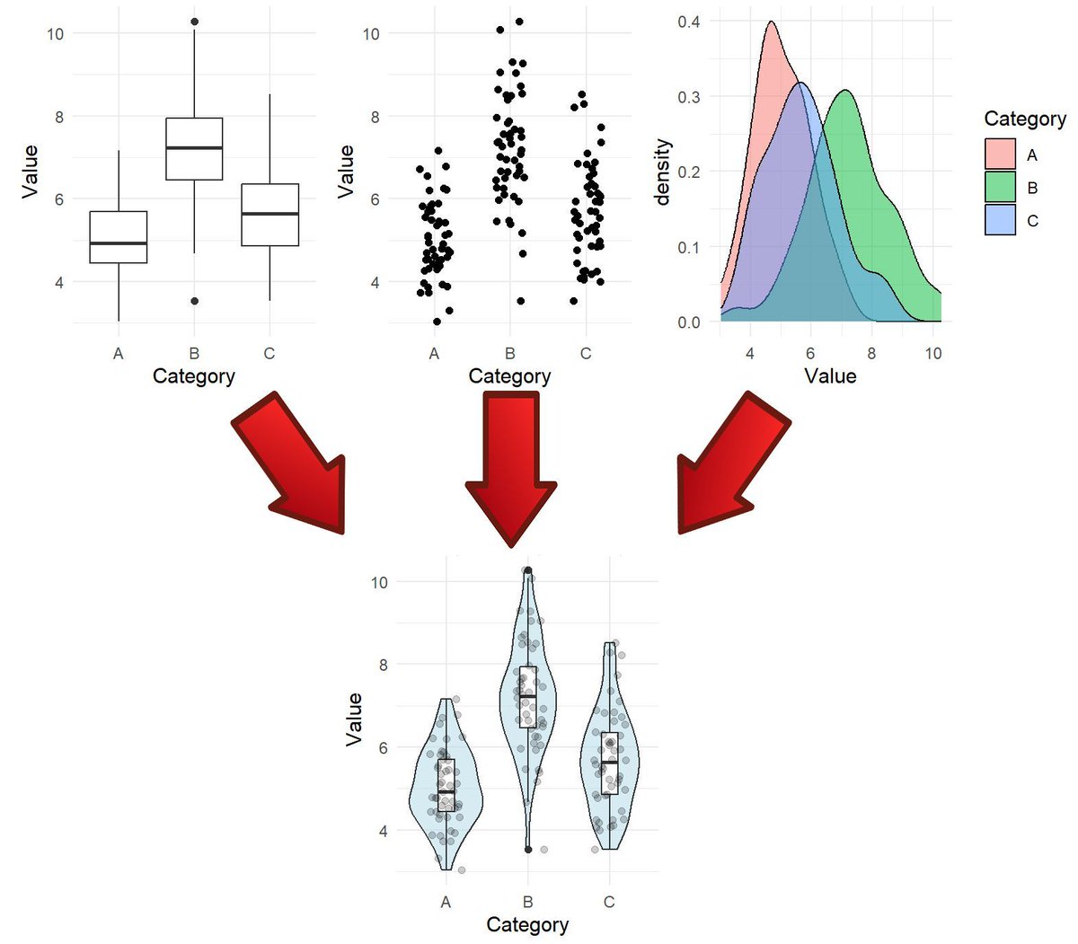
Effective data visualization is essential for statistical analysis and informed decision-making. That’s why my online course, Data Visualization in R Using ggplot2 & Friends, includes a dedicated section with 9 modules on specific plot types.
The violin plot is one of the plot types covered in this section. It serves as a powerful alternative to boxplots by combining summary statistics with kernel density estimates, offering a detailed view of data distributions. Violin plots are particularly useful for comparing groups and revealing patterns that simpler plots might overlook.
To give you a preview of the course, I’ve made the violin plot module available for free. This module includes a video lecture, a reproducible R script, several exercises with solutions, and many additional resources.
You can access the free module on violin plots here: statisticsglobe.com/online-c…
Interested in exploring more advanced data visualization techniques with ggplot2 and its extensions in R? Check out my comprehensive online course! Learn more by visiting this link: statisticsglobe.com/online-c…
#DataScience #RStats #VisualAnalytics #Rpackage #tidyverse #database #Data #programming #datavis
16
76
2,357