
Day 489 - Leetcoding with Kids - 206. Reverse Linked List
带娃刷题第489天 单向链表反转
#leetcode #tutorial #daily #learning #python #programming #力扣 #编程 #计算机 #学习 #coding
#algorithms #linkedlist #datastructure #链表 #数据结构 #算法


22

Current Leetcode ranking of 2,511,807 . Yesterday it was 2,651,064 ... Long road ahead to improve rank on LeetCode
#leetcode #algo #dsa #aijob #softwareengineering #softwarejob #datastructure

11
Still creating your reports manually in Word or PowerPoint?
This is one of the biggest productivity bottlenecks in data analysis because every change in your data requires manual updates to results, tables, and visualizations. This process is not only time consuming but also increases the risk of errors.
❌ Results can quickly become outdated when the data changes.
❌ Copy and paste workflows increase the chance of mistakes and inconsistencies.
Quarto solves this problem by allowing you to create fully reproducible and automated reports directly from R.
The visualization below shows the result of a typical Quarto workflow. You combine text, R code, and output in a single file, and Quarto automatically generates the final report. This ensures that your results, tables, and visualizations are always up to date and fully synchronized with your data.
Want more content like this? Subscribe to my newsletter for practical insights on statistics, data science, AI, and programming in R and Python. Click this link for detailed information: statisticsglobe.com/newslett…
#datastructure #DataScientist #DataAnalytics
1
6
45
1,235

Jun 11
Looking to create elegant Venn diagrams in R? ComplexUpset, an extension of ggplot2, offers a flexible and customizable approach to visualize set intersections with precision.
✔️ Customize colors, labels, and layouts to fit your analysis style.
✔️ Integrate additional layers of information for deeper insights.
✔️ Easily handle both small and large-scale data sets.
Whether you're exploring gene overlaps, survey responses, or experimental group comparisons, ComplexUpset equips you with powerful tools to transform complex intersections into clear, visually engaging diagrams.
This visualization is sourced from the package website: krassowski.github.io/complex…
Learn how to create impactful visualizations with ggplot2 and its extensions in my online course "Data Visualization in R Using ggplot2 & Friends."
More details are available at this link: statisticsglobe.com/online-c…
#ggplot2 #datastructure #programmer #RStats #Data

6
46
1,313

Jun 11
👨💻 Strong Python careers are built on data structures. Because they’re the difference between writing code and building systems that scale.
Data structures shape how programs store, process, and deliver results, and this course helps you master them through structured lessons and practical lab sessions focused on real-world tasks.
Enroll, earn a free CIQ UK certificate, strengthen your credibility and support your next move in tech.
👉 tinyurl.com/4m3b9dy6
#python #datastructure #freelearning #upskillnow #uniathena


2
23
Jun 11
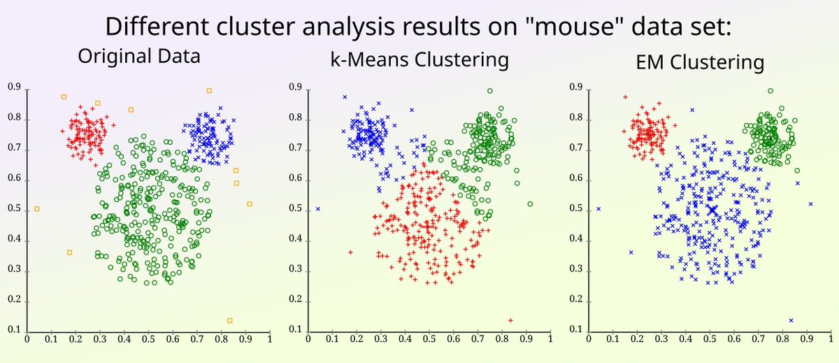
Trying to choose the right clustering method for your data? K-means and Expectation-Maximization (EM) clustering are two popular options, but they rely on different assumptions and can lead to very different results depending on the structure of your data set. Here are some guidelines to help you choose the method that fits your data best.
✔️ K-means is fast, easy to apply, and works well when clusters are compact, spherical, and similar in size
✔️ EM, often used with Gaussian Mixture Models, handles clusters with different shapes, sizes, and orientations
✔️ EM provides soft assignments, which means each point is assigned a probability of belonging to each cluster
❌ K-means forces hard assignments and assumes equal variance, which can distort results on uneven structures
❌ EM is more computationally demanding and can overfit if the number of components isn’t chosen carefully
❌ Both methods are sensitive to initialization and can converge to suboptimal solutions
To improve outcomes, consider scaling your data, using PCA before clustering, and selecting the number of clusters using criteria like BIC, AIC, or silhouette score. Running multiple initializations can also help avoid poor results.
The image compares both methods on a data set called "mouse." K-means splits the space into equal partitions, missing the natural structure. EM fits flexible Gaussian distributions that better match the true cluster shapes. Credit for the visualization: en.wikipedia.org/wiki/K-mean…
🔹 In R, use stats::kmeans() for K-means and mclust::Mclust() for EM, which includes built-in tools for model comparison and visualization.
🔹 In Python, use scikit-learn with KMeans and GaussianMixture, and apply PCA or model selection metrics like bic and silhouette_score.
For regular insights on practical statistics, data analysis, and how to apply them in R and Python, join my newsletter. Further details: statisticsglobe.com/newslett…
#datasciencetraining #Data #RStats #datastructure #DataAnalytics #rstudioglobal
7
47
1,585
Jun 10
I just came across a great R Shiny app that takes interactive mapping to the next level with Leaflet. It lets you draw "spray" patterns on the map by holding Shift Left Click to scatter points within a circle around your cursor. Best of all, you can export all generated points as a CSV file for further use.
Key Features of the app:
🔹 Adjustable spray radius & intensity
🔹 Live counters for total points and per-class counts
🔹 Four customizable classes (A, B, C, D), each with its own color
🔹 Quick reset to start fresh anytime
Licensed under MIT, the tool is open to customization and expansion. Perfect for interactive mapping demos, spatial analysis, or data exploration.
Thanks to Luca Dell'Anna for creating this great app!
Check it out here: github.com/lda2000/ShinyDemo…
Stay updated with more practical tips on statistics, data science, R, and Python by subscribing to my newsletter. Click this link for detailed information: statisticsglobe.com/newslett…
#datastructure #Data #R4DS #coding #programming #RStats

3
32
1,407
Jun 9
Simpson’s Paradox is a fascinating statistical phenomenon where the relationship between two variables can completely change when a third variable is considered. This often leads to contradictory conclusions if not carefully analyzed.
For example, in a data set, you might see a negative trend between variables X and Y. However, when you split the data into subgroups based on a third variable, Z, the trend might reverse or disappear.
Key takeaways:
✔️ Always consider potential lurking variables that could influence your results.
✔️ Be cautious with aggregated data; sometimes the real insights lie in the subgroups.
✔️ Use visualizations to better understand the relationships within your data.
The Wikipedia article on Simpson's Paradox offers this great visualization (en.wikipedia.org/wiki/Simpso…), emphasizing the importance of thorough analysis to avoid such pitfalls. This paradox underscores the necessity for data analysts to be meticulous in their work to prevent erroneous interpretations.
For regular tips on data science, statistics, Python, and R programming, check out my free email newsletter! Take a look here for more details: statisticsglobe.com/newslett…
#datastructure #RStats #statisticsclass #programmer
1
9
48
1,682
Jun 9
Neural networks are game-changers in data science, uncovering complex patterns and insights that traditional methods can’t. If you're in this field, understanding them is a must.
To help you dive into this topic, I’ve created a comprehensive tutorial that explains how to build and train a neural network in Python using TensorFlow, Keras, and Scikit-Learn.
Check out the tutorial: statisticsglobe.com/neural-n…
I’ve also created a series of posts on related topics across my social media channels. Here are a few examples:
- Convolutional Neural Networks: linkedin.com/feed/update/urn…
- Reinforcement Learning: x.com/JoachimSchork/status/1…
- Activation Functions: facebook.com/joachim.schork/…
Want to dive deeper into R, Python, and data science? Subscribe to my email newsletter for practical tips and resources!
Further details: statisticsglobe.com/newslett…
#R #datastructure #Data #datascienceeducation #RStats #DataScience
28 Nov 2024

Reinforcement Learning (RL) is a type of machine learning where an agent learns to make decisions by interacting with its environment, receiving feedback as rewards or penalties, and optimizing its actions over time. This approach is particularly effective for solving sequential decision-making problems where outcomes depend on a series of actions rather than isolated events.
✔️ RL has powered innovations like autonomous vehicles, robotics, and advanced recommendation systems. Its dynamic, interaction-based learning process allows agents to adapt to evolving environments and optimize long-term strategies, making it ideal for applications in industries ranging from logistics to gaming.
❌ However, RL presents challenges such as significant computational demands, instability in training due to exploration-exploitation trade-offs, and difficulties in defining appropriate reward functions. A poorly designed reward structure can lead to suboptimal or even harmful behaviors. Additionally, the "black-box" nature of many RL algorithms limits interpretability, which is critical in sensitive fields like healthcare or finance.
The diagram below illustrates the core concept of RL: an agent interacts with its environment by taking actions, which lead to changes in state and corresponding rewards. This feedback loop allows the agent to refine its strategy iteratively. Designing this feedback mechanism carefully is essential for achieving meaningful results. The image is credited to Wikipedia: en.wikipedia.org/wiki/Reinfo…
🔹 In Python, libraries such as gym and stable-baselines3 provide robust tools for simulating RL environments and applying algorithms like Q-learning, PPO, and DQN. Frameworks like Ray RLlib allow for scaling RL experiments, while numpy and matplotlib support data processing and visualization for analysis.
🔹 In R, the ReinforcementLearning package offers an accessible way to implement fundamental algorithms, enabling users to define state-action-reward mappings and train policies. Combined with dplyr for data manipulation and ggplot2 for visualization, R becomes a powerful tool for exploring RL.
RL is a rapidly advancing field, and staying informed about best practices and emerging techniques is essential for success. For more insights on Statistics, Data Science, R, and Python, subscribe to my email newsletter and keep learning! Check out this link for more details: eepurl.com/gH6myT
#DataAnalytics #RStats #tidyverse #Rpackage #pythonprogramming #DataScientist #Python #database #DataVisualization #datasciencetraining #ggplot2

1
16
75
2,159

"in French": and what Datastructure did you use in the database?
"Comment va ta seore?
1
14

Still after 15 years nobody from the real world needs solutions from the crypto world. Its just smoke and mirrors and updating some numbers in a distributed datastructure in a very complicated and often insecure hackable way
1
112

<3 another dayyy !! Consistent
day 8 of #SDESheetChallenge </>
Sliding window tbh :
1st : maintain map,for longest don't update further.
2nd: count subarrays with k xor.
3rd: without repeation this way key : so if any time freq>1 ele is found slide window
#DATASTRUCTURE #ALGO


1
3
42

Jun 7
trying not to spend a trillion tokens reconciling 16 different sources of data into a normalize datastructure 😅
right now i've had it generate a UI to help me start to do so manually, but 35k items is a lot... i might go local for this one - it'll be slow, but can work 24/7.
26
Jun 7
The Wilcoxon Signed-Rank Test is a non-parametric statistical test used to compare two related samples or repeated measurements to determine if their population distributions differ. Unlike the paired t-test, which assumes normal distribution, the Wilcoxon Signed-Rank Test is suitable for non-normally distributed data or data with outliers.
Advantages:
✔️ Suitable for non-normally distributed, ordinal data, or data with outliers.
✔️ Ideal for small sample sizes, providing robust results where the paired t-test may not be reliable.
✔️ Uses rank differences instead of actual values, reducing the impact of outliers and making fewer assumptions about the data.
Limitations:
❌ Compares ranks of differences, not specific measures like means or medians, potentially losing information about the magnitude of differences.
❌ Results can be misleading if data isn’t truly paired or if the assumptions, such as symmetry of differences around the median, are not met.
❌ Less powerful than the paired t-test when data is normally distributed.
Important Considerations:
While often used to assess differences between medians, the Wilcoxon Signed-Rank Test actually tests for differences in ranks of paired observations. This means it is sensitive to various aspects of the data, including the distribution's shape. If the data isn’t symmetric or doesn’t meet the test's assumptions, the test may not compare medians accurately and could lead to increased Type I error. For direct median comparisons, especially with non-symmetric data, consider alternatives like quantile regression or Mood's median test. Permutation tests also offer a flexible, non-parametric option for testing hypotheses about various statistics without relying on rank transformations.
Visualization Explanation:
The visualization compares the distributions of two skewed samples, "Time 1" and "Time 2," using density plots with dashed lines indicating their medians. Although the medians are displayed, the Wilcoxon Signed-Rank Test actually assesses the ranks of paired differences, rather than directly comparing medians. The test can only be used to compare medians if the samples are independent and identically distributed (IID), have the same dispersion and shape, and are symmetric about their medians. If these conditions are not met, the test may not accurately compare medians. In such cases, consider alternatives like quantile regression or permutation tests, which do not depend on rank transformations.
Explore more on this topic and other statistical methods in my online course on Statistical Methods in R!
Learn more by visiting this link: statisticsglobe.com/online-c…
#RStats #VisualAnalytics #datascienceeducation #DataViz #datastructure

12
83
2,359
Jun 7
Looking to visualize the distribution of a numeric variable across different categories in R? ggridges, an extension of ggplot2, makes it easy to create ridge plots, offering a clear and elegant way to compare distributions.
✔️ Effortlessly create ridge plots to visualize density distributions.
✔️ Display multiple categories in an overlapping style for clarity.
✔️ Customize colors, labels, and themes to match your presentation style.
✔️ Effectively handle large data sets with smooth visual output.
Whether you're comparing distributions across time, groups, or conditions, ggridges provides a powerful tool to present your data in an engaging and informative way.
I’ve collaborated with Adrián Álvarez Molina to create a tutorial that demonstrates how to use ggridges in practice: statisticsglobe.com/ridgelin…
Learn more about ggplot2 and its extensions in my online course "Data Visualization in R Using ggplot2 & Friends."
For more information, visit this link: statisticsglobe.com/online-c…
#tidyverse #datastructure #RStats #Data #coding

8
54
1,495
Jun 7
Creating visualizations in R can sometimes require quite a lot of code, especially when building more complex plots step by step.
The tidyplots package provides a structured and consistent approach that can make this process much easier. It follows a tidyverse-style workflow in which plots are built through a sequence of clear and readable functions. This often results in shorter code that is easier to understand and maintain.
To make the workflow easier to learn, the tidyplots developers provide a cheat sheet that summarizes the most important functions and plotting steps. More information about tidyplots and the cheat sheet: tidyplots.org/
The cheat sheet highlights:
🔹 The tidyplots workflow from dataset to finished plot
🔹 Functions for adding data layers and summary statistics
🔹 Tools for annotations and statistical tests
🔹 Options to adjust axes, labels, colors, and layout
🔹 Plot splitting and export functions
If you would like to learn more about topics like this, you can join my newsletter where I regularly share tips on statistics, data science, AI, and programming with R and Python. More info: statisticsglobe.com/newslett…
#VisualAnalytics #coding #RStats #DataAnalytics #Rpackage #datastructure

14
78
1,973

Jun 4
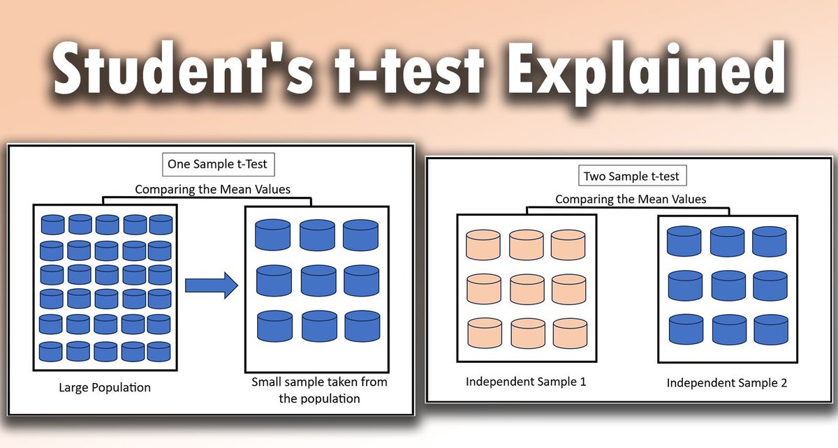
The Student's t-test is a crucial statistical method used to determine if there are significant differences between the means of two groups. It is widely applied in various fields to analyze small data sets, providing valuable insights when used correctly.
✔️ Reliable Results: When properly applied, the Student's t-test can offer reliable insights into differences between groups, helping to drive informed decisions.
✔️ Versatility: It works well with small sample sizes, making it a versatile tool in research and industry.
✔️ Simplicity: The t-test is easy to understand and implement, even for those new to statistical analysis.
❌ Misinterpretation: Misuse or misunderstanding of the t-test can lead to incorrect conclusions, undermining the validity of the analysis.
❌ Assumptions: The test assumes normality and equal variances, which may not always hold true, leading to inaccurate results.
❌ Sample Size Limitation: While useful for small samples, it may not perform well with more complex data sets.
🔹 R: Use the t.test() function from the base package, which handles both one-sample and two-sample t-tests efficiently.
🔹 Python: The scipy.stats.ttest_ind() function from the SciPy library is a reliable choice for performing t-tests on independent samples.
The visualization demonstrates two key concepts: on the left, it shows how a one-sample t-test compares the mean of a random sample against a larger population. On the right, it illustrates how a two-sample t-test compares the means of two distinct sample groups. This visualization is based on the images of this Wikipedia article: en.wikipedia.org/wiki/Studen…
For those interested in diving deeper into statistical methods like the t-test, check out my online course on Statistical Methods in R. Further details: statisticsglobe.com/online-c…
#Data #datastructure #RStudio #RStats #statisticians #datasciencetraining
9
56
1,776
Jun 4
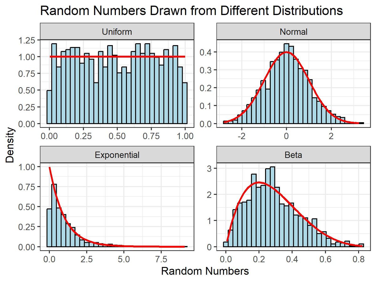
Random number generation from different distributions is a fundamental concept in statistics and data analysis. It's crucial for simulations, probabilistic modeling, and various machine learning applications.
✔️ When done correctly, it allows for accurate modeling of real-world processes, enhances the quality of simulations, and ensures robust statistical analyses.
✔️ It provides flexibility in data analysis by allowing the use of various distributions to model different types of data.
✔️ Proper generation and usage of random numbers can significantly improve the performance of machine learning algorithms by providing diverse and representative training data.
❌ However, if not handled properly, the generated random numbers might not represent the intended distribution, leading to biased results and incorrect conclusions.
❌ Misunderstanding the properties of different distributions can cause errors in statistical analysis and simulations, which might affect the outcomes of research or data-driven decisions.
To handle random number generation effectively, it's important to understand the properties of different distributions. The visualization of this post demonstrates how random numbers from Normal, Uniform, Exponential, and Beta distributions differ in shape and density. Each panel shows the histogram of random numbers and the theoretical density curve in red, helping to visualize how well the generated data matches the expected distribution.
🔹 R: Use the ggplot2 library for visualizing data from different distributions and functions like rnorm(), runif(), rexp(), and rbeta() for generating random numbers.
🔹 Python: Use libraries such as numpy for generating random numbers with functions like np.random.normal(), np.random.uniform(), np.random.exponential(), and scipy.stats for more advanced distribution functions and data visualization with matplotlib.
Check out my online course on Statistical Methods in R for a deeper dive into random number generation and other related topics! Learn more: statisticsglobe.com/online-c…
#DataViz #DataVisualization #datastructure #Data #statisticians #RStats #ggplot2
1
9
79
2,472
Jun 4
The Standard Error measures how much a sample statistic, like the mean, is expected to vary from the true population parameter. It helps us understand the precision of our estimates and how much confidence we can place in our results.
Why is Standard Error Important?
✔️ Precision in Estimates: The smaller the standard error, the more precise the estimate of the population parameter. This means we can be more confident that our sample mean is close to the true population mean.
✔️ Guides Sample Size: Standard error decreases as sample size increases, showing that larger samples give more reliable results. This is crucial for designing studies that provide meaningful insights.
The visualization of this post demonstrates how the standard error changes with different sample sizes. As sample sizes increase, the spread of sample means becomes narrower, reflecting a smaller standard error and more precise estimates. This visual is a great reminder of why larger samples are generally better in statistical analysis.
Standard Error vs. Standard Deviation: What’s the Difference?
The difference between Standard Error and Standard Deviation is often misunderstood. The Standard Deviation measures the variability of individual data points around the mean within a single sample, indicating how spread out the data is. On the other hand, the Standard Error measures how much the sample mean is expected to vary from the true population mean across different samples, focusing on the precision of the sample mean as an estimator of the population mean.
For a deeper dive into statistical methods and concepts like standard error, check out my online course on Statistical Methods in R. This course covers these topics in detail and much more. Take a look here for more details: statisticsglobe.com/online-c…
#datastructure #Statistics #RStats #database #statisticsclass

1
13
76
1,853