
24 Nov 2024
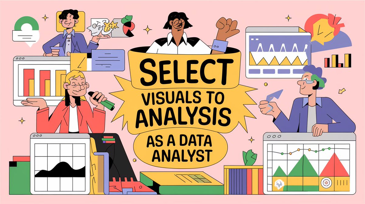
When you create visuals as a data analyst, focus on your data and the type of analysis you are performing.
• Are you comparing sales with the previous year or quarter?
• Do you want to see sales trends across months?
• Do you want to see data density?
• And much more.
You have different visuals for different kinds of analysis.
𝗙𝗼𝗿 𝗲𝘅𝗮𝗺𝗽𝗹𝗲:
• Side by Side bar charts for comparison.
• Line charts for trends.
• Heat maps for data density.
• Scatterplots for a lot of data points.
So, as a data analyst, first, figure out the kind of analysis that you are performing and then decide visuals according to that.
Have you ever encountered a problem in deciding which visual to use?
Mention them in the comments!
Enjoy. Follow for more.
#DataVisualization #DataAnalytics #DataAnalysis #DataAnalyst #AnalyticsTips #BusinessIntelligence #DataStorytelling #VisualizationTips #AnalyticsCommunity #EffectiveVisuals #USADataAnalytics #UKDataAnalyst #EuropeAnalytics #SingaporeDataAnalyst #GlobalDataCommunity #DataVisualizationWorldwide
#AnalyticsInUSA #AnalyticsInUK #AnalyticsInEurope #AnalyticsInSingapore #VisualizeData #DataPresentation #BusinessDashboards #TrendsAnalysis #DataDensity #AnalyticsDesign #ActionableInsights #VisualizationBestPractices
#DataDrivenDecisions #AnalyticsCareerTips
2
21

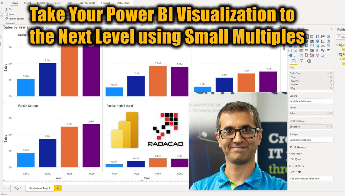
Today @Rad_Reza explained a quick tip that can take your #visualization with #PowerBI to the next level using small multiples. learn more about it here:
radacad.com/take-your-power-…
#PowerBIfromRookieToRockStar #RADACAD #VisualizationBestPractices #DataViz #DataVisualization
1

26 Mar 2018
Adding a colorblind eye to my dashboards: a new blog post on my solution to the red/green dilemma! graphgiraffe.net/1/post/2018… @tableau @tableaupublic #dataviz #visualizationbestpractices
3
14
26