
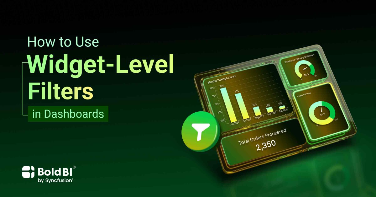
When every filter affects every widget, users get lost.
Widget-level filtering keeps:
Insights targeted, clean, and easy to understand.
This guide explains how to use them to improve decision-making:
boldbi.com/blog/how-to-use-w…
#AnalyticsDesign #SmartDashboards #DataDriven
2
13

Jan 29
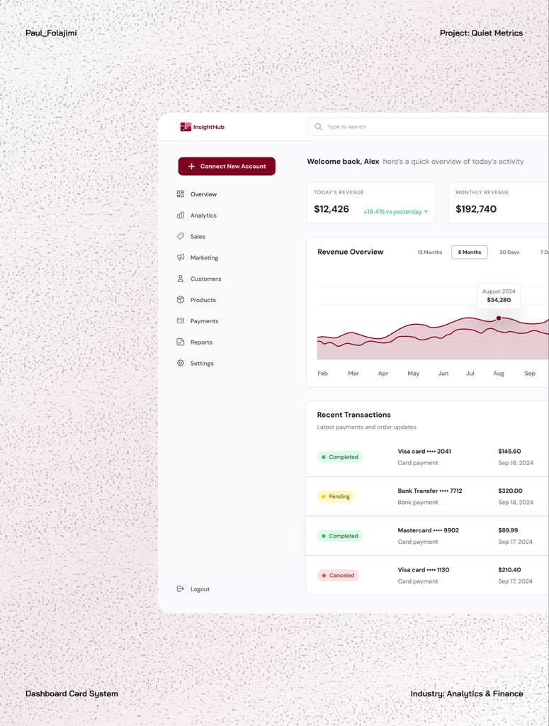
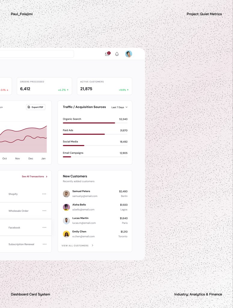
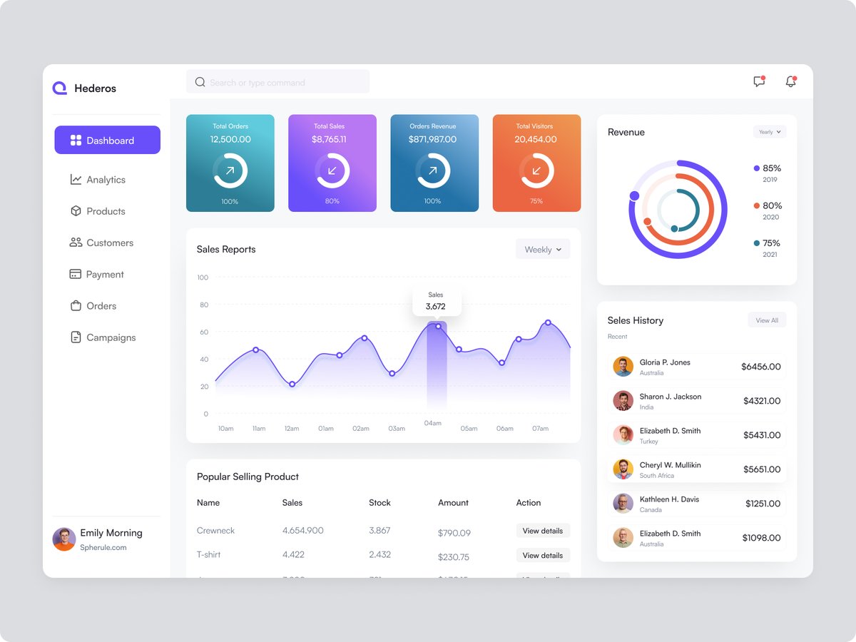
Light mode analytics dashboard mockup for Quiet Metrics.
A clean UI/UX dashboard design focused on readability, spacing, and accessible data presentation.
#UIUX #DashboardDesign #LightModeUI #AnalyticsDesign #Design

3
109

You built a Power BI theme… but is it perfect?
Creating a great theme isn’t one-and-done - it’s an art of iteration.
In Episode 3 of my Power BI Theme Masterclass, we dive into how to validate and refine your theme so it not only looks great but works perfectly across every report in your org.
Here’s what we cover:
- How to test your Power BI theme for color contrast & accessibility
- Spotting subtle design flaws before they go live
- Iterating fast with real visuals and dashboards
Perfecting your theme means delivering consistency, clarity, and confidence - every time someone opens your report.
Watch here → youtu.be/0xXCU3A-UJM
Let’s make your Power BI themes not just good… but legendary.
#datagods #PowerBI #MicrosoftFabric #KratosBI #PowerBITips #PowerBITheme #DataVisualization #DesignMatters #AnalyticsDesign #DataCulture
8
36
1,759

18 Mar 2025
And yes, there's a dark mode design concept version, too — perfect for those late-night analysis sessions. Enjoy the same great features with a sleek, eye-friendly interface.
#analyticsdesign #designconcept #designs #designteam. .
1
5
101

24 Nov 2024
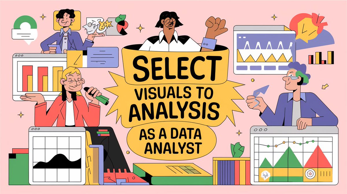
When you create visuals as a data analyst, focus on your data and the type of analysis you are performing.
• Are you comparing sales with the previous year or quarter?
• Do you want to see sales trends across months?
• Do you want to see data density?
• And much more.
You have different visuals for different kinds of analysis.
𝗙𝗼𝗿 𝗲𝘅𝗮𝗺𝗽𝗹𝗲:
• Side by Side bar charts for comparison.
• Line charts for trends.
• Heat maps for data density.
• Scatterplots for a lot of data points.
So, as a data analyst, first, figure out the kind of analysis that you are performing and then decide visuals according to that.
Have you ever encountered a problem in deciding which visual to use?
Mention them in the comments!
Enjoy. Follow for more.
#DataVisualization #DataAnalytics #DataAnalysis #DataAnalyst #AnalyticsTips #BusinessIntelligence #DataStorytelling #VisualizationTips #AnalyticsCommunity #EffectiveVisuals #USADataAnalytics #UKDataAnalyst #EuropeAnalytics #SingaporeDataAnalyst #GlobalDataCommunity #DataVisualizationWorldwide
#AnalyticsInUSA #AnalyticsInUK #AnalyticsInEurope #AnalyticsInSingapore #VisualizeData #DataPresentation #BusinessDashboards #TrendsAnalysis #DataDensity #AnalyticsDesign #ActionableInsights #VisualizationBestPractices
#DataDrivenDecisions #AnalyticsCareerTips
2
21

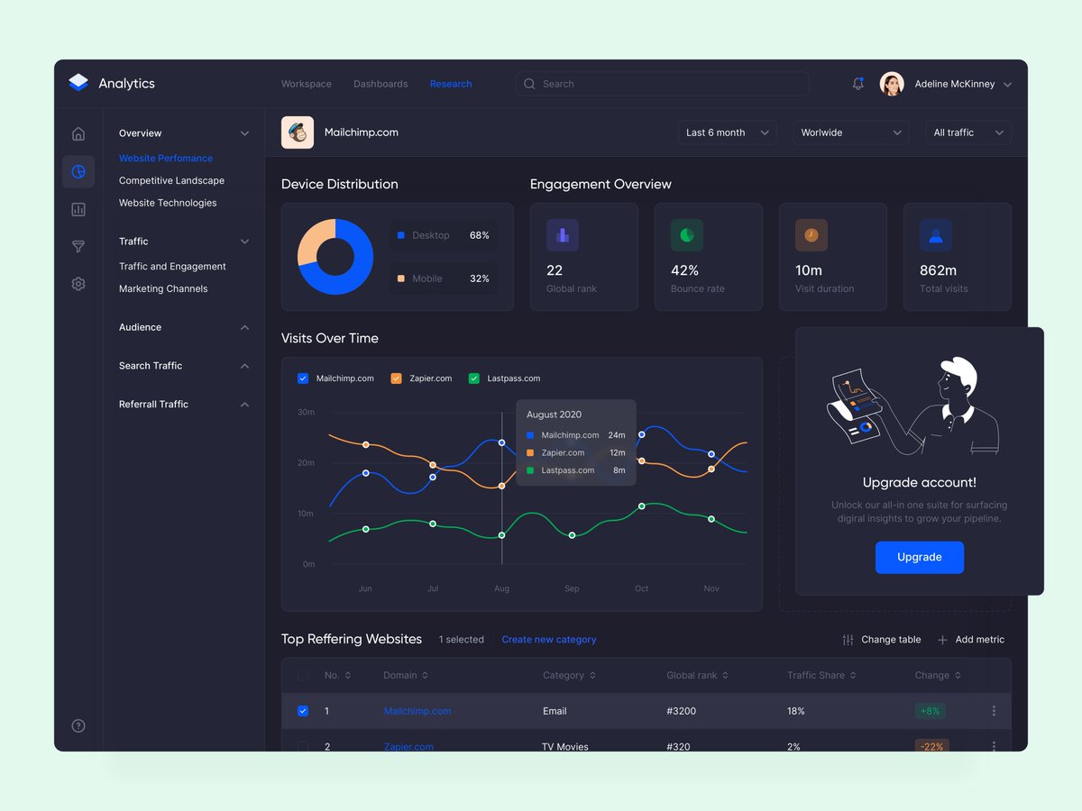
Analytics UI Design Dashboard
Free Download 👉uistore.org
Share your feedback in the comment section.
Available for UI design project DM Me
Reach out to:
✉️uistorofficial@gmail.com
Have a Nice Day 💌
#analytics #analyticsdesign #analyticsdashboard #analyticsdashboard
4
157

7 Apr 2022
Do not assume an #Analytics developer knows how to design an analytics solution. Although this distinction is rarely recognized today, it is a critical one that can make or break your efforts. #Data #Statistics #DataScience #MachineLearning #AI #AnalyticsDesign
3
2

27 Apr 2018
Interesting session on confluence of #HRTechnology and #AnalyticsDesign moderated by @BradBoyson #SHRMindia @SHRMindia #SHRMTech18 #FutureofHR #Futureofwork #DigitalTransformation #DisruptioninHR #DigitalHR

1
7
12