Probability plays a central role in statistics, data science, forecasting, and many real-world decisions under uncertainty. It forms the foundation for quantifying uncertainty, interpreting data correctly, building predictive models, and making informed decisions when outcomes are not fully known.
In his new book "Probability Fundamentals: An Intuitive Guide to Understanding Uncertainty", Jim Frost explains probability concepts in an intuitive and practical way, with a strong emphasis on real understanding rather than simply applying formulas.
Jim Frost is a highly trusted voice in the statistics and data science community, and since I’ve had the opportunity to work with him in the past, I can highly recommend both his work and his educational materials.
Congratulations on the book launch, Jim!
Link to the book: amazon.com/Probability-Funda…
#Probability #Statistics #DataScience #Analytics #BayesianStatistics #MachineLearning #StatisticalAnalysis

1
2
27
775


Jun 13
Traditionally, visualization and statistical testing are handled in separate steps. This makes the workflow slower and the results harder to present clearly.
With ggstatsplot in R, both are automatically integrated into a single figure. This helps you work more efficiently and makes your results easier to interpret and communicate.
The graphic below demonstrates this using the relationship between living space and property price. Each point represents one observation, and the line shows the overall trend. In addition, the plot automatically includes key statistical information, such as the correlation coefficient, confidence interval, p-value, and sample size.
This way, you can see the data and the corresponding statistical conclusions in one place, which makes your findings clearer and easier to share.
Looking to improve your data visualizations in R? In my course, Data Visualization in R Using ggplot2 & Friends, I cover ggplot2 and tools like ggstatsplot to help you build clear and effective plots. Check out this link for more details: statisticsglobe.com/online-c…
#StatisticalAnalysis #Rpackage #DataViz #DataVisualization #RStats #ggplot2 #coding #Data

1
5
71
1,806
Jun 12
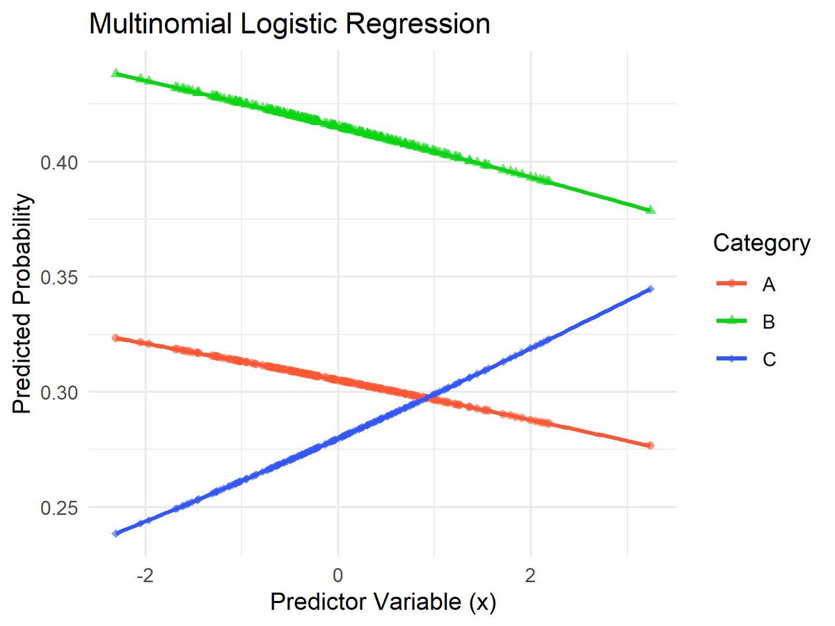
Multinomial logistic regression is a statistical method used to model outcomes with more than two categories. It helps us understand how various predictor variables influence the probabilities of different possible outcomes.
Advantages of using multinomial logistic regression:
✔️ Suitable for Multiple Target Categories: Perfect for situations where the target variable has more than two categories, allowing for more complex analyses.
✔️ Probability Estimation: Provides probabilities for each possible outcome, giving a comprehensive view of potential results.
✔️ Interpretability: The model coefficients help explain how predictor variables impact each outcome, making it easier to understand the relationship between variables.
Challenges if not applied correctly:
❌ Overfitting: Including too many predictor variables can make the model overly complex, reducing its performance on new data.
❌ Assumption Dependence: Like any regression model, multinomial logistic regression relies on assumptions, such as the relationship between predictors and the log odds of the target variable. If these assumptions are not met, the model’s reliability may be compromised.
❌ Data Requirements: Requires a sufficient amount of data for each category to ensure stable and reliable estimates.
To apply multinomial logistic regression practically, here are some tools you can use:
🔹 R: Use the multinom() function from the nnet package to fit a multinomial logistic regression model. Libraries like ggplot2 can be used to visualize the predicted probabilities for each category, as shown in the visualization.
🔹 Python: Utilize LogisticRegression from the scikit-learn library with the multi_class='multinomial' parameter to fit a multinomial logistic regression model. Visualization libraries like matplotlib or seaborn can be used to illustrate the model's results.
The visualization of this post demonstrates a multinomial logistic regression model. It shows how the predicted probabilities for each category change with the predictor variable. The colors represent different categories, and the smooth curves illustrate the probability trends, making it easy to see how each outcome's likelihood varies with changes in the predictor.
If you want to learn more about multinomial logistic regression and how to apply it effectively using R, check out my online course on Statistical Methods in R. This course covers multinomial logistic regression and many other related topics in detail.
Check out this link for more details: statisticsglobe.com/online-c…
#database #DataVisualization #StatisticalAnalysis #RStats #DataViz
8
47
1,318

Jun 11
This textbook delves into the synergy between mathematical statistics and R, exploring its applications, benefits, and reasons to master this combination. pyoflife.com/mathematical-st…
#DataScience #RStats #statisticalanalysis #machinelearning #ArtificialInteligence #datavisualizations

13
50
1,124

Jun 10
❓ Need Expert Help to Analyze Your Research Data? 🔍
#PhDiZone #dataanalysis #researchanalysis #spssanalysis #smartpls #matlabanalysis #researchguidance #phdassistance #thesiswriting #dissertationwriting #researchsupport #literaturereview #proposalwriting #statisticalanalysis

15
Jun 1
When planning a statistical study, it is important to find a balance between a large enough sample size to detect meaningful effects and the efficient use of resources. Sample size calculation using power analysis is a key tool for achieving this balance.
Power analysis allows you to determine how many observations are needed to detect an effect of interest with a given probability while controlling the significance level. It shows how quantities such as effect size, alpha level, statistical power, and sample size are related, making it an essential method for study planning.
Advantages of power analysis:
🔹 Helps determine an appropriate sample size before collecting data
🔹 Clarifies the relationship between effect size, alpha level, power, and sample size
🔹 Supports efficient use of time, budget, and other resources
🔹 Reduces the risk of underpowered studies
🔹 Makes study planning more transparent and scientifically sound
I recently released a new module in the Statistics Globe Hub that explains how to perform sample size calculation using power analysis. The module includes a video lecture, practical examples, and exercises to help you apply the method step by step in R.
The image below illustrates these relationships. On the left, you can see the connection between the null hypothesis, the alternative hypothesis, the critical value, and statistical power. On the right, the charts show how the required sample size changes depending on the effect size. In general, smaller effects require larger samples to be detected reliably.
If you are interested in topics like this, subscribe to my newsletter to receive practical tips on statistics, data science, AI, and programming with R and Python. Learn more by visiting this link: statisticsglobe.com/newslett…
#VisualAnalytics #DataViz #statisticians #RStats #database #datastructure #StatisticalAnalysis
9
50
1,613
May 27
If you're looking to master Deep Learning, following a structured roadmap is key to navigating this advanced and ever-evolving field. I recently found this Deep Learning roadmap, which lays out the essential concepts, architectures, and tools to help you build expertise step by step.
Here are some of the essential areas to focus on:
✔️ Neural Networks: Gain a deep understanding of foundational topics like activation functions, loss functions, weight initialization, and addressing challenges such as vanishing or exploding gradients.
✔️ Architectures: Explore widely used models such as CNNs, RNNs, Transformers, and GANs. Expand your knowledge with advanced components like LSTMs, GRUs, and attention mechanisms to solve complex problems.
✔️ Training Techniques: Learn optimization strategies with methods like Adam, SGD, and RMSProp. Enhance your models using techniques such as batch normalization, regularization, transfer learning, and adversarial training.
✔️ Tools: Familiarize yourself with leading frameworks like TensorFlow, PyTorch, Keras, and MLflow to streamline model development, training, and deployment.
✔️ Model Optimization: Understand advanced methods like distillation, quantization, and neural architecture search (NAS) to make your models faster and more efficient.
I came across this roadmap on the AIGENTS website, and what really stands out is its interactive format. Each element is clickable, offering AI-powered insights and resources that make it easier to dive deeper into each topic. It’s a fantastic way to structure your learning while staying focused on what matters most. More details are available at this link: aigents.co/learn/roadmaps/de…
#programmer #StatisticalAnalysis
7
41
1,789
May 22
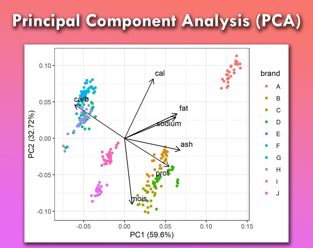
Principal Component Analysis (PCA) is a powerful tool for dimensionality reduction, used to simplify complex data sets while retaining their most important features.
It transforms the original variables into a new set of uncorrelated variables called principal components. These components capture the maximum variance in the data, making it easier to analyze and visualize.
Key Points:
✔️ Simplifies data sets by reducing the number of variables.
✔️ Helps in identifying patterns and insights.
✔️ Improves the performance of machine learning models.
❌ May result in loss of some information.
❌ Interpretation of components can be challenging.
Practical Implementation:
🔹 R: Use prcomp() from the stats package for performing PCA.
🔹 Python: Use PCA from the sklearn.decomposition module for PCA implementation.
For a detailed step-by-step tutorial on PCA, including practical examples, check out my tutorials created in collaboration with Paula Villasante Soriano & @Cansu_SG.
Article: statisticsglobe.com/principa…
Video: youtube.com/watch?v=DngS4LNN…
Furthermore, I have created an extensive introduction to PCA, which explains the theoretical concepts of PCA as well as how to apply it in R programming. More details are available at this link: statisticsglobe.com/online-c…
#StatisticalAnalysis #Rpackage #programmer #RStats
14
74
2,220
May 20
Time series analysis is a fundamental aspect of machine learning, particularly in industries where forecasting future trends is crucial. pyoflife.com/machine-learnin…
#DataScience #RStats #DataScientist #machinelearning #datasets #statisticalanalysis #ArtificialInteligence #dataviz

19
86
2,153
May 19
When visualizing data, it is often helpful to show both individual observations and summary statistics. This makes it easier to understand the overall pattern while still seeing how much variability exists in the data.
The tidyplots R package makes this very simple.
In the example shown here, monthly temperature observations are visualized using tidyplots. The plot combines individual data points with summary statistics to give a clear overview of both the data distribution and the overall seasonal pattern.
Several tidyplots helper functions are used to build the figure step by step:
🔹 add_data_points_beeswarm() shows the individual observations for each month
🔹 add_mean_line() displays the mean temperature for each month
🔹 add_sd_ribbon() adds a shaded ribbon representing the mean and standard deviation
This combination allows you to see both the overall pattern and the spread of the data at the same time.
Because tidyplots builds on ggplot2, it keeps the full flexibility of the ggplot ecosystem while providing a cleaner and more readable syntax for common visualization tasks.
You can find more information about the tidyplots package here: tidyplots.org/
If you would like more tips like this, you can subscribe to my newsletter where I regularly write about statistics, data science, AI, and programming in R and Python.
Learn more by visiting this link: statisticsglobe.com/newslett…
#datastructure #DataVisualization #StatisticalAnalysis #ggplot2 #statisticians #datavis #RStats #rstudioglobal #DataAnalytics

11
54
1,627
May 17
📌📚We delve into the basics of biostatistics and explore the powerful tool R, which has become integral to statistical analysis in the biological sciences. pyoflife.com/biostatistics-w…
#DataScience #bioinformatics #statisticalanalysis #statistics #datavisualizations #RStats #coding

15
94
2,773
May 16
The Z-test is a powerful statistical method used to determine if there is a significant difference between sample and population means, or between the means of two groups. Properly applying the Z-test can lead to more accurate conclusions in research and decision-making, but incorrect application can lead to misleading results.
✔️ The Z-test allows for precise hypothesis testing, enabling you to determine if your observed data aligns with expected outcomes based on a known population mean.
✔️ When used correctly, the Z-test can provide strong, statistically valid evidence to support or reject hypotheses, particularly in studies with large data sets and known variances.
✔️ The Z-test is straightforward and widely understood, making it a reliable tool for hypothesis testing when its assumptions are met, contributing to clearer and more consistent research results.
❌ Using the Z-test with small sample sizes can lead to invalid conclusions, as it assumes large samples for accurate results.
❌ Applying the Z-test to data that is not normally distributed violates its assumption of normality, risking inaccurate findings.
❌ Using the Z-test when population variances are unknown can lead to incorrect results, as it requires known variances for proper application.
❌ Over-reliance on the Z-test without understanding these key assumptions can result in flawed research outcomes and misleading interpretations.
While the Z-test remains a reliable method for large samples with known variances, more modern alternatives like Bayesian methods and bootstrapping offer greater flexibility and robustness in situations where traditional assumptions may not hold.
To apply the Z-test effectively in practice:
🔹 R: Use the z.test() function from the BSDA package to perform a Z-test on your data.
🔹 Python: Leverage the statsmodels library with the ztest() function to conduct a Z-test on your data.
When the significance level (alpha) is 0.05, the null hypothesis can be rejected if the Z value falls within the red region on the visualization. This visual is based on a Wikipedia image: en.wikipedia.org/wiki/Z-test…
You might check out my online course on Statistical Methods in R. This course will explain the Z-test and other related topics in further detail.
More info: statisticsglobe.com/online-c…
#StatisticalAnalysis #datastructure #statisticians

14
78
2,702
May 15
Mean imputation is a common method for handling missing values in numerical data. It replaces missing values with the mean of the observed values, ensuring the data set remains complete and easy to use. But is it truly a good option?
Why choose mean imputation:
✔️ Simple and quick to implement, requiring minimal computation.
✔️ Preserves the size of the data set, avoiding the loss of valuable rows.
What to be cautious about:
❌ Replacing missing values with the mean can reduce the natural variability in the data, leading to biased estimates in analyses.
❌ Can distort relationships between variables, particularly in predictive models.
❌ Fails to account for the uncertainty introduced by missing values, which can impact the validity of statistical inferences.
Are There Better Alternatives?
Predictive mean matching is a highly effective alternative to mean imputation. This method identifies observed values closest to the predicted value for a missing entry and randomly selects one of these matches as the replacement. It preserves the natural variability in the data, making it a more robust approach compared to simple mean imputation. Predictive mean matching also works well in handling outliers and maintaining the integrity of relationships between variables. To further enhance reliability and robustness, it is recommended to create multiple imputations. This approach creates several plausible data sets, accounts for the uncertainty in the imputation process, and produces more dependable results for subsequent analyses.
The image below illustrates the impact of mean imputation. The black line represents the original data distribution before imputation, while the red line shows the data distribution after imputation. Notice how mean imputation narrows the distribution, reducing variability and potentially impacting analyses that rely on the data's original structure. For cases where preserving the data's variability is essential, alternative imputation methods should be considered.
For a detailed explanation of mean imputation, including its advantages and drawbacks, check out my full tutorial here: statisticsglobe.com/mean-imp…
Interested in learning practical techniques for missing data? Take a look at my online course on Missing Data Imputation in R.
Further details: statisticsglobe.com/online-c…
#database #datastructure #StatisticalAnalysis #programming

4
30
1,541
May 14
A proper handling of missing data is essential if you want unbiased and trustworthy results. Because of this, many different R packages have been developed to support imputation and diagnostics. Below, I want to introduce some of the most useful packages for working with missing data.
🔹 mice: A flexible framework for multiple imputation using chained equations. It can be extended with packages such as miceadds and micemd, which add extra methods, utilities, and support for multilevel or clustered data.
🔹 VIM: Provides a wide range of imputation methods such as hot deck and kNN. It is especially useful for its strong visualization tools that help explore missingness patterns.
🔹 naniar: Offers tidy tools for handling, visualizing, and exploring missing data in a clean and consistent workflow.
🔹 NNS: Provides nonparametric imputation methods based on nonlinear dependencies and is useful when relationships in the data are complex.
🔹 jomo: Performs joint modeling multiple imputation and is particularly useful for multilevel and longitudinal data.
🔹 pan: Implements multivariate mixed models and supports imputation in hierarchical and repeated measures structures.
There are of course many more helpful packages for working with missing data. Which ones do you usually use? I would be very interested to hear your preferences in the comments.
If you want to learn how to apply missing data techniques in practice, my online course Missing Data Imputation in R can guide you through the process.
More info: statisticsglobe.com/online-c…
#StatisticalAnalysis #datastructure #statisticians

8
77
2,349

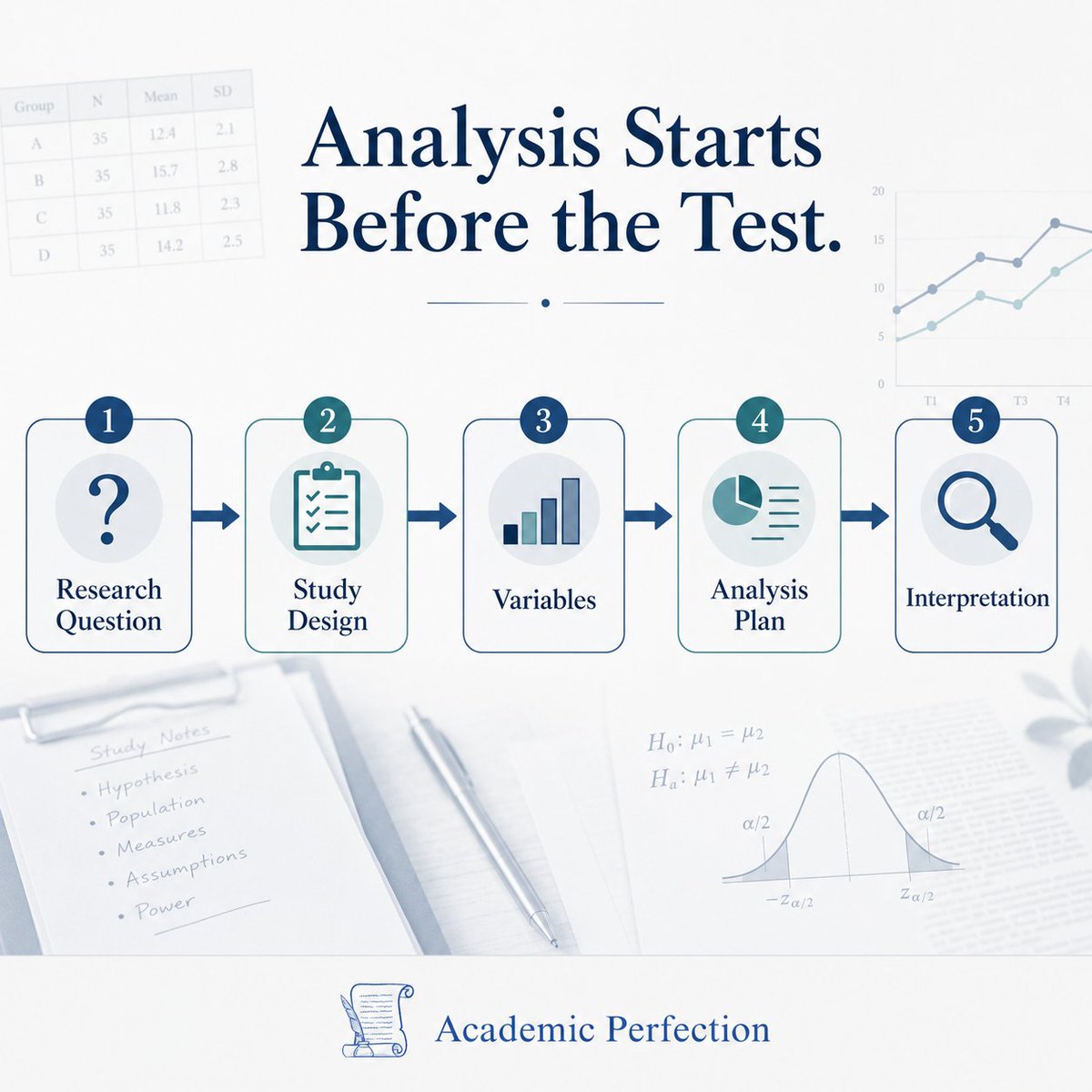
Statistics should not start with “Which test should I run?”
It should start with the research question, study design, variables, assumptions, and interpretation.
A p-value is not the whole story.
#academicperfection #StatisticalAnalysis
3
17
May 11
📌📚We will explore the fundamentals of statistics and how to effectively use the R programming language for statistical analysis. pyoflife.com/learning-statis…
#DataScience #RStats #MachineLearning #statistics #statisticalanalysis #datavisualizations #ArtificialIntelligence
22
85
2,289
May 5
Want to bring your plots to life? gganimate is a powerful extension for ggplot2 in R that transforms static visualizations into dynamic animations. It makes it easier to highlight changes and trends over time in a clear and engaging way.
The attached animated visualization, which I created with gganimate, shows inflation trends for six countries since 1980. I think it’s great how the animation moves year by year, with a year counter at the top showing the current year, making it easy to track how inflation changed for each country over time.
If you want to learn how to create animations like this, join my online course, Data Visualization in R Using ggplot2 & Friends. I’ll guide you through the steps to make visualizations like this and more! Check out this link for more details: statisticsglobe.com/online-c…
#StatisticalAnalysis #RStats #DataViz #Rpackage #tidyverse #ggplot2 #VisualAnalytics #RStudio #statisticians
5
42
1,629
May 5
Misinterpretation of correlation and causation is a common issue in data analysis. Correlation measures the strength and direction of a relationship between two variables, but it does not imply that one variable causes the other. Misunderstanding this distinction can lead to several problems:
✅ Incorrect conclusions: Assuming that a correlation between two variables means one causes the other can lead to erroneous conclusions.
✅ Misleading reports: Presenting correlated data as causative can mislead decision-makers and the public.
✅ Poor decision-making: Basing decisions on incorrect causal assumptions can result in ineffective or harmful policies and actions.
✅ Oversimplified analyses: Focusing on correlation without considering other factors can oversimplify complex relationships.
Consider the statement, "More storks lead to more babies!" This humorous example illustrates the fallacy of assuming causation from correlation. In reality, both variables might be influenced by a third factor, for example rural areas often have more storks and more families with children. The image below uses synthetic data to show how such indirect relationships can create a misleading appearance of causation.
For regular tips on data science, statistics, Python, and R programming, check out my free email newsletter. Check out this link for more details: statisticsglobe.com/newslett…
#database #StatisticalAnalysis #Data #statisticians

1
16
88
4,167
May 2
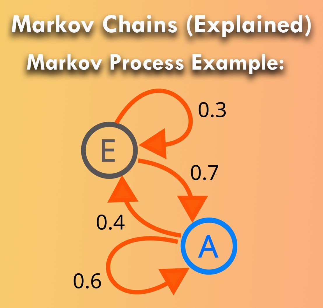
Markov chains are a fundamental concept in probability theory, modeling systems that undergo transitions from one state to another in a random process. They rely on the memoryless property, where the future state depends only on the current state, not the past. When properly utilized, Markov chains can unlock powerful insights across various fields, from finance to genetics.
However, improper handling of Markov chains can lead to significant drawbacks.
Challenges of Markov Chains:
❌ Misinterpretation: Without a thorough understanding, results derived from Markov chains might be misleading, particularly if the memoryless property is overlooked.
❌ Data Dependency: Markov chains rely heavily on accurate and representative data. If the data set is not sufficiently robust, the chain’s predictions could be inaccurate.
❌ Complexity: For large systems, constructing a Markov chain becomes increasingly complex, often requiring sophisticated computational tools and techniques.
Benefits of Markov Chains:
✔️ Predictive Modeling: When correctly applied, Markov chains can help forecast future states in a system based on its current state, leading to more accurate predictive models.
✔️ Simplified Analysis: They break down complex systems into manageable parts, allowing for a clearer understanding of each component and its behavior.
✔️ Versatile Applications: Markov chains are highly adaptable, with applications in queueing theory, economics, and machine learning, making them a versatile tool in a data scientist's arsenal.
To implement Markov chains in practice:
🔹 R: Use the markovchain package to create and analyze discrete-time Markov chains, which simplifies transitions, state spaces, and probabilities.
🔹 Python: Utilize the pymc or hmmlearn libraries to model and infer the hidden states in sequential data.
The following visualization, based on a Wikipedia image (link: en.wikipedia.org/wiki/Markov…), shows a simple two-state Markov process. The numbers represent the probabilities of transitioning from one state to another, illustrating the flow within the system.
To explain this topic in further detail, I collaborated with Micha Gengenbach to create a comprehensive tutorial: statisticsglobe.com/markov-c…
Want to dive deeper? Enroll in my online course, "Statistical Methods in R." Learn more: statisticsglobe.com/online-c…
#DataScientist #StatisticalAnalysis #datastructure #DataAnalytics #RStats #Rpackage
12
39
1,953