
UX Engineer @Microsoft | easing functions creator | deported from Nepal for human rights writing
Joined October 2008
- Tweets 26,265
- Following 2,169
- Followers 7,866
- Likes 78,254
1,486 Photos and videos


You have Claude Fable for only a few days. Here's how to make the most of it.
Introducing /improve: use your most capable model to audit your codebase and write plans for cheaper models to execute later.
Studies your code, figures out bugs, perf, tech debt, missing tests, what to build and writes plans any agent can run.

178
383
6,262
755,963
Robert Penner retweeted

Mar 5
So recently I've been re-exploring the Fourier Transform. I learned about it a long time ago, but didn't realize it could be applied to images too.
It's fascinating to see how sine wave patterns can add together to form an image.
made with #animejs and #threejs
9
17
299
21,380
Robert Penner retweeted

Apr 29
With the new scrambleText() feature, you can control reveal direction, create cursor effects, apply perturbation and easing, and chain it in keyframes and timelines like any other Anime.js animation property.
It's crazy how just a few lines of code can create such visually complex effects.
Apr 29

Anime.js 4.4 is out with CSS transforms and Stagger improvements, plus a new scrambleText() helper to easily create complex text scramble effects!
14
95
1,467
131,276

Robert Penner retweeted

May 30
Task 100 developers with building the same project using the same AI and tooling.
Someone will produce the best project. The top 10% will be a lot better than the bottom 10%.
This has always been the case, pre-AI too.
We are all still building stuff, but how we built has changed. That's all.

Thread. I thought I was immune from ever feeling hollowed out by AI as a programmer, because I've always gotten far more enjoyment from shipping, getting users, and solving problems than indulging in the art of coding.
As the LLMs have eaten deeper and deeper into our field, I've empathized with my peers who've expressed a sense of loss and disillusionment as the art of programming has become more and more automated. But, I've always seen myself as someone who saw coding as a means to an end to solve problems. Not something whose craftsmanship, culture, methodologies, and fads were worth getting too hung up on, beyond what was needed to adeptly deliver value to others and not fall behind the (frankly, rare) genuine advancements over the years.
This all changed for me over the last week. The frontier probably shifted a bit earlier than today, but I didn't see it until now. The change has come about for me because GPT-5.5 was able to build complex software I needed built autonomously for 2-3 days at a clip. Work that would have taken me months, or even years if you include learning the requisite languages, libraries, and tooling, being completed over a weekend.
This isn't something I think anyone who has been programming as long as I have can really be prepared for, this kind of velocity jump is just mindboggling. This is truly superhuman performance - it's not perfect, and there certainly is a level of simplicity and clarity that would come in the hands of the world's best programmers, but that margin is so small so as to be unnoticable when contrasted with the sheer volume of working software that it can produce per unit time.
So, why has this caused a shift in the way I feel about these technologies, after all this time not having felt it as each subsequent model advanced closer to what we see now? There are two reasons.
First, it's clear that the age of humans understanding how software works is over. Yes, humans will need to understand things, at least for a few more years, but we are now at a kind of escape velocity where the % of lines of code that are created every year that are even read, nevermind understood, by humans, is now permanently declining.
But the real shift, is I am no longer a programmer, I am a manager. Good managers do not take credit for the work of their team - they see themselves in service of their team. Up until now, claiming "I built this" still felt true when talking about things I had created with the help of LLMs.
But now, when the LLMs are writing thousands of lines of code, and I am simply providing guidance, direction setting, and oversight to catching the bigger errors, I found myself in the bizarre situation (that many will be in soon, I presume) of no longer feeling entitled to take credit for the work being done.
Not being able to say "I built this" when sharing something whose basic conception came from my own mind, but under the tireless effort of these insane machines to actually reason through and materialize into a working solution, is devastating. Not because of the fact it doesn't feel truthful now, but because I know it will never be truthful again for myself and soon for all of the rest of us.
5
1
19
4,044
Robert Penner retweeted

The middle duck paid attention in physics class, while the others played around in class...
361
3,362
51,335
2,855,691
Robert Penner retweeted

May 26
PICARD: Data, shields up
DATA: Brilliant! Shields can reduce damage we sustain. Not immunity. Not hubris. Just prudence. It's not precaution—it's strategy.
[camera shakes]
WORF: HULL BREACHES ON NINE DECKS
DATA: Here's what happened: you told me to raise shields, and I didn't
305
4,861
50,510
1,385,287

You joined a new team last week.
The codebase is 200,000 lines of TypeScript. Your tech lead says "just read through it." You open the repo. You stare at 400 files. You close your laptop and go get coffee.
You have no idea where anything is. You have no idea how anything connects. You spend three days reading code that teaches you nothing about the system it builds.
Someone built a tool that analyzes your entire codebase with a multi-agent pipeline and turns it into an interactive knowledge graph you can click, search, zoom, and ask questions about.
It's called Understand-Anything. 33,455 stars on GitHub.
You point it at your project. It reads every file, every function, every class, every dependency. Then it hands you a visual dashboard. Every node is clickable. Every connection is labeled. You can pan across the whole system or zoom into one module. You can search for any concept and see exactly where it lives.
Here's what it does:
→ Multi-agent pipeline analyzes your entire codebase automatically. Files, functions, classes, dependencies.
→ Builds an interactive knowledge graph. Every node links to real code. Click any node for a plain-English summary.
→ Domain view maps your code to actual business logic. Not just file structure. Real processes and flows.
→ Search across the graph. Type any concept, function name, or domain term and find it instantly.
→ Ask questions directly. "Where does authentication happen?" "What calls this function?" Get answers with context.
→ Guided tours of the codebase. Follow the path from entry point to core logic.
→ Works as a Claude Code plugin. Also works with Codex, Cursor, GitHub Copilot, Gemini CLI, and more.
→ Live interactive demo in the browser. Pan, zoom, explore before you install anything.
→ Supports any codebase. Not just TypeScript. Any project your AI agent can read.
Here's the wildest part:
The goal isn't a graph that wows you with how complex your codebase is. It's a graph that quietly teaches you how every piece fits together.
That sentence is in the README. And it's the exact thing every code documentation tool gets wrong. They produce diagrams that look impressive in a presentation and teach you nothing on Monday morning when you're trying to fix a bug.
Understand-Anything builds graphs that teach.
Swimm charges $39/user/month for AI-powered code documentation. Sourcegraph starts at $19/user/month. CodeSee charged enterprise pricing before it shut down entirely in 2024. Mintlify starts at $150/month for team plans.
Every one of them puts your code on their servers. Every one of them charges you monthly to understand your own codebase.
Understand-Anything: $0. Any codebase. Any size. Your machine. Your files. Forever.
33,455 stars. 2,718 forks. Built in TypeScript. Active since early 2026.
MIT licensed. Self-hosted. Free forever.
100% Open Source.

15
42
328
27,647
Robert Penner retweeted

May 23
Stepping away from the dopamine chat box and recording a long, rambling, yet intentional voice memo covering everything you want to accomplish in whatever project you’re working on. Then transcribing that and using it as input to the model, where you then ask the model to ask you questions exhaustively until it knows exactly what to do in order to accomplish your goal
May 23

What is the most underrated AI tool right now?
27
59
1,144
84,506
Robert Penner retweeted

May 19
They had a chance to stop this when the robot almost fell.
Then it really Fell.
But the show must go on.
178
274
1,871
4,748,188
Robert Penner retweeted

May 16
The hard-earned skills of software engineers will never be useless, no matter how much AI coding improves.
The way an experienced SWE who has written and reviewed millions of lines of code looks at a problem is different from a person whose only exposure to software has been vibe coding and prompting LLMs.
In fact, the experienced engineer will be able to use those tools much more efficiently. They can speak in patterns, architectures, modules, and force the LLM to produce higher quality code.
And when the AI gets confused, the engineer can steer it in the right direction. The same can't be said for the 19yo who only vibe-codes without looking under the hood.

Serious question.
For 20 years, a "Software Engineer" was someone who spent thousands of hours mastering complex syntax, logic, and architecture.
Now, a 19-year-old can vibe-code a production-ready SaaS in a weekend using plain English and a $20 Claude subscription.
What does the title "Software Engineer" even mean right now?
15
18
259
21,049
Robert Penner retweeted

May 14
I’ve designed 10 design systems, and even in 2026, the same problem keeps showing up on prospective client calls:
Most AI tools still use design languages and component systems that were never actually built for AI interactions or modern design engineering workflows.
Patterns like chat interfaces, prompt libraries, workflows, confidence rationales, memory behavior, and agent interactions are no longer peripheral. They are the product experience.
Which means the design system needs to be intentionally designed — not assembled screen by screen and hoped to feel cohesive later.
And no UI kit really solves this for you. Not Shadcn. Not MUI. Not premium kits. Not whatever’s trending on Figma Community this month. You still have to build these foundations yourself.
That remains true even if you’re hiring design engineers or building AI-first product workflows. Because the real leverage comes from getting the foundational patterns right early. Once those are solid, everything else — screens, flows, scaling, velocity — becomes significantly easier.
Weak foundations eventually surface everywhere.
And in most AI products, the long-term bottleneck usually isn’t engineering speed or even growth. It’s that the design, UX, and customer experience layer can’t scale with the pace of the product.
The patterns most teams are still missing:
— Workflow states
— Partial responses
— Retry and recovery flows
— Editable AI responses
— Memory behavior
— Multi-agent interactions
— Ambiguity handling
— Confidence levels
Each of these needs UX thinking before visual design.
What is the user trying to understand in this moment? What happens when output is incorrect, incomplete, delayed, or changing in real time?
How does the interface communicate trust, uncertainty, progress, or control?
That interaction layer is becoming just as important as buttons, forms, and navigation.
Treat it like core infrastructure — because now, it is.
May 9

After building 4 design systems since December — mostly for AI-first products evolving beyond basic MVPs — one thing I’ve realised is:
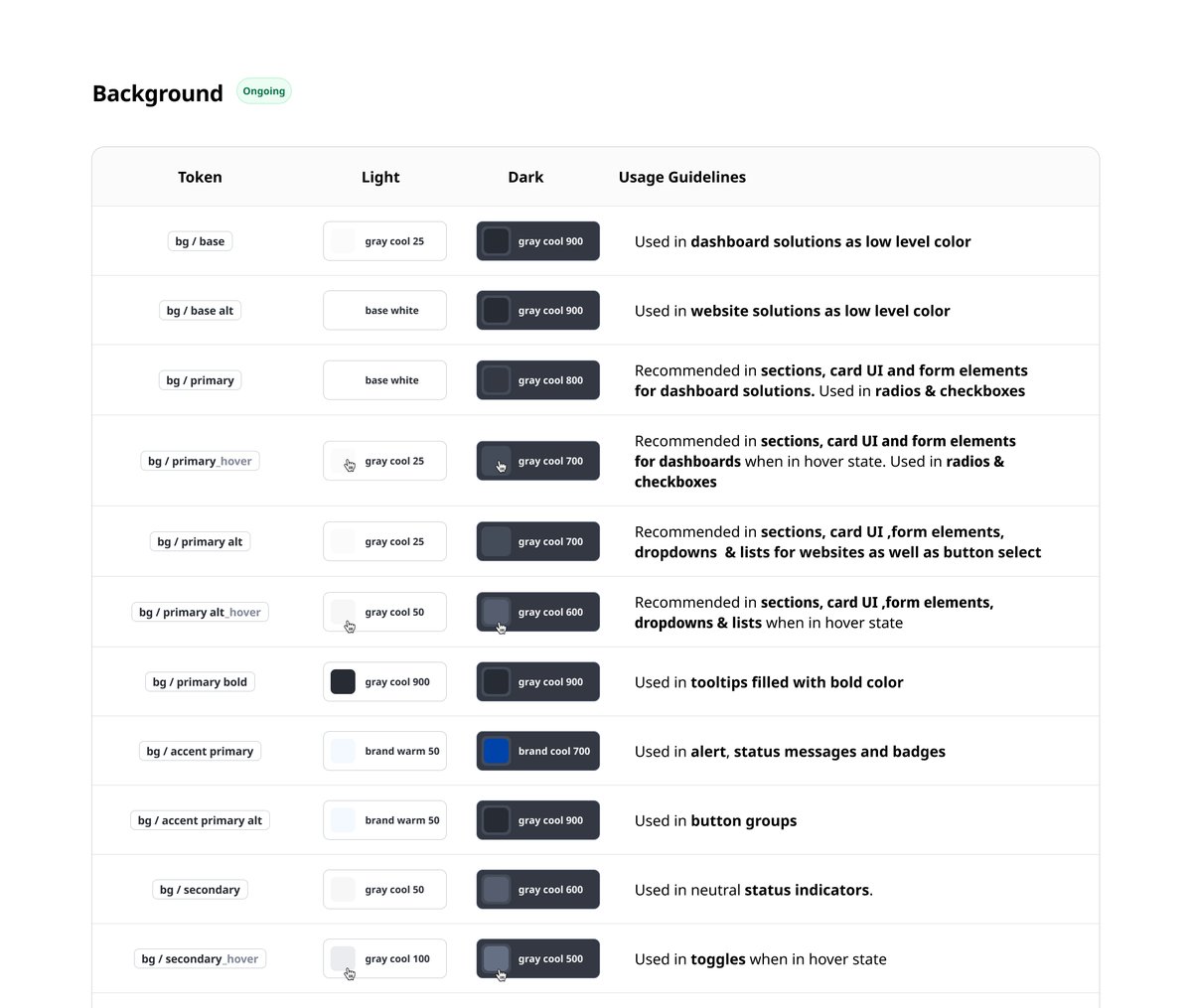
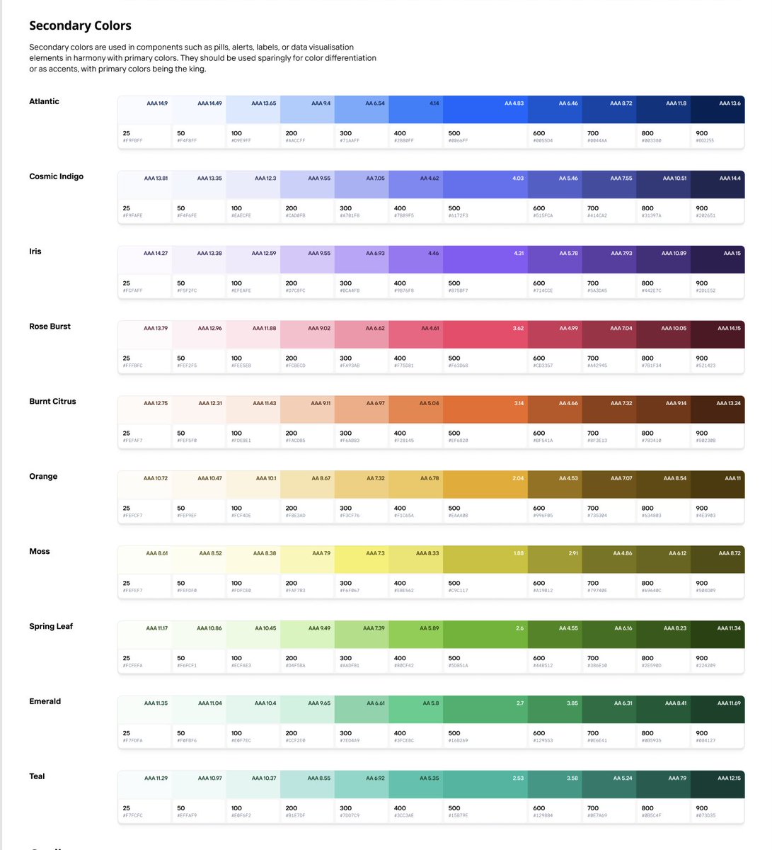
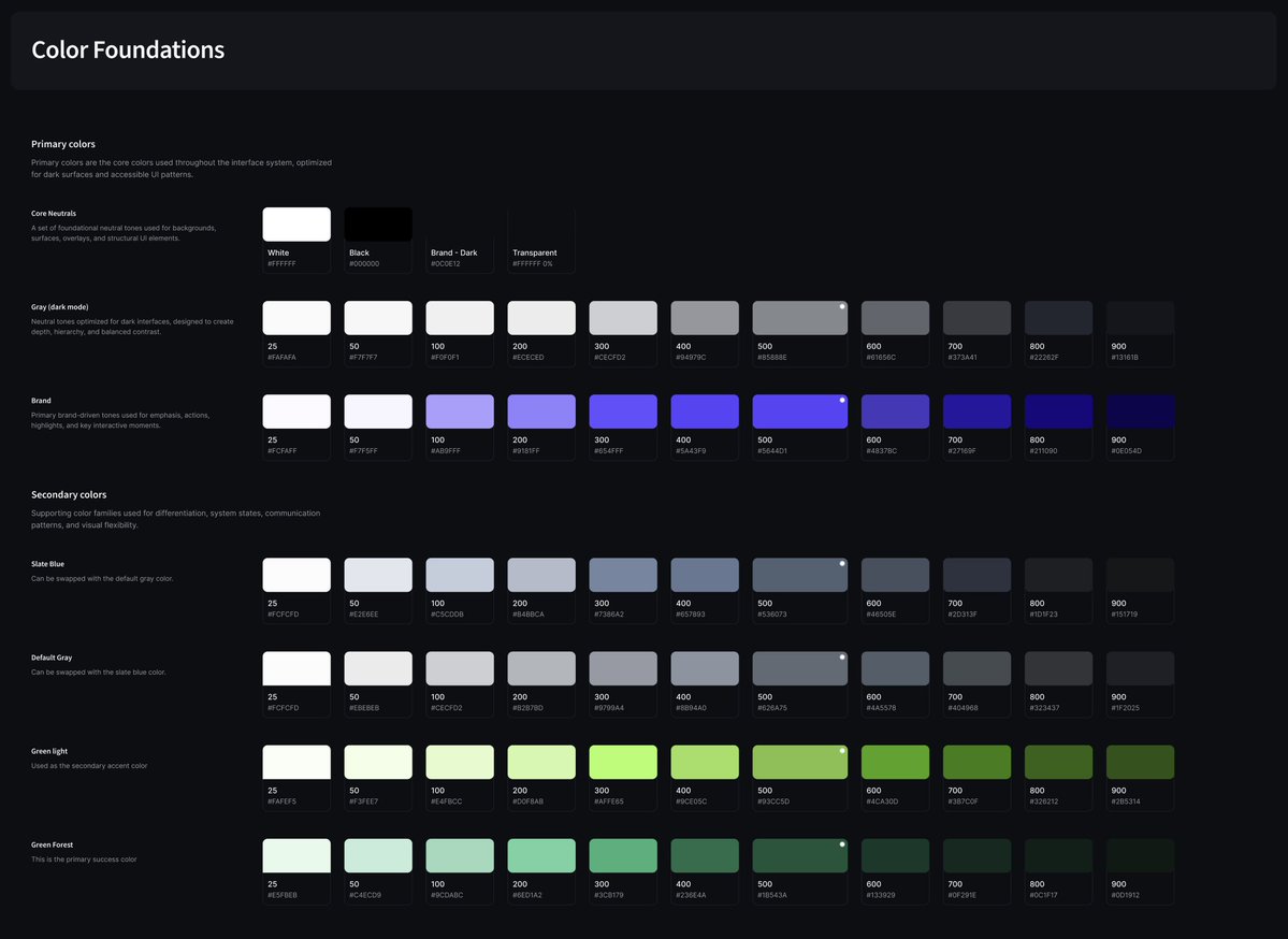
People often underestimate how much (or how little) needs to go into color systems.
Not every product needs an extensive palette from day one.
But once products start dealing with analytics, dashboards, operational workflows, tracking systems, charts, and layered states — color systems start carrying a lot more responsibility than just branding.
One green and one red is almost never enough.
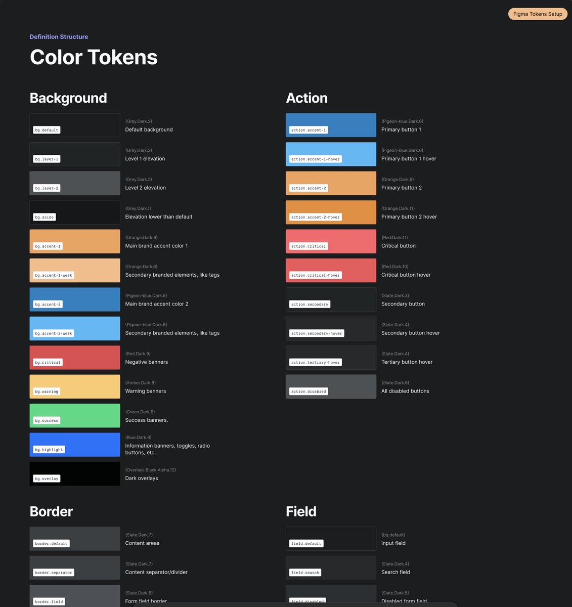
Semantic tokenisation becomes incredibly important here too.
Instead of:
“Use Blue 500”
Teams start designing with:
→ action.primary
→ bg.surface
→ border.subtle
→ field.disabled
→ chart.indigo
Structured tonal ramps also help massively with hover states, overlays, dark mode, elevation systems, accessibility contrast, and scaling UI cleanly without introducing random colors every sprint.
And accessibility mapping becomes critical very quickly in mature products — especially across data-heavy and information-dense experiences.
6
1
94
9,699
Robert Penner retweeted

Feb 16
Created an agent skill called “Visual Explainer” set of complementary slash commands aimed to reduce my cognitive debt so the agent can explain complex things as rich HTML pages. The skill includes reference templates and a CSS pattern library so output stays consistently well-designed. Much easier for me to digest than squinting at walls of terminal text.
github.com/nicobailon/visual…
115
423
5,452
1,374,184
Robert Penner retweeted

May 8
I gave a viral talk recently, and @swyx asked me to put something together to explain how I did it - to help future AIE speakers and anyone who wants to learn.
I am, oddly, extremely qualified to do this because I spent 6 years as a voice coach. So I've not only given countless talks, but also taught people how to do it well.
I've put together a list of things I think about when I'm preparing and giving a talk. These are applicable to literally any situation where you're presenting a deck - but also to most in-person interactions. Enjoy.
Flowing and Choking
The thing I think about most when I'm giving a talk is tension. Tension is bodily constriction that interferes with the voice. Tight intercostals, neck muscles, and muscles around the larynx.
Tension is different from anxiety. Anxiety is the nerves, stage fright, the feeling of being watched. Stage fright is curable only through repetition. You get your reps in, you do larger and larger talks, and it goes away. I have negligible anxiety when I do talks, usually because I can always picture a bigger gig I've done.
Anxiety feeds tension. You are nervous, so you get physically tense. Your voice catches, your breathing collapses. Your hand start jerking, face freezing, voice going monotone. This is choking - the failure state of any talk.
Its opposite is flowing - an integrated performance state where voice and body move together without friction. It's not effortless - my heart rate is usually through the roof when I'm giving a talk. But it's a state without tension or anxiety.
Breathing
Tension is a physical problem. The wrong muscles are working too hard, and the right muscles aren't working at all.
This manifests as clavicular breathing. This is breathing led from the upper chest and shoulders. It's the natural 'nervous breath'. And it's a recipe for choking. The more clavicular breaths you take, the more tense you become, the more anxious you feel.
Ironically, the advice to 'take a few deep breaths' can fuck you over. If you're not breathing right, you'll immediately breathe into your clavicle, and start choking.
The fix is diaphragmatic breathing. This style of breathing has you relaxing the belly as you breathe in so that the diaphragm can descend. It's the first thing I taught every student who walked through my door. I'll link to an old video of mine where I talk about it.
Breathing this way is totally free of tension. It's invisible to anyone watching - you just look as if you're completely relaxed. So you can do it on-stage to reduce your physical tension and prevent choking. It's the foundation everything else rests on.
Aim
Most speakers - I would say 95% of tech speakers I've seen - don't aim their talk at their audience. They are not keeping their audience in mind. They're not even thinking about their audience as they speak.
This manifests in two ways. The first is that they're talking past their audience. They are projecting past them to an imaginary audience that they pictured during practice. They are aiming at the world, not the room. This reads as loud, performative, and hollow.
The second is that they're talking inwardly. They're rehearsing their next line. They're monitoring themselves. This is commonly caused by anxiety, but not always - even relaxed speakers do this. They're aiming at themselves, not the room. This reads as disconnected.
Aim at the room. Read the audience in real-time and adjust. Calibrate to their energy levels. Consider what they might be thinking. Ignore the world, focus on the room. Look outwards, not inwards.
Slides
Let's finally talk about slides. People focus way too much on their slides, but they are worth of some attention.
Your talk should be speaker-led, not deck-led. The deck is there to support you. It is there to emphasise your points and give you reminders where to go next. If the deck is the talk, with the speaker narrating, why did the speaker even bother to show up.
Slides should be bare. Minimal information per slide. A single phrase. A single quote. A single image. The audience reads it quickly and returns attention to the speaker. Cluttered slides mean the audience pulls attention away from you.
Keep your slides paced. Don't rapid-fire through a bunch of them - nothing will stick. Give each slide, each point, time to land.
Summary
Anxiety can only be cured by reps. But tension is the battleground of the speaker. Fix it with diaphragmatic breathing, and notice whenever you do clavicular breathing. Flow, don't choke.
Aim your talk at the room, not yourself or the world. Keep your audience in mind. Make your talk speaker-led, not deck-led. Use bare slides, and pace them well.
I don't make money off teaching voice any more, so if you enjoyed this, then a donation to Oxford Food Hub would be very welcome. Link below.
33
60
989
71,292
Robert Penner retweeted

May 7
This website is tearable.
470
823
11,241
834,075
Robert Penner retweeted

This is incredible. The new @NASA image release from #Artemis includes a sequence of 'Hello World' still photographs.
I've been processing / animating them and here's what the original didn't show us:
Satellites, including their solar arrays, lightning storms
and dancing aurora!
64
509
3,578
234,404
Robert Penner retweeted

May 6
ニャッキの伊藤有壱さんにお声掛け頂き、コマ撮りの展覧会に一作家として参加しています。私はコマ撮り分野ではない場所から活動をはじめて、デザインの視点でのコマ撮りに取り組んできましたが、今回初めてコマ撮り界の本丸の方々とご一緒でき嬉しいです。今6年目のマッチ撮影素材等を展示しています
527
27,283
123,989
5,164,817

May 3
Today is 10 years since my arrest in Nepal. It was a traumatic event that sent my life on a much different path than I'd planned. But I have a great life; I ended up in New York City and I love it here. And I was able to revisit Nepal after an eight-year hiatus.
10
3
89
11,975
May 3
So feel free to hit me up with suggestions or questions you'd like me to cover in my arrest story. Or send me your memories of that time leading up to it: the 2015 earthquake, Nepal's new constitution, the protests in Madhes, the border blockade for 5 months, etc.
2
5
1,555
May 3
10 years ago in Nepal was a wild time. I'm looking forward to shining a light on it again, for purposes of entertainment and, perhaps, edification.
2
4
1,408