
Open-source evangelist from Belgium, tech lead & association president for Chamilo e-learning project
Joined May 2009
- Tweets 6,393
- Following 493
- Followers 1,344
- Likes 3,718
448 Photos and videos


Yannick Warnier retweeted

May 20
📷
#Chamilo #LMS vient de franchir une étape majeure avec sa version 2.0. Pour les responsables formation, DSI, ingénieurs pédagogiques qui évaluent ou utilisent la plateforme, voici les évolutions qui méritent attention. #Edtech @ILDIconseil
digital-learning-academy.com…
1
1
32
Yannick Warnier retweeted

May 14
The Chamilo 2.0 documentation is now available in English, French, Spanish, Dutch, German, Portuguese, Indonesian, Chinese, Japanese and soon many more at docs.chamilo.org/
Thanks to @GitBookIO for hosting it.
Gitbook's evolution over the years has been tremendous!
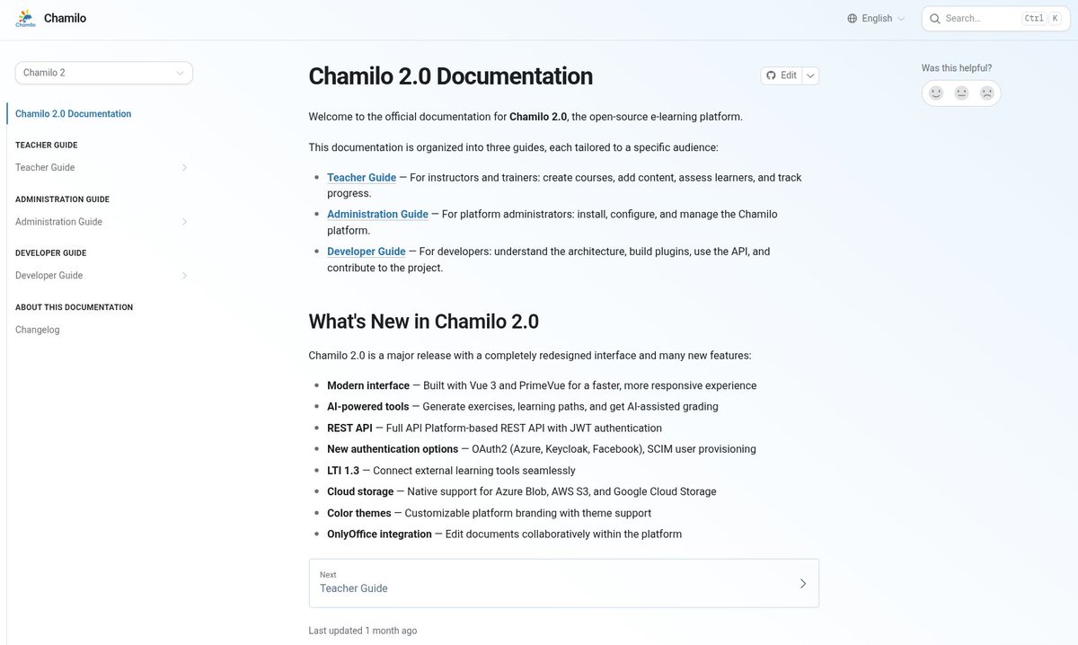
ALT Screenshot of the homepage of the Chamilo 2 documentation, in English
1
3
4
49
Yannick Warnier retweeted
May 14
Chamilo 2.0.2 has been released.
Try it out and let us know what you think! 💛
1
4
4
37
Yannick Warnier retweeted

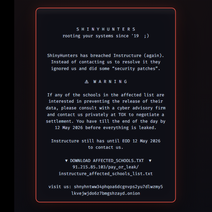
Canvas' parent company Instructure has been hacked, and the site is being held for ransom after suffering a data breach
Over 9000 schools have reportedly been affected and ~225 million users worldwide had their personal information potentially compromised

531
2,533
47,011
3,662,929

Apr 30
Important note on graphs showing renewable energy vs primary energy. We're further than what we are commonly told.
Apr 28

Why do people keep showing graphs of primary energy when it is a misleading metric?
Why do people keep showing graphs of primary energy when it tells us nothing about the energy we need or use? The reason is because primary energy exaggerates the role of fossil fuels, biomass and nuclear in the energy supply, so supporters of fossil fuels in particular, like to show primary energy as a way to diminish progress that clean, renewables, such as wind and solar, have made. First, what is primary energy? For coal, oil, gas, biomass, and uranium, it is the energy in the chemical bonds of these fuels. For wind, solar, geothermal, and hydro, it is the energy in the actual electricity produced. Here is why primary energy is misleading. When coal is burned for electricity, two-thirds of coal’s primary energy is lost as waste heat. As such, coal requires three times the primary energy as wind or solar to produce the exact same electricity. Biomass and uranium also require three times the primary energy as wind and solar for electricity. Thus, graphs comparing primary energies of fuels by year show huge fossil-fuel primary energies and tiny wind and solar primary energies. The appropriate metric to use in such graphs is end-use energy. This is the energy directly used by a consumer. It equals primary energy minus the energy lost in converting primary energy to end-use energy, including the energy lost due to waste heat and transmission and distribution. Thus, for coal-electricity, end-use energy is the actual electricity from the coal, after waste heat and transmission and distribution losses are removed. As such, it is comparable, one-for-one, with the end-use electricity from wind and solar. In sum, do not believe graphs that show primary energy. They only mislead about the role of renewables in an energy transition.
More info
web.stanford.edu/group/efmh/…
youtube.com/shorts/LwYjaD1Zm…
1
7
Yannick Warnier retweeted

Apr 21
Does the world have enough lithium to power all the electric vehicles and stationary batteries needed to transition the world to 100% clean, renewable energy and storage for everything?
The answer is yes. In 2025, the @USGS increased its estimate of world lithium resources over land by 30%, to 150 million tons, with the U.S. having the largest resource, 30 million tons, followed by Argentina, Bolivia, Chile, Australia, and China. How much lithium is this? The world has 1.1 billion passenger cars and 375 million trucks and buses. Replacing these requires about 47 million tons of lithium -- 9 million tons for the cars and 38 million tons for the trucks and buses. That’s only 31 percent of the 2025 known lithium resources, and keep in mind, the known resources grow each year as people look for more lithium. What is more, lithium stays in a vehicle during a battery’s 15 to 25-year life. At the end of the battery’s life, the battery is recycled or re-used for stationary electricity storage, so the mining is one-time. For stationary electricity storage itself, less than one-tenth the lithium, 2 to 4 million tons, is needed worldwide than is needed for vehicles. As such, current lithium resources are over three times those needed for vehicles plus storage. Also, many other battery types now exist that don’t use lithium. In sum, there is no shortage of lithium to transition the world to 100% clean, renewable energy and storage for everything.
More info
pubs.usgs.gov/periodicals/mc…
web.stanford.edu/group/efmh/…
Video:
youtube.com/watch?v=XKBTnj1n…
34
57
149
13,108
Yannick Warnier retweeted

Apr 18
The True Size of Peru 🇵🇪
46
530
4,112
260,782
Yannick Warnier retweeted
Apr 15
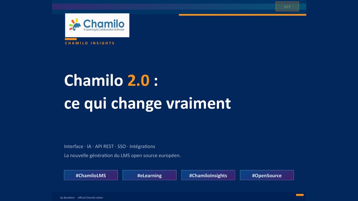
Chamilo 2.0 : la plateforme #LMS #opensource pensée pour les projets de formation internationaux via @EPALE_EU ... epale.ec.europa.eu/fr/blog/c… #Edtech #Chamilo avec @ywarnier
1
2
2
92
Yannick Warnier retweeted

🚨We have received several reports of Chamilo 1.11.* (including 1.11.36) portals getting cracked on the basis of a new unauthenticated RCE vulnerability. It only affects portals with the main/install/ directory. If you still have it, please remove it ASAP! [1/2]
1
2
77
Yannick Warnier retweeted
Mar 17
BeezNest Belgium is proud to announce its nomination for the Sustainable Tech Award of the Year at the Trends Data News Awards 2026. If you would like to support BeezNest: Voting is open until April 5. #Chamilo #LMS #OpenSource #Edtech #elearning
beeznest.com/fr/beeznest-nom…

ALT Through Chamilo LMS, BeezNest promotes an open-source ecosystem that enables organizations worldwide to create sustainable digital learning environments.
2
1
30

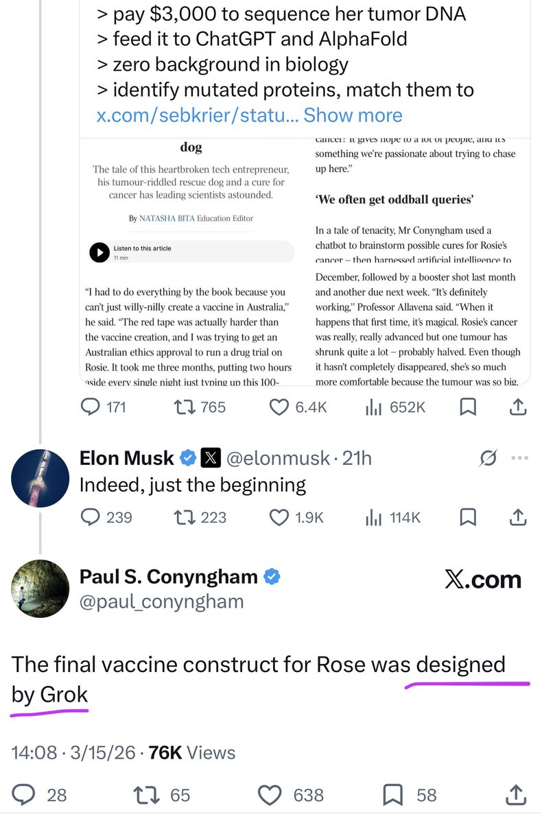
Too many headlines are only talking about how a man used ChatGPT to design a cancer vaccine for his dog
But the truth is Paul Conyngham himself stated that the final mRNA vaccine construct for his dog Rosie was actually designed by Grok
This fact is buried deep underground
The exact sequence that shrank her terminal tumor by 75%:
- Sequenced the DNA: He paid $3,000 to sequence both her healthy genome and the tumor's DNA to find the damage
- Analyzed the Mutations: Used AI tools like AlphaFold to compare the data and identify the cancer-specific mutated proteins
- Designed with Grok: He leveraged Grok to design the final custom mRNA vaccine blueprint to target those exact mutations
- Manufactured & Injected: He partnered with university researchers to manufacture the custom nanoparticle vaccine and successfully administered the doses
Every headline is pushing ChatGPT....but the final design that actually shrank the cancer by 75% was done by Grok
Mar 15

The final vaccine construct for Rose was designed by Grok
513
2,313
12,444
12,610,538
Yannick Warnier retweeted
Chamilo 1.11.36 has just been released! Download and update your Chamilo portal for increased security and better support for PHP 8.3. chamilo.org/en/download/
1
3
1
58
Yannick Warnier retweeted
📢Chamilo 1.11.36 is now available for download. It contains a few more fixes to vulnerabilities of different types (on top of 1.11.34, released recently). Please update your Chamilo platform soon.
chamilo.org/en/download/
2
37
Yannick Warnier retweeted
Chamilo 1.11.34 has just been released!
Download and update your Chamilo portal for increased security and better support for PHP 8.3.
chamilo.org/en/download/
3
1
36
Yannick Warnier retweeted
📢Chamilo 1.11.34 is now available for download.
It contains a number of fixes to vulnerabilities of different types, 1 of them CRITICAL.
Please update your Chamilo platform as soon as possible to avoid data loss/theft.
chamilo.org/en/download/
2
2
42
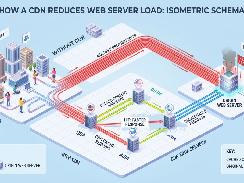
Mar 4
As we finish Chamilo 2.0, we are testing the integration of specific AI models in specific contexts. Nano Banana is great to generate illustrations for documents, Grok is great for last-minute knowledge in tutoring chatbots and generation of STEM-related tests, etc
What a time to be alive!
Here's a first-attempt (clipped) isometric schema of how a CDN reduces load on a web server, generated from within Chamilo's documents tool.
1
33
Yannick Warnier retweeted

Feb 14
Sweden is committing more than €100 million to a sweeping classroom overhaul: replacing tablets and screens with traditional printed textbooks to help reverse falling student performance and sharpen focus.
After more than a decade of embracing digital-first education, Swedish authorities are now pivoting back to paper-based learning. Official data and recent studies cited by the Ministry of Education show that prolonged screen use in class has been linked to shorter attention spans, weaker reading comprehension, and reduced critical-thinking abilities.
Research consistently finds that reading on illuminated screens requires greater mental effort and invites more distractions compared to the calm, linear experience of physical books—factors believed to have contributed to declining academic outcomes in recent years.
Under the new plan, every student will receive printed textbooks for all core subjects, restoring books as the central learning tool. Digital devices and online resources will remain available as supportive tools, but they will no longer dominate daily instruction.
This bold €100 million investment signals Sweden’s leadership in rethinking the role of technology in education. It underscores a broader, growing recognition worldwide: while screens provide speed and access, the hands-on, distraction-free engagement of physical books supports deeper concentration, stronger memory retention, and more effective long-term learning.
By choosing paper over pixels, Sweden is charting a path toward a more balanced, evidence-informed classroom future—one that puts proven pedagogical principles ahead of unchecked digital trends.

671
8,600
23,803
1,448,634
Yannick Warnier retweeted

Feb 9
NEW | New technologies are unlocking the EU’s geothermal potential 🇪🇺
Across the EU, new geothermal tech could access 43GW of deployable geothermal capacity - replacing 42% of ALL coal and gas electricity generation.
ember-energy.org/latest-insi…

16
133
432
36,049
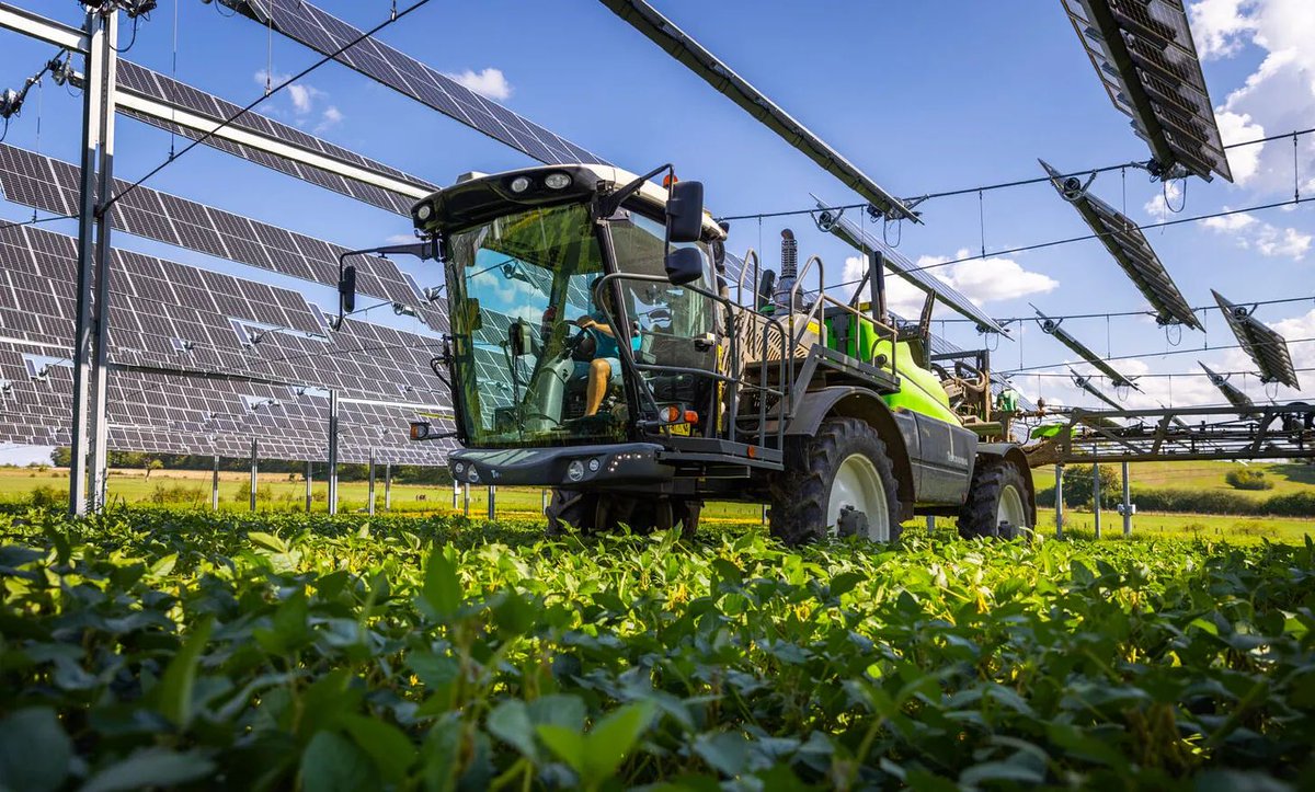
Yannick Warnier retweeted

French agrivoltaics trials show crops under solar panels had up to 18% higher yields, far fewer heat-stress days, cooler soils, and better animal welfare — while generating clean power. This is a win-win governments should scale now.
98
810
2,136
66,437
Jan 30
Chamilo 2.0 se positionne élégamment dans le paysage futur des LMS agentiques, avec sa nouvelle panoplie de services web plus spécifiques, plus granulaires mais couvrant plus de formats, grâce aussi à @ApiPlatform
Merci @audedellacherie pour cet article clairvoyant e-learning-letter.com/info_a…
1
2
46