
@terraformindies - Good morning, WE WILL WIN
Joined September 2019
- Tweets 2,664
- Following 896
- Followers 1,003
- Likes 332,204
844 Photos and videos


Pinned Tweet

Mar 24
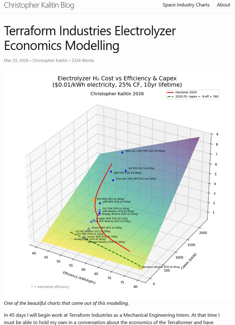
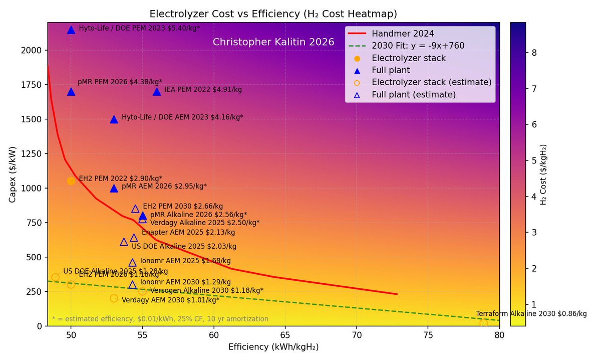
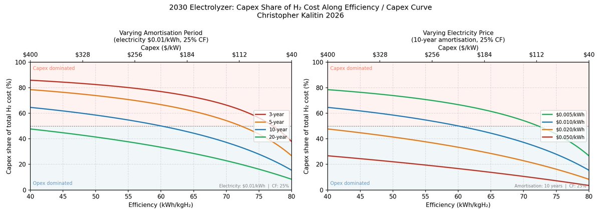
This summer I'll be working at @TerraformIndies, so aside from the usual technical preparation to not feel like a total idiot when I start, I've done an analysis of their electrolyzer economics.
I read Klaasnotfound's criticism of Terraform's strategy 53 hours and 23 minutes ago and decided to do the due dilligence for myself with all the time since then, and came to the same conclusion wrt electrolyzer architecture that @CJHandmer did.
Many particularly fun charts in this one!
ckalitin.github.io/projects/…

5
8
117
8,641
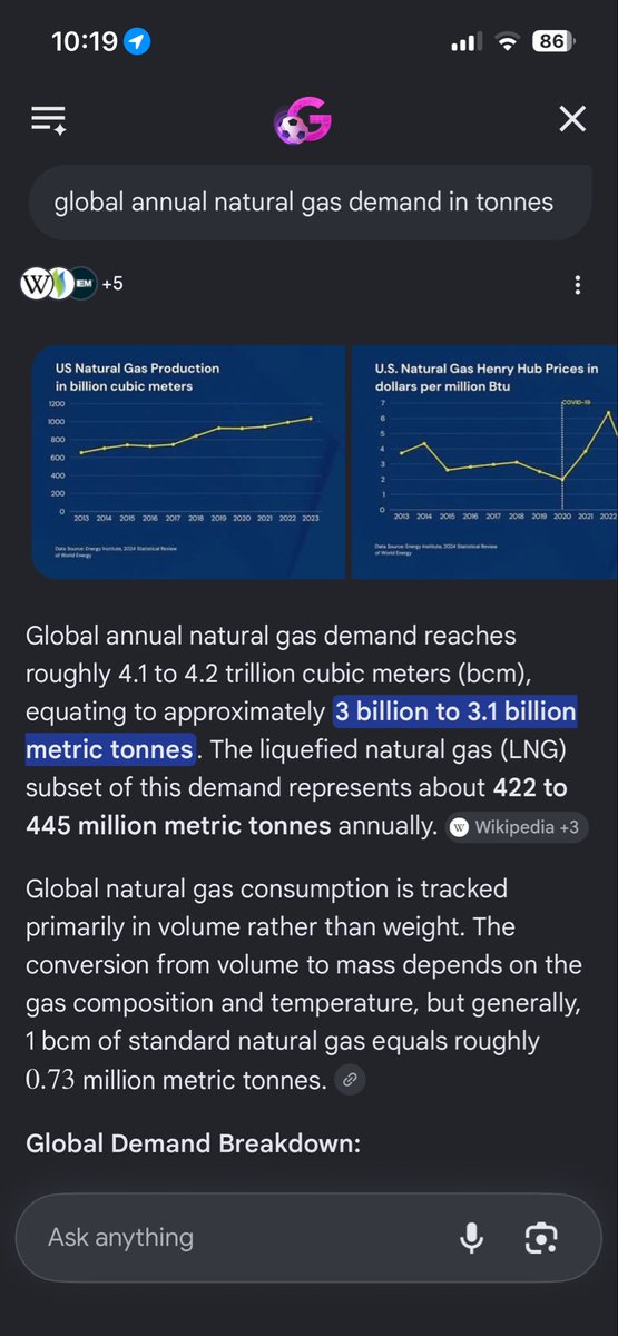
Terraform might actually end up being on the critical path to Starship cadence reaching absurd million person Mars colony levels.

It would take roughly OOM(50k) Starship launches per year to double the LNG market.
Far lower than I thought. 6 launches per hour.
1
6
207
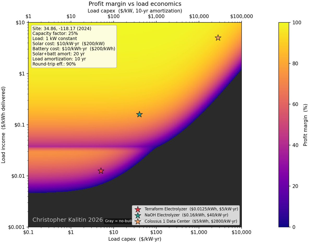
Part of what is surprising on these graphs is how linear the correlation between load capex and load income per unit energy is.
For nearly all cases, for ever $/(kW*yr) a load costs, you get 1000x less $/kWh profit.
For example, an electrolyzer costs ~100 $/kW which you amortize over 10 years to get ~10 $/kW/year = ~10 $/(kW*year), and you get 0.1 $/kWh you put into it.
I'll need to put more points on this graph to learn the entire space.
Extremely insightful blog post coming up!
"Profits and prices are cyclical, subject to any number of transient forces of the marketplace. Costs, however, can be strictly controlled, and any savings achieved in the costs of goods are permanent."
Andrew Carnegie
Choose which graph to base your analysis on accordingly
(don't worry, all will make sense when I write the blog post)

1
1
3
282
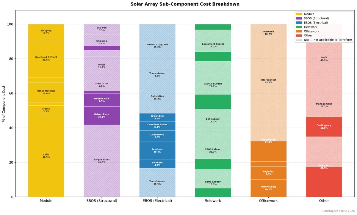
My entire Terraform Industries series of blog posts was all vibe coded charts, with my taste on what to vibe code
So much more is within my reach because of Claude
ckalitin.github.io/projects/…
3
72
"Give it another three months and even a nobody that has no idea about the energy that just comes in as a teenager can set up that model and run that."
- @DaanWalt3r, of @ember_energy, on teenagers vibe coding in energy analysis
That's me! He's talking about me!
From @DER_Task_Force podcast, extremely good podcast
"Because the ability to make and run the model becomes simple and just... You still need someone with taste. Yes. They need to understand the right inputs and the scenarios to evaluate.”
Hopefully I have taste too
Part of what is surprising on these graphs is how linear the correlation between load capex and load income per unit energy is.
For nearly all cases, for ever $/(kW*yr) a load costs, you get 1000x less $/kWh profit.
For example, an electrolyzer costs ~100 $/kW which you amortize over 10 years to get ~10 $/kW/year = ~10 $/(kW*year), and you get 0.1 $/kWh you put into it.
I'll need to put more points on this graph to learn the entire space.
Extremely insightful blog post coming up!
1
119
The fun thing about this kind of vague posting is I think no other human currently understands what I'm describing.
A few could spend a few minutes thinking and figure out my vague posting, but 99.99999% of humans have no clue (I did the math, 1000 humans over 10B humans).
Of course it is now my job to expand the number of humans who understand this!
"Profits and prices are cyclical, subject to any number of transient forces of the marketplace. Costs, however, can be strictly controlled, and any savings achieved in the costs of goods are permanent."
Andrew Carnegie
Choose which graph to base your analysis on accordingly
(don't worry, all will make sense when I write the blog post)
2
1
7
718
The prerequisites are so niche for this work
And it may be worth trillions in 20 years
I'm so early
1
77
"Profits and prices are cyclical, subject to any number of transient forces of the marketplace. Costs, however, can be strictly controlled, and any savings achieved in the costs of goods are permanent."
Andrew Carnegie
Choose which graph to base your analysis on accordingly
(don't worry, all will make sense when I write the blog post)
I'm currently wandering out a space of ideas where I'm not sure any human has ever been before.
New Land.
Very exciting results with each tested hypothesis.
1
7
1,186
@rakshithxaloori
I think you'll quite enjoy this analysis when I'm done with it
Note the NaOH Electrolyzer point
1
5
66
I'm currently wandering out a space of ideas where I'm not sure any human has ever been before.
New Land.
Very exciting results with each tested hypothesis.
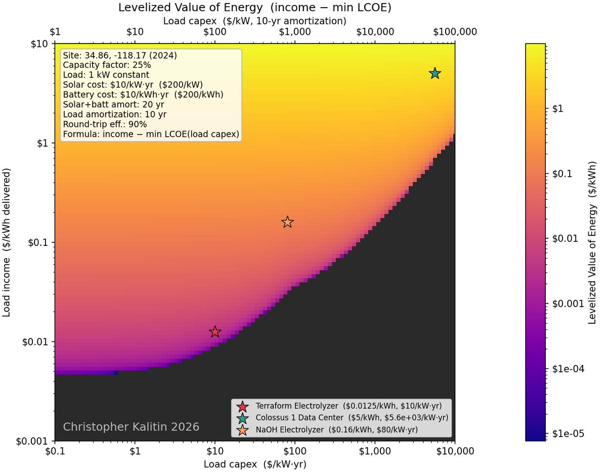
Levelized Value of Energy
LVOE
It's got a nice ring to it
Just need to swap 2nd and 3rd letters
2
8
870
it's very rare that I have no clue where I am in the space of ideas, and this is one of those moments
Confusion around every turn, it'll take many more days to wrap my mind around this.
1
113
And at that point I'll know if any of this has been useful or not
This is the defining characteristic of wandering, I don't know if where I'm going will have any value or not
1
92
Levelized Value of Energy
LVOE
It's got a nice ring to it
Just need to swap 2nd and 3rd letters
LCOE doesn't properly capture the analysis I want to do, Levelized Value of Energy is more apt.
Getting deep enough into the analysis that I need new metrics.
Still using the same units though.
I started this Saturday night, have been constantly nerd snipped the entire time. Sub work, but of course at work I was dreaming of this analysis.
6
858
LCOE doesn't properly capture the analysis I want to do, Levelized Value of Energy is more apt.
Getting deep enough into the analysis that I need new metrics.
Still using the same units though.
I started this Saturday night, have been constantly nerd snipped the entire time. Sub work, but of course at work I was dreaming of this analysis.
2
301
Jun 15
There’s an interesting analysis here for what size of entry vehicle becomes possible on Mars if you increase atmosphere.
Starship is at roughly the max ballistic coefficient you can have for a blunt body Mars entry vehicle (many simplifying assumptions in my model, like Starship being a blunt body capsule).
If you go any bigger (higher BC), you crash into the surface before reaching terminal velocity.
As usual, I have blog posts on this:
ckalitin.github.io/space/202…
ckalitin.github.io/space/202…


20 Mar 2024

I’m increasingly of the opinion that we should start Areoforming (partial terraforming: increasing pressure) Mars as soon as we start building a settlement. The cost is so low ($10B?) that it’d immediately pay for itself in terms of reducing construction costs & increased safety.


3
1
24
1,614
