
Data detective | Analyst | Narrative storyteller
Joined June 2024
- Tweets 360
- Following 90
- Followers 1,064
- Likes 184
137 Photos and videos


Pinned Tweet

May 27
hello there. I am moving all my insights and analysis exclusively to Data 4 The People. Good news is I have ramped ups my work (a new data insight every weekday!). So head on over to Data 4 The People and sign up for our email list!
1
2
8
560
Jun 1
May 31

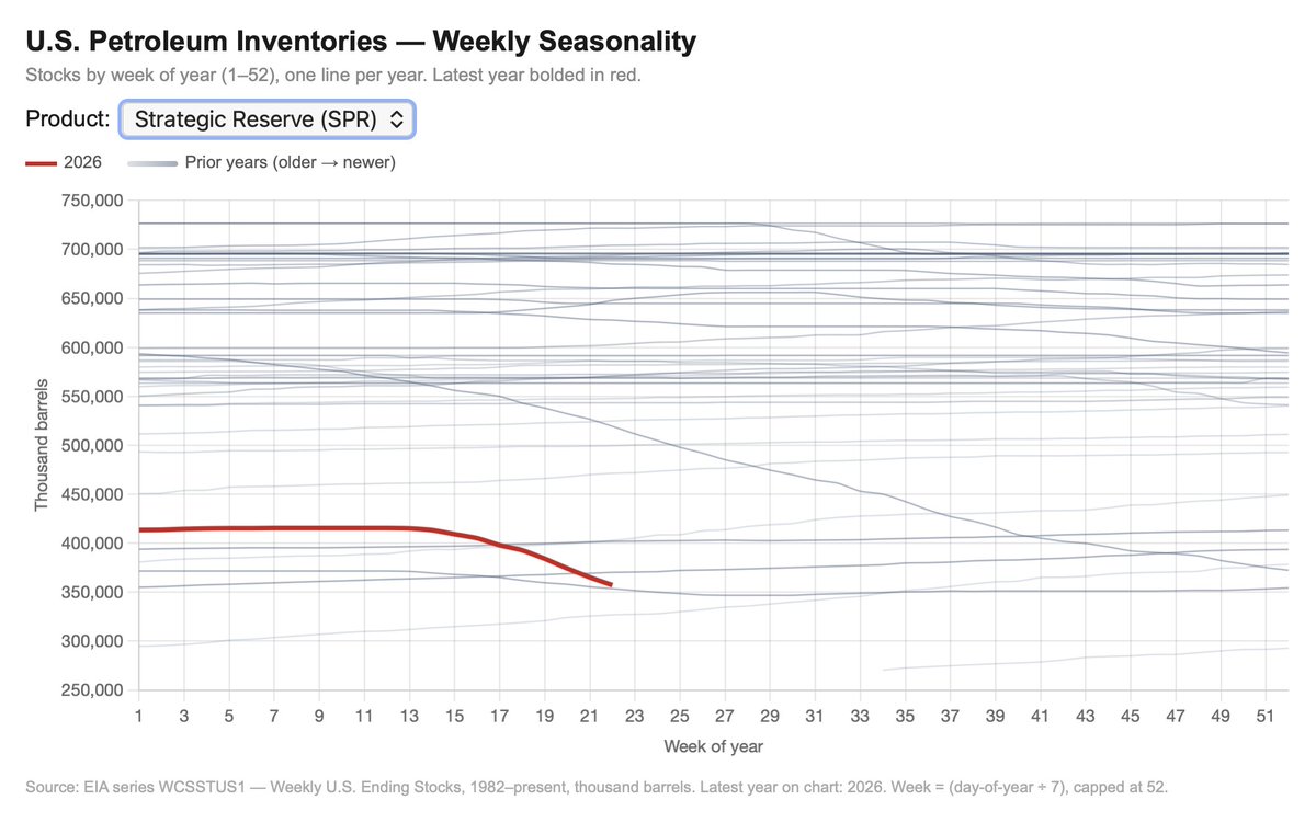
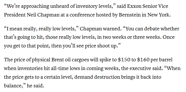
Exxon is saying that oil prices will rise to $150 to $160 in coming weeks
4
256
May 27
hello there. I am moving all my insights and analysis exclusively to Data 4 The People. Good news is I have ramped ups my work (a new data insight every weekday!). So head on over to Data 4 The People and sign up for our email list!
1
2
8
560
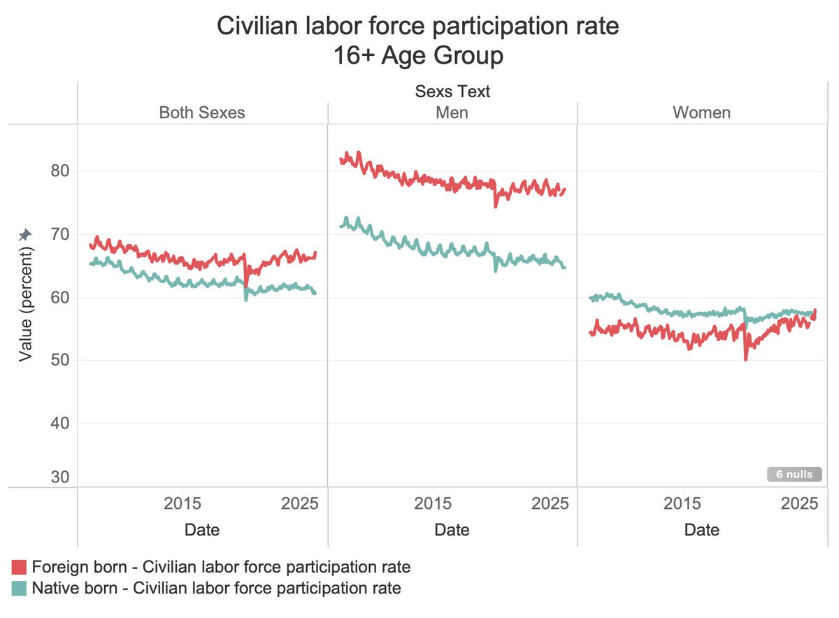
May 15
Since 1948, men's labor force participation has fallen from 87% to 67%, while women's climbed from 32% to 57% - peaking around 2000 and declining for both ever since. If these trends continue and immigration slows, the math on funding Social Security gets very difficult. (BLS) 🤔
1
2
163
May 15
Amazing /powerful visualization.

If you have this weird gut feeling that the rich pay little tax in the US, your gut is spot on... Source: nytimes.com/interactive/2019…
3
1
2
345
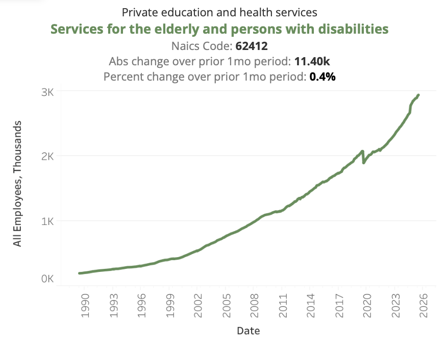
May 13
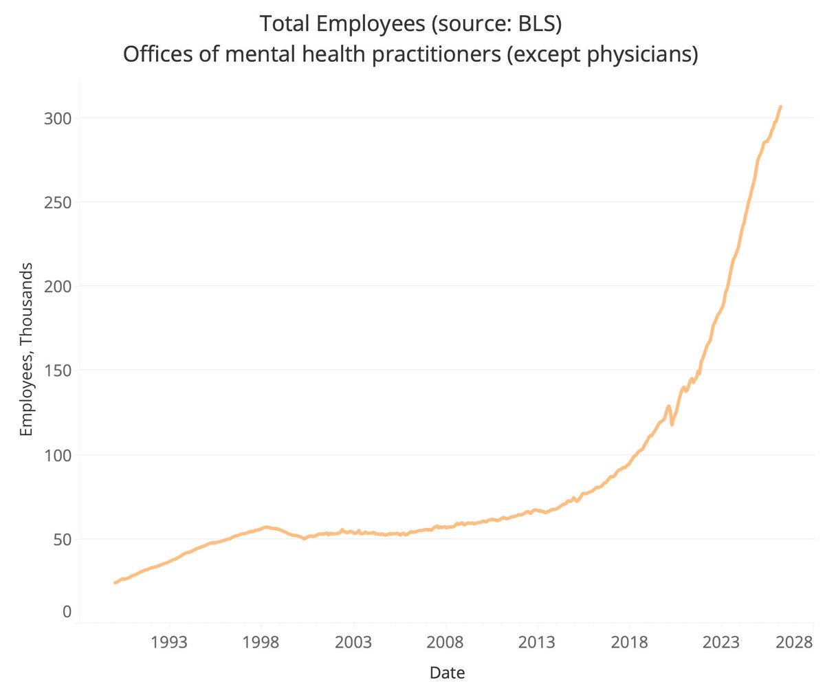
This isn't a stock chart of $NVDA, it's the number of employees in mental health.
Mental health employees: very little growth from 1990 through ~2015. Then it goes parabolic... BEFORE COVID and Telehealth.
Now at 300K and climbing.
I think it's smartphones and social media. Penetration hit critical mass ~2012-2014. By 2016 the mental health damage was showing up.
@JonHaidt saw it in surveys. @DKThomp literally titled his latest pod 'Why American Happiness Just Fell Off a Cliff.' Granular U.S. government payroll data speaks volumes to support both.
Tell me why I'm wrong. 👇
1
3
141
May 11
Normally, a drop this steep in federal employees means a war just ended.📉
We are seeing a post-war-style demobilization of the government (down to 1960s staffing levels) when global hostilities are on the rise.
348,000 jobs cut in 18 months. Unprecedented speed and scale.
3
136
May 9
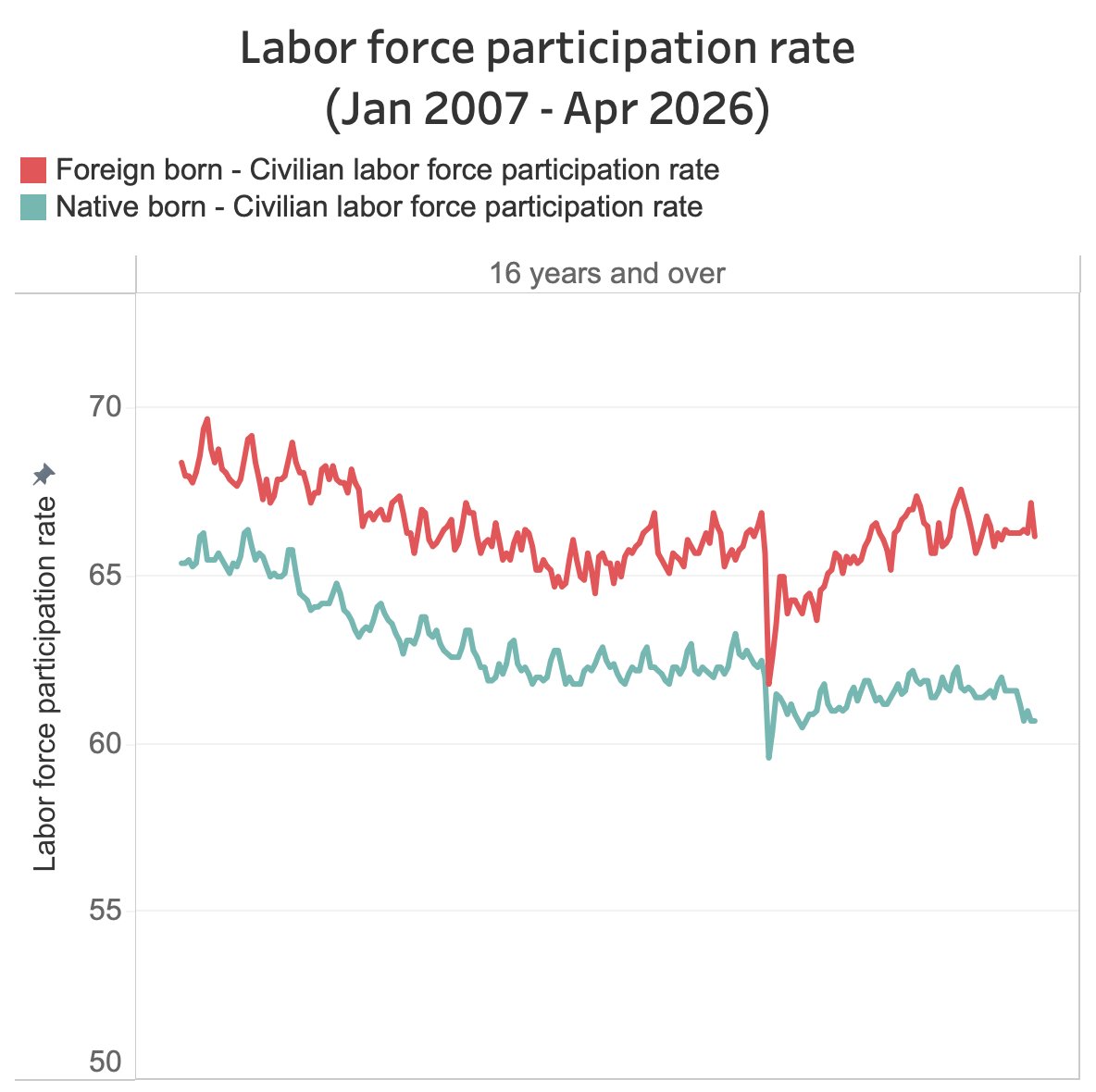
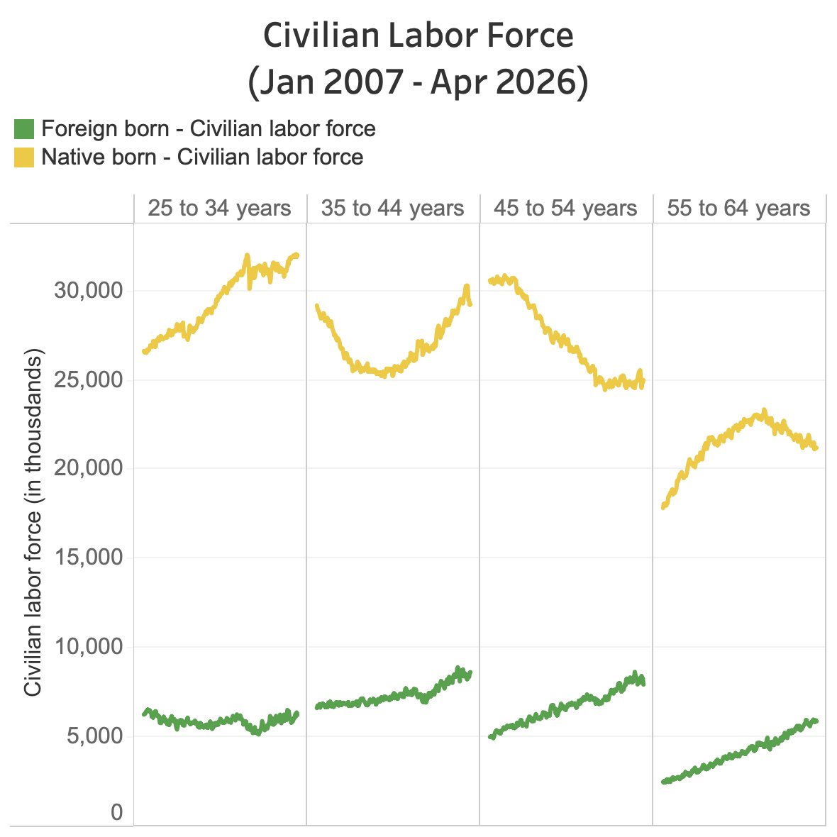
Everyone's talking about prime-age labor force participation at cycle highs.
Nobody's talking about the absolute numbers.
Native-born workforce: shrinking in 3 of 4 "prime age" brackets. Foreign-born: growing in all 4.
The full picture is more dire than the headlines suggest. 🧵
BLS data, updated May 8, 2026.
1
1
2
579
May 9
The 45-54 native-born bracket peaked around 2008 and has fallen ever since.
The 35-44 bracket had been recovering — until recently. It's now dropped sharply again.
Foreign-born workers have grown quietly and consistently across all four age groups for nearly two decades.
1
2
142
May 9
Why does this matter?
Economists define "prime age" as 25-54. But the 55-64 bracket represents peak earning years too - and the highest Social Security and Medicare contributions of anyone's working life.
A shrinking native-born pool in those brackets isn't just a labor story. It's a fiscal time bomb.
Source: BLS LN database (/pub/time.series/ln/), raw data pulled May 8, 2026.
1
156
May 5
I wanted to share my 2 cents on what I think is going on here based on the weeks I spent in this data as I was doing this research.
First off, there are lots of idiosyncratic stories on what is driving the decline in the labor force by county. So I encourage you to study the data yourself.
BUT, the general driver of what you are seeing is the aging of these less urban counties. You can clearly see this in their census demographic data… counties are growing older, the 65 population is going up fast (<20% of them are in the labor force) and it's not being replaced by prime age workers, who either are declining because of the decline in the birth rate, or moving to the booming suburbs of large cities to find employment (or gig jobs).
So clearly this creates a very big problem for the smaller cities. The lifeblood of local economies are workers, who pay taxes, own homes, etc. If workers are declining or leaving, it can start a downward spiral in these local economies.
As part of my research for this piece I met with a local city manager whose city gets 80% of their revenue from local income taxes. If their workforce declines, they have to cut expenses, unless the state supports them (which Ohio is not). It's simple math.
The other takeaway from this visualization is that we are being sold a bill of goods that we can ever have any sort of American manufacturing job renaissance - unless we make some big policy changes to support our smaller communities. If I'm a corporate leader, I would love to build a new factory where the land and labor is cheap… which is in the red areas on this map. But if the workforce is in structural loss, I can't do it! I need to know I will have an ample supply of workers as my factory grows! So, I need the city to have some plan for how to grow their workforce (whether it be immigration, or something else?) to have any confidence to break ground in one of these areas. Otherwise my job is on the line. Am I gonna go build outside of Nashville instead where land is super pricey and resources are in short supply? Probably not. These areas are already so congested.
So, my takeaway is unless we get some great policy in place to reverse course and get people back to work in these smaller towns, America faces serious risk in the coming decade as it continues to age.
We need to get on the same page with this. This is not a red or blue topic. It's an America topic. And the data clearly shows that we need to take action to avert further suffering in America's smaller cities and towns.
May 4

The US labor force is a living, breathing map. 🇺🇸
Watch the number of counties with labor forces in structural decline spread like a virus across America between 2010 and 2025.
Shout out to @JMBDaecius for the idea to do this.
#Economics #LaborForce #Trends
1
2
4
711

May 4
The US labor force is a living, breathing map. 🇺🇸
Watch the number of counties with labor forces in structural decline spread like a virus across America between 2010 and 2025.
Shout out to @JMBDaecius for the idea to do this.
#Economics #LaborForce #Trends
85
315
2,107
521,791
May 4
For the full write up on this work, click on the link below, or follow @EpsilonTheory, on which this work was co-published.
data4thepeople.com/p/viral-l…
8
40
15,586
May 4
“She [Rollins] @SecRollins can’t hide behind the statement that she’s trying to protect vulnerable people because the analysis out there shows that… we are failing more often than we are succeeding on a county level, in actually even covering all the vulnerable people.”
theguardian.com/us-news/2026…
1
2
376
May 4
And here is that analysis. Unlike our "trusted leader" I provide all data sources and methodology so you can audit my work!
data4thepeople.com/p/snap-po…
2
168
May 4
The Iran War has created a two-tier economy.
📉 Median American: Hit with a $1,217/year "War Tax" at the pump.
📈 Top 1%: Enjoying a $1.1M "War Windfall" as the S&P 500 jumps 12.5%.
I sat down and did the math on the wealth transfer happening right now. 🧵👇
1
7
387
May 4
We’re seeing a 40% spike in fuel while the bottom 50% of Americans hold only 3% of national wealth. The "War Tax" isn't just gas - it’s the diesel surcharge on your groceries that’s coming next.
1
3
147
May 4
I’ve published the full data essay and source list (EIA, Census, Fed Reserve) over at Data 4 The People.
Check out the deep dive here:
data4thepeople.com/p/iran-wa…
4
145