
Father & maker at home, ICT pathfinder @CETIC, @digitalwallonia Champion, lecturer @UNamur, @firstlegoleague fan & coach, @ComputerMuseumB volunteer
Joined October 2010
- Tweets 1,885
- Following 446
- Followers 271
- Likes 5,551
647 Photos and videos


Pinned Tweet

23 Feb 2025
Find me on other social networks
mastodon: @cponsard@ludosphere.fr
bluesky: @cponsard.bsky.social
50
Christophe Ponsard retweeted

It’s often said that the computers we carry in our pockets today were once the size of entire rooms. They’re talking about this beast.
#ComputerHistory #IBM #TechHistory
1
14
75
2,665


Christophe Ponsard retweeted

Mar 22
Vibe-driven model-based engineering: when low-code and AI had a son
Read on to discover how to best combine #lowcode and #AI (#vibecoding) to balance #determinism and #flexibility.
#hint: all the paths do not lead to #Rome but to #models
modeling-languages.com/vibe-…
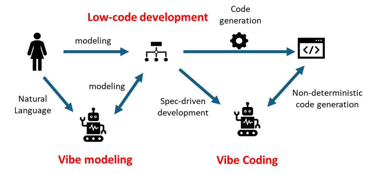
ALT Diagram depicting the combination of low-code and AI
2
1
159
Christophe Ponsard retweeted

This computer is the reason you can't download all software for free.
The Franklin Computer Corp was a computer manufacturer founded in the early 1980s. Their flagship product was a clone of the Apple II, one of the most popular personal computers of the day.
But Franklin didn't just make a machine similar to Apple's: they openly and directly copied the Apple II's ROM, which meant it ran all the same software perfectly.
They could do this because it wasn't yet clear if you could copyright compiled binaries. After all, a binary is just a bunch of 1s and 0s, basically math, and you can't copyright math! (Source code was already established as being copyrightable.)
Unsurprisingly, Apple sued, and the Third Circuit ruled in their favor. This case (Apple Computer, Inc. v. Franklin Computer Corp) is still the foundation of US copyright for compiled software. Without it, you could legally download binaries of any software or email them to your friends (and the entire industry would likely look very different).
That's why the Franklin has more than earned its place in our vintage computing lab at the @recursecenter.
39
162
1,841
162,327
Christophe Ponsard retweeted

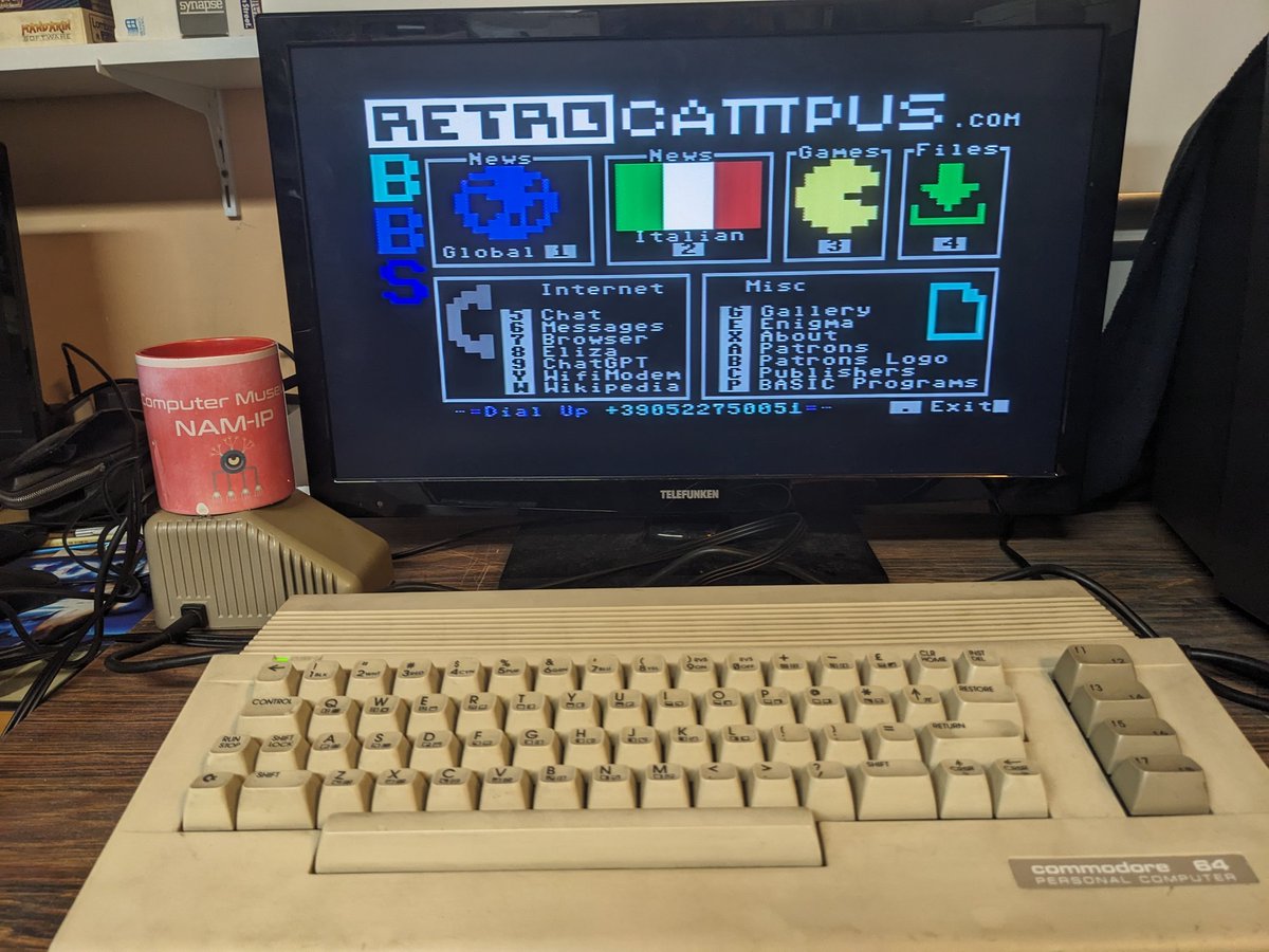
Feb 20
Continuing my fun with the Enigma machine: I wrote two emulators for a Commodore 64, one in BASIC and the other in Assembly (Turbo Macro Pro, coded on a C64).
The BASIC version does about 3 characters per second. The assembly version can encrypt/decrypt roughly 1500 characters per second.
6
20
187
12,493
Christophe Ponsard retweeted

She taught computers how to smile and changed how the world sees technology.
Cupertino, 1983. The Macintosh team was building a personal computer for ordinary people, not engineers. The hardware was revolutionary, but there was a problem: computers still felt cold and intimidating. Green text on black screens. Cryptic commands. No warmth. No welcome. Steve Jobs wanted the Macintosh to feel different approachable, even friendly.Someone suggested Susan Kare.
She wasn’t a programmer. She wasn’t an engineer. She was a sculptor and graphic designer with a fine arts PhD. She had never designed software. Jobs offered her a short-term contract to create a few icons for the new machine.She said yes.
At the time, the Macintosh screen measured just nine inches diagonally, with a resolution of 512 by 342 pixels. Every icon had to fit into a tiny 32-by-32 pixel grid, in black and white. There were no established conventions. No visual language for graphical interfaces. Susan wasn’t refining a system she was inventing one.
She began with graph paper. Each square represented a pixel. She sketched carefully, testing shapes that could communicate meaning instantly. A trash can for deleting files. A folder that resembled the manila folders found in offices. A document that looked like a sheet of paper. A floppy disk for saving work. Visual metaphors rooted in everyday life.
Then she created the smiling Macintosh face—the “Happy Mac.” When users turned on their computer, it greeted them with a smile.It was a small detail. It changed everything.
Until then, computers had no personality. Susan gave the Macintosh warmth. She understood that technology adoption isn’t just about power or speed—it’s about comfort. People needed to feel invited, not intimidated.
Her influence extended beyond icons. She designed typefaces for the Macintosh, naming them after cities Chicago, Geneva, Monaco. Chicago became the system font seen by millions for decades. She created the Command key symbol based on a Scandinavian campsite marker so it would feel universal rather than language-specific. She even designed the whimsical “dogcow” graphic in the print dialog box an unnecessary but charming detail that made users smile.
When the Macintosh launched in 1984, its friendliness stood out. The interface felt intuitive because it was built on visual metaphors people already understood. Other companies quickly followed. Microsoft Windows adopted similar icon conventions. The visual vocabulary Susan created became the foundation of modern user interface design.
Decades later, we still use her language. The trash can icon. The folder. The floppy disk symbol for saving long after floppy disks disappeared. Her early pixel sketches shaped the way billions of people interact with technology every day.
Susan went on to design for NeXT, Microsoft, Facebook, Pinterest, and others. In 2015, she received the National Design Award for Lifetime Achievement. Her original Macintosh icon sketches now sit in the Museum of Modern Art.
She proved that design is not decoration it is communication. It bridges complexity and clarity. It transforms tools into companions.
Before Susan Kare, computers were machines.
After Susan Kare, they smiled.And once technology learned to smile, the world was finally ready to embrace it.
( Credit: Martinbutler )
38
400
1,516
78,228

Happy 83rd Birthday to Ken Thompson! 🎂
A true computing legend and co-creator of UNIX, B, and Go—technologies that shaped the modern software world and still power the bulk of today’s infrastructure. 💻️🔥
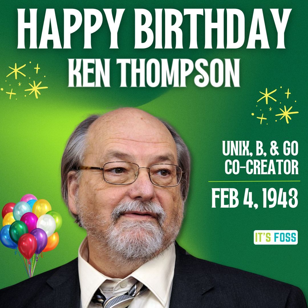
ALT Happy Birthday Ken Thompson Unix, B, & Go Co-Creator Feb 4, 1943. There is a picture of Ken in the middle, wearing a black suit.
10
120
750
12,687
Christophe Ponsard retweeted

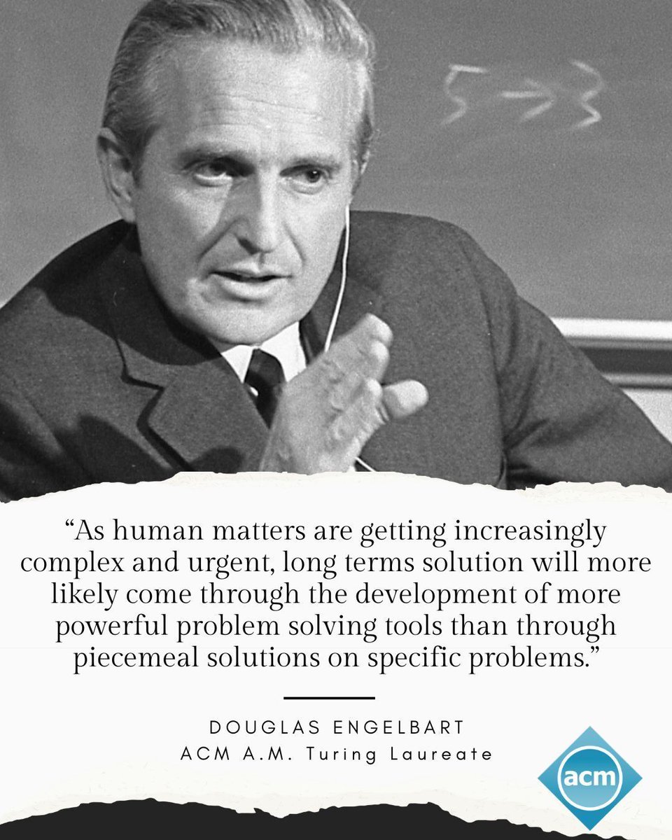
Today in 1925, #ACMTuringAward recipient Douglas Engelbart was born. Engelbart received the Turing Award in 1997 for his inspiring vision of the future of interactive computing and the invention of key technologies to help realize this vision.
Engelbart invented or helped pioneer foundational technologies of modern computing, including the computer mouse, hypertext, windowed and split-screen interfaces, interactive text editing, email, and groupware. At Stanford Research Institute, he led the development of the oN-Line System (NLS), famously demonstrated in the 1968 “Mother of All Demos,” which helped define computer-supported collaborative work and shaped personal computing and the Internet.
Read about his contributions and impressive career, here: amturing.acm.org/award_winne…
6
14
823

A Brief History of the Spreadsheet ift.tt/1AP4Q87
4
11
3,462
Christophe Ponsard retweeted

19 Dec 2025
⭐️Calendrier de l'avent mathématique⭐️
Jour 19 : Benoît B. Mandelbrot

3
34
217
14,898
Christophe Ponsard retweeted

21 Aug 2025
Tu n'es pas à Pas Sage En Steïr centredesabeilles.fr/pas-sag… ? Désolé pour toi mais tu peux le suivre sur live.passageenseine.fr/cinem… ou twitch.tv/passageenseine
#PSESQ
2
7
6
3,386
Christophe Ponsard retweeted

9 Aug 2025
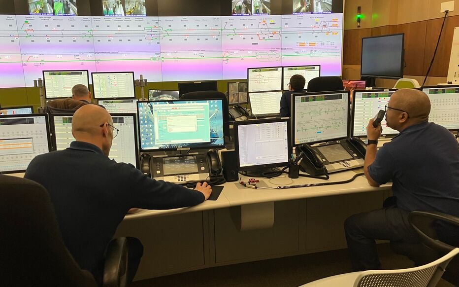
Cette semaine, la @Ligne9_RATP était fermée. En gros, le but était de passer de l'image de gauche à l'image de droite pour contrôler toute la ligne.
La @Ligne14_RATP aussi a fermé.
Je vous raconte pourquoi.
⬇️⬇️⬇️
#Thread

15
116
735
91,394
Christophe Ponsard retweeted

27 Jul 2025
🔟 TOUR DE FRANCE STAGE WINS !
CHAPEAU L'ARTISTE !
#TDF2025 | 🇧🇪 @WoutvanAert

13
257
1,894
78,091
Christophe Ponsard retweeted

26 Jun 2025
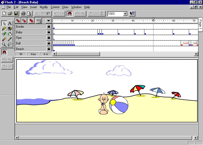
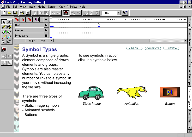
In June 1997, Macromedia released a vector graphics editor for creating interactive Macromedia Flash 2.0 web animations.
#WebDesignHistory
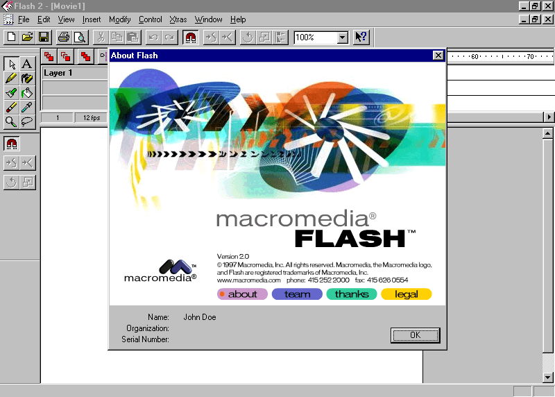
ALT Macromedia Flash 2.0
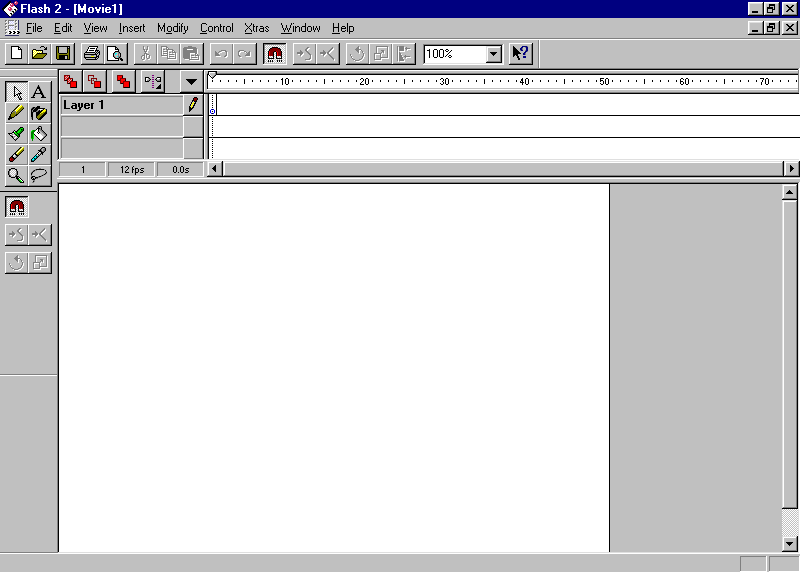
ALT Macromedia Flash 2.0
ALT Macromedia Flash 2.0
ALT Macromedia Flash 2.0
15
101
597
37,317
Christophe Ponsard retweeted

3 Jun 2025
1/ I am saddened to report (from today's print version of Le Monde) the passing away of the great French computer scientist Jean-Raymond Abrial. He is a pioneer in formal methods and their applications, particularly through three major innovations: the "Data Semantics" model,
2
14
39
2,272
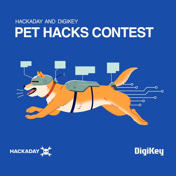
Got an idea to make life better for pets? 🐕 🐾
Enter the 2025 #PetHacksChallenge and show it off!
Submission Deadline: June 10th | Join the Challenge ➡️ hubs.la/Q03ncTLh0
#Hackaday #MakerChallenge Sponsored by @digikey
4
9
3,141
Christophe Ponsard retweeted

5 May 2025
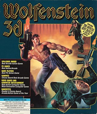
Happy birthday to Wolfenstein 3D, released May 5, 1992!
136
851
5,638
122,870
Christophe Ponsard retweeted

5 May 2025
#otd in 1974 TCP/IP was born, when Vint Cerf & Bob Kahn's paper describing a protocol for sending packets across networks was published: bit.ly/2QbDPpi
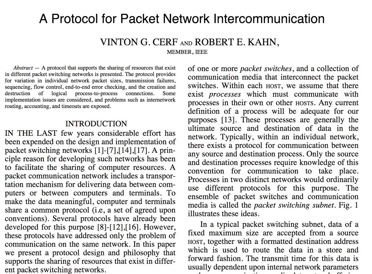
6
92
288
17,084
Christophe Ponsard retweeted

10 Apr 2025
Aurélie Jean (@Aurelie_JEAN) : «Singer le style de Ghibli avec ChatGPT, c’est mettre à mal la propriété intellectuelle (et la planète)»
lefigaro.fr/vox/societe/sing…
1
4
7
6,790