
Usually posting about Cardiff and Urbanism
Joined June 2019
- Tweets 10,702
- Following 208
- Followers 2,166
- Likes 15,207
2,137 Photos and videos


Pinned Tweet

10 Apr 2020
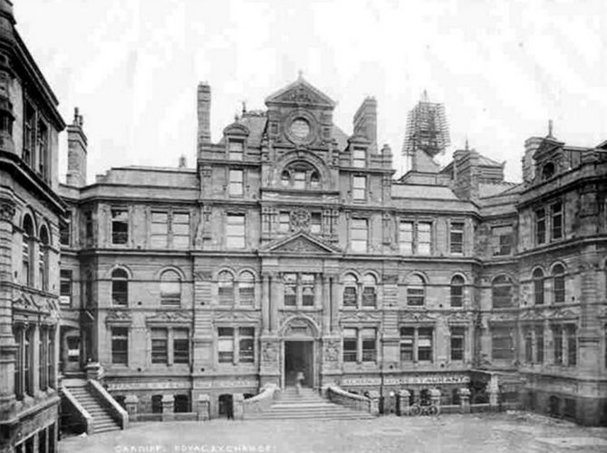
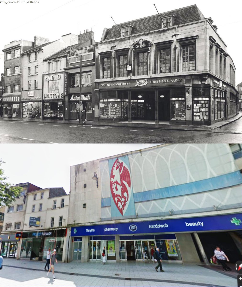
Some of my favourite lost architecture of Cardiff - 1) Boots Queen St
77
248
930
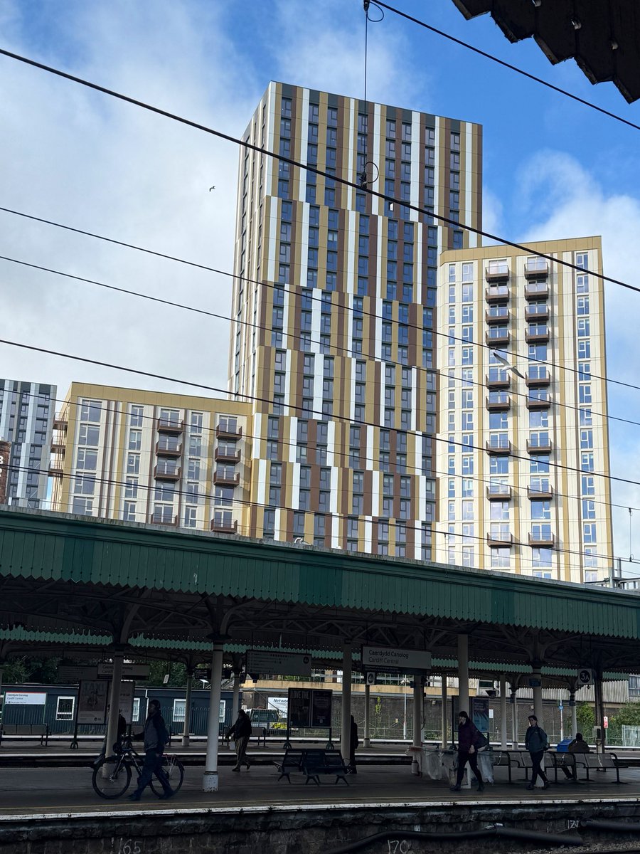
Jun 7
We could have had them in brick.
Still wouldn't have won any awards - but at least would have tied in better to brewery been a bit less of an eyesore.
Instead we got the one with maximum cost-engineering, to ensure maximum investor return, with maximum disregard for the site.


6
8
71
9,849
Jun 7
Biggest missed opportunities to create something special for Cardiff in my lifetime.
Prime location, a landmark people of Cardiff feel a connection to - just squandered on soulless copy/paste blocks with no regard for the site.
Heritage should have been celebrated, not hidden.

3
4
46
1,638
G retweeted

Bring back shop awnings.


1
4
42
2,331
May 22
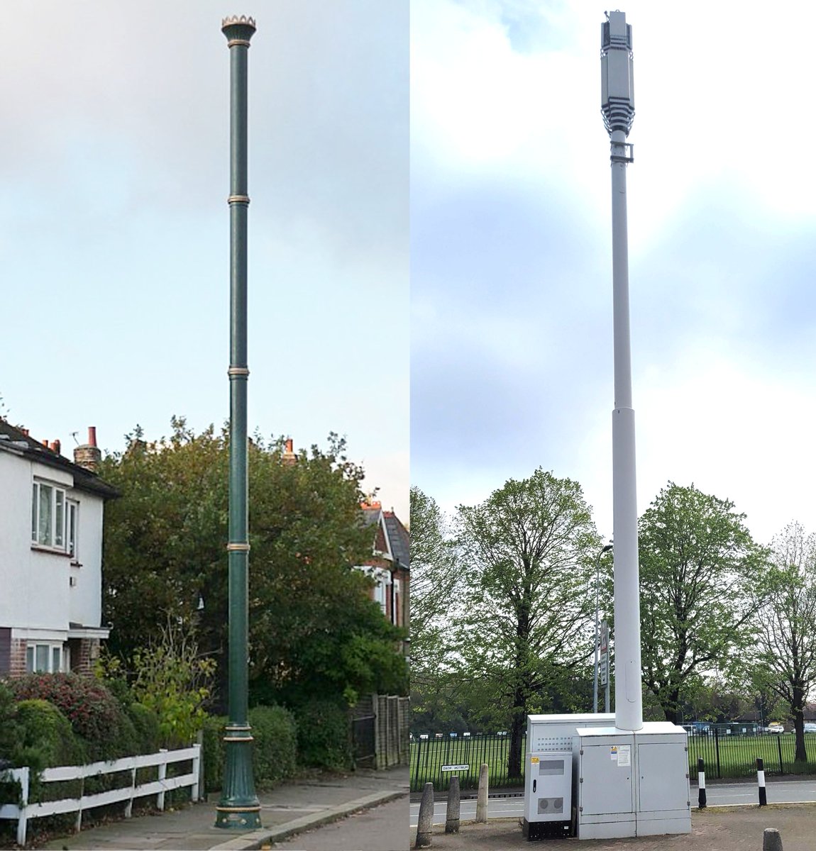
I often think "what if" the Victorian's designed these 5G Masts you see going up everywhere.
They cared about their streetscapes - going as far as to design ornate "stink pipes" for venting sewers (a number of which are now listed!)
I can't see any of our 5G towers being listed.
9
11
91
4,463
G retweeted

Apr 27
~50 bays, 8 storeys, a massive slab of flats, 400 windows on one huge plane. And yet, this 1930s building looks pretty good. Why?
Part of the answer is the use of the classical language to visually structure and humanise the enormous bulk.
Vertically, the lower ground floor is distinguished as a visual 'plinth' with stone facing, and the upper ground is then marked off with a string course (a band of stonework). The middle three storeys are grouped as an 'implied order' between the string course and the cornice. Above the cornice is an 'attic' storey, and then there are two storeys in the roof.
No storey is an exact duplicate of another; each plays a different role in the ensemble. If you cut out any one of them, the proportions of the others would look slightly wrong.
Horizontally the facade is broken down into a five-part composition (only four parts are visible in the photo), with three 'pavilions' distinguished from the linking wings by richer ornamental treatment.
Again, this means that each bay plays an indispensable part in the whole. If you sliced off the final bay, the whole 50-bay building would look wrong. You might be able to cut a bay or two from one of the wings without people noticing, but pretty quickly the lopsidedness would become obvious.
At the time of its construction, this building would have been seen as extremely mechanical and monotonous relative to the kind of architecture then admired. But there is a sense in which the classical language is seen at its best in cases like this, where it makes a basically repetitive and monotonous building type markedly less relentless than it would otherwise be.
18
113
851
34,780
Apr 26
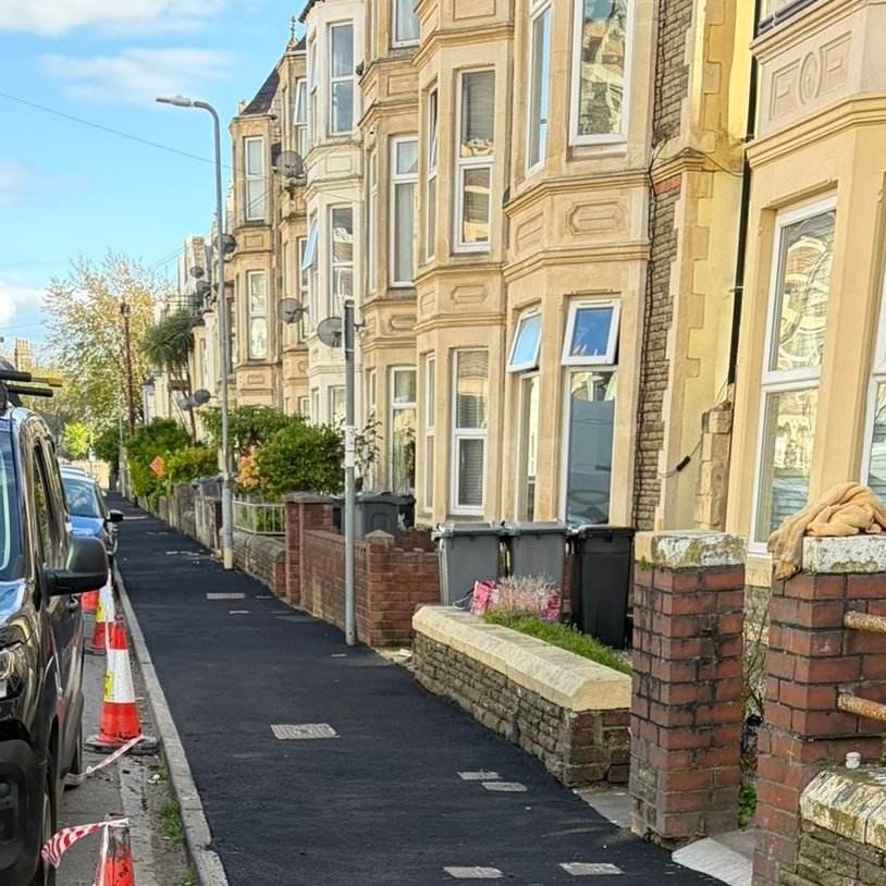
While Im glad to see pavement resurfacing going on around Roath - it would have been nicer to see a surface colour other than jet black.
I can understand the move away from slabs to asphalt on cost/maintenance grounds - it makes sense - but I just wish we didn't always use black!
9
1
90
11,488
Apr 21
It’s nice to see Cardiff celebrating a piece of its history.
Just a shame the building they’re proud of is still sitting empty years after all that money was spent renovating it.
Surely a permanent use could be found by now?

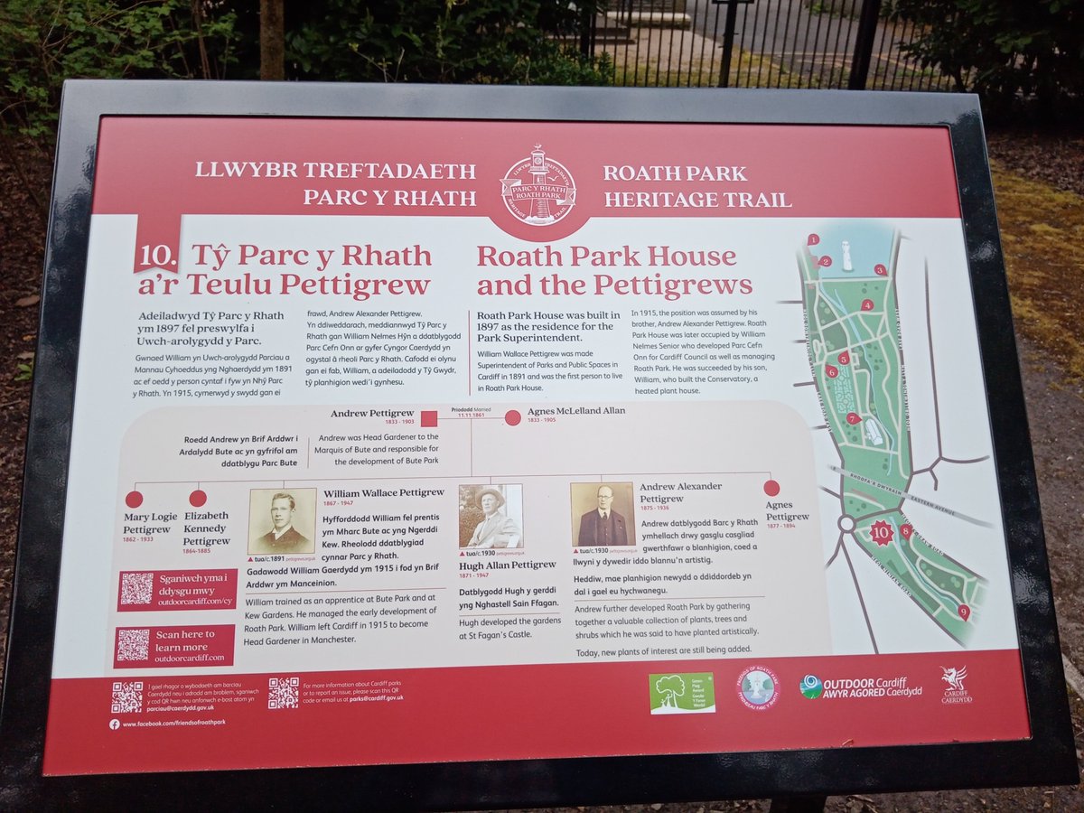
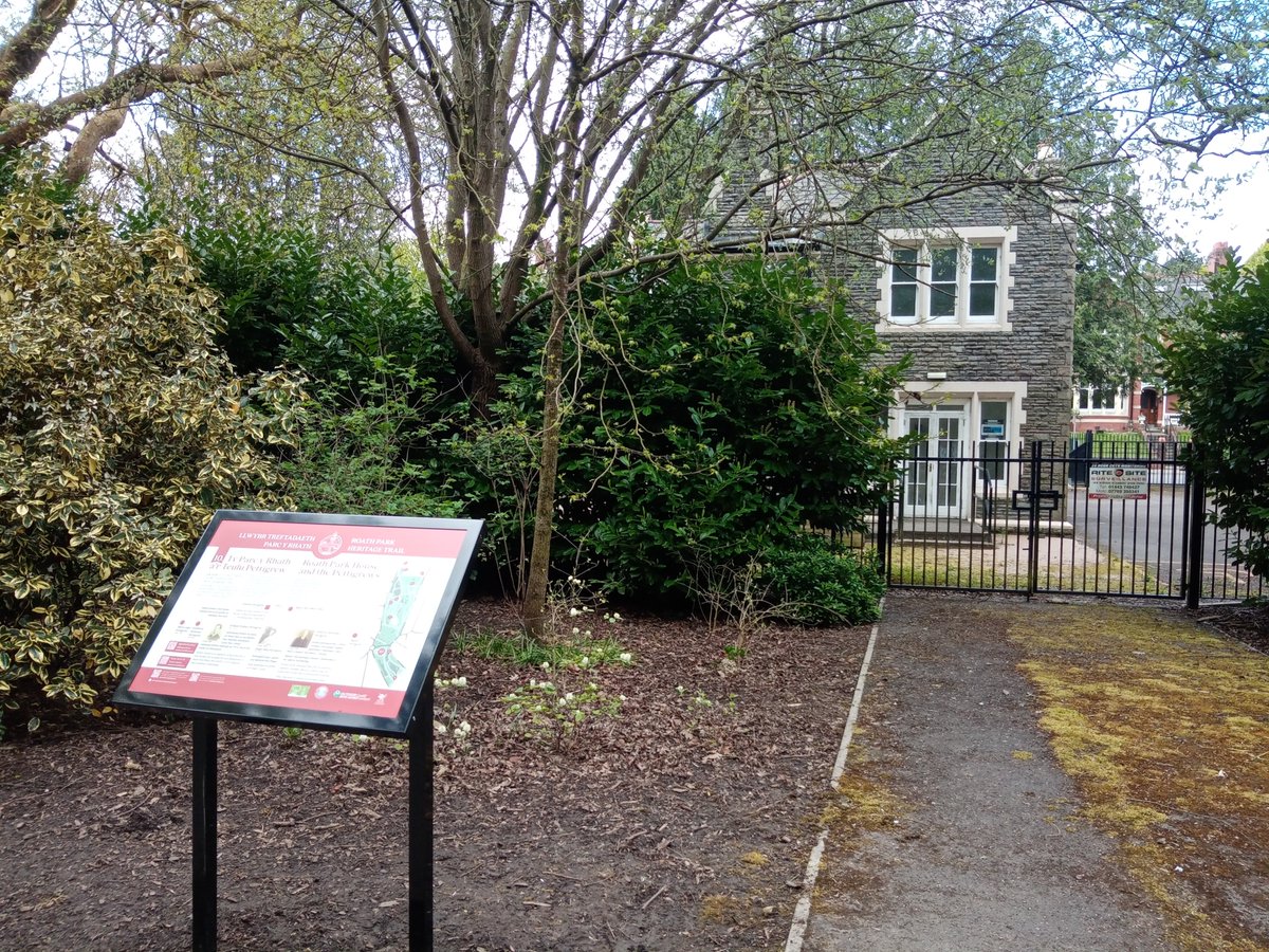
Nice to see the new Roath Park Heritage Trail taking shape. This information board of outside Roath Park House and gives information on the Pettigrew family.
10
1,154
G retweeted

Apr 13
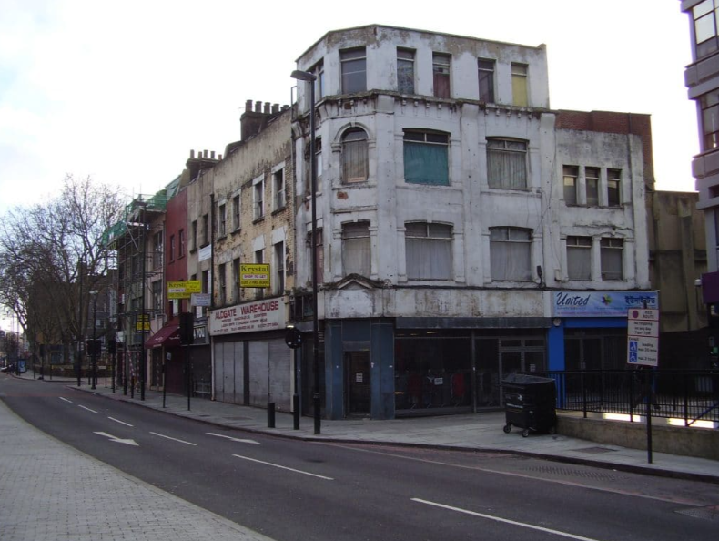
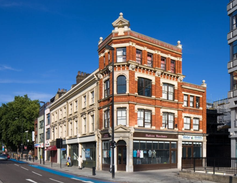
As part of a £36m project, dozens of building were restored as part of the High Street 2012 scheme. Here's one of the best examples, on Whitechapel High Street, by the contractor @payestonework. Funding came from the Mayor, DCLG, LTGDC, Lottery Fund, English Heritage and TfL.
26
77
865
40,744
G retweeted

And this gopping horrible eyesore of a home will only set you back half a million!

34
22
694
65,635
G retweeted

Mar 29
75 new social housing apartments in Glebe, Sydney
A cross laminated timber (CLT) structure, robust brick cladding, stunning recessed brick balconies, fully-electric and 6 star green star rating.
Would *love* to see more housing like this!
By JPW Architects


55
215
2,098
105,276
G retweeted

A trained and licensed motorist fails to spot a cyclist after they come out of nowhere dressed all in black with no high vis or lights
64
42
1,090
382,810
G retweeted

Mar 29
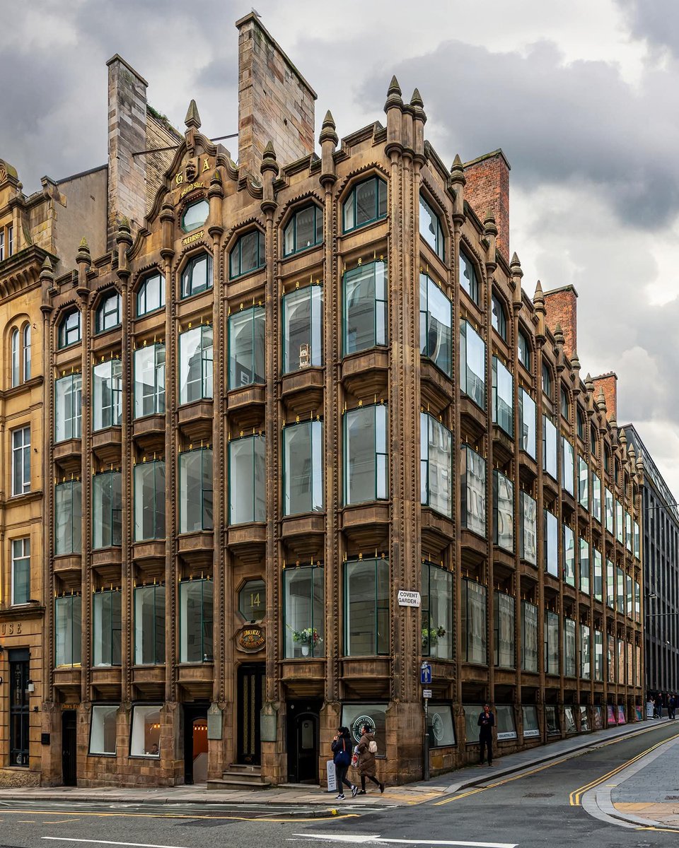
Oriel Chambers, Water Street, Liverpool was completed in 1864 and is often overlooked but its significance is immense.
Designed by local architect Peter Ellis, it was a radical departure from the heavy, load-bearing masonry of its time. With its pioneering use of an iron frame and huge projecting bay windows (the "oriels"), it maximised natural light and space – a true precursor to modern curtain-wall construction and the skyscrapers we see today.
23
143
981
44,152
G retweeted

Mar 29
One of the best public art projects I've seen. Grim park shelter turned into glorious roman-style mosaic menagerie, by the Hackney Mosaic Project.


31
661
7,566
125,833
G retweeted

Mar 28
Taken ages to get these that work so well elsewhere. But Cardiff have the most expensive charges?
Cardiff’s new ‘bike hangars’ cost more to rent here than anywhere else in the UK – and more than a car parking permit – The Cardiffian journalism-school.cardiff.ac…
5
3
11
996
G retweeted

Mar 26
Appalling these trees endangered "by mistakes made" during the cycleway's construction.
Mature trees' value can't be overstated in mitigating heat & poor air quality. Active travel? Shade here makes full-sun walking possible. @CardiffCivicSoc @DeAthCardiff nation.cymru/news/beautiful-…
1
2
2
340
G retweeted
Mar 25
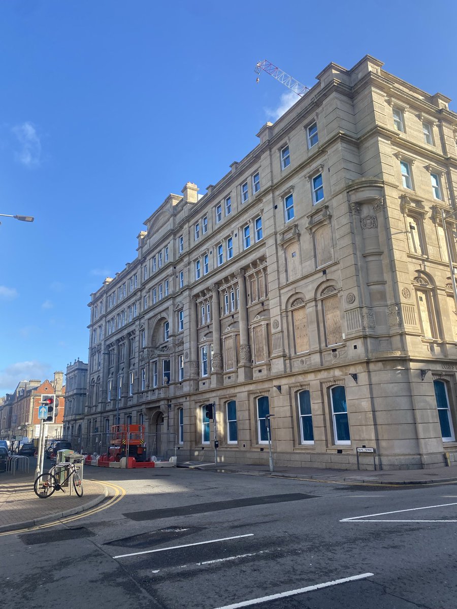
This building, Cory building?, is looking fantastic as part of the refurb and renovations.
Fair play.
Great to see
3
4
31
1,407
G retweeted

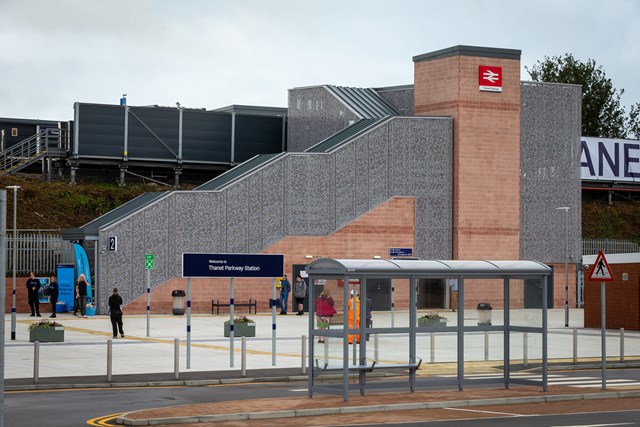
It's okay but it's no Thanet Parkway.
Mar 23

Surely one of the most remarkable stations built this century?
The “Centro Direzionale” underground station designed by EMBT in Naples. Designed to be like a “stroll through the woods"

3
16
1,056
81,697
G retweeted

Mar 21
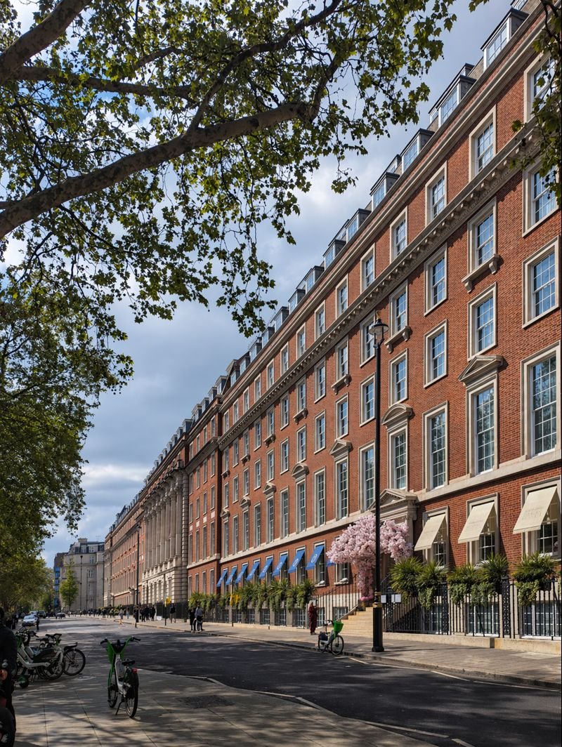
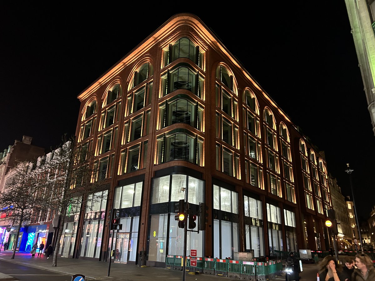
New building in Oxford Street, central London. Hopeful.

27
77
1,878
409,099
Mar 17
If you want a permit to park a car in Cardiff - £35 for the year.
If you want to securely store a bike in Cardiff - £120 for the year.
As far as I can tell, the most expensive cycle hangar scheme in the entire UK!
For comparison; Bristol £55, Bath £60, S. Gloucestershire £72
Why?

New secure Bikehangars are being installed across Cardiff.
17 hangars – each holding 6 bikes – will be added to residential streets in Canton, Riverside, Plasnewydd, Cathays and Splott this month, making cycling easier and more secure.
More here: orlo.uk/Yd1Ko

ALT Bikehangars
23
10
87
12,647
G retweeted

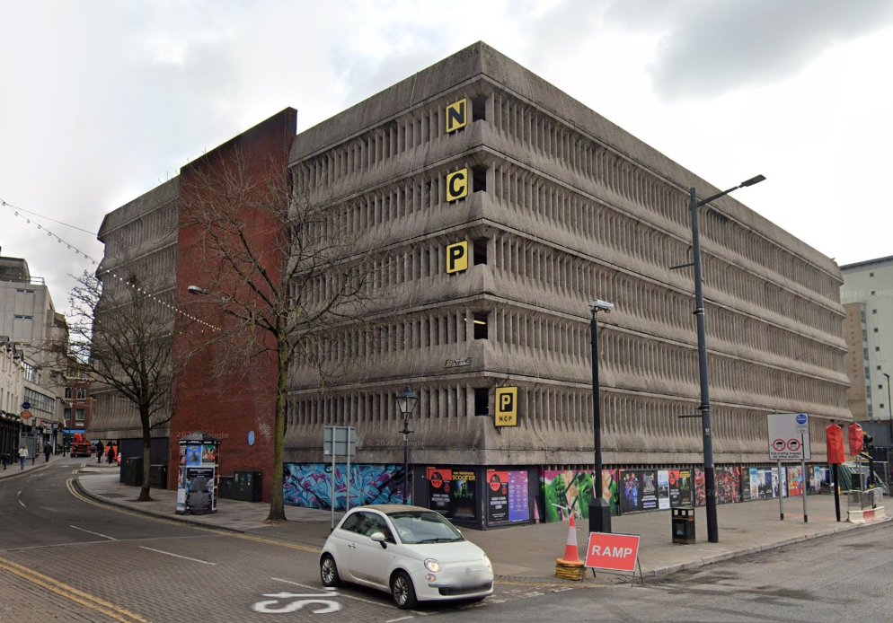
Mar 16
The city centre car park has had its day. There is now a significant opportunity to put the land previously used for car parking to much more productive use.
Land that could be used for tens of thousands of homes in city centres.
bbc.co.uk/news/articles/c2e4…
38
33
220
19,533