
هل كنت تعلم ؟؟ 😊
.
.
.
.
.
#تحليل_البيانات #علم_البيانات #اكسل #باور_بي_اي #تابلو #بايثون #آر
#داتا_ايكو #dataecho
#data #dataanalytics #datascience #excel #sql #powerbi #python #r #tableau #analysis #alteryx #knime
#dashboard

1
3

Tell me about her using Data terms:
I will start..
She was my VLOOKUP. Always found what i needed, in any table, any sheet. Then one day - value not found 🤣🤣
#dataanalytics #datascience #datajokes #datavisualization #datareporting #dataengineering
2

🔧 Tool: Microsoft Excel (PivotTables, PivotCharts)
📊 Dashboard is next
#DataAnalytics #HealthcareAnalytics #Excel #EDA #DataScience #PortfolioProject #DataVisualization #Dashboard #Analytic
2

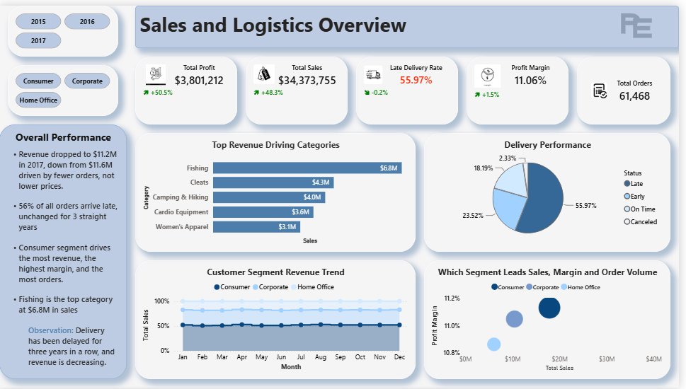
Sometimes the answers are just sitting in the data waiting for someone to look.
What would YOU have done with findings like these?
GitHub: [github.com/peaceekete/Supply…]
#PowerBI #DataAnalytics #DataAnalyst #PortfolioProject


5
Asante Theophilus ❤ retweeted

We are all relaxing today right ? #datafam
Enjoy your weekend ✨
#dataanalytics #dataanalysis #excel #datadrivendecision #techskill #weekedvibez

4
1
14
143

Create clear and informative box plots with added statistical insights using ggpubr! This package makes it easy to design polished plots that effectively showcase group comparisons and data distributions.
✔️ Visualize Group Comparisons: Box plots are ideal for comparing distributions across categories, showing medians, quartiles, and outliers. Combined with dot plots, they provide a detailed view of individual data points and variability.
✔️ Comprehensive Statistical Annotations: Add statistical comparisons, such as p-values and significance brackets, directly on the plot. The example here includes results from a Kruskal-Wallis test, with pairwise comparisons displayed above to indicate where significant differences exist between groups.
✔️ Customizable Design: Adjust colors, shapes, and labels to make your plots visually appealing and easy to interpret, ensuring they convey the right message.
✔️ Seamless Integration with ggplot2: Works directly with ggplot2, letting you build on your existing plots and enhance them with statistical details without the need for complex syntax.
The visualization shown here is from the package website, demonstrating how ggpubr can create polished, publication-ready plots with detailed statistical annotations: rpkgs.datanovia.com/ggpubr/
Ready to master ggplot2 and its powerful extensions to create stunning visualizations? Enroll in my online course, “Data Visualization in R Using ggplot2 & Friends!”
Learn more: statisticsglobe.com/online-c…
#database #VisualAnalytics #Data #DataAnalytics #RStats

1
13
353

🌐 Kafka Azure = Reliable event streaming, seamless integration, and limitless scalability. ☕️
#dataengineering #machinelearning #cloudcomputing #dataanalytics #aws #googlecloud #microsoftazure #datascience

57

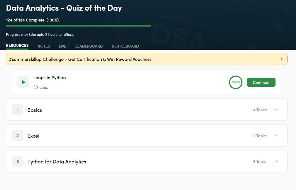
Day 14/30 — Streak on!
Here's what I completed today:
Data Analytics – Quiz of the Day
- Loops in Python
MCQs - 5/5
Apply Link: gfgcdn.com/tu/cv6/
#GeeksforGeeks #skillupwithgfg #summerskillup #DataAnalytics
1

Stop guessing what sells on TikTok Shop 📈
FastMoss helps you spot trending products, track competitor shops, and see which creators and ads actually drive sales using real data from 500M products.
👉Try FastMoss: saaspirate.com/go/fastmoss
#TikTokShop #DataAnalytics #SaaSPirate
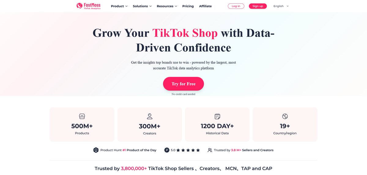
ALT FastMoss
15

𝐁𝐞𝐬𝐭 𝐏𝐨𝐰𝐞𝐫 𝐁𝐈 𝐂𝐨𝐦𝐩𝐞𝐭𝐢𝐭𝐨𝐫𝐬 𝐢𝐧 𝟐𝟎𝟐𝟔: 𝟏𝟎 𝐌𝐨𝐝𝐞𝐫𝐧 𝐁𝐈 𝐓𝐨𝐨𝐥𝐬 𝐄𝐱𝐩𝐥𝐚𝐢𝐧𝐞𝐝
Power BI isn’t the only game in town anymore! From Tableau’s stunning dashboards to ThoughtSpot’s search-driven analytics and Omni’s cloud-native approach, businesses have more choices than ever. Discover the 10 hottest BI platforms shaking up the analytics market in 2026 and find the perfect fit for your data strategy.
#PowerBI #BusinessIntelligence #DataAnalytics #Tableau #Looker #AI #AINews #AnalyticsInsight #AnalyticsInsightMagazine
Read More 👇
zurl.co/HPyLk

14

🌍 Here are the top 20 official gold holdings by country as of March 2026 (expressed in tonnes):
🇺🇸 United States: 8,133 t
🇩🇪 Germany: 3,350 t
🇮🇹 Italy: 2,452 t
🇫🇷 France: 2,437 t
🇨🇳 China: 2,313 t
🇷🇺 Russia: 2,305 t
🇨🇭 Switzerland: 1,040 t
🇮🇳 India: 881 t
🇯🇵 Japan: 846 t
🇳🇱 Netherlands: 612 t
🇵🇱 Poland: 582 t
🇹🇷 Turkey: 535 t
🇹🇼 Taiwan: 424 t
🇺🇿 Uzbekistan: 416 t
🇵🇹 Portugal: 383 t
🇰🇿 Kazakhstan: 354 t
🇸🇦 Saudi Arabia: 323 t
🇬🇧 United Kingdom: 310 t
🇱🇧 Lebanon: 287 t
🇪🇸 Spain: 282 t
source: tradingeconomics
🔹 Institutional reallocation trends show distinct regional shifts, with specific emerging economies steadily building their strategic bullion buffers.
#DataAnalytics #GlobalEconomy #Gold
1
25

Excited to complete a course on Foundations: Data, Data, Everywhere
#learning #dataanalytics #datascience coursera.org/share/dcf396a39…
4

💪 Power BI button slicer as a KPI card on steroids
🔗 medium.com/microsoft-power-b…
Get all our tutorials: powerbi-masterclass.short.gy…
#PowerBi #DataAnalytics #datafam #dataviz

1
5
1,022

A vest can't
measure
a big game.
How Brazil Is Betting on 'Smart Vests' in Its Bid for World Cup Glory
The end of the eye test? Brazil's new edge is a wearable sensor.
Behind the scenes, Brazil's sports scientists have been tracking players using wearable technology that monitors sprint speeds, heart rates, fatigue levels, and injury recovery.
The data is collected year-round from clubs and fed into the national team's database.
My data brain loves this—quantifying physical load, spatial efficiency, and rehabilitation timelines.
My gut feeling knows that no vest can measure a player's big‑game temperament or a manager's tactical intuition.
But when Brazil take the pitch against Morocco, they'll have years of data behind every decision. The question: does more data lead to better decisions—or just more hesitation?
#Brazil #WorldCup2026 #SportsTech #WearableTech #DataAnalytics #FootballScience #PerformanceAnalysis #EyeTest #SportsInnovation #TeamBrazil
22

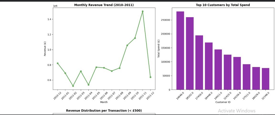
🚀 Week 1-2 done at @AnalystLabAfrica Data Analytics Internship!
Cleaned & analyzed 2 real datasets:
🛒 541,909 e-commerce transactions
🎬 8,807 Netflix titles
Using Python, Pandas & Matplotlib for the first time 💪
The grind continues 📊
#DataAnalytics #Python #LearningInPub


1
1
14

Are you just getting started in Data Analytics?
Kindly follow my page so we can learn together, because I’ll be sharing my relearning experience here daily
#Dataanalytics
1
1
11

Do you have a LinkedIn?
We should connect 👇🏾
I'm always happy to meet people learning Data Analysis, Data Science, Excel, SQL, Power BI, and other tech skills.
shorturl.at/R6QSt
#DataAnalytics #DataScience #PowerBI
24

Build expertise at the intersection of Economics Data Analytics with the M.Sc (Online) in Economics & Data Analytics from IIT Kanpur
Apply by: 25 June 2026
Follow @gradlyofficial for end to end support
#IITKanpur #DataAnalytics #Economics #Masters #Gradly

1
2
118
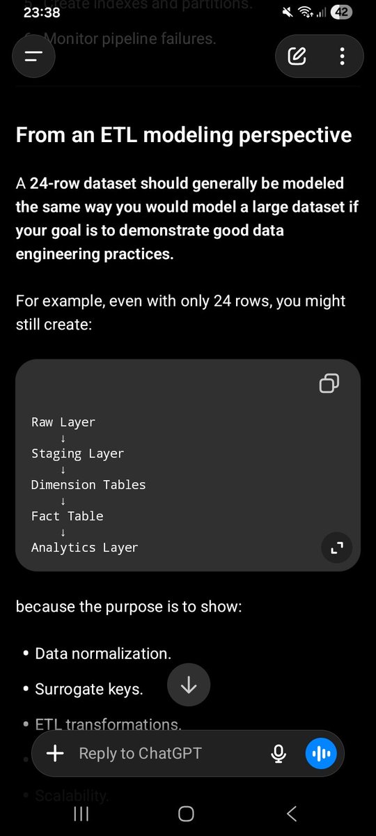
Learning ETL one step at a time.
Excel → SQL → Power BI.
A small business dataset helped me answer a bigger question:
"Is Jiji Premium actually profitable?"
The screenshots show why learning the process matters more than having millions of rows
#DataAnalytics #SQL #PowerBI


This is mastering the basics in Data Analysis.
No fancy dashboards.
No advanced SQL.
No machine learning.
Just learning one skill at a time.
Most people skip this stage.
But basics make everything easier.
#DataAnalysis #Excel #SQL #PowerBI
1
3
63

Every SQL tutorial starts the same way: "First, install Postgres."
That's exactly where most people quit.
Today I'm launching Data Learn — and I built it to delete that first step entirely.
It's LeetCode, but for SQL. You open a problem, write a query, hit run, and it executes right there in your browser. No database to install. No Docker. No sample data to download. Nothing to configure. You're writing real SQL against real data in about three seconds.
A few things I'm proud of:
→ It runs real query engines in your browser
→ Every submission is checked against the expected output and saved to your history so you can watch yourself getting better.
→ I just shipped Contests: race the clock on a set of problems, or create your own and share the link with your team or study group.
→ And there's a Learn section with written lessons, so you're not grinding problems blind.
It's live, it's free, and this is the first time I'm sharing it publicly.
If you've been meaning to get sharper at SQL — for interviews, for analytics work, or just because — I'd genuinely love for you to try it and tell me what's missing.
👉 Link : learndatanow.com/
What's the one SQL concept you wish you'd learned sooner? 👇
#SQL #DataAnalytics #DataEngineering #LearnToCode #BuildInPublic

20