
Jun 12
The gorgeous historic building in Segovia Spain is monumental.
But this social media post is a monument to the foolishness that goes on in town planning that removes benches for fear of use by homeless.
Humans need benches! #streetphotography #planning #spain #DesignForHumans

21

May 22
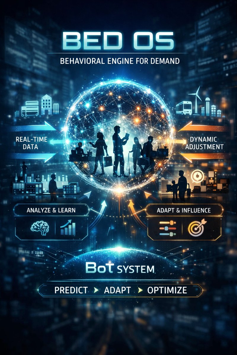
BED operates in real time. It adapts, learns, and evolves with every interaction. Systems built on static forecasts, outside marketing pushes, and fixed incentive models become obsolete when behavior itself becomes part of the infrastructure.
BED is the next step beyond IoT. IoT connects devices. BoT connects decisions. IoT measures what happened; BoT determines what should happen next. IoT automates hardware; BoT optimizes human system interaction. This shift matters because demand patterns are no longer predictable. They are shaped, stabilized, and aligned dynamically.
From a behavioral science perspective, BED functions as a timing aware intervention layer that reduces friction and aligns incentives with natural decision patterns. From a crypto infrastructure perspective, BED behaves like a hidden coordination protocol. A behavioral operating layer capable of synchronizing demand, capacity, and human action across any environment.
Applications in retail, campuses, utilities, transportation networks, digital platforms, public services etc. BED smooths peaks, stabilizes flow, and creates the conditions for adaptive, self-optimizing systems. This is how crypto emerges into mainstream everyday life. Not through speculation, but through real‑world behavioral infrastructure that learns, adjusts, and evolves.
Learn more: bedmitclean-495114.web.app/i…
@MITresearch @BehavioralSci @GoogleCloudTech @Solana @SystemsThinking @TechCrunchAI @OpenBehaviorLab @FutureSystems @AIandSociety @DesignForHumans
10
1
15
165

Apr 5
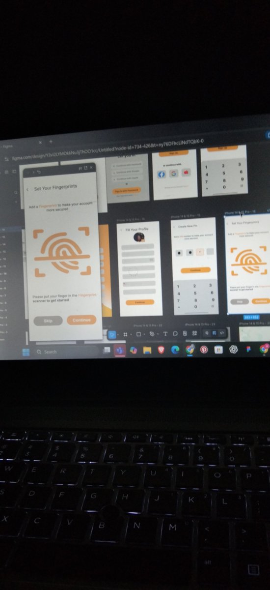
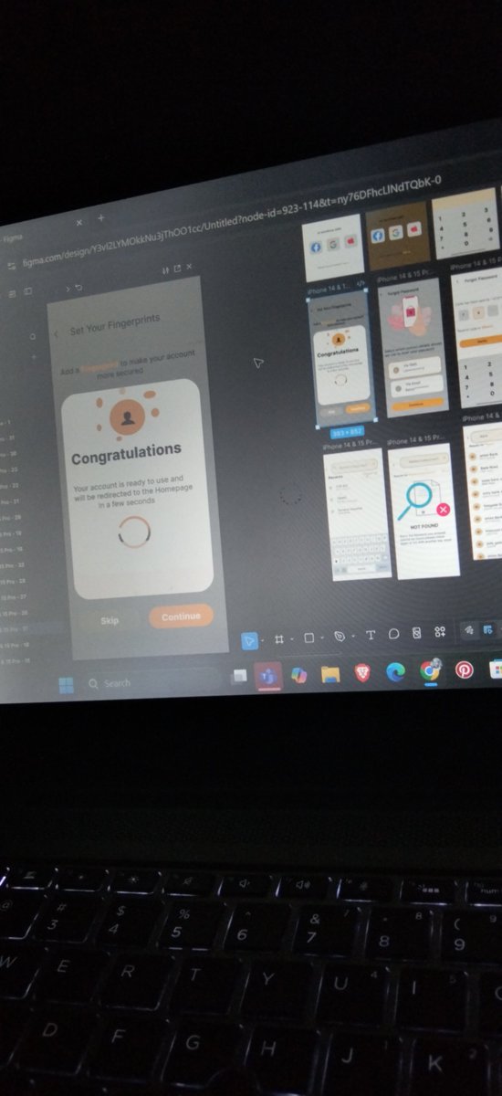
Just wrapped up this clean and intuitive “Forgot Password” flow 🔐✨
Focused on:
• Simple user choices (SMS or Email)
• Clear visual hierarchy
• Friendly and modern UI
• Smooth user experience from start to finish
I design interfaces that are not just beautiful but easy to use and conversion-focused.
If you need a UI/UX designer who can bring your product ideas to life, let’s work 🤝
DMs are open 🚀
#UIUX #ProductDesign #MobileDesign #Figma #UXDesign #UIDesign #DesignForHumans
4
19
27
394

Uncomfortable truth: Most dashboards are exhausting to use.
Not because of complexity.
But because the UI is visually loud.
Bright screens all day = eye strain tired brain.
And the worst part? Users don't complain. They just… stop logging in. Quiet churn. The kind you don't see until it's too late.
Dark mode isn't about aesthetics.
It's about:
- Reducing visual noise
- Supporting long focus sessions
- Making your product feel calm, not demanding
Comfort = retention. Simple as that.
#DarkMode #UIUX #SaaSDesign #ProductThinking #DesignForHumans #hashbyt
3
4
138

1 Jul 2025
Finally! A solution to the “Network Problem” that has nothing to do with network speed. We’ve all been there, poor internet, trying to tap a button on an app or site, and… nothing.
#UXDesign #ProductDesign #MicroInteractions #UIDesign #DesignForHumans #OpenToInternship
2
8
169

26 Jun 2025
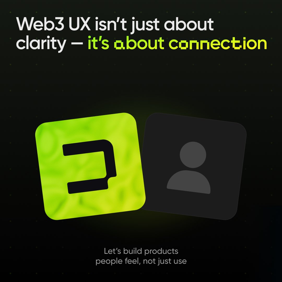
Web3 UX isn’t just about clarity — it’s about connection
Design tools people feel, not just use. That’s the future.
#DesignForHumans #EmotiveUX #CryptoFuture #Web3Experience #BuildDifferently
4
48

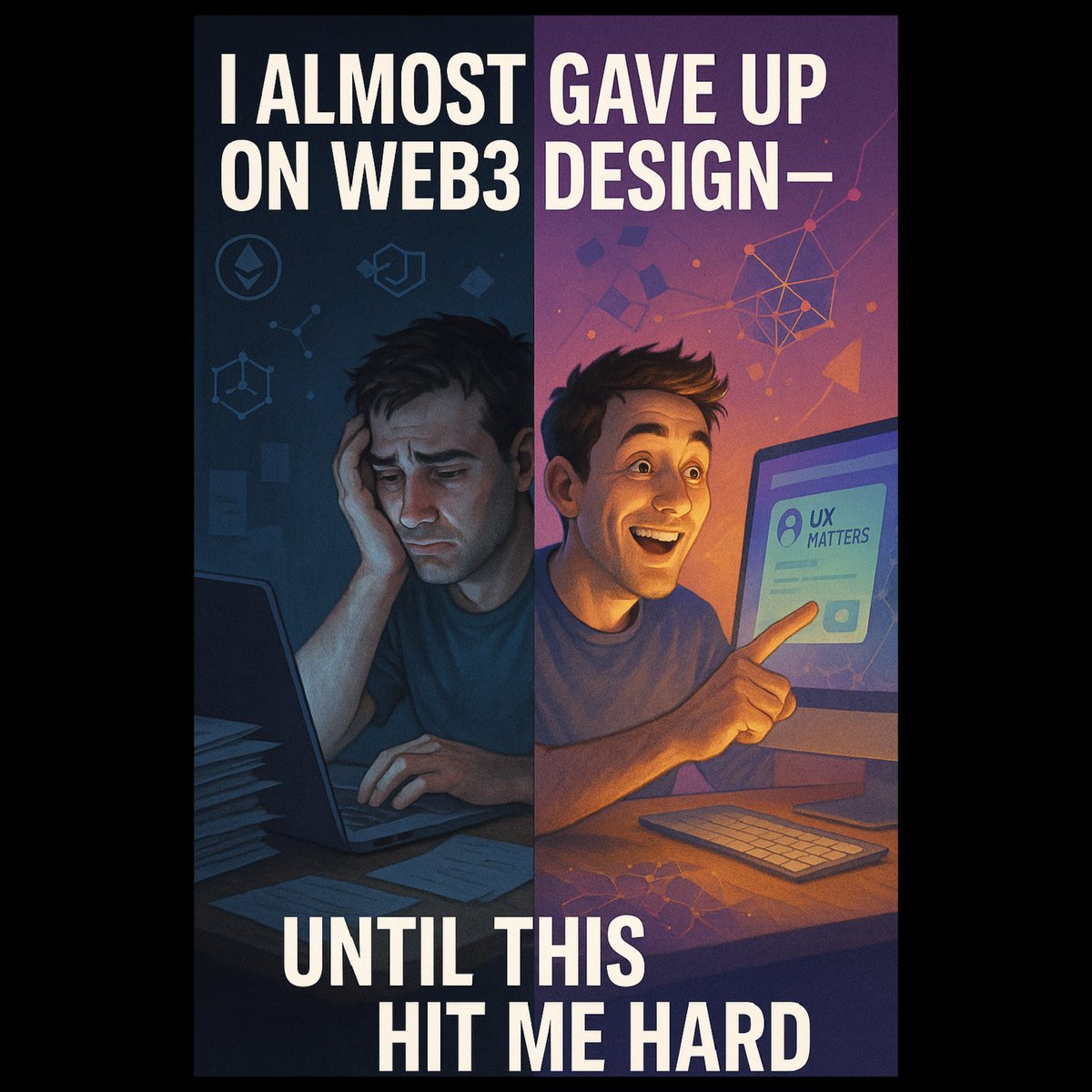
23 Jun 2025
🤦 I Almost Gave Up on Web3 Design. Until This Hit Me Hard.
🔸🔸🔸🔸🔸🔸🔸🔸🔸🔸🔸🔸🔸🔸
About a year ago, I landed my first gig as a UI/UX designer for a Web3 project.
It felt like I had finally entered the “big leagues” smart contracts, DeFi dashboards, DAOs, wallets. the whole exciting chaos.
The devs were brilliant.
The tech was bulletproof.
And me? I was ready to make it beautiful.
But guess what?
🔸Struggle:
No one used it, Literally no one.
We shipped, We tweeted, We dropped tutorials, Still zero traction.
Users opened the dApp and closed it just as fast.
Even I, the designer, had to reread the homepage twice to understand what it did.
That’s when it hit me: we weren’t building for humans.
We were building for ourselves. For devs. For insiders.
No empathy. No clarity. Just assumptions and a fancy landing page.
I felt defeated and I blamed myself.
They blamed “user adoption.”
But deep down, I knew the truth: the UX was trash.
🔸Discovery:
I decided to stop designing like a Web3 designer.
Instead, I started thinking like my confused cousin who didn’t know what a wallet was.
I began asking:
What would make this screen less intimidating?
Why should a user trust this platform?
Can we speak to people like people and not like a whitepaper?
We stripped the jargon.
We simplified the flow.
We treated every button like it was the first time someone ever saw a dApp.
The result?
Engagement skyrocketed.
User feedback turned from “I’m lost” to “Finally, this makes sense.”
The devs started asking me to lead design strategy—not just “make it pretty.”
🔸Lesson:
Web3 doesn’t have a user problem. It has a UX problem.
People don’t hate decentralization. they just hate being confused.
If your Web3 project doesn’t invest in UI/UX, you’re not early, you’re invisible.
Design is no longer a luxury.
It’s the bridge between your brilliant idea and actual adoption.
So if you're building in Web3, don’t just ask, “Can we build this?”
Ask, “Can people actually use it and want to come back?”
Trust me: one good UX decision can do more than a hundred tweets ever will.
#UX #Web3Design #DesignForHumans #ProductDesign #CryptoUX #UIUX
2
4
80

1 Jun 2025
ทำไมบางแอปทำให้เราอยากกลับไปใช้ซ้ำ
ทั้งที่ไม่ได้แจกโปร ไม่ได้ให้แต้ม
แต่แค่เปิดแอปก็รู้สึกชอบ
คำตอบคือ emotional design ครับ
ลองดู 3 แอปนี้ที่โตระเบิดจากความรู้สึกไม่ใช่แค่ฟีเจอร์
Duolingo
แอปเรียนภาษา ที่ไม่ใช่แค่สอนภาษา
แต่ทำให้เรารู้สึกเหมือนกำลังเล่นเกมอยู่กับเพื่อน
มีมาสคอตนกสีเขียวที่พูดได้ ยิ้มได้ เศร้าเป็น
ตอบถูก มันเฮ ร้องดีใจ
ตอบผิด มันทำหน้าจ๋อย
ทุกครั้งที่เปิดแอป = interaction ที่มีชีวิต
สิ่งนี้เองที่ทำให้ยอดใช้งานรายวันโตจาก 14 ล้าน → 34 ล้านใน 2 ปี พร้อมยอดสมัครสมาชิกแบบเสียเงินที่พุ่งตามไปด้วย
Phantom
กระเป๋าเงินดิจิทัลที่อยู่ในโลกคริปโต ที่เต็มไปด้วยความซับซ้อน
แต่ Phantom ออกแบบให้เหมือนแอปแชตหรือแอปเกม
มีผีการ์ตูนน่ารักเป็นมาสคอต ใช้สีสันสดใส
ทุกการกด สร้าง animation ที่ เบา สบาย ไม่กลัว
มันทำให้โลกคริปโตที่เคยดูเย็นชาและน่ากลัว
กลายเป็นพื้นที่ที่ เราเข้าใจได้
จนกลายเป็นแอปอันดับ 2 ในหมวด utility ของ US App Store
เหนือกว่า IG และ WhatsApp ในบางช่วงครับ
Revolut
แอปการเงินที่เริ่มจากการโอนเงินข้ามประเทศ
แต่วันนี้เป็นเหมือน แบงก์พรีเมียมในมือเรา
แค่เปิด onboarding ก็รู้สึกเหมือนเดินเข้าแบรนด์หรู
กราฟที่ใช้ติดตามการใช้เงิน มี glow ตอบสนอง
บัตรเครดิตหมุน 3D สะท้อนแสง
ทุกดีไซน์ถูก craft ให้เหมือน luxury product
ไม่ต้องพูดเยอะ คนรู้เลยว่าของแพง
และนี่คือ emotional trigger ที่ทำให้ลูกค้าระดับบนไว้ใจ และพร้อมจ่ายมากขึ้นครับ
โดนสรุปนะครับ ทั้ง 3 แอปใช้ emotional design ต่างกัน
Duolingo → ใช้ ความน่ารัก เพื่อสร้าง habit
Phantom → ใช้ ความเป็นมิตร เพื่อลดความกลัว
Revolut → ใช้ ความพรีเมียม เพื่อสร้างความเชื่อมั่น
สำหรับแอปไทย ส่วนตัวยังไม่เห็นนะครับ หวังว่าจะมีบ้างครับ
เพราะสุดท้ายแล้ว คนจะจำไม่ได้ว่าเรามีฟีเจอร์อะไร
แต่จะจำได้ว่า รู้สึกยังไง ตอนใช้มันครับ
#duolingo #phantom #revolut
#EmotionalDesign #UXDesign #Fintech #Crypto #Edtech #DesignForHumans
#ProductThinking #BrandEmotion
ขอบคุณ Tim Gabe ที่วิเคราะห์มาให้ครับ น่าสนใจมากครับ

1
7
7
1,235

28 May 2025
🎭 Social Media is Dead. Long Live the Algorithm.
Remember when social media was actually… social?
Now:
•You don’t see your friends.
•You see what it wants you to see.
•Your feed isn’t yours — it’s a slot machine.
📱 Less connection, more curation.
🧠 Less sharing, more shaping your behavior.
We used to post for people.
Now we post for the algorithm.
It’s not social media anymore.
It’s algorithmic media — designed to entertain, addict, and optimize you as the product.
🔄 The scroll never ends.
❤️ The likes mean less.
👁 You’re not just watching — you’re being watched.
So ask yourself:
Are you expressing yourself?
Or just feeding the machine?
#SocialMedia #AlgorithmCulture #DigitalDetox #DesignForHumans #AttentionEconomy
2
5
138

21 May 2025
Would love to hear your thoughts.
Check out the project here: behance.net/gallery/22606973…
#UXDesign #Web3UX #ProductDesign #CryptoUX #NFTDesign #Figma #Onboarding #DesignForHumans
@figmadesign @OdysseyDAO @UXpills @useweb3 @viamirror
2
30

26 Feb 2025
Finance isn’t scary. Bad UX is. Let’s fix that.
You open a finance app, expecting clarity. Instead, you get:
• A cluttered dashboard with complex charts you don’t understand.
• Tiny numbers & percentages with zero context.
• Jargon like “expense ratio” & “equity allocation” with no explanation.
No wonder users give up.
The real issue? Most fintech apps assume users think like analysts. But in reality, 64% of global consumers use fintech, and most just want to understand their money—without a finance degree.
How Do We Fix This? Human-Centered Design (HCD).
Let’s take a look at real-world solutions from leading fintech & financial service providers:
1️⃣ Progressive Disclosure: Show key insights first
Example: Apple Card – Instead of overwhelming users, Apple Card summarizes spending in color-coded categories. Want details? Tap for a deeper breakdown. Essential info comes first, complexity only when needed.
2️⃣ Clear Visual Hierarchy: Make data digestible
Example: Google Pay – Instead of tables filled with small numbers, Google Pay uses bold typography and conversational UI (“You spent ₹5,000 on food this month”) to make spending patterns instantly clear.
3️⃣ Emotional Design: Make finance feel approachable
Example: Cleo AI – A budgeting app that uses humor and chat-based interactions to engage users. Instead of sterile bank statements, Cleo playfully nudges users about their spending, making finance less intimidating.
4️⃣ Cross-Platform Consistency: Seamless experience everywhere
Example: Revolut – Whether on mobile, web, or smartwatch, Revolut keeps the same interface, so users always feel in control no matter where they access their finances.
5️⃣ TransUnion’s Redesign: Fixing Overwhelming UX in Credit Reports
TransUnion realized users were drowning in data and couldn’t understand their own credit reports. Their solution? A complete redesign using HCD principles:
✅ Progressive Disclosure – Key credit insights up front, with deeper details available on demand.
✅ Clear Visual Hierarchy – No more data dumps—just structured, easy-to-read information.
✅ Emotional Design – A welcoming “open doors” motif to make the experience feel intuitive.
✅ Cross-Platform Consistency – The same seamless experience across mobile, desktop, and even physical spaces.
The Impact? More people understood their credit reports, support tickets dropped, and engagement increased. Because when finance makes sense, people actually use it.
The Takeaway for Fintech Designers:
🔹 Start with people, not data. Build for real-world users, not financial analysts.
🔹 Guide users, don’t overwhelm them. Clarity leads to engagement.
🔹 Make financial data intuitive, not intimidating. Finance should be empowering, not confusing.
When finance makes sense, people engage. Let’s design for that. 🚀
#Fintech #UXDesign #HumanCenteredDesign #GoogleDesign #DesignForHumans
1
2
150

5 Sep 2024
🌞 Fun Fact: Did you know that exposure to natural light can help regulate your sleep cycle? 💤🌿
In buildings where natural light is limited, occupants often experience fatigue and low energy; artificial lighting can even make things worse.
Solera® brings the outdoors in, diffusing soft, even daylight that enhances well-being and productivity.
No more dim, oppressive interiors—our Translucent Glazing Units (TGUs) create bright, comfortable spaces that make you feel more connected to nature and more energized throughout the day.
🌟 Ready to boost your building’s energy and productivity? Explore Solera® today and see the difference: bit.ly/3Wz6hX8
#DaylightMatters #HealthyBuildings #ArchitectureThatInspires #Solera #DesignForHumans

2
9

27 Apr 2024
¡Feliz día del Diseñador Gráfico! A todos quienes crean, plasman y comunican a través del diseño, pensando siempre en los dolores y necesidades de los usuarios
.
.
.
#UX #diseñografico #design #designer #diseño #diseñocentradoenelusuario #designforhumans #userinterface #UI

1
3
186

18 Mar 2024
Get more content about user needs, content-led digital transformation and content strategy that meets people's needs.
Like and follow us❤️ on Instagram.
Together, we can design better products and services.
instagram.com/llibertat_uk/
#UXDesign #ContentDesign #DesignForHumans
1
2
30

User opens/closes water with a light switch?! This is the epitome of confusing UX. Make it obvious, people! #UsabilityMatters #ClearControls #DesignForHumans
2
68

Say Goodbye👋🏻 to Math Anxiety!
Introducing Calculate & Pay, a built-in calculator seamlessly integrated into your UPI app's payment page.
No more juggling between apps to split bills or double-check amounts.
#DesignForHumans #fintech #uxdesign #uidesign #upi #digitalindia

ALT Bento cards for a concept design of a Calculator integrated into the UPI payment page
1
3
425


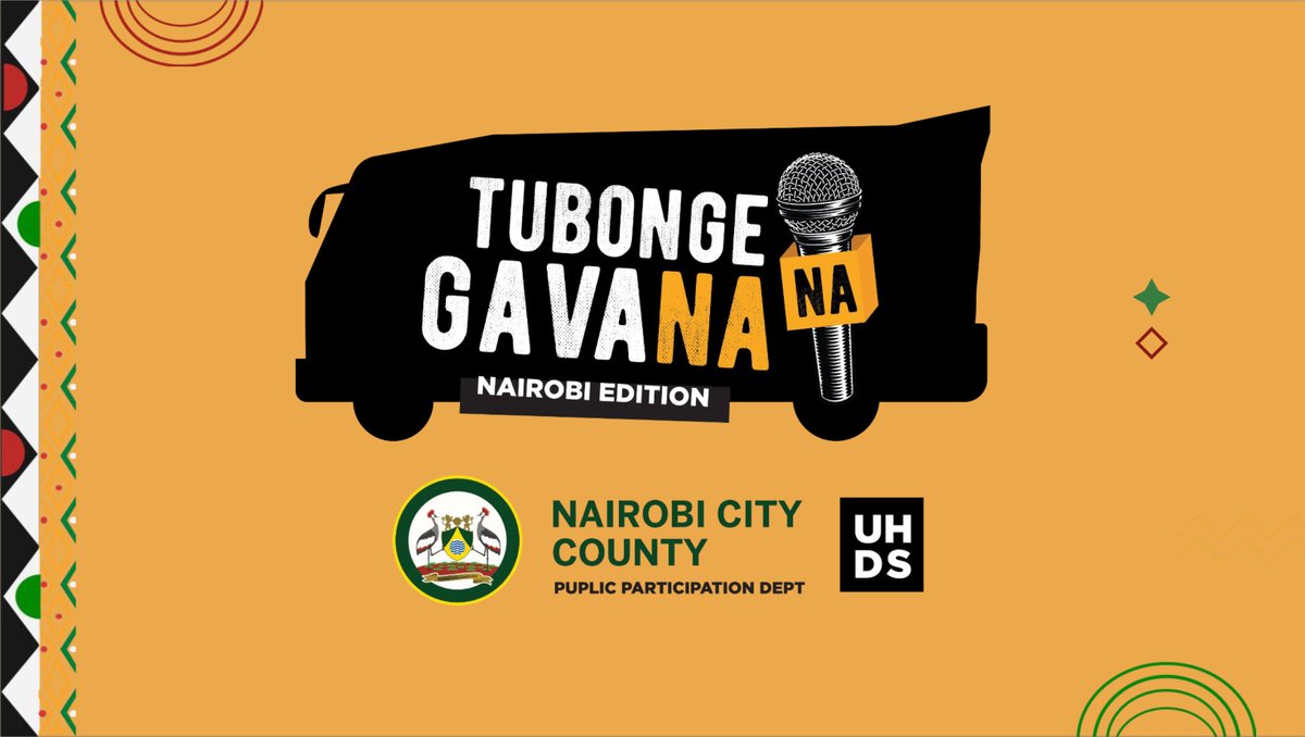
12 Oct 2023
Kumbe @micchequepod walinunua Ng'anya na subscription fee za checkmates! 🤣🤣🤣
Anyway we hired their mat for the "Tubonge na Gavana" activation.
Toene za macho basi! @Mwass_ @ThatGuyChaxy @047County @SakajaJohnson
#DesignForHumans
behance.net/gallery/18208018…
2
2
1,440

7 Oct 2023
Zebonastic AI Art October 07, 2023 zebonastic.ai/ #AIArt
Etsy shop Zebonastic.com #prompts #Midjourney #365DaysOfAI #photography #digitalart #aiart #interactiveart #DesignForHumans #PhotographyArt #VAE #ArtificialIntelligence #3Dprinting #GenerativeDesign


3
62

16 Aug 2023
User-centered design isn't just a buzzword – it's our mantra! 🙌🔍 Crafting designs that make users' lives easier and more enjoyable is what we live for. Let's create digital harmony together! 🌈 #UIUXMasters #UserFirst #DesignForHumans #figma #productdesign
2
5
6
302