
Question for Shopify Plus brands:
What is your biggest strategic challenge right now?
A) Data overload & confusion
B) Slow decision making
C) Global scaling uncertainty
D) Other
Drop your answer below 👇 #GMIH #ShopifyPlus
18

22h
Fragmented tagging logic compromises global store architecture.
We engineer centralized tagging governance to eliminate data silos.
→ Unified taxonomy across storefronts.
→ 100% attribute consistency.
Start Your Project: xco.agency
#ShopifyPlus #GlobalCommerce

1
22h
Reward your top tier. We architect automated VIP access that scales.
Segment-locked stores → 2.8x repeat purchase lift
Automated tagging → zero overhead
Start Your Project: xco.agency/blog/maestro-mast…
#CustomerLoyalty #ShopifyPlus

2
22h
Reward your top tier. We architect automated VIP access that scales.
Segment-locked stores → 2.8x repeat purchase lift
Automated tagging → zero overhead
Start Your Project: xco.agency/blog/maestro-mast…
#CustomerLoyalty #ShopifyPlus

23h
Launch globally, sleep locally. 🌍
Architect multi-region sync to automate expansion. We engineer zero-lag workflows for global releases.
→ 100% accuracy
→ Zero manual lag
xco.agency/blog/maestro-road…
Post 3 of 100 #ShopifyPlus #Automation

1
1
23h
Architecting stable MRR requires precision engineering. SubFlow secures retention via automated dunning and strategic recovery flows.
→ 18% lift in customer LTV
→ 24/7 automated churn mitigation
Start Your Project.
#ShopifyPlus #MRR #Growth #CX

9
23h
Rolling out the red carpet shouldn't be manual. 🎟️
Automate VIP access with instant segmentation:
→ Give customers royal treatment effortlessly
→ Gated experiences made easy
Start here: xco.agency/blog/maestro-mast…
#ShopifyPlus #Automation

10
23h
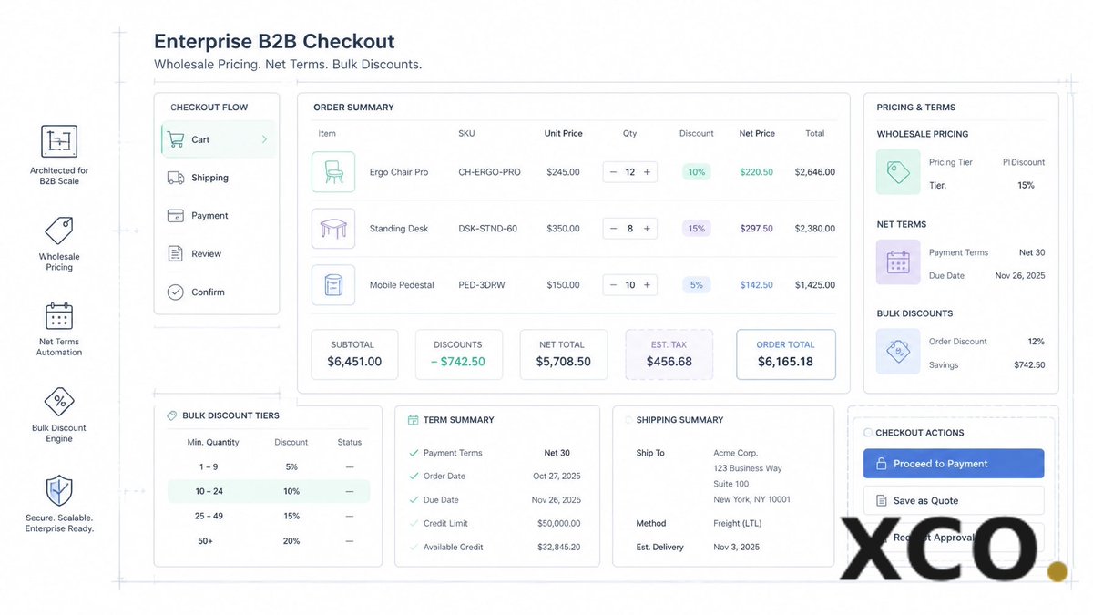
B2B doesn't have to be boring or manual. 💼
Automate your wholesale checkout with Maestro:
→ Custom pricing
→ Net terms
→ Bulk discounts
Grow your B2B empire while you sleep. 💤
xco.agency/blog/maestro-road…
#B2B #ShopifyPlus
1

Most Shopify clothing brands don't need more traffic.
They need a store that converts.
Better UX faster speed stronger product pages = more sales.
#Shopify #ShopifyDeveloper #ClothingBrand #FashionBrand #Ecommerce #DTC #ShopifyPlus
18

Jun 12
Think your Meta ads are underperforming? You might want to check your Shopify cart page first.
Discover how to eliminate cart friction, lower buyer hesitation, and turn abandoned carts into raw revenue.
#ShopifyExpert #CartAbandonment #EcommerceCRO #ShopifyPlus #Mastroke
57

Jun 12
Giving a discount in your first abandoned cart email is one of the most expensive mistakes in ecommerce.
You're not recovering carts.
You're training customers to abandon on purpose.
#shopify #shopifyplus
1
20
Jun 12
Day 53: Frictionless with The Checkout Captain. 🤖⚓
Automate post-purchase offers and custom fields based on cart data.
→ Personalize journey
→ Lift conversion
→ Scale value
Master your checkout: xco.agency/blog/maestro-mast…
#ShopifyPlus

Jun 12
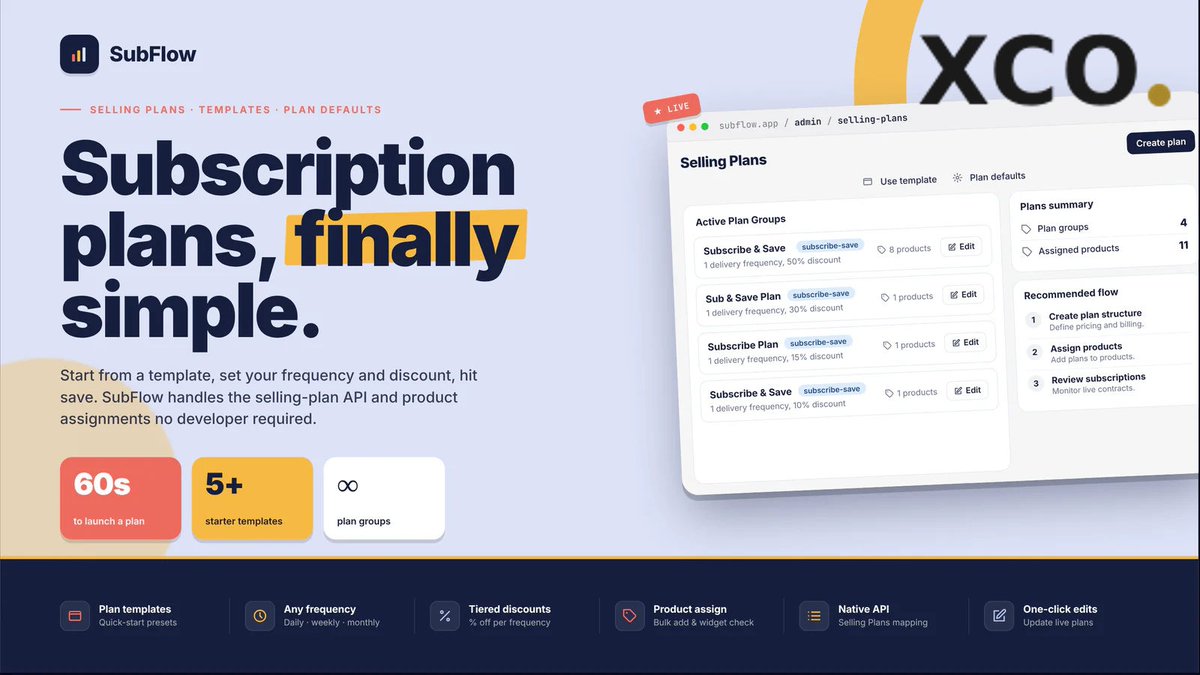
We architect digital experiences that convert.
Meet SubFlow by XCO Apps. A built-in growth engine for Shopify Plus subscriptions.
→ 3.2x LTV acceleration
→ Engineered for scale
→ Refined recurring UX
Start Your Project today. 🚀
#ShopifyPlus #SubFlow #SaaS #Growth
1
5
Jun 12
Why wake up at 3 AM for product drops? 😴
Precision automation means you sleep while sales roll in. No more manual theme swaps or midnight stress.
Check the Maestro Master Roadmap: xco.agency/blog/maestro-mast…
#ShopifyPlus #Ecommerce 🚀

1

Watch Me Build a Custom Discount Rule in 60 Seconds
What if you could create a powerful Shopify discount rule without writing a single line of code?
With Nexus Functions Creator, I built a custom Shopify Discount Function in under 60 seconds.
Tiered Discounts
BOGO Offers
Bundle Discounts
Cart Value Discounts
Customer-Specific Promotions
As Shopify merchants move from Shopify Scripts to Shopify Functions, the ability to build advanced discount logic quickly is becoming more important than ever.
With Nexus Functions Creator, you can create:
Discount Functions
Bundle Discounts
Payment Functions
Delivery Functions
Validation Functions
Plus, migrate Shopify Scripts to Functions in just a few clicks.
🔗 Try it here:
apps.shopify.com/nexus-funct…
How long does it take your team to build a custom discount rule?
#Shopify #ShopifyFunctions #ShopifyDiscounts #DiscountFunctions #ShopifyApps #ShopifyPlus #CheckoutExtensibility #BOGO #BundleDiscounts #ShopifyScripts #eCommerce #NexusFunctionsCreator
14

Jun 12
Over 70% of your e-commerce traffic is buying on a mobile device. Yet, legacy subscription widgets are still built like massive desktop plugins, taking up vital vertical screen space and forcing your primary Add to Cart button completely below the fold.
If a mobile user has to scroll past three blocks of text just to buy your product, your conversion rate drops instantly. That is why we built Aon Subscriptions. 📱📉
In mobile e-commerce, above the fold screen real estate is your most valuable asset.
Every single millimeter of space determines whether a customer takes action or leaves your store completely.
When a user lands on your mobile product page, they should instantly see your product title, clear pricing, and a thumb friendly buy button.
But legacy subscription tools completely crush this layout. They force giant, multi layered borders, massive explanatory text paragraphs, and stacked selection blocks onto the screen.
The result is that your buy button gets pushed down into the mobile abyss. You are not giving your customers options, you are forcing them to work just to complete a transaction.
The Mobile Conversion Drain
A bulky, poorly optimized mobile layout introduces immediate friction to your storefront.
The Forced Scroll: If a user cannot see the Add to Cart or Buy Now button when the page loads, your conversion probability drops with every pixel they have to scroll.
Layout Shifts and Lag: Heavy javascript plugins take seconds to fully render on mobile networks. Right as a user goes to tap a button, the subscription box pops in late, shifting the whole layout and causing accidental clicks.
Complex Multi Step Friction: Mobile buyers demand a flat, lightning fast interaction flow. Confusing, multi step selection layers inside a tiny mobile viewport cause instant cart abandonment.
If your subscription software treats mobile design like a secondary afterthought, it is actively costing you money.
The Solution: High Performance Compact Layouts with Aon
We engineered Aon Subscriptions to be mobile first and strictly minimalist. We stripped away the unnecessary padding, eliminated the blocky borders, and optimized the vertical height so your storefront layout stays perfectly compact.
Here is how Aon's native architecture protects your mobile conversion funnel:
Sleek Above The Fold Integration: Aon’s flat design is incredibly compact.
It allows your pricing, variant choices, and checkout options to fit together perfectly, keeping your call to action button highly visible without scrolling.
Zero Theme Shift: Built directly on Shopify’s modern infrastructure, Aon renders instantly alongside your theme code. No late loading spinners, no disruptive layout jumps, and no broken mobile frames.
Thumb Friendly Simplicity: We designed our selection blocks for easy, intuitive mobile navigation. Buyers can toggle between a one time purchase and a subscription with a quick tap, making the entire checkout pipeline effortless.
Code for mobile. Scale without friction.
Stop sacrificing your mobile storefront speed and layout balance to outdated, desktop era software.
Give your mobile shoppers an ultra clean, lightning fast experience that keeps their journey moving straight toward the checkout line.
Super clean UX. Mobile first rendering.
Pure Aon growth. 🟩
👉 Ready to optimize your mobile storefront layout and secure your conversions?
Search Aon Subscriptions on the Shopify App Store to deploy a clean native widget today. 🚀
Install Free Today!!
apps.shopify.com/aon-subscri…
#Shopify #ShopifyPlus #MobileCommerce #PageSpeed #AonSubscriptions #RecurringRevenue #MobileUX #ZeroCode #EcommerceGrowth #D2C #ShopifyApp #ConversionRate #Ecommerce2026 #ShopifyFounder #MRR

1
55
Jun 12
Is a hidden trust mistake quietly dismantling your Shopify store’s conversion rate?
Discover how to streamline your storefront trust signals, lower buyer hesitation, and safeguard your ad ROAS immediately.
#ShopifyExpert #EcommerceCRO #TrustSignals #ShopifyPlus #Mastroke
1
6
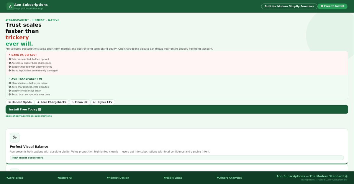
Jun 12
Pre-selecting the subscription option on your product page to "trick" users into a recurring plan isn't growth hacking, it’s a fast track to bank chargebacks, support desk nightmares, and destroyed brand trust.
Modern e-commerce conversion optimization requires a clean, transparent user experience that guides the buyer naturally without deception. That’s why we built Aon Subscriptions. 🎯🛑
It’s one of the oldest debates in subscription e-commerce: Should you default your product page widget to a one-time purchase or pre-select the subscription option?
Many legacy applications push merchants to auto-select the subscription by default, hiding the one-time purchase option behind tiny text.
The logic seems simple: force the opt-in, spike your sign-up metrics, and look at the short-term revenue growth.
But this aggressive, dark UX pattern introduces a massive, hidden operational tax to your business.
When a customer checks out assuming they bought a single item, only to see a second billing charge hit their bank account 30 days later, they don’t think, "Wow, what a convenient service." They feel cheated.
The Hidden Tax of Deceptive UX
Forcing accidental subscriptions creates an immediate backend crisis for scaling brands:
Catastrophic Chargeback Rates: Frustrated consumers skip your customer service team entirely and file a dispute directly with their bank.
High chargeback ratios ruin your payment processing standing and lead to heavy merchant account penalties.
Support Desk Burnout: Your customer service reps spend hours dealing with angry emails, processing manual refunds, and manually canceling plans that should have never been created in the first place.
Negative Brand Equity: Word spreads fast. If your brand gains a reputation for sneaky billing tactics, your long-term customer acquisition cost (CAC) will skyrocket as consumer trust evaporates.
True recurring wealth is built on high-intent loyalty, not accidental clicks.
The Modern Way: Elegant, High-Conversion Transparency
A modern, high-performance storefront doesn't need to trick the user. Instead, it relies on exceptional visual hierarchy and clean design to make the subscription option the most compelling choice on the page—honestly.
We engineered Aon Subscriptions to deliver an elite, transparent user interface that converts through clarity, not deception:
Perfect Visual Balance: Aon’s minimalist layout presents both one-time and subscription options with absolute clarity.
The value proposition (like a clear 10% discount) is highlighted cleanly, allowing the user to opt-in with total confidence.
Zero Script Jumps: No clunky, slow-loading boxes that suddenly shift layout elements right as a mobile user goes to tap. The interface renders instantly, keeping the mobile user experience smooth and frustration-free.
Frictionless Trust Architecture: When customers know exactly what they are signing up for, they enter your subscription ecosystem with high intent.
They stick around longer, maintain healthier cohort curves, and boast a significantly higher Lifetime Value (LTV).
Trust Scales Faster Than Trickery
Stop treating your checkout pipeline like a trap. When you respect your customer's intelligence and give them an ultra-clean, transparent buying journey, your support tickets plummet, your chargebacks disappear, and your recurring revenue compounds naturally.
Transparent design. Bulletproof loyalty.
Pure Aon growth. 🚀
👉 Ready to build a high-conversion, honest subscription engine?
Search "Aon Subscriptions" on the Shopify App Store to deploy a clean native widget today. 🟩
Install Free Today!!
apps.shopify.com/aon-subscri…
#Shopify #ShopifyPlus #AonSubscriptions #RecurringRevenue #ConversionRate #EcommerceGrowth #ShopifyApp #D2C #ShopifyFounder #MRR #Ecommerce2026 #SubscriptionBusiness #DarkUX #CustomerTrust
3
75
Jun 12
The exact millisecond a high-end customer senses a clunky, third-party plugin on your product page, your brand equity plummets.
Many founders spend months designing a beautiful storefront, only to install a subscription app with a default widget that looks like a blocky plugin from 2012, complete with bright blue radio buttons and conflicting fonts. If it looks cheap, consumers won't trust it with their credit cards.
That’s why we built Aon Subscriptions. 🎨❌
You spend thousands of dollars on custom development, professional photography, and premium font licensing to build a world-class brand identity. Every pixel on your storefront is polished to perfection to cultivate immediate consumer trust.
Then, you install a legacy subscription app.
Suddenly, your premium product page is hijacked by an un-styled, crowded box filled with harsh borders, overlapping text, and default browser radio buttons.
To a premium buyer, this visual disconnect screams "third-party risk." It breaks the immersion of your design, creates immediate psychological friction, and leaves your customers wondering if their payment data is actually secure.
The True Cost of a "Frankenstein" UI
In high-end e-commerce, design is directly tied to conversion rates.
When your subscription interface looks like a patchwork afterthought, it introduces major friction to your buying journey:
Destroyed Brand Trust: If your checkout widget looks cheap, buyers assume your fulfillment, product quality, and data security are cheap, too.
Mobile Layout Crashing: Legacy widgets are rarely built for modern mobile viewports.
They stretch, create awkward text wrapping, and force your primary "Add to Cart" button completely below the fold.
Complex CSS Workarounds: Merchants shouldn't have to write hundreds of lines of custom code or override heavy stylesheets just to make a standard checkbox match their brand's color palette.
Your tech stack should inherit your design language automatically, not force you to compromise your aesthetic.
The Solution: Elegant Invisible Design with Aon Subscriptions
We engineered Aon Subscriptions with an absolute obsession over minimalist, premium front-end presentation. Aon doesn't fight your theme layout, it dissolves right into it.
Here is how our design-first framework preserves your store's aesthetic:
Seamless Theme Harmony: Out of the box, Aon's flat, clean layout automatically inherits your store's native typography, font weights, and primary styling. It looks completely custom-coded to your brand.
Super Clean Palette Integration: No random, bright default colors. Aon's interface utilizes a refined, uncluttered design that pairs perfectly with a premium brand identity, cleanly utilizing native white spaces and targeted tones.
Zero Layout Bloat: Built natively for modern Shopify setups, our lightweight interface loads instantly without shifting your product page elements around or creating laggy mobile layout jumps.
Respect the Pixel. Protect the Conversion.
Don't let clunky, outdated software ruin a beautiful user journey at the exact moment of purchase. Give your customers a unified, lightning-fast, and premium subscription experience that feels like a natural extension of your brand.
Super clean UX. Instant brand harmony.
Pure Aon growth. 🟩
👉 Ready to swap legacy widgets for a sleek, custom-coded aesthetic?
Search "Aon Subscriptions" on the Shopify App Store to deploy a high-performance native layout today. 🚀
Install Free Today!!
apps.shopify.com/aon-subscri…
#Shopify #ShopifyPlus #AonSubscriptions #RecurringRevenue #MinimalistDesign #EcommerceGrowth #ShopifyApp #D2C #ZeroCode #ShopifyFounder #MRR #Ecommerce2026 #BrandDesign #SubscriptionBusiness

1
52
Jun 11
Is your Shopify category layout making it too hard for customers to browse?
Discover how to streamline your collection grid layout and clear the path to purchase.
#ShopifyExpert #EcommerceCRO #CollectionPageFix #ShopifyPlus #Mastroke
5