
Read more about Bryj App Ranking Methodology: bryj.ai/mobile-app-ranking-m…
How Bryj evaluates mobile app opportunity and growth potential.
#MobileApps #MobileCommerce #RetailApps #CustomerEngagement #RetailInnovation #Bryj
2

Jun 12
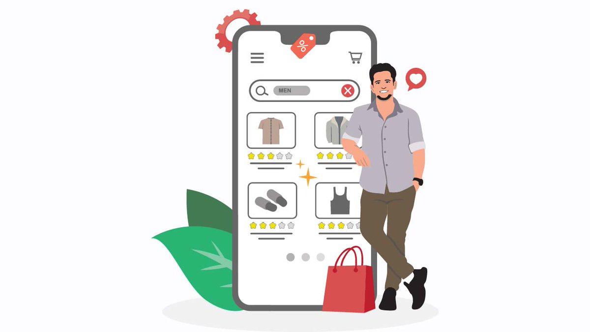
Over 70% of your e-commerce traffic is buying on a mobile device. Yet, legacy subscription widgets are still built like massive desktop plugins, taking up vital vertical screen space and forcing your primary Add to Cart button completely below the fold.
If a mobile user has to scroll past three blocks of text just to buy your product, your conversion rate drops instantly. That is why we built Aon Subscriptions. 📱📉
In mobile e-commerce, above the fold screen real estate is your most valuable asset.
Every single millimeter of space determines whether a customer takes action or leaves your store completely.
When a user lands on your mobile product page, they should instantly see your product title, clear pricing, and a thumb friendly buy button.
But legacy subscription tools completely crush this layout. They force giant, multi layered borders, massive explanatory text paragraphs, and stacked selection blocks onto the screen.
The result is that your buy button gets pushed down into the mobile abyss. You are not giving your customers options, you are forcing them to work just to complete a transaction.
The Mobile Conversion Drain
A bulky, poorly optimized mobile layout introduces immediate friction to your storefront.
The Forced Scroll: If a user cannot see the Add to Cart or Buy Now button when the page loads, your conversion probability drops with every pixel they have to scroll.
Layout Shifts and Lag: Heavy javascript plugins take seconds to fully render on mobile networks. Right as a user goes to tap a button, the subscription box pops in late, shifting the whole layout and causing accidental clicks.
Complex Multi Step Friction: Mobile buyers demand a flat, lightning fast interaction flow. Confusing, multi step selection layers inside a tiny mobile viewport cause instant cart abandonment.
If your subscription software treats mobile design like a secondary afterthought, it is actively costing you money.
The Solution: High Performance Compact Layouts with Aon
We engineered Aon Subscriptions to be mobile first and strictly minimalist. We stripped away the unnecessary padding, eliminated the blocky borders, and optimized the vertical height so your storefront layout stays perfectly compact.
Here is how Aon's native architecture protects your mobile conversion funnel:
Sleek Above The Fold Integration: Aon’s flat design is incredibly compact.
It allows your pricing, variant choices, and checkout options to fit together perfectly, keeping your call to action button highly visible without scrolling.
Zero Theme Shift: Built directly on Shopify’s modern infrastructure, Aon renders instantly alongside your theme code. No late loading spinners, no disruptive layout jumps, and no broken mobile frames.
Thumb Friendly Simplicity: We designed our selection blocks for easy, intuitive mobile navigation. Buyers can toggle between a one time purchase and a subscription with a quick tap, making the entire checkout pipeline effortless.
Code for mobile. Scale without friction.
Stop sacrificing your mobile storefront speed and layout balance to outdated, desktop era software.
Give your mobile shoppers an ultra clean, lightning fast experience that keeps their journey moving straight toward the checkout line.
Super clean UX. Mobile first rendering.
Pure Aon growth. 🟩
👉 Ready to optimize your mobile storefront layout and secure your conversions?
Search Aon Subscriptions on the Shopify App Store to deploy a clean native widget today. 🚀
Install Free Today!!
apps.shopify.com/aon-subscri…
#Shopify #ShopifyPlus #MobileCommerce #PageSpeed #AonSubscriptions #RecurringRevenue #MobileUX #ZeroCode #EcommerceGrowth #D2C #ShopifyApp #ConversionRate #Ecommerce2026 #ShopifyFounder #MRR

1
55

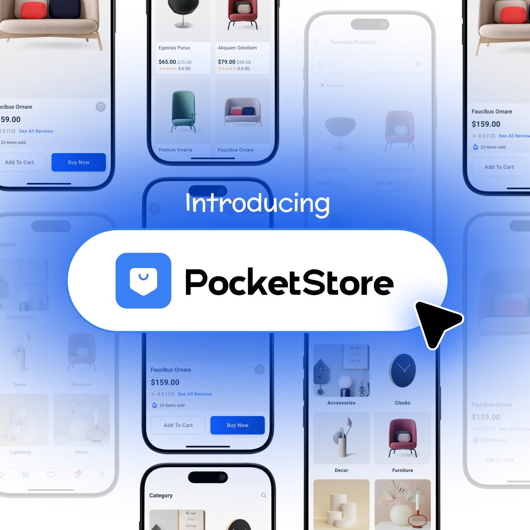
PocketStore is live 🎉
More WooCommerce stores are seeing customers shop from mobile. But a mobile browser still comes with friction, slow browsing, missed repeat visits, and customers leaving before checkout.
PocketStore helps you turn your WooCommerce store into a branded iOS and Android app, without hiring a custom app team or managing the technical work yourself.
Your products, cart, checkout, payments, orders, coupons, wishlist, customer accounts, and push notifications work inside the app.
And for launch, you can get 40% off build charges.
Build your WooCommerce mobile app with PocketStore.
👉 Get started: storepulse.co/pocketstore/pr…
#PocketStore #WooCommerce #WordPress #weDevs #MobileCommerce
1
1
64

Jun 11
Most brands chase more traffic.
The best ones build better retention.
Distacart grew app revenue contribution from 7% → 22% in 9 months by treating mobile as a retention channel, not a side project.
Higher LTV. More repeat purchases. Less dependence on ads.
#DTC #MobileCommerce
26

Jun 11
Why is Amazon making this change?
Mobile shopping continues to drive marketplace growth, and long product titles often get truncated on mobile devices.
Amazon aims to:
✅ Improve customer experience
✅ Increase listing readability
✅ Improve product discoverability
✅ Strengthen marketplace search quality
#AmazonMarketing #AmazonSEO #ProductVisibility #MobileCommerce
1
8
Jun 10
Pre-purchase to post-delivery.
One loyalty combination built for DTC mobile.
Learn more: clickpost.ai
#Appbrew #ClickPost #CustomerLoyalty #DTCBrands #ShopifyBrands #MobileCommerce
8

SXO strategies are reshaping ecommerce by blending search intent with seamless shopping experiences. Frictionless product discovery, AI-optimized product pages, fast mobile performance, and conversion-focused checkout flows work together to increase engagement, boost rankings, and drive higher sales. The future of ecommerce is built on speed, relevance, and user-first optimization.
#SXO #EcommerceSEO #SearchExperience #DigitalCommerce #AIOptimization #ConversionRate #UXDesign #MobileCommerce #OnlineRetail
16

May 26
Online shoppers expect fast search, easy checkout, and smooth mobile shopping. Boost conversions with powerful eCommerce solutions from Digital Aptech.
#eCommerce #OnlineShopping #DigitalCommerce #DigitalAptech #UXDesign #MobileCommerce #eCommerceSolutions

2
23

🚀 New collaboration in motion @WizzyAi × @AppbrewInc
From intelligent product discovery to high-converting mobile app experiences, building a more connected commerce journey
Excited for what’s ahead!
@abhijeets14 | @ShahAenik7856 | @alok0590
#ecommerce #AI #mobilecommerce

2
3
28

Checkout decides everything.
More steps → more drop-offs.
Less friction → more orders.
14-day free trial
apps.shopify.com/shop-app-bu…
shopappbuilder.com/home
#shopify #ecommerce #mobilecommerce

2
17
Typing…
and already seeing what you want.
That’s predictive search.
With Shop App Builder, customers discover products instantly, and shop faster.
Explore →apps.shopify.com/shop-app-bu…
#shopify #mobilecommerce #ecommerce
2
12
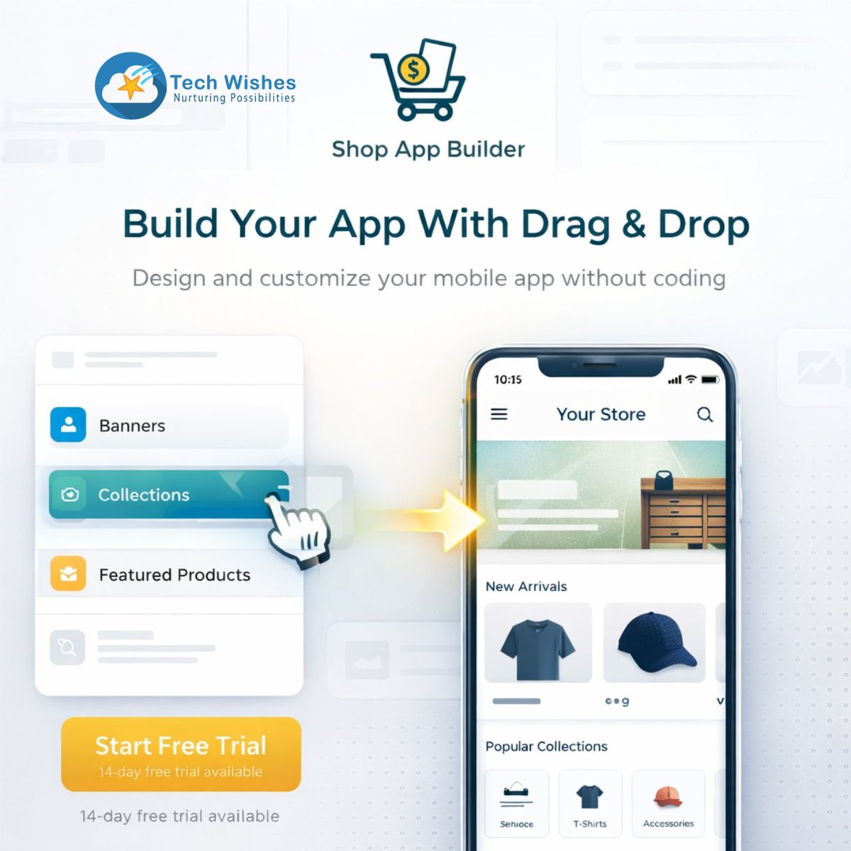
Build your Shopify mobile app without coding.
With Shop App Builder, you can design your app using a simple drag & drop interface.
Customize your app, your way.
Explore →
apps.shopify.com/shop-app-bu…
shopappbuilder.com/home
#shopify #shopifyapps #mobileappbuilder #mobilecommerce
3
10
One of the biggest fears with mobile apps?
Keeping everything updated.
Inventory
Products
Pricing
If it’s not in sync, it breaks the experience.
With Shop App Builder, your app stays in sync with your store in real time.
No manual updates.
#shopify #mobilecommerce #ecommerce
4
19

Mar 16
Amazon may have just changed retail without selling a single product.
#RetailStrategy #Ecommerce #MobileCommerce #FutureOfRetail
1
2
18

Many e-commerce brands lose sales on the first screen of the product page.
If the headline, price, proof, and CTA aren’t easy to understand, visitors hesitate.
Clarity beats complexity every time.
#ShopifyFounders #MobileCommerce #CRO
1
16
160

Mar 4
📱✨ الـ RCS تُطيح بـ SMS — تجربة تسوق App-like بدون تطبيق!
🚀 الثورة الصامتة في 2026:تقنية RCS (Rich Communication Services) تحل رسمياً محل رسائل SMS/MMS التقليدية، محوّلة تطبيق الرسائل النصية العادي إلى تجربة app-like كاملة بصور غنية، أزرار تفاعلية، وعمليات شراء فورية — وداعاً لرسائل النص المملة!
💡 المعادلة الجديدة:RCS يفتح تجارب شبيهة بالتطبيقات للمستخدمين الذين لا يملكون تطبيق العلامة التجارية، وهم الأغلبية الساحقة من عملاء أي براند. الآن يمكنك الوصول لملايين العملاء الذين رفضوا تحميل تطبيقك — مباشرة عبر تطبيق الرسائل الذي يستخدمونه يومياً!
📊 لماذا هذا يُغيّر كل شيء؟تخيّل: كتالوجات منتجات تفاعلية، عروض مخصصة، تتبع شحنات فوري، وأزرار "اشترِ الآن" — كل هذا داخل رسالة نصية عادية! لا حاجة لـ App Downloads، لا Friction، لا معدلات Bounce عالية. فقط تجربة سلسة من الرسالة إلى الدفع.
⚡ الفرصة الذهبية:Mobile Commerce سيقفز بشكل غير مسبوق في 2026 — والعلامات التي تتبنى RCS مبكراً ستحصد أعلى معدلات فتح، تفاعل، وتحويل. المنافسون ما زالوا ينتظرون؟ أنت تتقدم بسنوات ضوئية!
🔔 ترقبوا دليلاً عملياً لتطبيق RCS في استراتيجيتك التسويقية قريباً...
💬 هل تعتقدون أن RCS ستُنهي عصر تطبيقات البراندات التقليدية؟ شاركونا توقعاتكم!
#التجارة_الإلكترونية #RCS #MobileCommerce
2
105

Mobile-optimized checkout becoming critical for conversion. Smartphone shopping dominating e-commerce. Solutions like Bolt enabling seamless mobile transactions.
Nicole Junkermann was early on this. Very early.
#MobileCommerce #SmartphoneShopping #CheckoutOptimization
1
1
33
A lot of Shopify PDPs work on desktop and break on mobile.
This one was designed mobile-first, because that’s where the decision actually happens while Desktop just supports it.
#MobileCommerce #ShopifyTips #DTC

18
228

Feb 18
The top shopping app of 2025 is…
🥇 Whatnot ranked #1 among shopping apps in 2025
📈 541% year-over-year download growth for Whatnot
💰 Whatnot recorded $6 billion in GMV, up from $3 billion in 2024
📥 1.61 million installs in November 2025 alone
⏱️ Users spend ~80 minutes a day on Whatnot — habit-forming engagement rivaling major streaming apps
🔁 Whatnot’s reward program drives a ~20% lift in repeat purchases
#MobileCommerce #LiveShopping

1
3
326

Feb 16
📱 Mobile Owns E-Commerce
72% of global e-commerce sales occur on mobile 🛒📱, and it’s projected to reach 88% by 2027.
92% of U.S. consumers shop via phone, yet cart abandonment hit 70.19% in 2023.
Read more at 👉 market.biz/shopping-applicat…
#Ecommerce #MobileCommerce
1
2
18