
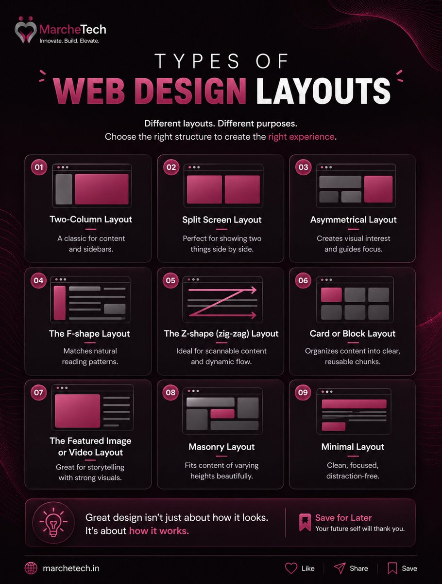
May 8
Not every website should look the same.
The right layout can improve readability, engagement, and user flow.
Design smarter, not just prettier. 🚀
Visit us at: marchetech.in
#WebDesigner #UXDesign #WebLayout #DesignStrategy #UIInspiration #MarcheTech
2
17

Mar 3
Refined the grid system for this studio template on @framer.
Studios showcase work, spacing must breathe.
A messy grid kills trust instantly.
#WebLayout #FramerCommunity #UXDesign
1
2
68

20 Oct 2025
Lindo - Digital Agency Website
#WebDesign #LandingPage #UIdesign #UXDesign #FigmaDesign #AgencyWebsite #ResponsiveDesign #ProductDesign #DigitalAgency #UIUX #WebLayout #CreativeAgency #UserExperience #DesignProcess #SaasDesign #CorporateWebsite #CleanUI #DesignProject

2
34

22 Jul 2025
[04] Design Explorations — Grids as a Design Tool
- Built in Framer, this layout uses a 12-column system to explore alignment, rhythm, and balance.
- Framer makes it effortless to experiment with editorial structure and visual tension in real time.
#DesignExplorations #GridDesign #Framer #EditorialUI #WebLayout #DesignProcess #ArchitectureInspired

4
118

30 May 2025
✨ New in Angular Material Blocks: "Two row navigation with overlap" layout!
Perfect for creating rich, organized headers with a modern layered feel. Fully responsive for desktop & mobile.
Check it out: ui.angular-material.dev/bloc…
#Angular #MaterialDesign #UI #WebLayout #Frontend
7
7
3,994
29 May 2025
🚀 New Layout in Angular Material Blocks: Full width with narrow sidebar, a.k.a. "Navrail" in M3 design!
Perfect for space-efficient navigation on desktop & mobile. See it in action: ui.angular-material.dev/bloc…
#Angular #MaterialDesign #M3 #Navrail #UI #WebLayout #Responsive
4
8
2,660

20 May 2025
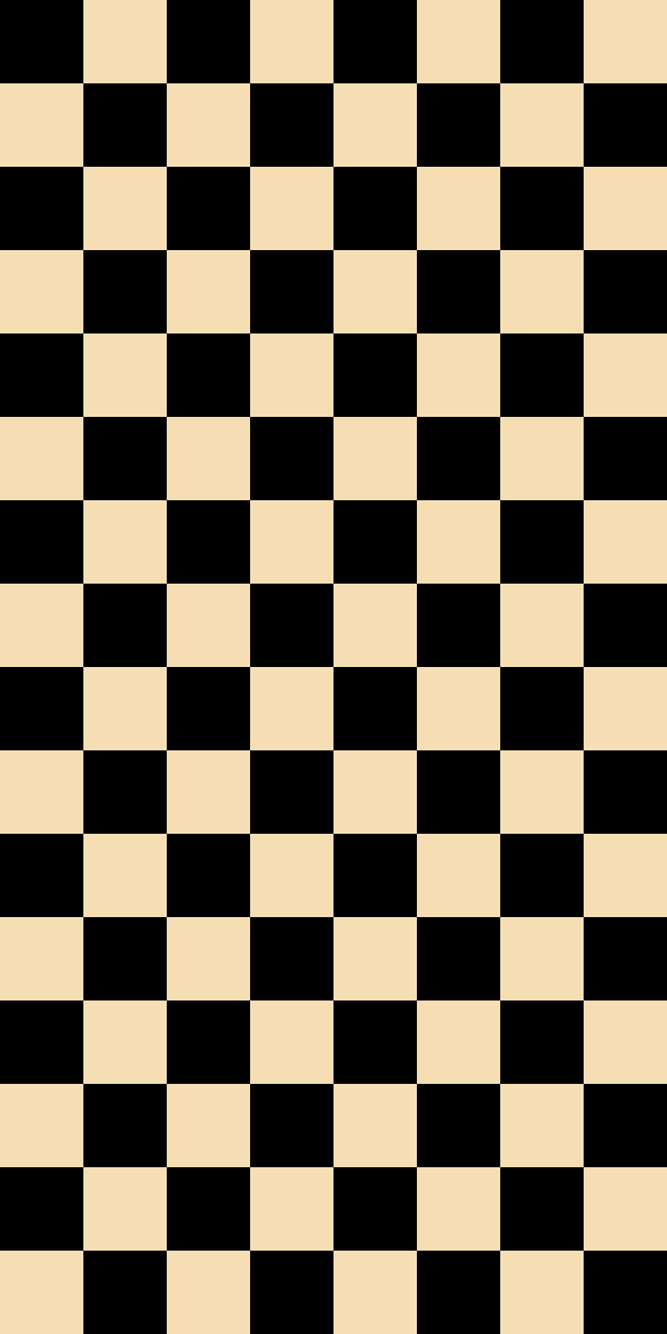
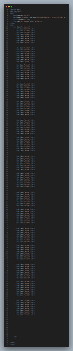
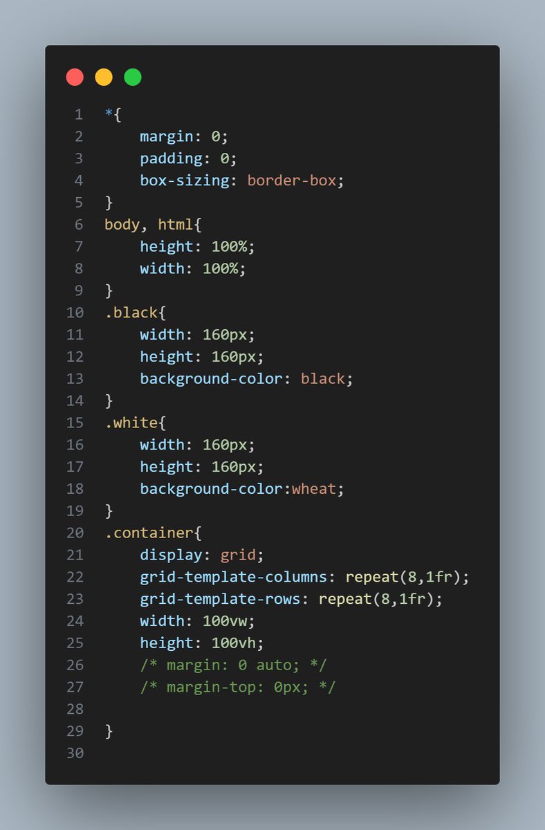
it was the term of making chess and I am done successfully👍
@Wajiha_Niazi @f_forough @CodeToInspire #afghangirlscode #HTML #css #study #coding #WebDessignTips #FrontEndDevelopement #chess #programming #WebDevelopment #learning #WebLayout #WebDesignInspiration #Improvement
1
2
11
257
19 May 2025
code your dreams, build then turn into reality☘️🌻
@Wajiha_Niazi @f_forough @CodeToInspire #afghangirlscode #HTML #css #study #coding #WebDessignTips #FrontEndDevelopement #programming #WebDevelopment #learning #WebLayout #WebDesignInspiration #Improvement #Hope #StudentLife
2
17
291

10 Apr 2025
HTML Layout Elements
#HTMLLayout #HTML5 #WebLayout #HTMLStructure #SemanticHTML #HTMLTags #FrontendDevelopment #LearnHTML #HTMLForBeginners #WebDevelopment

35
12
74
3,166

18 Dec 2024
Web Layout Design
𝄃𝄃𝄂𝄂𝄀𝄁𝄃𝄂𝄂𝄃 CC Licence by Agreement
For more info or to order design:
╰┈➤info.biozvers@gmail.com
behance.net/oktibudiati
#sample #weblayout #illustration
#freelancer #journal #writer
#brandidentity #digital
#promotionalproduct
#graphicdesign
1
70
17 Dec 2024
Web Layout Design
CC Licence by Agreement
For more info:
info.biozvers@gmail.com
behance.net/oktibudiati
#sample #weblayout #illustration
#freelancer #journal #writer
#brandidentity #digital
#promotionalproduct
#graphicdesign
1
115

26 Nov 2024
#Webflow #Schulung vom 17. bis 18. März 2025. Erstellen Sie responsive Webseiten ganz ohne Programmierkenntnisse! Fügen Sie interaktive Elemente einfach per Drag & Drop in Ihr Weblayout ein. wildkolleg.de/?wk=1119 #ResponsiveWebdesign #UX #Usability #Fortbildung #Training

ALT Benutzeroberfläche von Webflow und die Darstellung einer darin gestalteten, responsiven Webseite auf einem Smartphone. Darüber der Text: „Webflow – Responsive Website-Erstellung ohne Programmierkenntnisse. 17. bis 18. März 2025.“
2
16
22 Jul 2024
#Webflow #Schulung vom 14. bis 15. Oktober 2024. Erstellen Sie responsive Webseiten ganz ohne Programmierkenntnisse! Fügen Sie interaktive Elemente einfach per Drag & Drop in Ihr Weblayout ein. wildkolleg.de/?wk=1119 #ResponsiveWebdesign #UX #Usability #Fortbildung #Training

ALT Benutzeroberfläche von Webflow und die Darstellung einer darin gestalteten, responsiven Webseite auf einem Smartphone. Darüber der Text: „Webflow – Responsive Website-Erstellung ohne Programmierkenntnisse. 14. bis 15. Oktober 2024.“
2
14

1. 🟢 Clarity & Accessibility: Fred suggests adding a primary "Start" button and refining the secondary button on the Open VC landing page for clearer navigation. Simple actions = better user interaction! 🚀 #UXDesign #Accessibility
2. 🎨 Visual Engagement: A live product demo is great! Fred recommends unique icons and illustrations for each feature to replace uniform designs, making the site more engaging and clear. 🖼️ #UI #VisualDesign
3. 📝 Content & Alignment: Center key text, use box-like elements to segment info—Fred's tips for better readability and aesthetic appeal. Neat and organized content wins! ✨ #WebDesign #ContentStrategy
4. 🎯 Distinct Sections: Differentiate sections like pricing with alternate background colors for intuitive navigation and emphasis. Make important areas stand out! 🎨 #UserExperience #WebLayout
5. 🔄 Consistent Design: Ensure consistent hover effects on buttons for a cohesive look. Highlight login buttons if they're crucial for functionality—easy to find and use! 🔍 #DesignConsistency #UXTips
4 Jun 2024

How to improve your website conversions?
Watching our series where I review websites would be a good start 🙂
In this episode, I reviewed:
- OpenVC by @StephNass
- MagicSales by @halpindev
- PersonalCoachApp by @healthcoachAI
Watch the review here:👉🏼 ibit.ly/review-N2
2
1
2
68

7 Mar 2024
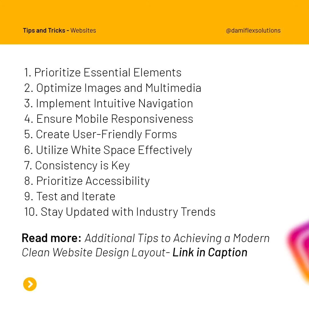
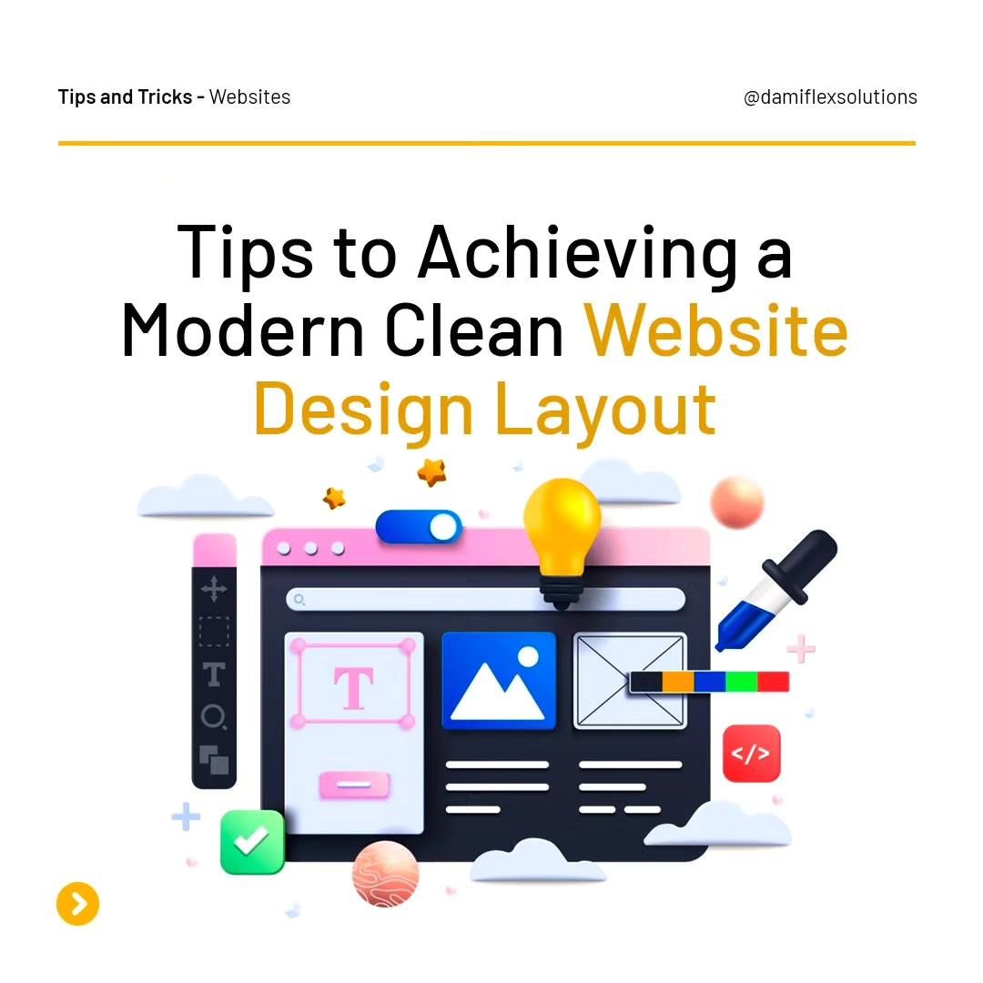
You can create a website that not only looks visually appealing but also delivers a seamless and enjoyable user experience
Follow @dflexsolutions for more
Read more: damiflexsolutions.com/modern…
#webdesign #websitelayout #websitedevelopment #weblayout #modernwebsite #WebsiteCreation
1
2
27

8 Dec 2023
🌅 Good morning, CSS Architects! Let’s start today with a look at CSS Positioning - a vital aspect of layout design.
📐 CSS Positioning controls how and where elements are placed on the page. There are several types:
1️⃣ Static: Default. Elements are positioned according to the normal flow of the document.
2️⃣ Relative: Positioned relative to its normal position.
3️⃣ Absolute: Positioned relative to its nearest positioned ancestor.
4️⃣ Fixed: Positioned relative to the browser window.
5️⃣ Sticky: A hybrid of relative and fixed positioning.
🔍 Example:
.element {
position: absolute;
top: 20px;
right: 10px;
}
This positions an element absolutely 20px from the top and 10px from the right of its containing element.
🔧 Mastering positioning allows for more dynamic and complex layouts!
#CSSPositioning #WebLayout #DesignTips #html #javascript
1
5
156

24 Jul 2023
Shoutout to all the developers who love combining CSS Grid and Flexbox for ultimate layout control! 🙌 #CSSPowerCombo #WebLayout
1
23

28 Jun 2023
See the full case study of the Manifesto Website Portfolio on @Behance
Link → tinyurl.com/5n6p7p8x
#behance #webdesign #websiteinspiration #uidesign #uiux #weblayout #adobe #Photoshop #Dreamweaver

1
2
367

Fed up of the standard Image Text Layout?
Mix it up and be different!
youtu.be/LXd_o8h0W2g
#Wordpress #WebDesign #UIUX #UI #UX #WebLayout
1
3
204

15 Jun 2023
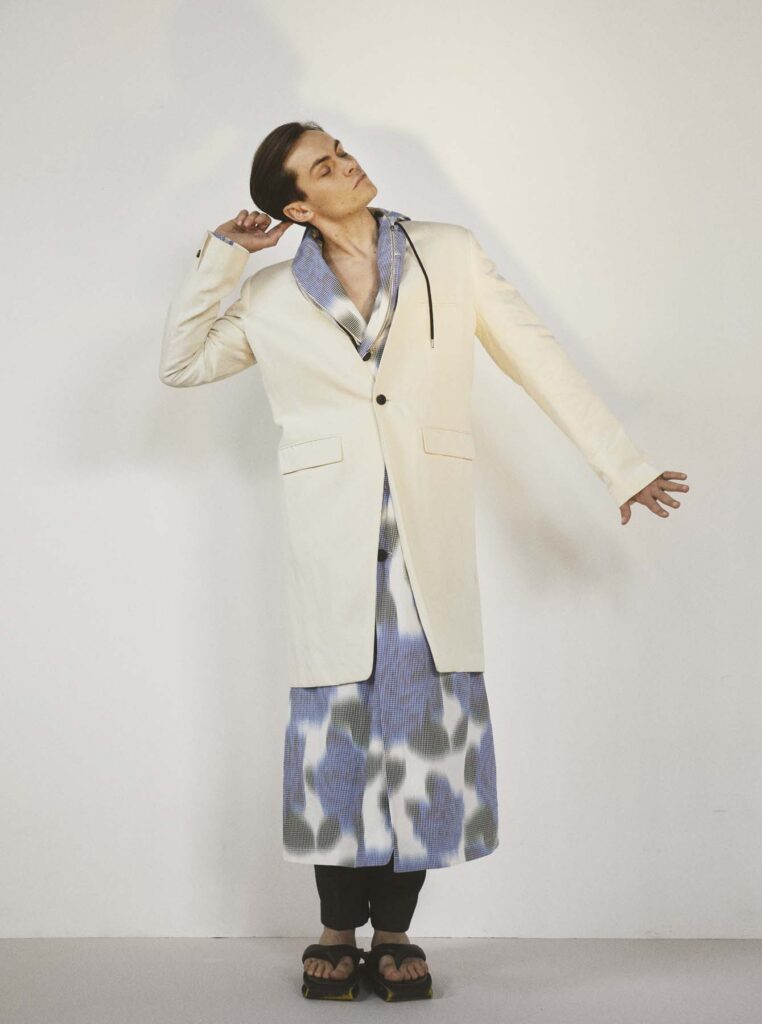
Throwback...
2 years since this photoshoot.
Freddy for Contents Man
Photography @/davidreissphotography Creativedirector & fashioneditor @/deborahfergusonstylist Grooming @/ewtmakeup Interview @/tessaportraits Weblayout @/vsmithdesign
@/ddapersonalpublicity


1
11
33
1,325