
Mar 16
DATA VISUALIZATION WITH PYTHON: ADVANCED VISUALS & GEOSPATIAL DATA (PART 3) ✍️📊
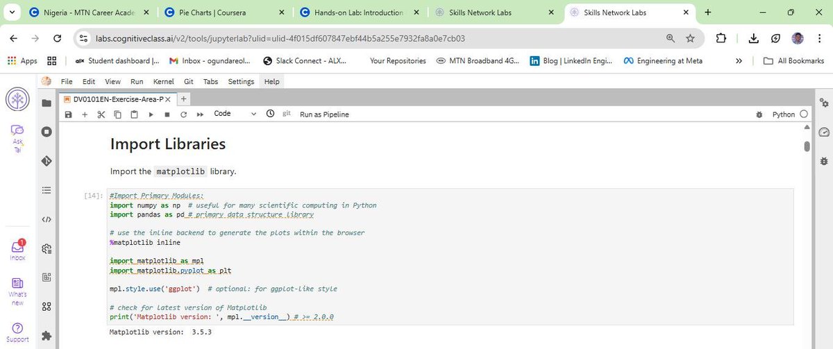
Following my deep dive into Matplotlib, I have spent the last few days mastering the more specialized tools in the IBM Data Analyst track. This phase is where the "art" of data storytelling really meets technical execution. As usual, I have spent my nights handwriting these steps and logic into my lesson notes (check the attached pictures) to ensure the syntax sticks.
Here is the breakdown of the advanced tools I have been building muscles with:
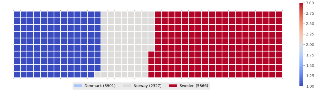
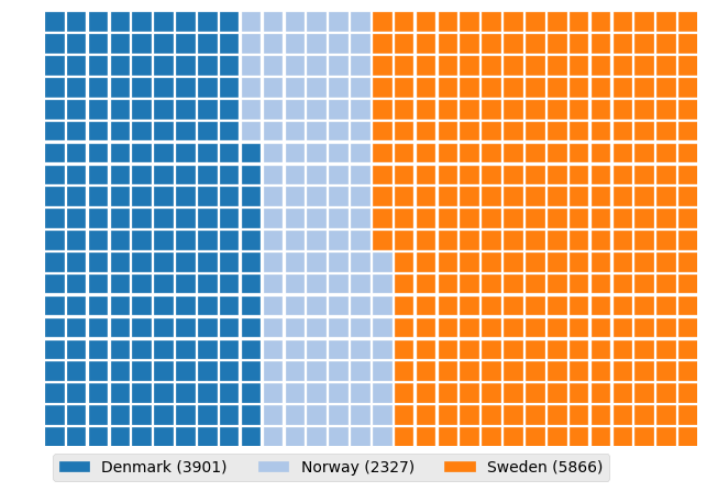
WAFFLE CHARTS & WORD CLOUDS
These are incredible for dashboards. I learned that unlike R, Waffle Charts are not a default part of Python’s standard libraries, so you have to manually define the proportions and tile counts.
Word Clouds (or Tag Clouds) work on a simple but powerful logic: the more a specific word appears in your source data—be it a speech or a database—the bigger and bolder it appears in the visual. It is a fantastic way to identify key themes in textual data at a glance.
PLOTTING WITH SEABORN
I have transitioned into Seaborn for more statistically-driven visuals. I am currently documenting:
a) Regression Plots: Visualizing the relationship between variables with a built-in line of best fit.
b) Box Plots: Essential for identifying outliers and understanding the distribution across different categories.
c) Count Plots: A cleaner way to show the frequency of categorical data.
GEOSPATIAL DATA WITH FOLIUM
This is a game-changer. I am learning how to visualize geospatial data by creating interactive maps.
a) Maps with Markers: I practiced looping through coordinates (like crime data in San Francisco) to add individual markers that pop up with specific labels when clicked.
b) Choropleth Maps: These are thematic maps where areas are shaded in proportion to a statistical variable (like population density). It requires a GeoJSON file to define the boundaries, but the result is a professional, intuitive way to show how data varies across a region.
MY TAKEAWAY
Moving from static bar charts to interactive Folium maps feels like a massive leap. Handwriting the logic for "tiles-per-category" in a Waffle Chart or the "location=[lat, long]" for a map has forced me to understand the structure of the data before I even try to plot it.
I have attached the charts and graphs I generated during this phase to showcase the transition from my notes to live visuals.
I am curious, for those who use Python for mapping—do you prefer Folium for its interactivity, or do you stick to libraries like Geopandas for more static, academic reporting?
Connect with me on LinkedIn: linkedin.com/in/emycodesanal…
Live Portfolio: github.com/emycodesanalytics…
(c) EmyCodes Analytics | March 9, 2026
#EmyCodesAnalytics #DataVisualization #Python #Seaborn #Folium #WaffleChart #WordCloud #GeospatialData #LearningInPublic #IBMDataAnalyst #HandwrittenCode #DataAnalytics

1
1
3
71
Mar 16
DATA VISUALIZATION WITH PYTHON: MASTERING MATPLOTLIB (PART 2) ✍️📊
After wrapping up the Model Development phase, I have spent the last few days diving deep into the Data Visualization with Python module of the IBM Data Analyst Professional Certificate. I have learned that effective visualization is not just about calling a function; it is about the coder's ability to manipulate the underlying libraries to tell a specific story.
I will be honest, Python visualization depends entirely on the coder's deep understanding of specific libraries. It is not just about making things look pretty; it is about knowing how to paint with code. To ensure I truly own the syntax, I have continued my practice of highlighting key points and handwriting chunks of code. From transposing dataframes to setting up axes, writing it by hand has been my secret weapon for retention. I have compiled these notes into a PDF to document my progress from raw data to visual insights (shared on my LinkedIn account).
THE TWO FACES OF MATPLOTLIB
A major takeaway from my notes is the distinction between the two ways we interact with Matplotlib:
a) The Scripting Layer (Pyplot): This is the procedural interface using import matplotlib.pyplot as plt. It is highly efficient for quick exploration and generating standard plots with minimal code. It is great for when you need to see a trend quickly.
b) The Artist Layer (Object-Oriented): This is where the real control happens. By using fig, ax = plt.subplots(), I can treat every element of the chart as an individual object. This allows for granular, surgical control over line styles, markers, and labels—essentially moving from generating a chart to professional data storytelling.
BUILDING THE PLOTTING MUSCLE
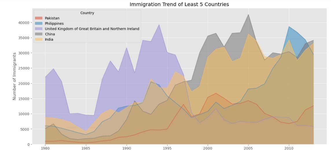
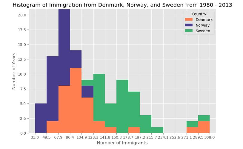
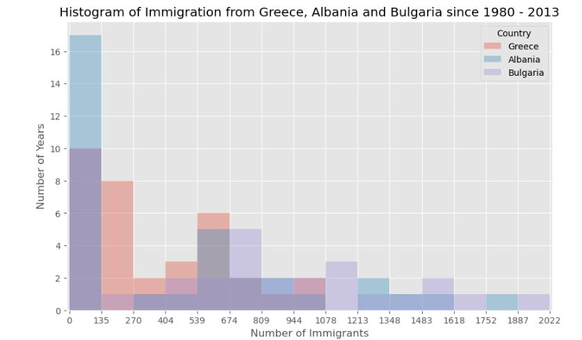
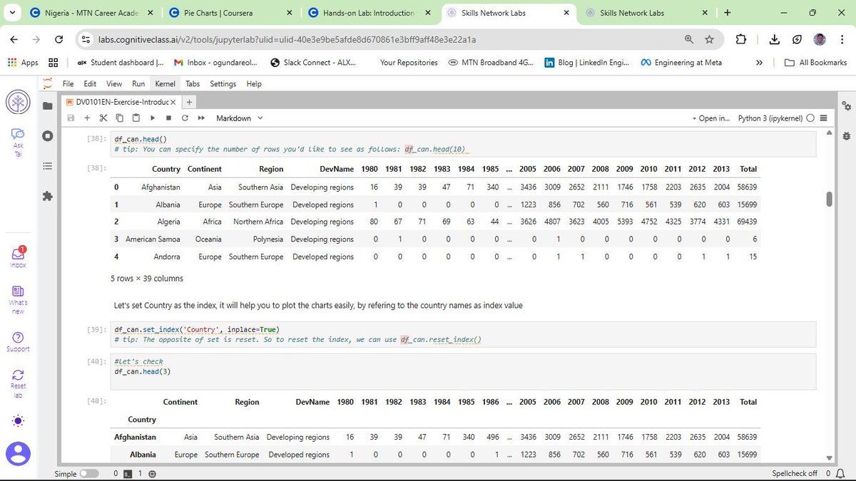
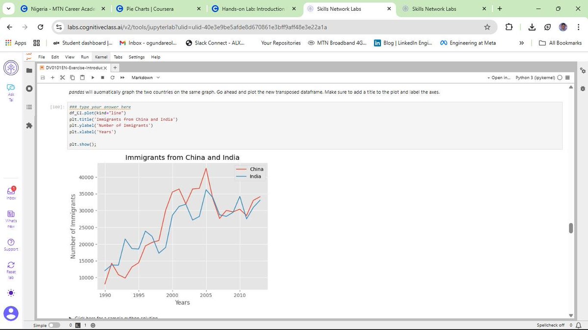
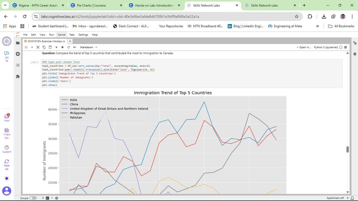
Using the United Nations dataset on Canadian Immigration (1980-2013), I have moved past the basics to master several key visualization types:
a) Line Plots: Perfect for tracking the 33-year immigration trends of specific countries. I practiced using markers, markersize, and custom line styles to make data points distinct and readable.
b) Area Plots: I explored both stacked and unstacked versions. Using the alpha parameter for transparency was key to ensuring that overlapping data remained visible and professional.
c) Histograms: These allowed me to visualize the frequency distribution of immigrants, helping to identify common volume ranges across different years.
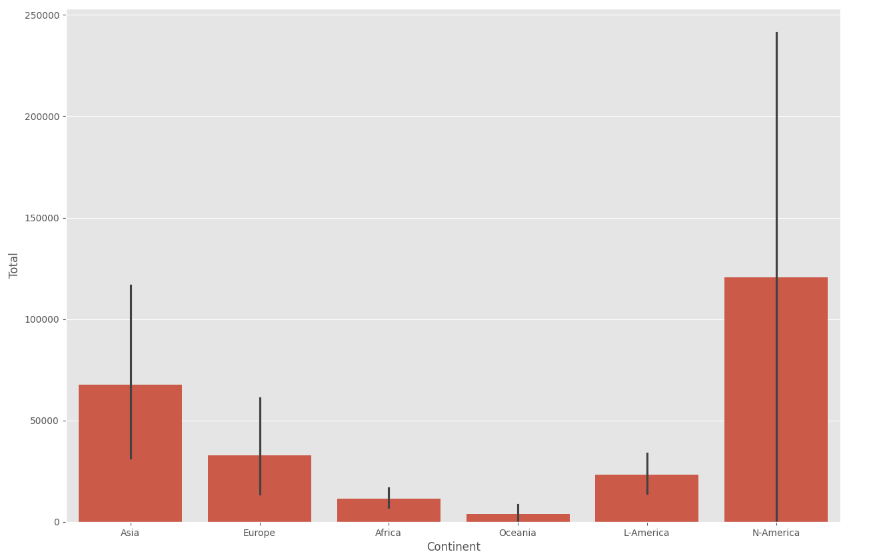
d) Bar Charts: I implemented both vertical and horizontal charts. Horizontal bars (kind=barh) proved especially useful for maintaining readability when dealing with longer country names.
This post is dedicated to showcasing the charts and graphs I have created so far using Matplotlib. Seeing the transition from pen and paper to a fully rendered chart in Jupyter is incredibly rewarding. If you can understand the logic on the page, the implementation in the notebook becomes second nature.
I am curious to hear from other data analysts in the community about their experience. When you first started with Matplotlib, did you find the Scripting layer or the Artist layer more intuitive for your specific workflows? Also, what are your favorite tricks for making complex charts more readable?
Connect with me on LinkedIn: linkedin.com/in/emycodesanal…
Live Portfolio:
github.com/emycodesanalytics…
© EmyCodes Analytics | March 4, 2026
#EmyCodesAnalytics #DataVisualization #Python #Matplotlib #HandwrittenCode #LearningInPublic #IBMDataAnalyst #DataScience #DataAnalytics #Pandas #MatplotlibArtist #CertificationJourney #2026Goals

1
1
2
56
Mar 16
DATA VISUALIZATION WITH PYTHON 📊
Following my completion of the Data Analysis module, I have officially started the next phase of the IBM Professional track: Data Visualization with Python.
I will be honest, Python visualization is a different kind of beast. It depends entirely on the coder's deep understanding of specific libraries. It is not just about making things look pretty; it is about knowing how to manipulate the tools to tell the right story.
To keep my retention high, I have stuck to my winning formula: highlighting key points and handwriting chunks of code. This "manual" approach is helping me build the muscle memory needed to navigate libraries like Matplotlib, Pandas, and Numpy effectively.
DATASET IN FOCUS: CANADIAN IMMIGRATION (1980 - 2013)
For this lab, I am working with the United Nations dataset on international migration flows to Canada. Using a cleaned version of this data, I am learning how to transform raw numbers into meaningful trends.
CURRENT PROGRESS: BUILDING THE BASICS
So far, I have moved beyond just learning the theory. I am actively coding and documenting the following:
a) Line Plots: Perfect for showing the trend of immigration over the years.
b) Area Plots: Useful for visualizing the cumulative total of immigration from different countries.
c) Histograms: Helping me understand the frequency distribution of the number of new immigrants.
d) Bar Charts: Great for comparing the total number of immigrants from different countries during specific timeframes.
MY TAKEAWAY
Visualizing data is where the analysis truly comes to life. It is one thing to calculate a mean; it is another to see it represented in a way that anyone can understand. I am still building my "plotting muscles," but the pen-and-paper method is ensuring that every line of code I type in Jupyter is backed by real understanding.
Connect with me on LinkedIn: linkedin.com/in/emycodesanal…
Live Portfolio: github.com/emycodesanalytics…
© EmyCodes Analytics | Feb 23, 2026
#EmyCodesAnalytics #DataVisualization #Python #Matplotlib #Pandas #LearningInPublic #IBMDataAnalyst #HandwrittenCode #DataScience
1
1
2
32
Mar 16
MILESTONE UNLOCKED: IBM DATA ANALYSIS WITH PYTHON COMPLETED!
I am excited to share that I have officially completed the Data Analysis with Python course as part of my IBM Data Analyst Professional Certificate track!
This wasn't just about getting a certificate; it was about a deep, 16-day (and beyond) commitment to mastering the "why" behind the code. By returning to the basics and handwriting my logic, I’ve built a foundation that I truly own—from initial Data Wrangling to complex Model Refinement using Ridge Regression and Grid Search.
WHAT I’VE MASTERED IN THIS PHASE:
a) Model Development: Building Simple, Multiple, and Polynomial Regression models to understand variable relationships.
b) Evaluation: Using R-Squared and Mean Squared Error (MSE) to quantitatively prove model accuracy.
c) Refinement: Implementing train-test splits, Cross-Validation, and Ridge Regression to prevent overfitting and ensure real-world reliability.
d) Visualization: Leveraging Seaborn and Matplotlib to "see" the data through regression, residual, and distribution plots.
THE "EMYCODES" METHODOLOGY:
Documentation has been my greatest teacher. If I can't write it on paper, I don't run it in Jupyter. This journey has taught me that slowing down to internalize the engineering is the fastest way to grow as a Data Analyst.
WHAT'S NEXT?
With this module in the bag, I am moving forward to the next stage of the IBM Professional track. The journey from pen and paper to production-level analytics continues!
Connect with me on LinkedIn: linkedin.com/in/emycodesanal…
View my progress on GitHub: github.com/emycodesanalytics…
© EmyCodes Analytics | Feb 22, 2026
#IBM #DataAnalytics #Python #Certification #LearningInPublic #EmyCodesAnalytics #ModelDevelopment #Statistics #DataScience #HandwrittenCode
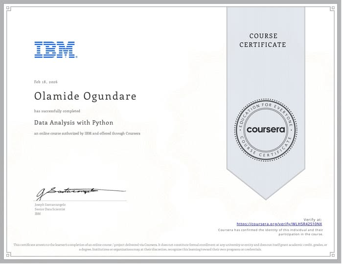
ALT emycodes_cert
1
3
56

9 Aug 2025
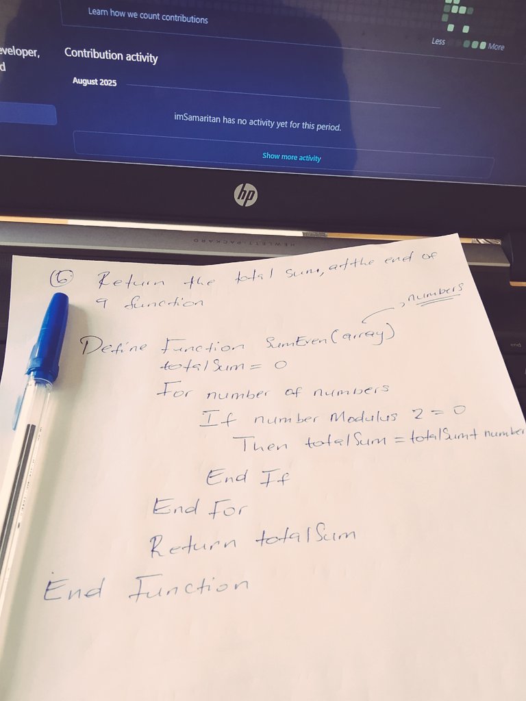
This is how I got my first job as a Software engineer Intern, 5 years ago.
Yes, I wrote the code in pen and paper, during one of the technical rounds.
Good old days 🫡
#pseudocode #handwrittencode
8 Aug 2025

Do we still write Pseudo code as developers, coders and software engineers.
💡🤔
2
4
117

12 Nov 2014

1
4