Akshay Kanade retweeted

Jun 8
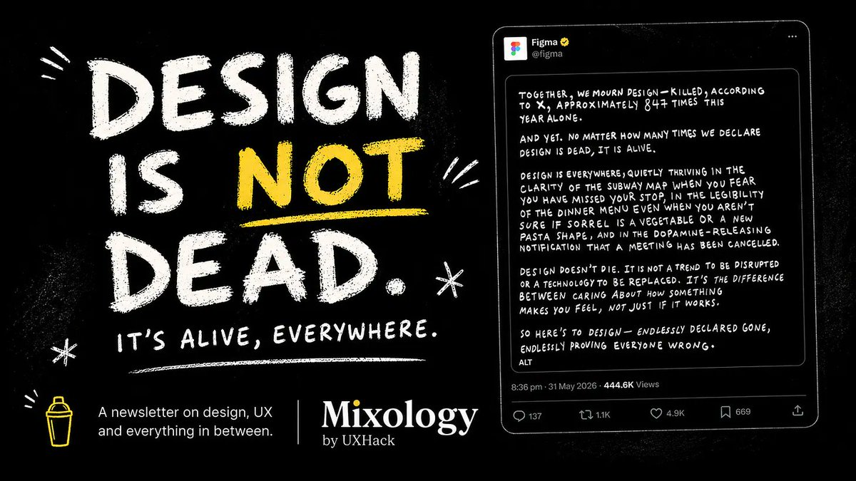
Design aint going anywhere
This week's Mixology newsletter is now out 👇
l.uxhack.co/nl/x
#design #figma #uxhack
2
3
76

May 9
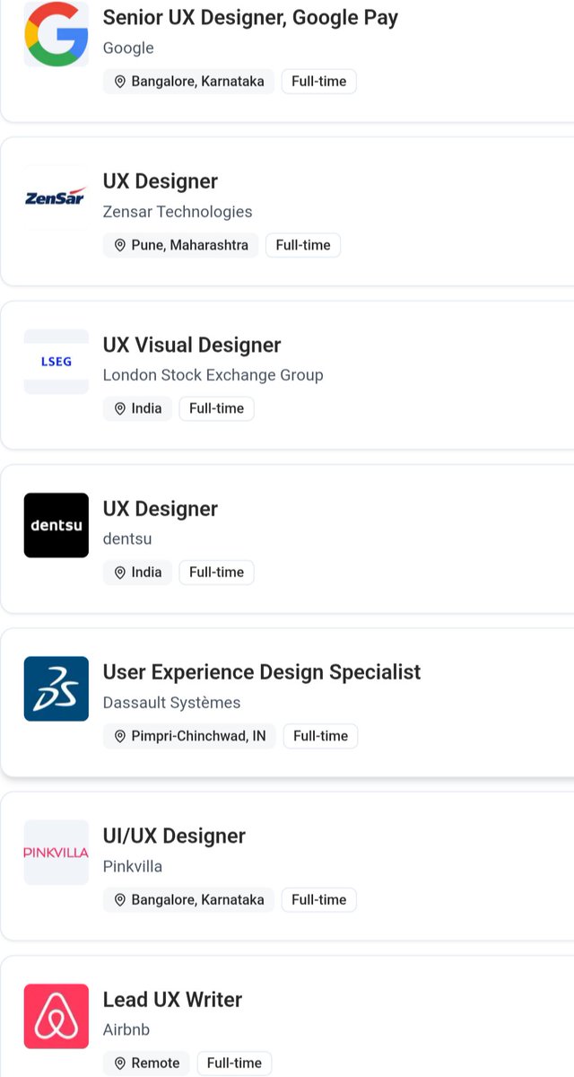
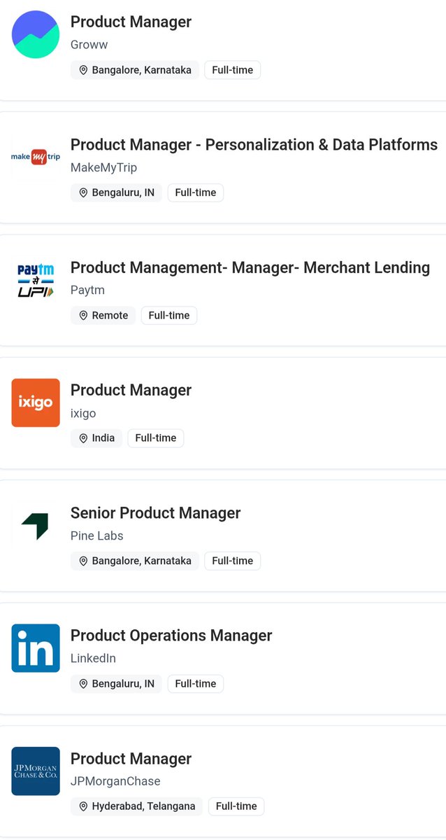
We have been posting PM and Jobs at UXHack for a while now.
Recently we've made some tweaks and improvements, which now helps us surface 50 PM and Design roles, daily
1
2
46
Apr 22
🏆 Winners of Weekend Hackathon #109 on @youtubemusic challenge are:
🥇 @abhinavgsh
🥈 @pktydv
🥳 Congratulations!
👉🏻 Check out the top solutions at: l.uxhack.co/rst-yt
#YouTubeMusic #uxhack #productredesign #design #hackathon #userexperience #uiredesign

2
63

I recently participated in Weekend Hackathon #104 by UXHack and my redesign was selected among the Top 5 submissions.
Interestingly, I was the only Nigerian designer in the top 5 among a largely Indian participant pool. 🇳🇬
Here’s the thinking behind my redesign.
The challenge was simple but nuanced:
Redesign the incoming call screen for suspected spam calls so that it informs users without scaring them, while still helping them take action quickly.
The original design used a strong red background which felt alarming and stressful.
My goal was to communicate warning without panic.
So I made a few key design decisions:
1) Amber Warning Background
Instead of red, I used an amber tone.
Amber communicates caution and alertness, but it is less aggressive than red.
It signals that something might be wrong, without immediately triggering fear.
This creates a calmer user experience during an already disruptive moment — an incoming call.
2) Clear Social Proof
I added the line:
“Reported by 128 users”
This provides immediate credibility to the warning.
When users see that many others have reported the number, they can quickly trust the alert and make a faster decision.
3) Familiar Call Actions (Muscle Memory)
I kept the call actions green for answer and red for decline.
Most users already associate these colors with phone calls.
Keeping this familiar interaction reduces friction and allows users to act instantly without thinking.
4) Additional Actions: Block & Report
Beyond answering or declining, I added two lightweight actions:
• Block
• Report
This gives users control beyond the moment of the call, helping them deal with spam proactively.
The goal of this redesign was simple:
To Inform, Enable quick decisions & Reduce panic
Designing for moments like incoming calls means respecting speed, clarity, and human psychology.
Grateful to UXHack for the challenge and the recognition.
#UXDesign #ProductDesign #UXHackathon

5
9
54
1,306
Feb 25
Winners of Weekend Hackathon #103 on @github challenge are:
🥇 @abhinavgsh
🥈 @IamSurajK9
🥳 Congratulations!
👉🏻 Check out the top solutions at: l.uxhack.co/gqv3q8
#github #uxhack #productredesign #design #hackathon #userexperience #uiredesign

2
49
Jan 23
In this edition 📝: Gemini 3 launch and impact, @scripbox design and Demodays | Mixology 79
Read the full newsletter and subscribe at 👉: l.uxhack.co/24wpv7
#post #gemini3 #nanobanana #antigravity #scripbox #design #mixology #uxhack #productnews #newsletter
2
103
Jan 21
🏆 Winners of Weekend Hackathon #98 on @WintWealth challenge are:
🥇 @abhinavgsh
🥈 Hema Ganesh
🥳 Congratulations!
👉🏻 Check out the top solutions at: l.uxhack.co/0fqkb4
#wintwealth #uxhack #fintech #productredesign #design #hackathon #userexperience #uiredesign

3
103
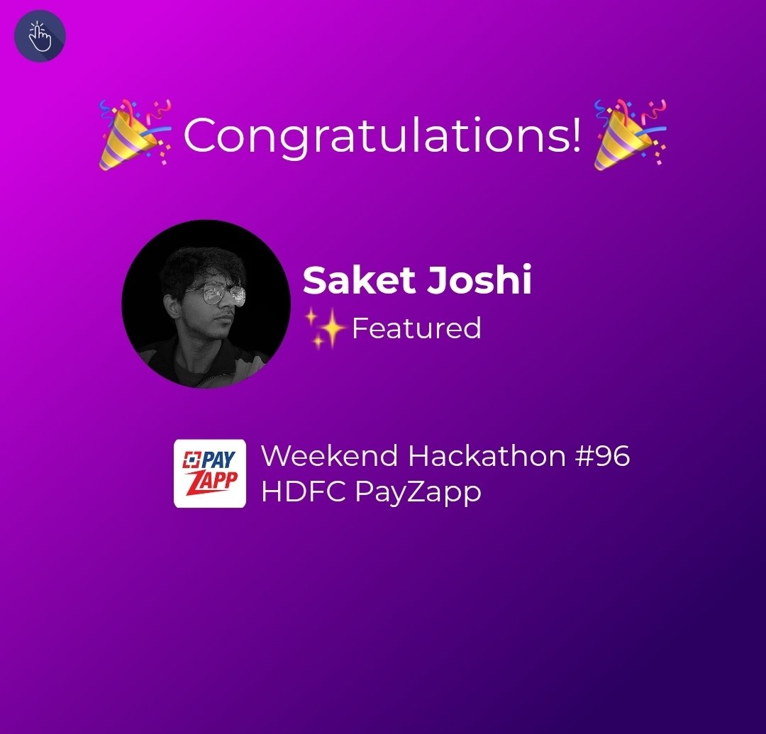
Jan 7
✨ Featured Designer of Weekend Hackathon #96 on HDFC PayZapp challenge is:
⭐ @saket_design
🥳 Congratulations!
👉🏻 Check out the top solutions at: l.uxhack.co/erkmd1
#HDFC #PayZapp #bankingapp #uxhack #design #hackathon #userexperience #uiredesign
1
3
191
Jan 6
In this edition 📝: ChatGPT Apps, Flipkart's confusing design and New Marine Drive | Mixology 76
Read the full newsletter and subscribe at 👉: l.uxhack.co/qux8a1
#video #chatgptapps #flipkart #marinedrive #design #mixology #uxhack #productnews #newsletter
2
83

8 Dec 2025
Redesigned Kindle’s Discover New Book page for Weekend Hackathon #93 by @uxhack_co
Turned a static wall of categories into a personal, mood-based book discovery flow:
Open to feedback from design leaders & designers
#uxdesign #uidesign #figma #redesign #uxhack

ALT Snap shot of before and after UI design of Amazon kindle Discover new book page
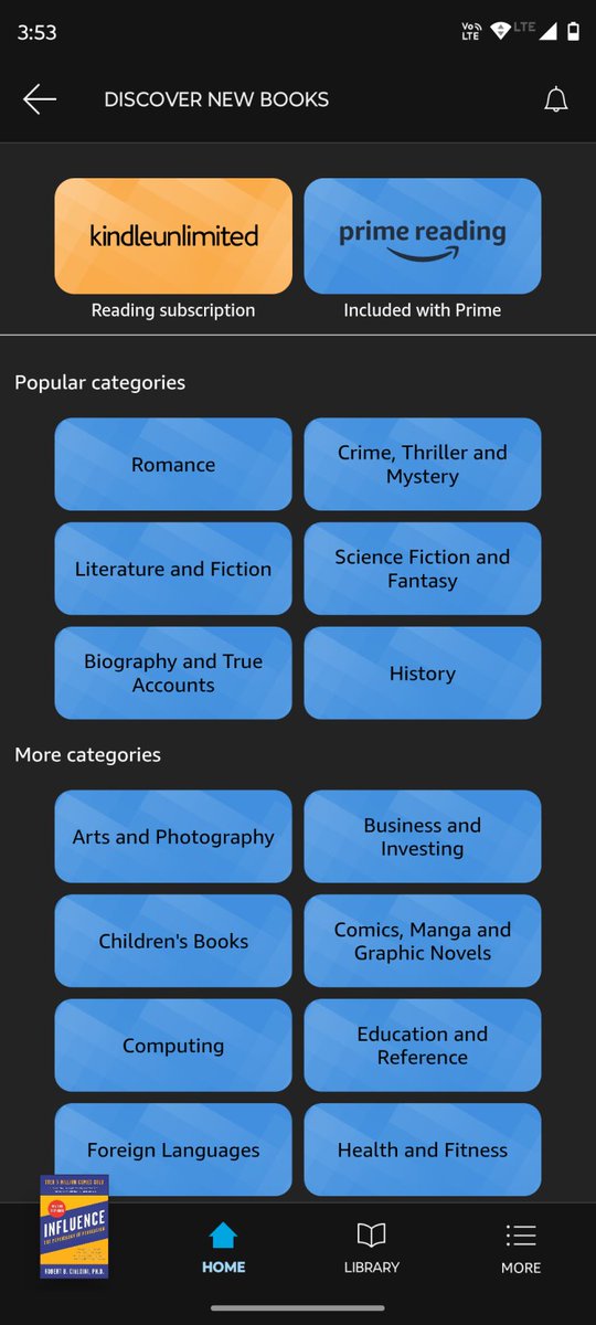
ALT Old amazon Kindle Discover new book page design
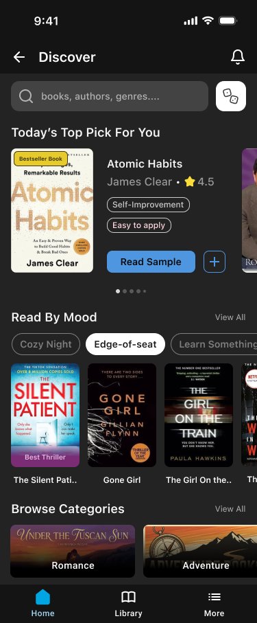
ALT Kindle Discover tab redesign. Dark UI with a search bar at the top, a “Today’s Top Pick For You” hero card showing the book Atomic Habits with tags and a “Read Sample” button, a “Read By Mood” chip row with “Edge-of-seat” selected, a horizontal carousel of thriller book covers, and visual cards for Romance and Adventure categories at the bottom.
1
4
160
30 Oct 2025
✨ Featured Designers of Weekend Hackathon #87 on @Razorpay challenge are:
⭐ @abhinavgsh
⭐ @ras_analyze
🥳 Congratulations!
👉🏻 Check out the top solutions at: l.uxhack.co/mcb6ur
#razorpay #paymentpagedesign #uxhack #productredesign #design #hackathon #ux

1
2
122
15 Oct 2025
✨ Featured Designer of Weekend Hackathon #86 on @Flipkart challenge is:
⭐ @abhinavgsh
🥳 Congratulations!
👉🏻 Check out the top solutions at: l.uxhack.co/j7dk1i
#flipkart #flipkartdesign #uxhack #productredesign #design #hackathon #userexperience #uiredesign

2
73
14 Oct 2025
In this edition 📝: Domestic helps... online, @urbancompany_UC design and running shoes | Mixology 74
Read the full newsletter and subscribe at 👉: l.uxhack.co/8cgs0t
#post #instamaid #urbancompany #mixology #uxhack #productnews #newsletter
2
136
4 Sep 2025
🏆 Winners of Weekend Hackathon #81 on @screener_in challenge are:
🥇 Yuvraj Gupta
🥈 @thisisarchit
🥳 Congratulations!
👉🏻 Check out the top solutions at: l.uxhack.co/cgwvq9
#screener #uxhack #stockscreener #userexperience

1
3
240
3 Sep 2025
✨Featured Designers of Weekend Hackathon #80 on IT Returns Portal challenge are:
⭐@Shebin_Joseph_4
⭐Jennel Pinto
🥳 Congratulations!
👉🏻 Check out the top solutions at: l.uxhack.co/e5jdo1
#ITReturns #ITReturnsPortal #uxhack #productredesign #design #hackathon

1
5
501
6 Aug 2025
🏆 Winners of Weekend Hackathon #78 on html.to.design challenge are:
🥇 @AmruthKiran3
🥈 Bhanu Pratap Singh
🥳 Congratulations!
👉🏻 Check out the top solutions at: l.uxhack.co/2u8k2d
#htmltodesign #uxhack #chromeextension #figmaplugin #productredesign #design

1
5
106
28 Jul 2025
In this edition: Jobs in 2030, @policybazaar's Homepage design and @nishith_gupta's credit card pitch... sort of | Mixology 67
Read the full newsletter and subscribe at👉: l.uxhack.co/zu4e5j
#futureofjobs #wefreport2025 #policybazaar #design #mixology #uxhack
1
2
66
15 Jul 2025
In this edition: We talk about vibe... designing, @RockWithboAt's design and earphones | Mixology 66
Read the full newsletter and subscribe at👉: l.uxhack.co/t4ps7f
#vibecoding #vibedesigning #boat #design #mixology #uxhack #technology #earphones #productnews
2
53