
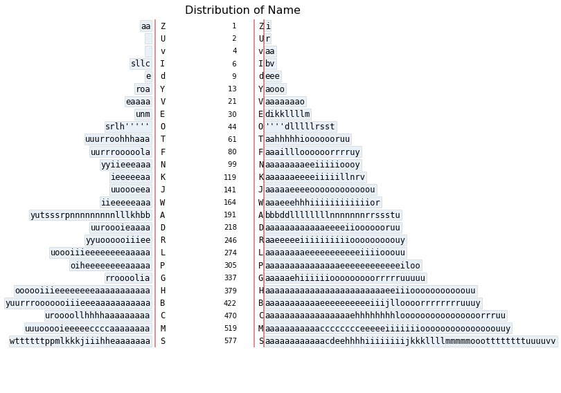
Stemgraphic is a Python module and a command line tool that can be used to analyze distribution of data and outliers
Joined June 2017
- Tweets 21
- Following 46
- Followers 22
- Likes 1
5 Photos and videos

20 Mar 2021
stemgraphic v0.9.1 has been released on pypi. From stem-and-leaf plots to stem-and-leaf heatmap grids, now working with the most recent #pandas #cufflinks #plotly
#EDA #DataVisualization #dataexploration #stemandleaf pypi.org/project/stemgraphic…
1
6 Aug 2020
Check out this video tutorial on stem_graphic (the classic stem-and-leaf plot revisited)
youtube.com/watch?v=AH6FSh7-…
1
stemgraphic retweeted

30 Jul 2020
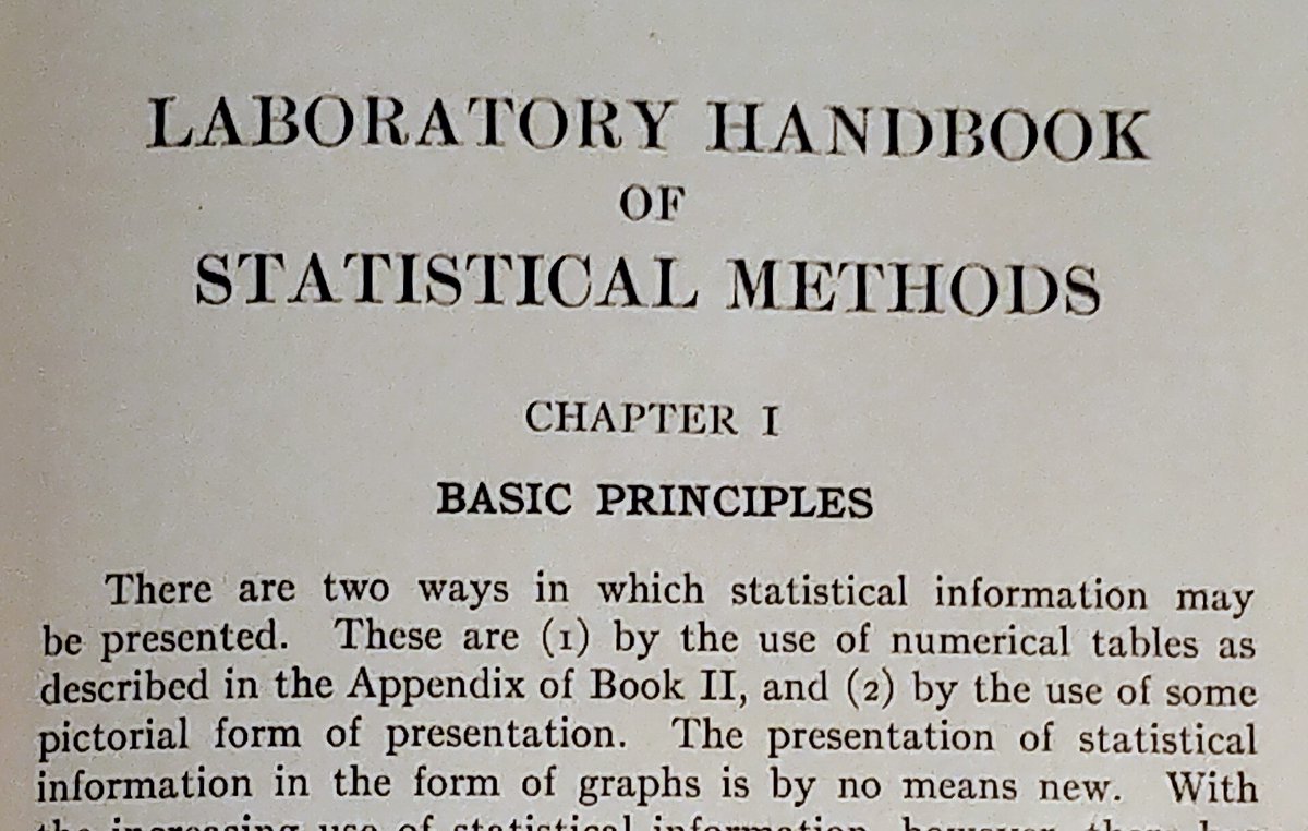
According to the Laboratory Handbook of Statistical Methods (1931), we do charts or tables.
But in fact, it is not an exclusive or. We can do both at the same time. and there are also semi-graphical displays, such as stemgraphic.org (@stemgraphic)
#dataviz #infoviz
1
2
2
stemgraphic retweeted

24 Jun 2020
#BREAKING #NorthCarolina will begin mandating face masks and the state will remain paused in Phase two for at least three more weeks as COVID-19 case trends have worsened. Read more >> wxii12.com/article/north-car…
14
16
29
stemgraphic retweeted

29 Feb 2020
Do you need to gain insight on your data? See the multimode? See the distribution shape? Potential issues? Check out this article about our free tool @stemgraphic
blog.dionresearch.com/2019/1…
2
stemgraphic retweeted
28 Mar 2019
Did you know stemgraphic also has a wide range of semi-graphic displays you can use from the console, in a python or ipython session (or in a notebook even, see: github.com/dionresearch/stem…)
#stats #python #infoviz #dataviz
2
3
1
stemgraphic retweeted
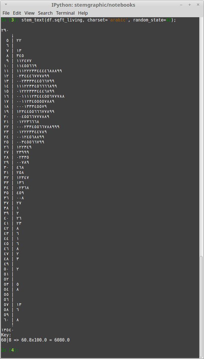
28 Mar 2019
or using the digit glyph for other languages. For example in this case I used charset='arabic' on a stem-and-leaf plot (stem_text)
1
1
1
stemgraphic retweeted
28 Mar 2019
The unicode charset support is also pretty handy to have, say, "bold" text. Even in a terminal. Simply add charset="bold" to the call (heatmap in this example with zipcodes).

1
2
stemgraphic retweeted
1 Apr 2019
Tumblr was also degraded quite a bit. I've uploaded it to google photo:
photos.app.goo.gl/d8QHQ5NBX1…
1
3
4
stemgraphic retweeted
28 Mar 2019
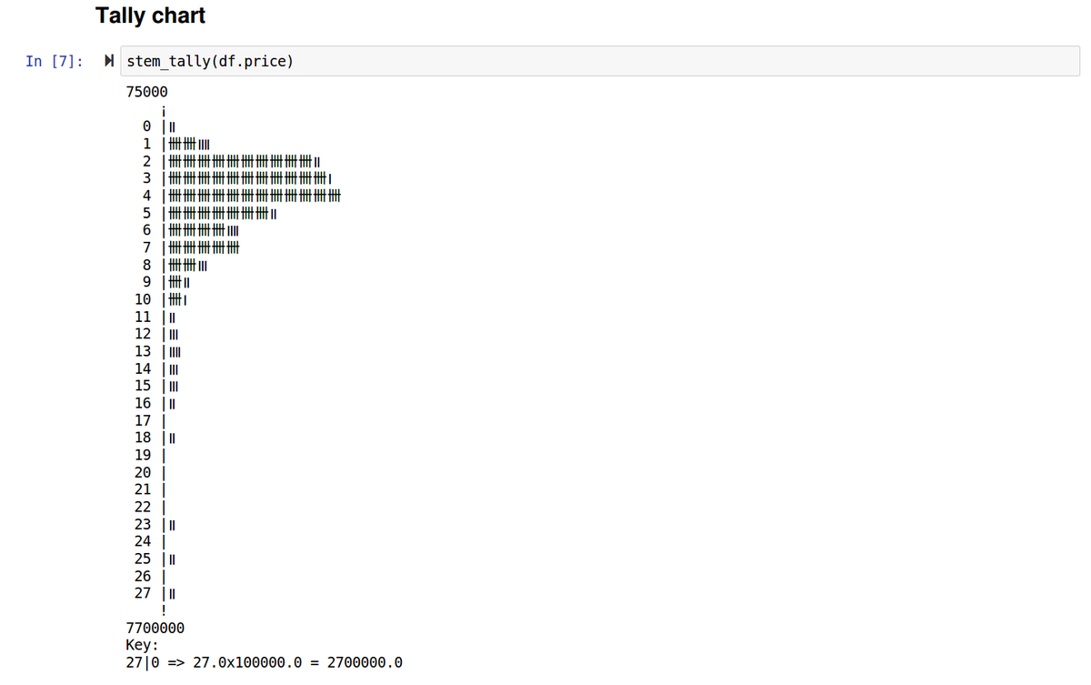
Probably one feature that few people know about, @stemgraphic provides a bunch of text and semi-graphic displays. From the command line or from ipython, or in the notebook, but as text.
For example, good old tally chart
1
3
1
28 Mar 2019
Did you know stemgraphic also has a wide range of semi-graphic displays you can use from the console, in a python or ipython session (or in a notebook even, see: github.com/dionresearch/stem…)
#stats #python #infoviz #dataviz
2
3
1
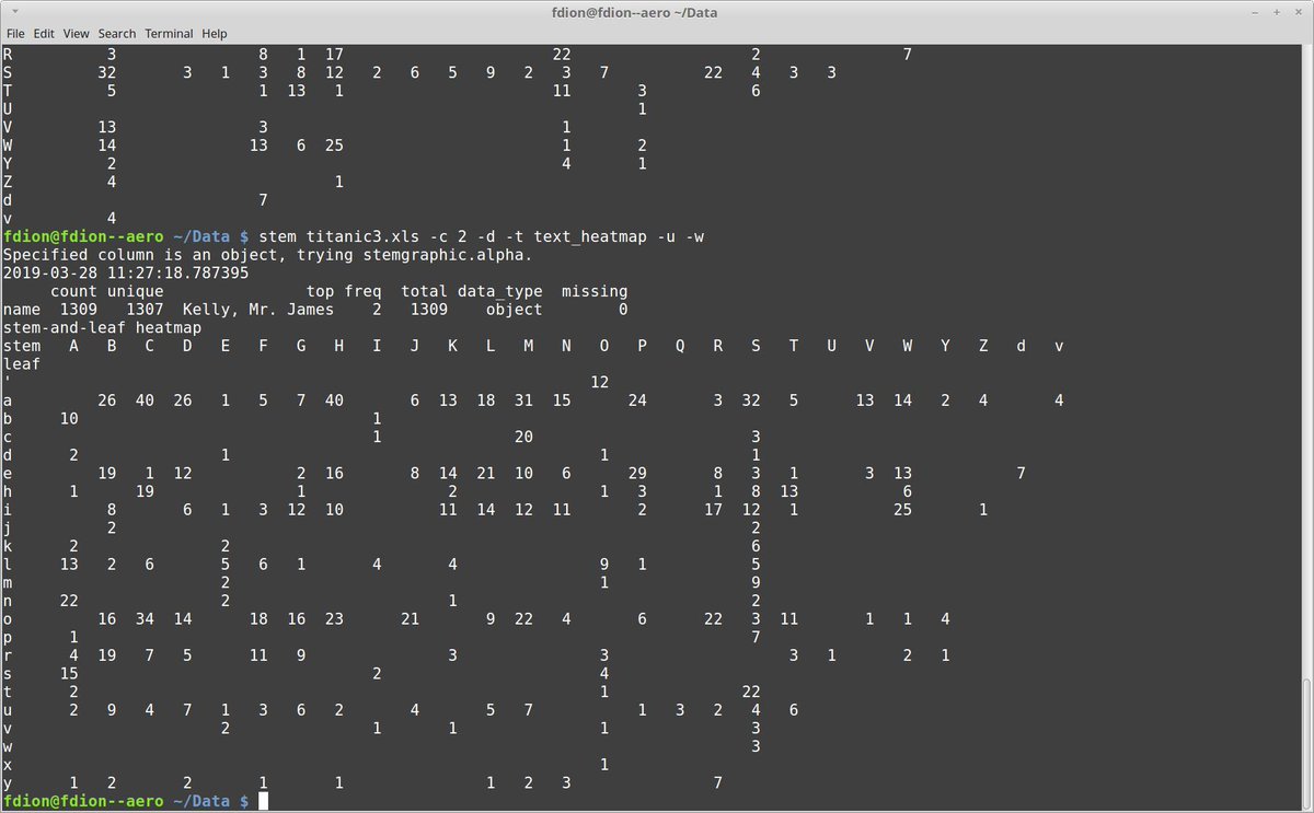
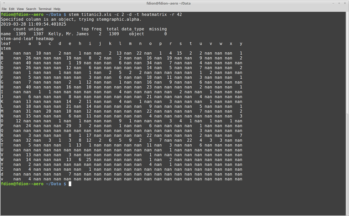
28 Mar 2019
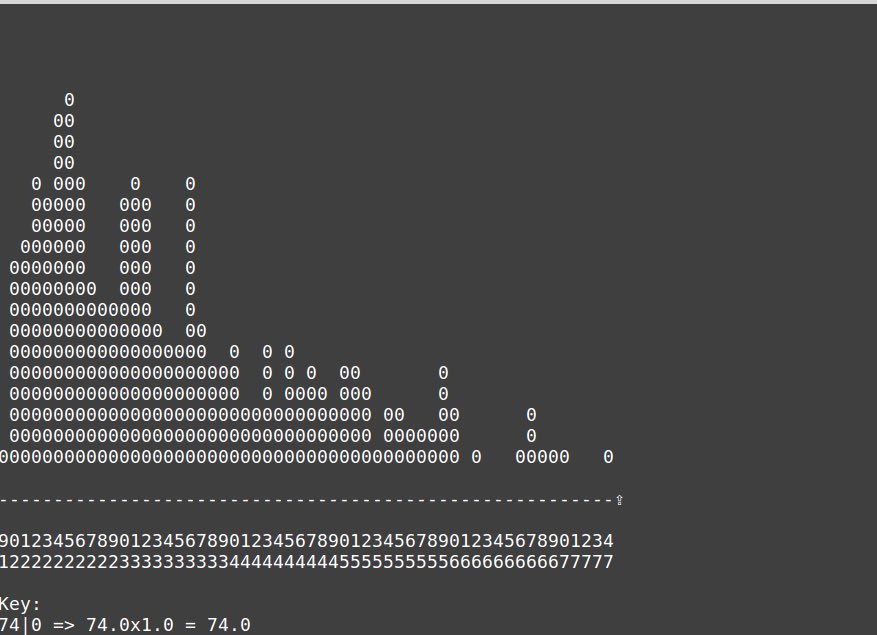
Heatmatrix are when you want all the numbers in a filled matrix. But for patterns, you might prefer a compact form with the zeros removed:
Again, this is using the stem command line tool from stemgraphic, but using text_heatmap as type.
1
28 Mar 2019
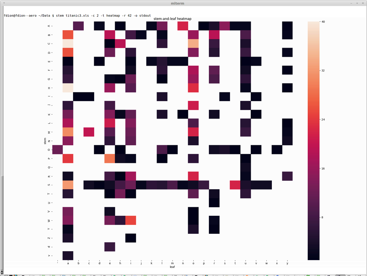
And finally, if you use xtem, mlterm or any other terminal supporting Sixel graphics in a text environment, then stem has a -o stdout graphical support you will appreciate. Still command line, but with graphics inside your terminal.
2
1
stemgraphic retweeted
5 Mar 2019
Of course with @stemgraphic, you can do stem-and-leaf plots in text mode, wide format now. Millions of rows in a few seconds on my laptop.
And, if you’ve missed it, @stemgraphic has been able to do them with categorical or text too #dataviz #infoviz
4
3
stemgraphic retweeted
5 Mar 2019
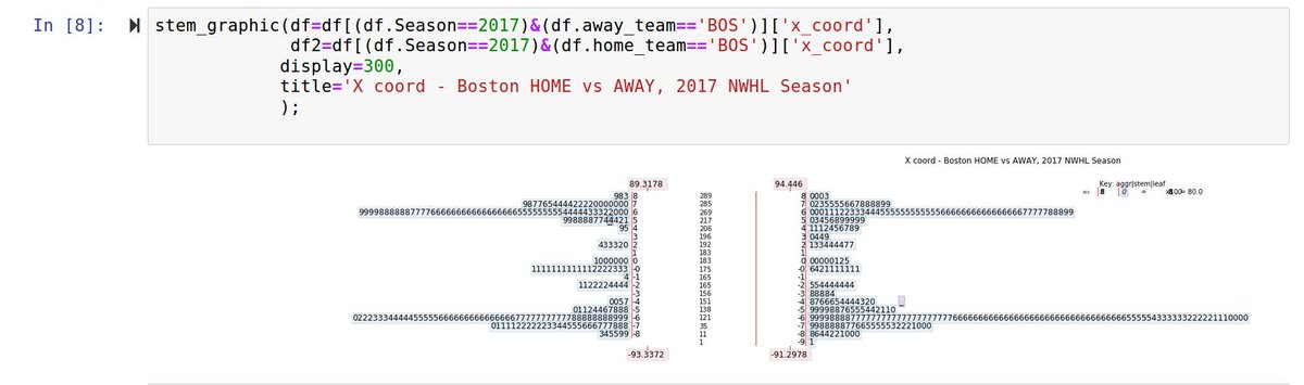
Also, violin plots seem to suggest plays outside of the rink... Not the case with stem-and-leaf.
Here's an example with NWHL data, 2017 season, using @stemgraphic to plot it (using pandas to select year and team, BOS), in a back to back format, for X coordinate:
1
1
stemgraphic retweeted
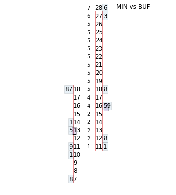
17 Mar 2019
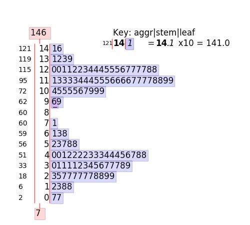
That's a back to back @stemgraphic in case you are wondering. Distances are read directly on the stem and the fractional feet are the leafs. gives the *exact* distribution, unlike a box plot or violin plot.
17 Mar 2019

In the above, I mean "distance of shots when there is a goal", to be clear.
But what about looking at only the @WhitecapsHockey and @BuffaloBeauts games against each other? Buffalo is very consistent against any opponent and appears to block Minnesota's attack from distance.
2
30 Jun 2017
A simple stem-and-leaf plot using @stemgraphic tool. Can be used from the command line, or in @ProjectJupyter notebooks or #python apps