The White House keeps saying this is about health care for immigrants.
That’s an OUTRIGHT LIE and a blatant attempt to distract you from the fact that they’re trying to increase ALL our premiums – no matter what insurance you have.
Become a leader in the Tableau Community and help bring analytics to everyone.
Submissions for this year's Tableau Ambassador cohort close July 25 at 11:59pm PT.
tabsoft.co/3GPfeq7
Tableau Ambassadors lead, evangelize, and amplify new voices. Applications for the 2025 cohort close July 25 at 11:59pm PT.
Apply or nominate an Ambassador today: tabsoft.co/3GPfeq7
Become a leader in the Tableau Community and help bring analytics to everyone.
Submissions for this year's Tableau Ambassador cohort close July 25 at 11:59pm PT.
tabsoft.co/3GPfeq7
Tableau Conference 2026 is plotting something big! The countdown to #TC26 starts now, get ready to join the #DataFam in San Diego, May 5-7, 2026.
tabsoft.co/3EEeL9j
This #VizOfTheDay created during the 2025 #IronViz competition by finalist @katmccrind explores data from wildlife strikes. Kathryn uses map layers and features line and bar charts, maps and more.
tabsoft.co/3GkCvzF
Theaters, trainings, meetups, breakouts, and the magical moments in between—Tableau Conference #TC25 has it all. See you at the best data and analytics conference, DataFam! ✨
Hear what the #DataFam has to say: Chris Williams, @ZenDollData, @CesarPicco, and @dataunjaded
The 10th annual Vizzies—awards from the community, for the community—will be announced at #TC25 Tableau Conference.
⏰ Nominate #DataFam who go above-and-beyond by March 20: tabsoft.co/3TKwkYo
This new Data Vis Dispatch is full of maps – and we love maps. But it also includes annotated lyrics, multiple lines, bracelets (yes!), and complex interactive visualizations.
See them on our blog: blog.datawrapper.de/data-vis…
ALT A split map of Paris's primary urban cluster compares actual and potential walkability. One map shows an ideal distribution of neighborhood services, while the other shows the current reality; a slider allows the reader to uncover one view or the other. Central areas appear more walkable, in dark blue, while peripheral areas are more red, indicating longer walks to amenities. Published in The Economist.
ALT Choropleth map of forest ownership in Sweden and Finland. In all provinces at least 28% of woodland is privately owned; in the more southern regions, that goes up to 86%. Published in Bloomberg.
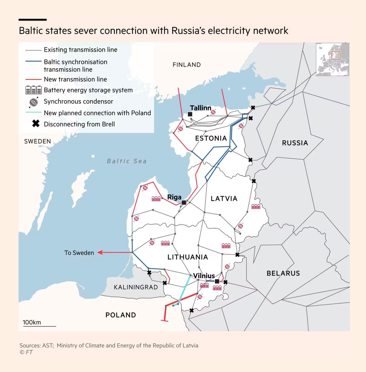
ALT Map of power lines connecting Russia and Belarus to the Baltic states of Estonia, Latvia and Lithuania. Small black crosses mark recent disconnections at the border line; the three Baltic states are severing their connections to the Russian-Belarussian power grid. Published in the Financial Times.
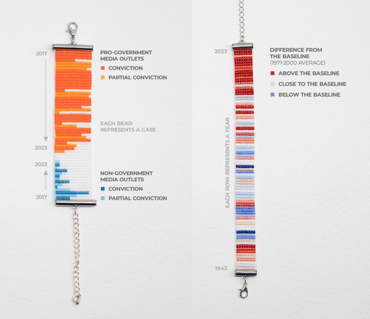
ALT Two bracelets where colored beads are used to visualize data. One is showing the number of media prosecutions in Hungary between 2017 and 2023; the other shows climate stripes in Budapest, where colors range from blue (below the baseline) to dark red (above the baseline).
I was tired of manually adding parameters to my Tableau Public dashboard URLs for a clean view, so I created a simple URL converter to streamline the process. Feel free to use it for a clean, isolated dashboard view! #Tableau#tableaupublic#datafamsamodrole.com/projects/table…
🎵 #TheBeatles Remastered!🎶
Refreshed my Beatles viz with new features, rebuilt in ONE #Tableau sheet!
🥁 Play and Explore 200 songs
🎹 Dive into albums
🎸 Highlight songwriters’ impact
🎛️ Sort top tracks by 15 metrics
Share your thoughts!
🔗public.tableau.com/app/profi…#DataFam