
landscape ecology, insect niche and distribution modeling, functional insect, biodiversity and conservation, biological invasion, global change, microclimate
Joined May 2019
- Tweets 810
- Following 1,591
- Followers 325
- Likes 1,180
12 Photos and videos


Zhu, Gengping retweeted

Jun 10
Conducting road safety audits, scheduling maintenance, or planning logistics routes used to require combing through imagery or, worse, driving miles of roads yourself. Not anymore. goo.gle/4omKDRZ
New AI-powered data layers in Google Earth are changing that. Pulling from billions of Google Street View images, these layers now spot infrastructure assets like stop signs, speed limit signs, and more to map infrastructure for you.
By combining these assets into a single project and diving into Street View you can locate and validate assets on Google Earth in seconds.
These layers are now available for Professional & Professional Advanced customers on web and Android, with coverage expanding over the coming weeks.
6
42
193
17,032
Zhu, Gengping retweeted

Mar 27
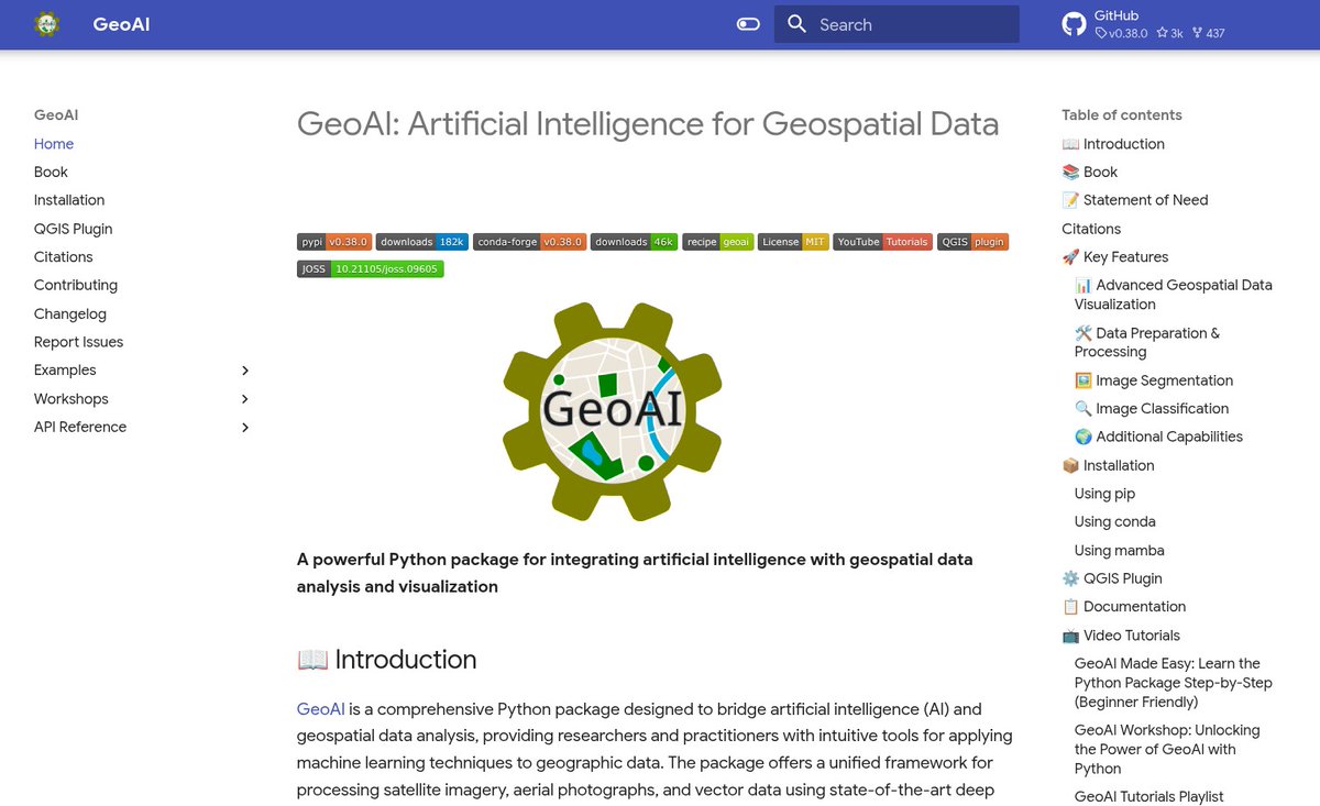
The GeoAI Python package now supports object detection using pre-trained models from the GeoDeep libarary (github.com/uav4geo/GeoDeep). The supported object types include cars, trees, birds, planes, aerovision, utilities, buildings, and roads. Try it out:
GitHub: github.com/opengeos/geoai
Notebook example: opengeoai.org/examples/geode…
#geospatial #geoai #opensource #python
13
170
1,061
86,894
Zhu, Gengping retweeted

Jun 1
Herramientas para crear un mapa web interactivo rviv.ly/QxwfBF #AJAX #django #GeoServer #Leaflet #node
9
44
2,122
Zhu, Gengping retweeted
May 15
Excited to share that the GeoAI repository has passed 3,000 GitHub stars 🌟 !
A big thank you to everyone who has used the project, shared feedback, opened issues, contributed code, or helped spread the word. The goal of the GeoAI package is to make it easier for researchers, developers, and practitioners to apply modern AI methods to geospatial data with minimal coding.
Repository: github.com/opengeos/geoai
Website: opengeoai.org
QGIS plugin: opengeoai.org/qgis_plugin
YouTube playlist: youtube.com/playlist?list=PL…
Thank you again for the support. More features and tutorials are on the way.
#GeoAI #OpenSource #Geospatial #EarthObservation #Python
1
33
273
10,566
Zhu, Gengping retweeted
May 30
GeoLibre v0.5.0 is out! This update significantly expands data format support, making it easier to work with a wide range of geospatial datasets in a lightweight, modern GIS environment.
Newly supported formats and services include: GeoJSON, Shapefile, GeoPackage, GeoParquet, KML/KMZ, FlatGeobuf, PMTiles MBTiles, GeoTIFF, Zarr, LiDAR point clouds, Gaussian Splatting, and ArcGIS services.
GeoLibre is a lightweight, cloud-native GIS built with MapLibre and Tauri. It runs directly in the browser and is also available as a standalone cross-platform desktop application at only ~30 MB.
GitHub: github.com/opengeos/GeoLibre
Website: geolibre.app
Live demo: geolibre.app/demo
Feedback, ideas, and contributions are welcome.
#geospatial #opensource #maplibre
4
64
360
18,590
Zhu, Gengping retweeted

May 26
STOP telling ChatGPT:
“Check my grammar and writing.”
This is a weak prompt - and it produces low-quality results.
If you want professional-level output, use these instead 👇

29
36
70
3,720
Zhu, Gengping retweeted

May 22
Mapped: the % of occupied housing units without air conditioning by Census tract.
Uses the new @uscensusbureau LACE dataset.
Map the data yourselves: gist.github.com/walkerke/71e…
2
9
68
6,752
Zhu, Gengping retweeted

Apr 20
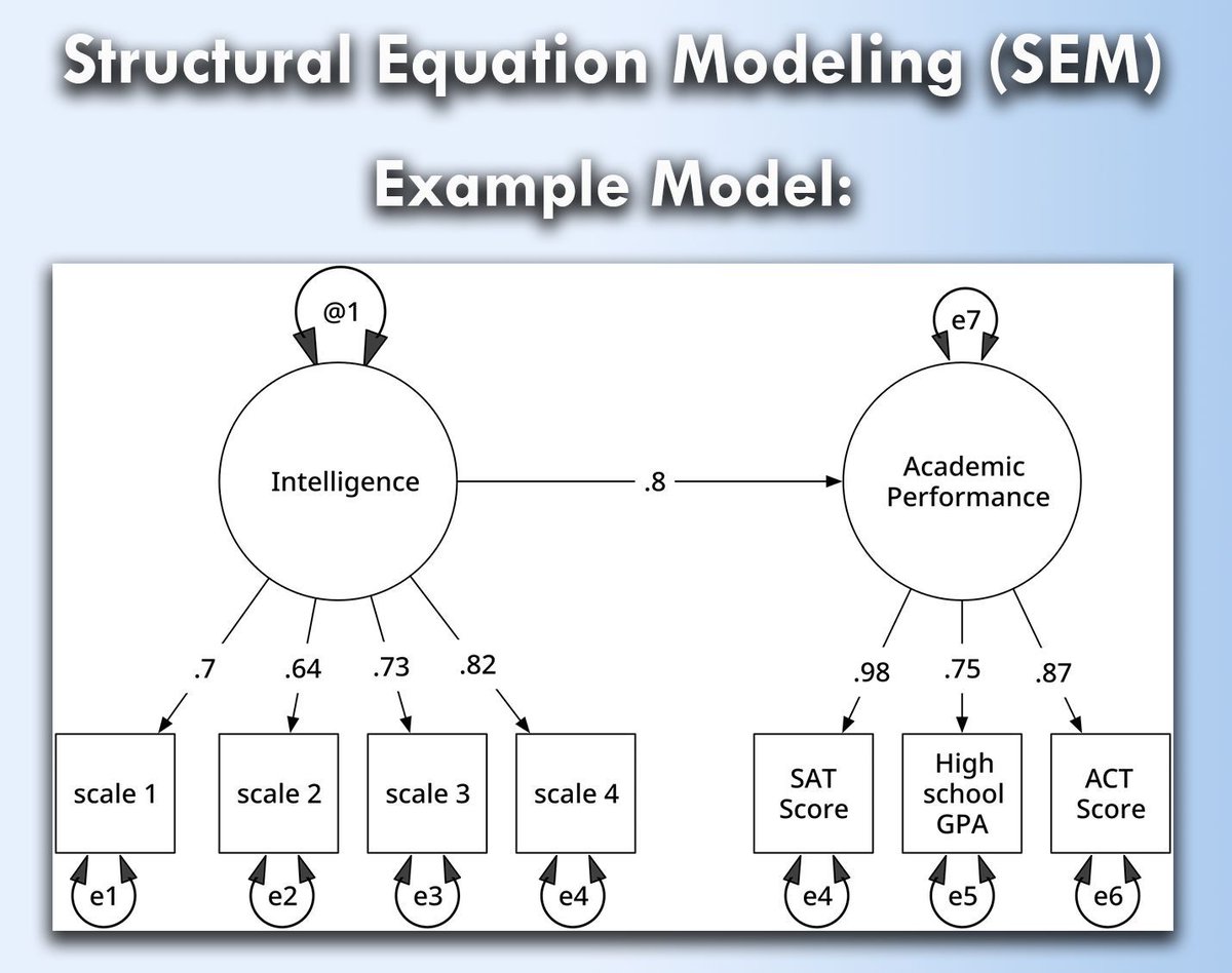
Structural Equation Modeling (SEM) is a powerful statistical technique used to analyze complex relationships between variables. It allows researchers to examine both direct and indirect effects, making it especially useful for fields like psychology, economics, and social sciences.
When handled correctly, SEM opens up a range of opportunities:
✔️ Provides insights into hidden (latent) variables that are not directly measurable.
✔️ Offers flexibility to test multiple hypotheses in one framework.
✔️ Allows researchers to examine causal relationships, improving the accuracy of results.
However, if SEM is not applied properly, several challenges can arise:
❌ Misinterpretation of results due to incorrect model specifications.
❌ Complex computations can lead to convergence issues or biased outcomes.
❌ SEM requires large data sets, and small sample sizes may lead to unreliable conclusions.
To implement SEM in practice:
🔹 In R: Use the lavaan package to define, estimate, and test SEM models with functions like sem().
🔹 In Python: Leverage the semopy library, which simplifies structural equation modeling with tools like Model() and Opt().
The visualization, based on an image from Wikipedia (link: en.wikipedia.org/wiki/Struct…), shows a structural equation model, depicting latent variables (shown in ovals) and observed variables (rectangles). Residuals and variances are represented by arrows, illustrating how measurement errors influence latent intelligence and achievement. This visualization is based on a similar one from Wikipedia.
To explain this topic in further detail, I collaborated with Micha Gengenbach to create a comprehensive tutorial.
Learn more by visiting this link: statisticsglobe.com/structur…
#datascienceeducation #DataAnalytics #RStats #database
1
16
94
4,135
Zhu, Gengping retweeted

12 FREE GOOGLE EARTH ENGINE TUTORIALS FOR AGRICULTURE
🪡🧵

12
257
1,280
77,455
Zhu, Gengping retweeted

Mar 3
China’s traditional lantern festival falls on March 3 this year. Marking the first full moon of the Chinese lunar new year, it brings families together under glowing lanterns. Wish everyone peace, happiness and a fulfilling year ahead. Happy Lantern Festival!
11
24
147
3,403
Zhu, Gengping retweeted
Mar 1
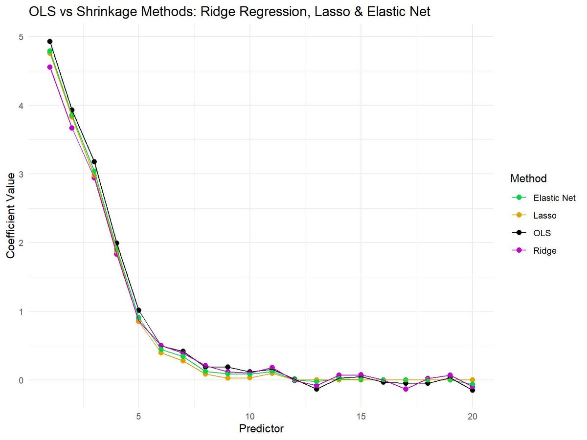
Shrinkage methods like Ridge Regression, Lasso, and Elastic Net are essential techniques in modern statistics and machine learning. These methods help reduce overfitting in models by shrinking the coefficient values, making them more robust and generalizable to unseen data.
✔️ Improved model performance: Shrinkage methods reduce the risk of overfitting by penalizing large coefficients, leading to more reliable predictions.
✔️ Feature selection: Lasso, in particular, can reduce some coefficients to exactly zero, prioritizing features that most improve predictive performance.
✔️ Balance between Ridge Regression and Lasso: Elastic Net offers a balance, combining Lasso’s feature selection and Ridge Regression’s stability for correlated variables.
❌ Loss of interpretability: If shrinkage is too aggressive, it may drive important coefficients closer to zero, making it hard to interpret the true importance of predictors.
❌ Tuning challenges: Selecting the correct penalization parameter (lambda) is crucial. Too much shrinkage can lead to underfitting, while too little shrinkage can still cause overfitting.
❌ Not all methods perform well in every situation: Ridge Regression works better when all predictors are important, while Lasso is more suited when only a few predictors matter. Elastic Net tries to balance both but may need careful tuning to work effectively.
The plot attached visualizes the differences between OLS (no shrinkage), Ridge Regression, Lasso, and Elastic Net. OLS shows the raw coefficients, while shrinkage methods reduce the magnitude of the coefficients to varying degrees. Lasso sets some coefficients to exactly zero, Ridge Regression keeps all coefficients non-zero but shrinks them, and Elastic Net combines aspects of both methods.
🔹 In R: Use glmnet for Ridge Regression, Lasso, and Elastic Net, providing control over the alpha parameter to adjust between Lasso and Ridge Regression.
🔹 In Python: Use sklearn.linear_model with Ridge, Lasso, and ElasticNet classes for efficient model fitting and coefficient shrinking.
You can check out my online course on Statistical Methods in R, which explains this topic as well as other related topics in further detail.
More information: statisticsglobe.com/online-c…
#datavis #R #datascienceenthusiast #DataVisualization #RStats
1
4
40
1,793
Zhu, Gengping retweeted

Feb 26
I really love teaching Bayesian linear regression. It’s the perfect introduction to #Bayesian methods for #MachineLearning.
Spoiler alert: they’re awesome. 🔥
In class, I walk students step-by-step through:
1️⃣ How the prior is updated with the likelihood to produce the posterior
2️⃣ How we sample that posterior using Markov Chain #MonteCarlo (MCMC) — specifically Metropolis sampling
Then we open up my interactive #Python dashboard and actually do it:
Sample the Markov chain of model parameters, compute the acceptance probability directly from
prior × likelihood ∝ posterior
Theory → algorithm → live visualization.
No black boxes. Just probability in motion. 🚀
That moment when students see the posterior emerge from the sampling process? Completely stoked. 🤘
I share the full interactive notebook here:
github.com/GeostatsGuy/DataS…
#GitHub
1
39
254
9,544
Zhu, Gengping retweeted
Feb 25
When variables have different scales or units, it becomes difficult to compare them directly or use them effectively in many machine-learning algorithms. Feature scaling techniques such as normalization and standardization solve this by putting all variables on comparable scales, making your data easier to interpret and analyze.
Why feature scaling is useful:
✔️ Scale comparability: Prevents large-scale variables (e.g., income) from dominating smaller ones (e.g., satisfaction scores).
✔️ Improved model performance: Algorithms like k-means, PCA, or neural networks work better when features are scaled.
✔️ Faster convergence: Gradient-based optimizers reach stable solutions more efficiently.
✔️ Better interpretability: Makes visualizations and statistical comparisons clearer.
✔️ Consistent ranges: Methods like min-max normalization map values to a specific range (often 0–1), while standardization centers around zero with unit variance.
There are different types of normalization and standardization, and the right choice depends on your data and analysis goal. I found this helpful table on Wikipedia that summarizes several commonly used methods. Source: en.wikipedia.org/wiki/Normal…
Want to know how to standardize data in R? Check out my tutorial: statisticsglobe.com/standard…
For more tutorials and insights on R, Python, and data science, subscribe to my newsletter. See this link for additional information: statisticsglobe.com/newslett…
#RStats #datastructure #R #DataScience

2
24
131
3,930
Zhu, Gengping retweeted
Feb 23
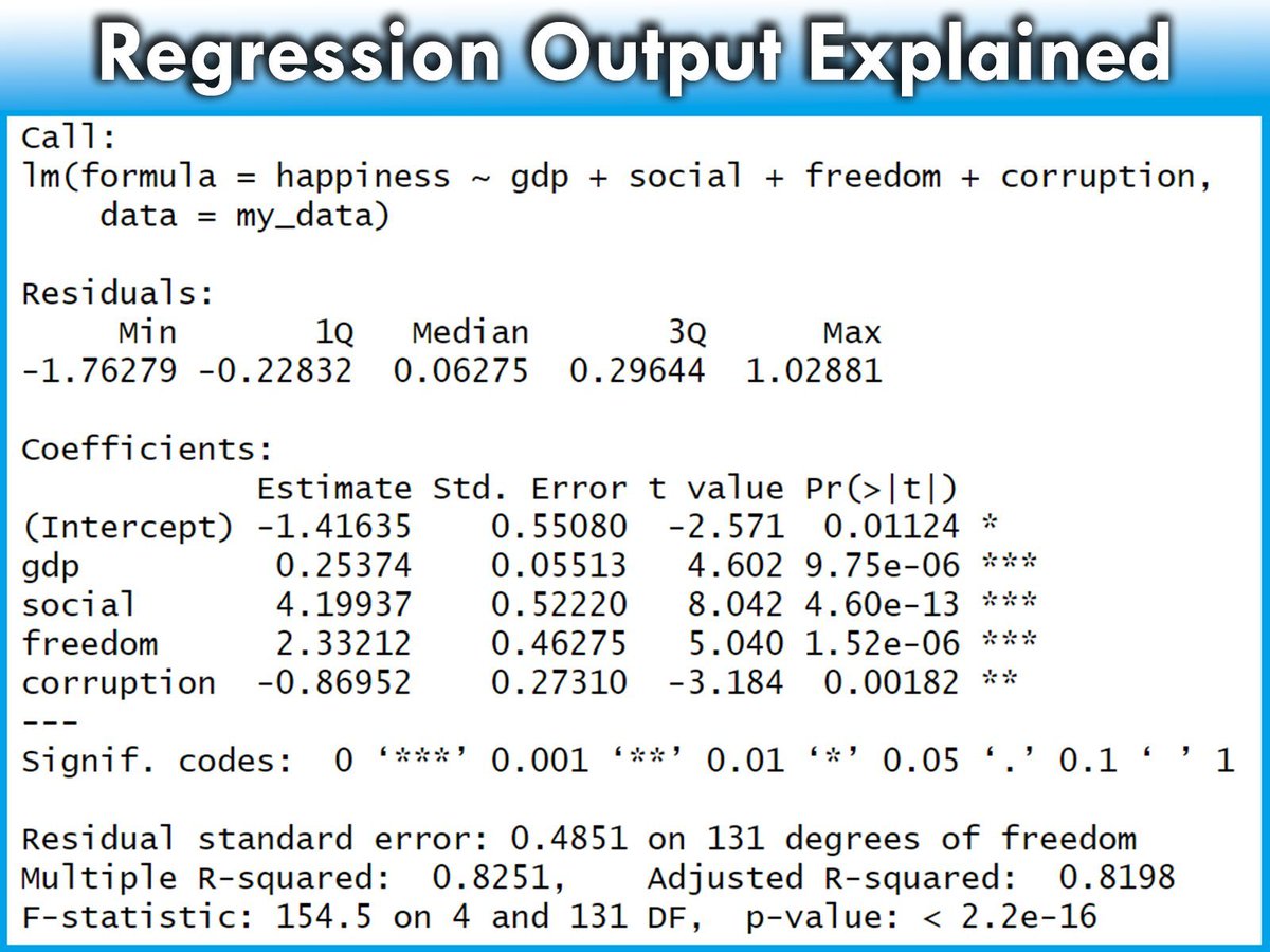
Regression outputs contain many different components, each providing crucial insights into the effectiveness and characteristics of the model.
The detailed explanation below will help you understand the various parts of the regression model output provided by R. From the formula used to the statistical significance of the coefficients, each element plays a key role in interpreting the overall performance and validity of the model.
✅ Call: Restates the regression formula and the data set used. Example: Modeling happiness with predictors (gdp, social, freedom, corruption) using data set my_data.
✅ Residuals: Differences between observed values and model predictions. Summary includes:
- Min and Max: Range of residuals.
- 1Q and 3Q: Middle 50% of residuals.
- Median: Middle value of the residuals. Close to 0 suggests accuracy.
✅ Coefficients: Provides estimates of the regression coefficients and their significance:
- Estimate: Impact of each predictor on the target variable. Example: Increase in gdp leads to a 0.25374 increase in happiness.
- Std. Error: Variability of each estimate.
- t value: Test statistic for the significance of each coefficient.
- Pr(>|t|): p-value for the t-test; values < 0.05 often indicate significant effects.
✅ Significance codes: Quick reference for significance levels next to the p-values.
✅ Residual standard error: Measure of the fit quality, indicating the average size of the residuals. Lower values suggest a better fit.
✅ Multiple R-squared: Proportion of variance in the target variable explained by the predictors. For instance, 82.51% in this model.
✅ Adjusted R-squared: Adjusts the R-squared to account for the number of predictors, providing a more accurate measure of model performance.
✅ F-statistic and its p-value: Tests if at least one predictor has a non-zero coefficient. A small p-value rejects the null hypothesis that all coefficients are zero, confirming the model’s significance.
Explore my webinar titled "Data Analysis & Visualization in R," where I demonstrate how to estimate linear regression models alongside other essential techniques. More info: statisticsglobe.com/webinar-…
#Statistics #Data #programmer #RStats
2
23
141
3,832
Zhu, Gengping retweeted
Jan 25
Bayesian logistic regression is a powerful method for predicting binary outcomes (such as yes/no decisions). It differs from traditional logistic regression by incorporating prior beliefs and quantifying uncertainty using posterior distributions. This makes Bayesian logistic regression ideal for situations where you want to explicitly account for uncertainty or include prior knowledge.
Here’s a breakdown of the four key graphs that provide insights into a Bayesian logistic regression model:
✔️ Posterior Distribution Plot: This plot displays the posterior distributions of the coefficients for predictor1 and predictor2. The shaded area shows the range of probable values (credible intervals), while the vertical line marks the median estimate of each coefficient. Unlike frequentist approaches that provide single point estimates, Bayesian logistic regression gives a distribution of possible values, which allows for a clearer understanding of uncertainty in the model parameters.
✔️ Trace Plot: This shows the trace of the MCMC (Markov Chain Monte Carlo) sampling process over 4000 iterations for predictor1 and predictor2. The traces should ideally look "fuzzy" and well-mixed, moving around the full parameter space without getting stuck. This indicates that the chains have converged and that the model’s parameter estimates are reliable. A poorly mixing chain (one that looks like a straight line or is stuck) would indicate convergence issues.
✔️ Posterior Predictive Check: This plot helps to evaluate the model's predictive performance by comparing the predicted outcomes (y_rep, light blue) with the observed data (y, dark blue). The closer the predicted values align with the observed data, the better the model captures the underlying structure. In this case, the predicted values align well with the observed data, indicating a good fit. This check is crucial for assessing whether the model generates realistic predictions.
✔️ Posterior Interval Plot: This plot visualizes the credible intervals for the model coefficients, including the intercept. The wider the credible interval, the more uncertainty there is in that coefficient estimate. Both 50% (inner) and 95% (outer) credible intervals are shown, providing a range of probable values for each coefficient. If a credible interval includes zero, it means the predictor may not have a strong effect on the target variable.
This grid of graphs allows for a comprehensive understanding of your Bayesian model, showing how well the model fits the data and how much uncertainty there is in the parameter estimates. Bayesian logistic regression provides a richer interpretation than traditional methods by quantifying uncertainty and incorporating prior knowledge into the analysis.
Want more insights on data science? Subscribe to my free email newsletter!
Check out this link for more details: eepurl.com/gH6myT
#DataAnalytics #datavis #Statistics #VisualAnalytics #Python

1
52
278
10,424
Zhu, Gengping retweeted
Jan 20
While boasting the world’s fastest bullet trains, China is still running slow trains to help farmers transport their produce to market, with ticket prices ranging from $0.14 to $5 — unchanged for decades.
Development is for all, and we are committed to ensuring no one is left behind.

9
13
80
2,578
Zhu, Gengping retweeted

28 Dec 2025
STOP telling ChatGPT:
“Check my grammar and writing.”
Bad prompt = bad output.
Use these instead 👇
103
2,965
13,603
3,173,244

9 Oct 2025
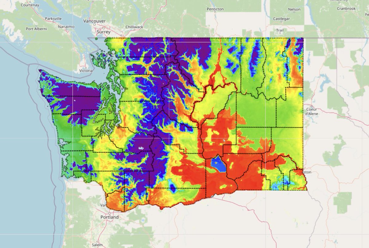
Tree-killing beetles are in Portland. Is Washington next? - Columbia Insight columbiainsight.org/tree-kil…
40
Zhu, Gengping retweeted

1 Sep 2025
Exciting news for #QGIS users! The "Google Earth Engine Plugin for QGIS" is now updated with new no-code tools that allow you to download and use #EarthEngine datasets in QGIS easily. Check out my newly contributed tutorials for the latest plugin (1/n) 👇
19
228
1,101
54,426
Zhu, Gengping retweeted
12 Aug 2025
Want to visualize between-group comparisons with added statistical insights? The ggbetweenstats() function from the ggstatsplot package is designed for exactly that. It combines violin and box plots to show group distributions while seamlessly including statistical test results directly on the plot.
✔️ Clear Group Comparisons: Visualizes data distributions across multiple groups using a mix of violin and box plots, effectively highlighting mean values and differences between groups.
✔️ Statistical Details Built-In: Automatically includes statistical test results, effect sizes, and confidence intervals in the subtitle, offering key insights without the need for extra steps.
✔️ Flexible Plot Design: Choose between a violin plot, box plot, or a combination of both, depending on how you want to present your data.
✔️ Seamless Integration: Works directly with ggplot2, so you can customize and extend your plots with the familiar syntax.
The visualization shown here is from the package website, illustrating how ggbetweenstats() makes it easy to compare groups with detailed statistical information: github.com/IndrajeetPatil/gg…
Ready to master ggplot2 and its powerful extensions to create stunning, insightful visualizations? Enroll in my online course, “Data Visualization in R Using ggplot2 & Friends!”
Click this link for detailed information: statisticsglobe.com/online-c…
#statisticsclass #ggplot2 #datascienceenthusiast #RStats
1
23
147
6,923