
Edu & HR | VC Governors | ex- committee and cheerleader of @CIPDSouthYorks | Head of Learning @FrontlineSW | Co-founder @LearningMagpie
Joined January 2010
- Tweets 2,635
- Following 705
- Followers 714
- Likes 3,337
118 Photos and videos


Pinned Tweet

8 Apr 2020
Do you manage teams that are now working remotely? My 8 top tips in this thread can be returned to time and again to check you’re covering all the right bases...#remotework #virtualnotdistant #leadership @CIPD 1/9
10
9
52
7 Sep 2022
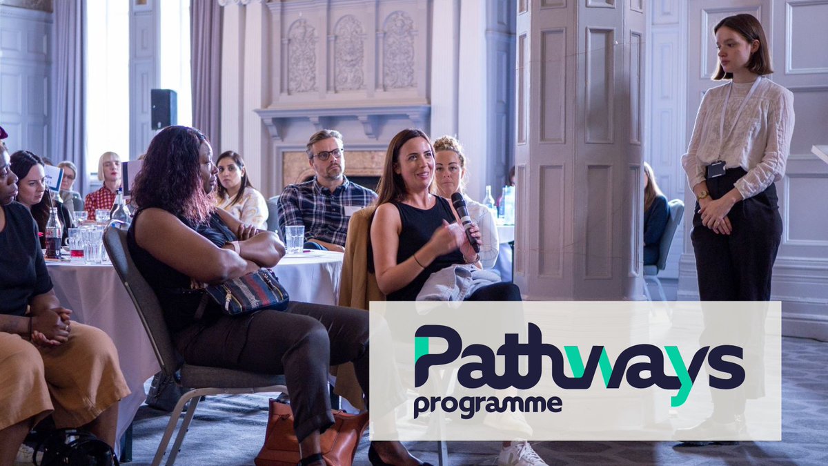
Last few places available for this Autumn. How about a free (fully-funded) leadership programme tailored to your role or one you’re aspiring to and packed full of evidence-informed content?
Please share especially if you have #SocialCare colleagues in your network #SocialWork
5 Sep 2022

The Pathways programme empowers #socialwork leaders to navigate their roles, support their teams and create a culture which prioritises children and families above all else. Find out more and apply today: bit.ly/3KkkDCM
2
21 Jul 2022
Back in person for a superbly organised AGM and conference by @CIPDSouthYorks
The other speakers were so interesting and varied in their content. Lots of takeaways and well worth the trip. #CIPD
1
25 Jan 2022
Twitter hive mind pls help!
Does I know anyone who’s a palaeontologist or otherwise expert in all things dinosaurs who’d be willing to be interviewed over Zoom by some lovely primary school kids based in Spain (Tenerife)? RT
#dinosaur #speaker #edutwitter #paleontology
3
2
1
Laura Watkin retweeted

10 Dec 2021
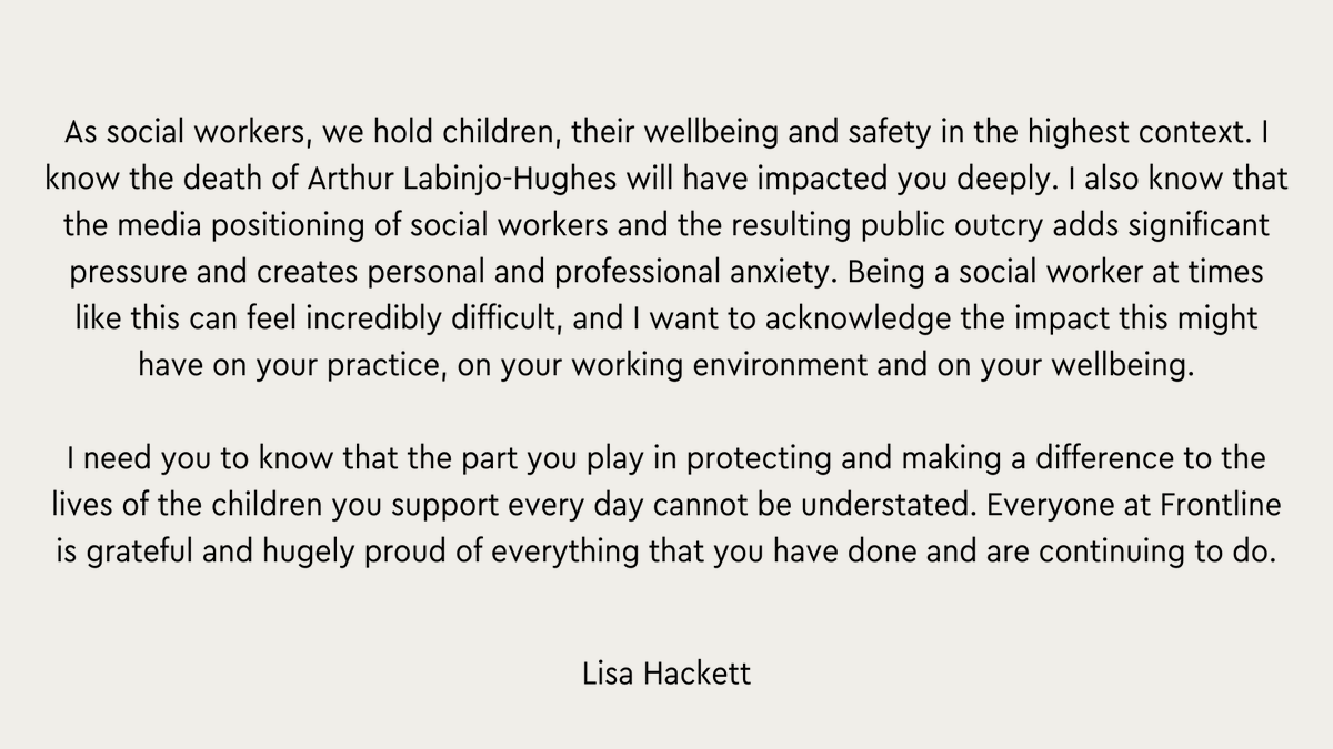
This Friday, we wanted to share a message from our Chief social worker, Lisa Hackett, to all of our fellows and social workers across the country.
#SocialWork #Charity #SocialWorkers
1
2
12
Laura Watkin retweeted

11 Dec 2021
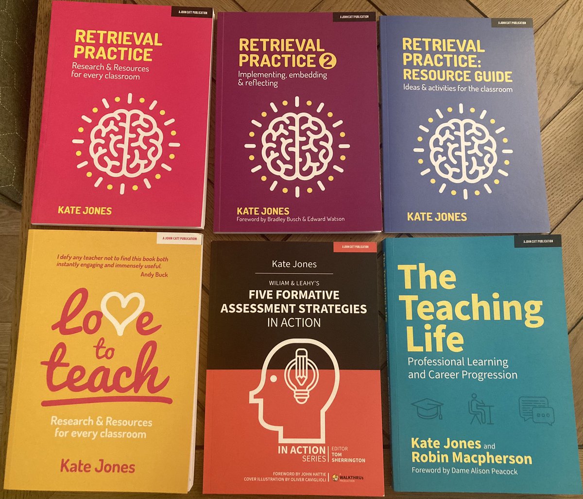
🚨 Christmas competition 🎁 🎉
Simply retweet this tweet to be entered to win the full set of my books & I will sign them with a nice message in each book 😁🥰
Winner announced 20.12.21 🎄👏🏻
155
5,352
2,137
3 Nov 2021
When you work on your birthday, you’ll know the best conference organisers (@steph_jmatthews ) because they greet you with a birthday badge!
Thank you to organisers and attendees being so engaging.
1
4 Sep 2021
Bloody hell @RNLI watching #SavingLivesAtSea is an emotional rollercoaster. Pls remind everyone that these heroes are VOLUNTEERS. If you’ve been in the sea this summer perhaps consider donating the cost of your next pint/coffee to this vital service.
2
2
65
18 Aug 2021
#SafeGuarding children is everyone’s responsibility. Shout out to the @EastMidRailway conductor who has spotted a lone young person, without any belongings and on the wrong train and taken him into his care to be met at the next station for support. #EverydayHeroes
2
7
21 Jul 2021
Some really hard thinking and continued iteration and evolution.
Hats off to the amazing @CoachDeveloper bringing our thinking to life.
#WorkInProgress
21 Jul 2021

#BeMoreLnD - playing with some visuals for our ASRI model for Learning Design @TalentEdMagpie @LearningMagpie #WorkingOutLoud. Let us know what you think…


1
Laura Watkin retweeted

16 Jul 2021
Hopping on the 🧵wagon ... so here is a 🧵of the wonderful pieces of insight and experience @DannyCipriani87 @clemo12 @DanielPTobin @RobSchremp @jackd0dd @CoachDeveloper @TalentEdMagpie have shared. Read, enjoy, reshare, comment, discuss etc, y'all know the drill!
#affectchange
2
8
13
Laura Watkin retweeted

23 Jun 2021
I’ve collated a new bank of the podcasts and webinars I’ve watched in 20/21.
🔗155 links in total - curated under the following broad headings:
▪️DEI
▪️Pastoral & Behaviour
▪️SEND
▪️Teaching
▪️Reading
▪️Prof Dev
▪️Curriculum
▪️Leadership
Help yourself👇🏻
dropbox.com/s/1qd410bbxl3gwx…
61
231
823
8 Jul 2021
Credit for the application, connection and words to @CoachDeveloper 🙌🙌
1
1 Jul 2021
Great feedback and I wholeheartedly agree. This mag is expertly driven and curated by @CoachDeveloper - legend! 🙌🎉
1
29 Jun 2021
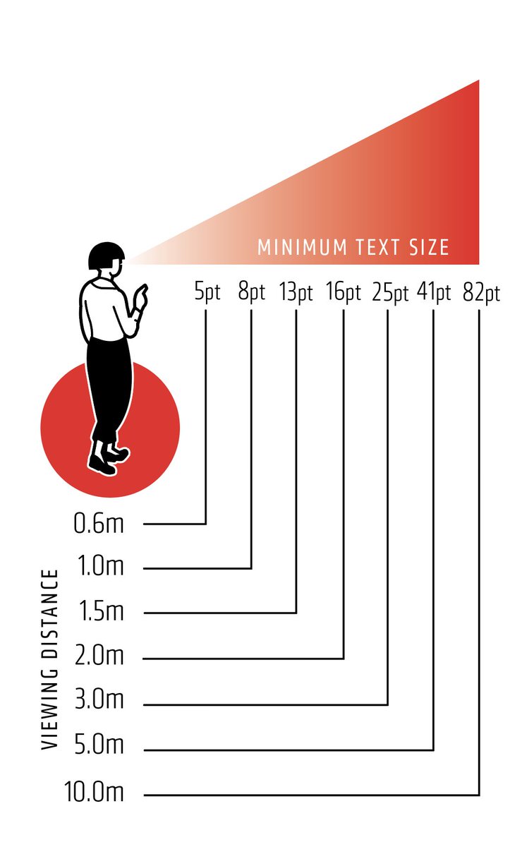
Really helpful chart to consider guidance for font size depending on viewing mode i.e. f2f vs online display of slide decks. I’m now off to try out 5pt font to view online!
Consistency of font size between slides feels important to reduce eye strain of refocusing.
29 Jun 2021

This might help: a chart I found and used when explaining text size for displays. So, no, you aren't over thinking. The nearer, the smaller font can be and vice versa. As you would expect.
1
29 Jun 2021
So….font size on slides for online delivery. Can/should the font size be smaller if you’re viewing the slides on a computer screen vs sitting a distance away from a physical screen? Am I over thinking this?! @olicav @DonaldClark
3
3

A trilogy on worked examples this time by @P_A_Kirschner and me. This week Designing Winning Worked Examples 1 – Intra Example Features (Part 2 next week!). 3starlearningexperiences.wor…
1
3
15
18 Jun 2021
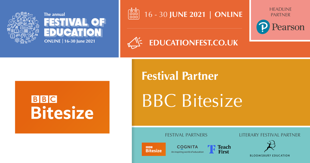
Free and online festival of education - check it out! Some great cross-sector learning opportunities for all
#Edutwitter #LDInsight
#LearningMagpies @LearningMagpie
18 Jun 2021

Thank you to our Festival Partner @bbcbitesize for your continued support of #EducationFest. Their support has helped us provide free access to this year's Festival.
👉 buff.ly/33CAmIJ
16 Jun 2021
And an incredible session it was - thanks to the curious and insightful group and their contributions. “My brain is buzzing” was one reflection that I certainly share!
Thanks all and looking forward already to more time with this community.
#LearningMagpies #LearningDesign
16 Jun 2021
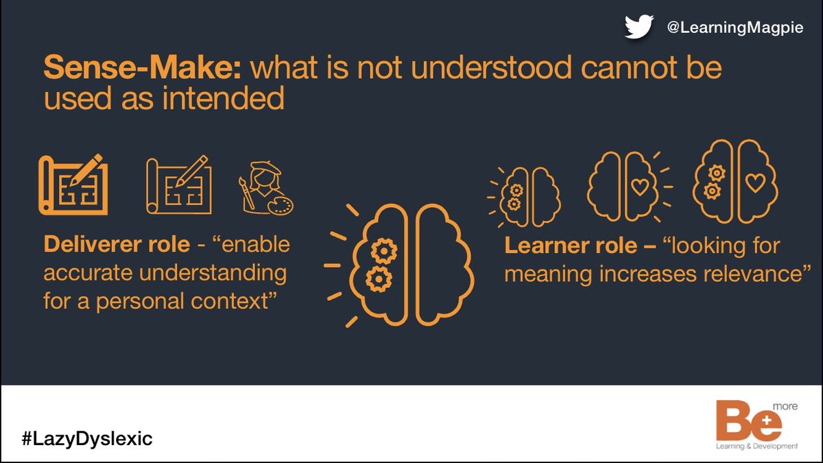
Today’s the day… myself (@CoachDeveloper) and @TalentEdMagpie will be holding our first gathering of our #Sensemakers. Exploring #ScienceOfLearning our ASRI Model and Persistent Problems…. Looking forward to seeing you all soon…
2
Laura Watkin retweeted

16 Jun 2021
Today’s the day… myself (@CoachDeveloper) and @TalentEdMagpie will be holding our first gathering of our #Sensemakers. Exploring #ScienceOfLearning our ASRI Model and Persistent Problems…. Looking forward to seeing you all soon…
17 May 2021
We are holding our first 'sense makers' conversation on 16 June 1:30-2:30 via Teams. In this session we want to explore the model we have created. I mean first and foremost, is it any good?
If you fancy joining us simply respond to this post with ‘I’m in’. #LearningMagpie

1
3