
Exposing the climate change dogma infecting science and academia by showcasing stories and studies ignored by the legacy media.
Joined May 2009
- Tweets 108,641
- Following 642
- Followers 18,960
- Likes 27,387
17,331 Photos and videos


Climate Dispatch retweeted

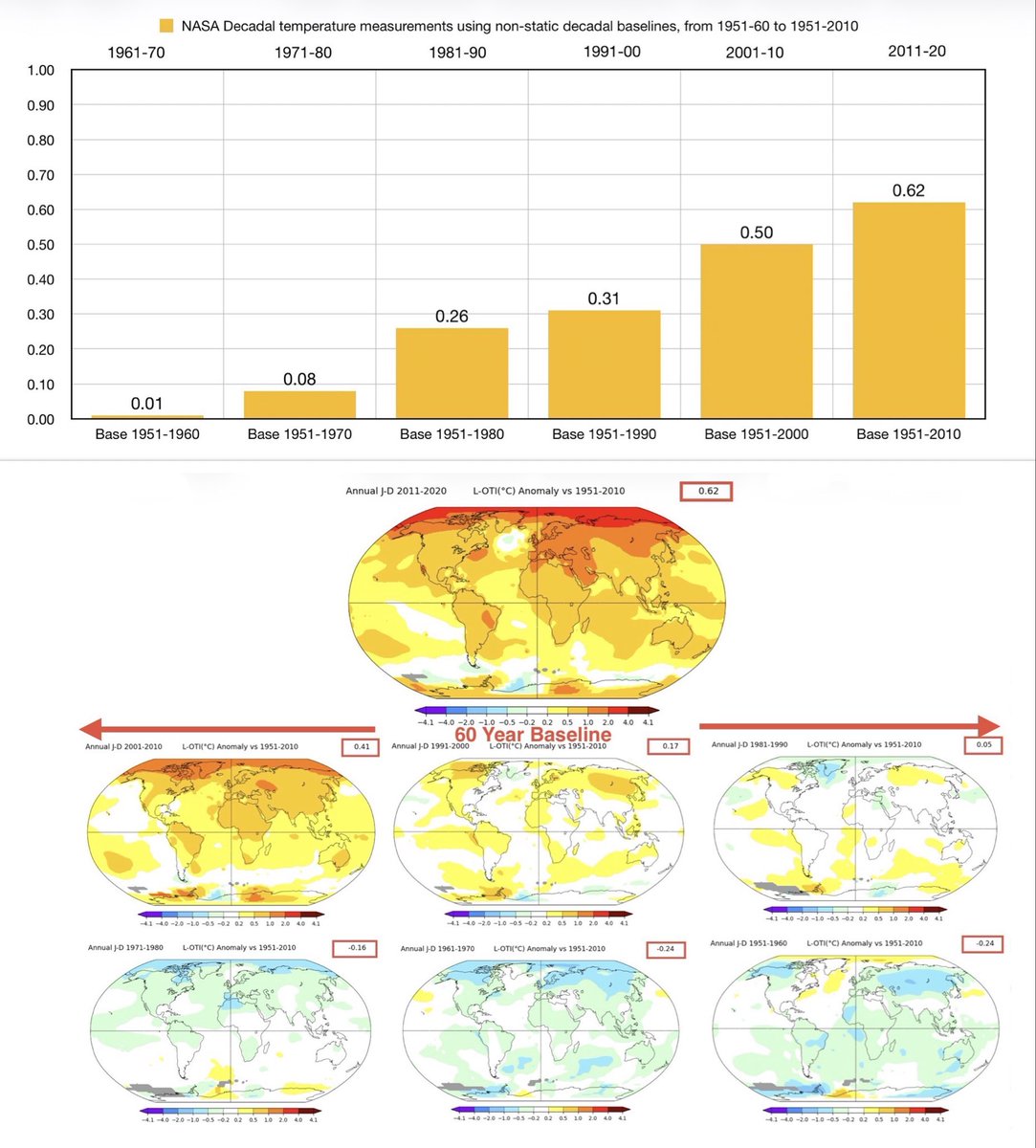
The following NASA Temperature chart may seem controversial, in that it starts from 1951. Its arraignment is based on the logical reasoning there wasn’t a great deal of coverage of official weather stations placed, to make world measurements until this period.
My investigation to try and reinvent the temperature wheel may well turn out to be regarded as a folly, but I won’t let that get in the way of trying. First observation is that the calculation of a baseline results in a zero, in that, whatever you are trying to use as a point of reference starts at zero.
This is a 60 year base, from 1951-2010, to measure how much has changed during the period/decade 2011-2020. The result is 0.62C. I would argue that the interpretation of this analysis is that there has been an average increase of approximately 0.1C per decade. However @grok informs me that I should demonstrate previous decadal measurements. So, with that in mind, and not trying to bore everyone, I’ve done this with the respective decadal data using 50, 40, 30, 20 year baselines.
In summary over the past 60 years our planet has warmed by at least 0.62C. Any other calculations are based on guess work, however my apologies in advance if people were recording data in the Amazon Jungle, deepest Africa or the Antarctic prior to the 1950’s.
Those of you will note the content of the following baseline uses different data to the top table, this is because a base makes a readjustment each time it’s used. So the next base, for 70 years, will change the current measurement of 0.62c to a lower figure.
The sixty million dollar question is, what is it that’s being measured. I have no doubt it’s not the effect of man made CO2, CO2 on its own maybe, but my guess it’s Water Vapour.
5
8
16
1,340

𝐋𝐚𝐛𝐨𝐫’𝐬 𝐂𝐚𝐩𝐚𝐜𝐢𝐭𝐲 𝐈𝐧𝐯𝐞𝐬𝐭𝐦𝐞𝐧𝐭 𝐒𝐜𝐡𝐞𝐦𝐞 𝐟𝐨𝐫 𝐫𝐞𝐧𝐞𝐰𝐚𝐛𝐥𝐞𝐬 𝐝𝐞𝐥𝐢𝐯𝐞𝐫𝐞𝐝 𝐎𝐍𝐄 𝐨𝐩𝐞𝐫𝐚𝐭𝐢𝐨𝐧𝐚𝐥 𝐩𝐫𝐨𝐣𝐞𝐜𝐭 𝐢𝐧 𝐭𝐡𝐫𝐞𝐞 𝐲𝐞𝐚𝐫𝐬.
Labor’s Capacity Investment Scheme has delivered just one operational renewable energy project – a small solar farm in Victoria producing 46 megawatts of power – casting fresh doubt on whether Anthony Albanese will meet his target of 82 per cent renewable electricity by 2030.
Government officials have also revealed that of the 94 projects announced and funded under the CIS, which had its first auction in 2023, 35 were under contract and had just reached a final investment decision.
Confirmation the government’s flagship scheme to supercharge renewable investment has produced one completed project so far comes as Climate Change and Energy Minister Chris Bowen travelled to Germany to lead negotiations at the Bonn climate change conference, where he backed a global electrification target.
theaustralian.com.au/nation/…… via @australian

4
5
289
Climate Dispatch retweeted

Jun 13
There has been an increase of 33 parts per million of human-caused CO2 since 1750. There has also been an increase of 110 parts per million of natural CO2 during the same period. This means that even if all human-caused CO2 emissions stopped today, it would have no effect on this natural increase nor keep it from increasing in the future.

47
87
227
4,456
Climate Dispatch retweeted

Jun 13
Don’t stop talking about this
Voters in Los Angeles County were overwhelmingly rejecting the sales tax increase on the ballot
Then after election, late mail in ballots surged in and pushed through the sales tax increase
Again, voters who showed up in person and were all rejecting the tax increase. It was only late mail in ballots, that all came in overwhelming supporting Democrats that pushed through the tax
IT’S SO RIGGED
How can any of this stand, where is the federal audit into all this?? We need updates now
655
11,946
30,957
221,090

Why aren't we seeing every single Senate Republican bubbly coming out swinging against John Cornyn?
All we see is @BasedMikeLee pushing back against the UNIPARTY Republicans.
Where is @tedcruz ?
Where is @SenRickScott ?
Where ya at @SenateGOP ?
312
2,296
6,917
47,190
Climate Dispatch retweeted
It could happen if we put the SAVE America Act on the floor with strong resolve to continue debating it until it passes.
I’m neither naive nor misinformed.
I’m just unwilling to pretend we have no ability to avoid failure.
Jun 13

Not gonna happen, and every one (except the naive or misinformed) knows it.
545
2,019
8,403
110,959
Climate Dispatch retweeted

18h
Cabinet Crack-Up: Miliband Refuses To Raid Net Zero Pot To Pay For Britain's Defence
climatechangedispatch.com/mi… via @ccdeditor
2
83
Climate Dispatch retweeted

Jun 13
This character is morphing into a self-righteous despot, overriding even the safety of our country, with his Net Zero fanaticism, while no one in power has the wit or wisdom to sack him.
Jun 13

Ed Miliband will ban the sale of underfloor heating systems deemed to be using too much power in his latest Net Zero drive as he also sets his sights on electric towel rails, gas fires and storage heaters. dailysceptic.org/2026/06/13/…
4
5
216
Climate Dispatch retweeted

Jun 12
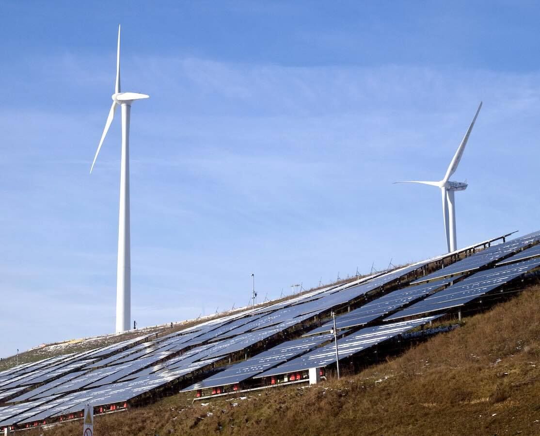
Kudos to the Trump administration for having offshore wind permits through national security review. I am not worried about job losses because these are non-productive, if not harmful, jobs. Offshore wind steals from taxpayers to increase electricity prices for consumers and make our electricity grid less stable and endanger national security. We need productive jobs, like building coal and gas plants to lower electricity prices, improve grid stability, and to ensure national security.
apnews.com/article/wind-ener…

7
21
82
1,788

The Renewable Lie: How Australia Was Sold a False Promise | Aidan Morrison @FootnotesGuy
This is a fair investment in time, but if you are concerned about what is happening with renewable energy in Australia you should watch it.
youtu.be/KKZnXLM69zU?si=Tj_z… via @YouTube
1
6
10
945
Climate Dispatch retweeted

Jun 13
Hello Senator....
This November it will be 50 years since you were first elected to Congress, so we want to be the first to say .
"Happy 50th Anniversary of drawing a taxpayer funded salary."
That is quite an achievement.
In fact - you are 2nd longest-still serving member in Congress.
It has been a long time since you held a private sector job.
AND yes 50 years ago - in 1976 (it was America's Bicentennial that year) - people still punched clocks back then. The world has changed a lot.
During your 50 years in Congress - you watched as the creators and inventors and producers changed the world, creating trillions in new wealth, millions of new jobs and dramatically raising living standards for everyone rich and poor alike.
And for 50 years you have voted to raise taxes and regulate and oversee every move of the private sector.
You have never created or invented or produced. Just taxed and regulated and outraged.
But thank you for using the platform the "TRILLIONAIRE class" has provided to the entire world for free to tell us all how disgusted you are.
We would never know otherwise.

Elon Musk just became the world's first trillionaire. While working people struggle to get by, the billionaire class is becoming the TRILLIONAIRE class. It's disgusting. I'm fighting to tax the rich so we stop rewarding trading stocks over punching clocks.
688
7,802
28,647
426,426
Climate Dispatch retweeted

Jun 12
California is not only allowing ballots to be counted a week after election day, but even ballots without postmarks. Eventually, you will be able to vote by just shouting out the window of your car at any election official...

449
3,919
12,431
112,448
Climate Dispatch retweeted

Jun 12
Congratulations @ElonMusk.
Thanks to SpaceX's IPO, he's the first Trillionaire.
He didn't TAKE money from anyone. He CREATED wealth.
He launched satellites that connect even the poorest, most remote parts of the world.
Our world needs more MAKERS like Musk; fewer TAKERS like:
1,397
9,342
60,219
1,065,998
Scientists Say They Know Why Sea Levels Are Accelerating — But The Data Tells Another Story climatechangedispatch.com/se… via @ccdeditor
1
2
5
208
Climate Dispatch retweeted

Jun 13
Scientists Say They Know Why Sea Levels Are Accelerating — But The Data Tells Another Story climatechangedispatch.com/se… via @ccdeditor
1
1
2
137
Climate Dispatch retweeted
The most pseudoscientific claim in climate science isn't that the Earth has warmed... it's the pretense that we know the global average temperature in 1800 to a few tenths of a degree and today's global average to a few hundredths.
That's not measurement. It's calculation layered on assumptions, adjustments, infilling, homogenization, and statistical reconstruction.
The further back you go, the fewer observations exist, yet confidence somehow grows. When people claim this level of precision with a straight face, they shouldn't be surprised that public trust in climate science is declining.
Jun 13

No, I'm claiming that we had enough observations back then to give reasonable (if large) error bars on the estimates, as the paper explains in quite some detail.
38
77
374
13,682
Climate Dispatch retweeted
Jun 13
Scientists Say They Know Why Sea Levels Are Accelerating — But The Data Tells Another Story climatechangedispatch.com/se… via @ccdeditor Scare mongering around sea level rise has been shown to be mendacious. A battery tide gauge in New York City has operated since 1856 & it shows a steady rise around 2:8 to 3:00 millimeters a year (0:118 inches). Sea level crisis has been flooded out by the facts.
1
4
114
Climate Dispatch retweeted
Jun 13
Cabinet Crack-Up: Miliband Refuses To Raid Net Zero Pot To Pay For Britain's Defence climatechangedispatch.com/mi… via @ccdeditor Miliband is bullying our inept & cowardly PM.
1
3
76
Climate Dispatch retweeted

Jun 12
On what planet is this an attack on Republicans?
We have majority support for the bill.
In this rare circumstance, we should put it on the floor and keep debating it until it passes.
That’s not an attack on Republicans.
That’s a plan of attack against voter fraud.
Jun 12
Mike, I am a co-sponsor and have repeatedly voted for this but you don’t have the votes. @LeaderJohnThune can’t change that. It is math. Try focusing on Democrats instead of Republicans. Republican on Republican attacks are hurting our chances to win the majority in November.
1,097
3,861
18,929
572,530