Editor of Datavisualization.ch the premier news and knowledge resource for data visualization and infographics.
Joined January 2009
- Tweets 3,571
- Following 490
- Followers 11,901
- Likes 66
32 Photos and videos


Benjamin Wiederkehr retweeted

8 Apr 2020
I'm excited to host an online conversation with @datavisFriendly and @srendgen on Historical #DataVisualization next week (April 14th). This is a FREE panel followed by QA. Please register 👇 and help us spread the message. 👋 See you on the other side.
crowdcast.io/e/historical-vi…
2
11
37
Benjamin Wiederkehr retweeted

18 Oct 2019
This Sunday is election day in Switzerland 🗳🇨🇭! Over the past few months, we’ve supported @srfdata with their #ddj on candidates, parties, financing, diversity, and the electorate: srf.ch/news/wahlen-2019-srf-….

1
3
15
31 Jan 2019
«A Closer Look at the Polar Vortex’s Dangerously Cold Winds» by @nytgraphics (now with even more animated particles!) buff.ly/2HEpzWp
1
4
29 Jan 2019
Ha, finally a new attempt to sticky graphic with scrolly interaction. Plus, a well thought out mobile version. Great work by @nytgraphics! nytimes.com/interactive/2019…
3
12
14 Dec 2018
Very pretty traces of airplanes landing and taking off from FRA, LHR, SFO & CDG by @phil_osophie: x.com/phil_osophie/status/10…
18 Nov 2018

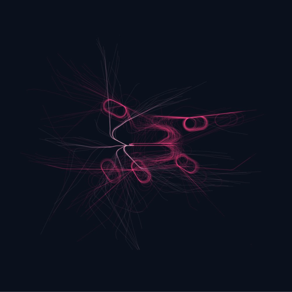
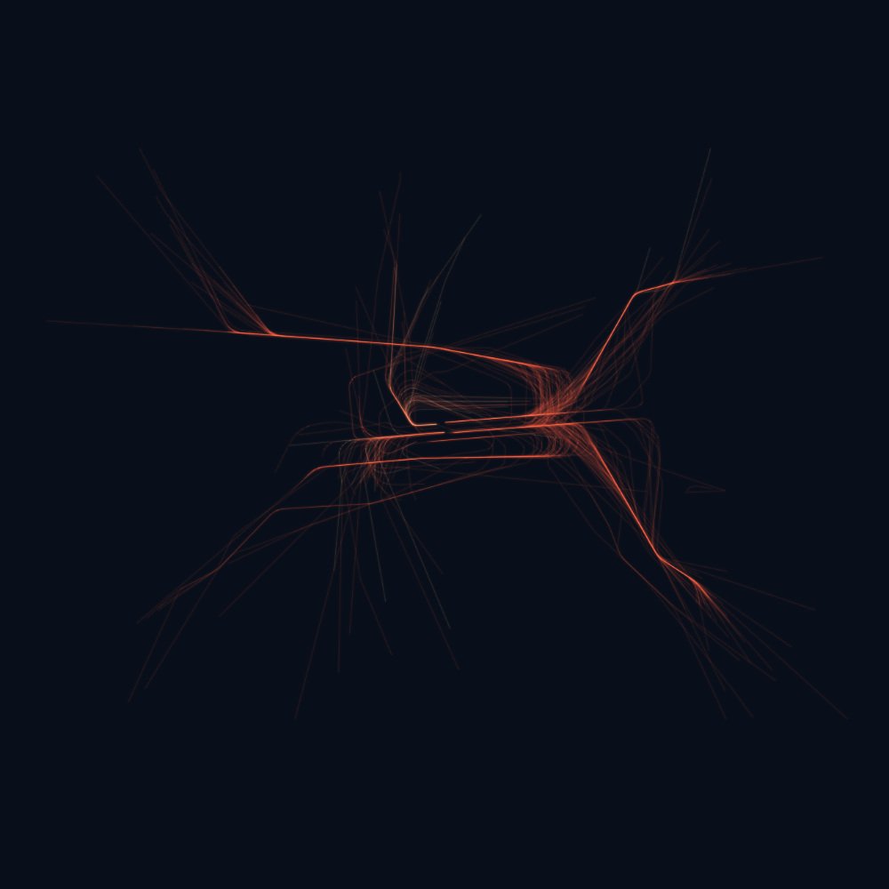
Actually I wanted to penplot them but turns out they look super boring on paper and much better with transparency & darker colors. So here are ~10h of takeoffs and landings at FRA,LHR,SFO & CDG 🛫 🛬
Data from @OpenSkyNetwork rendered with #deckgl
#webgl #dataviz


2
7
Benjamin Wiederkehr retweeted

13 Dec 2018
NEW PROJECT - A visualization of the careers of football players
Legends, One-club men and Journeymen
futbolismo.it/legends-one-cl…
#dataviz for #football at @ftblsm
10
18
Benjamin Wiederkehr retweeted

15 Nov 2018
Visualizations in scientific papers... @GBPlucinska had enough of it and started a blog, with critique and makeovers: gabrielaplucinska.com/blog Nice work, Gabriela!
1
25
76
Benjamin Wiederkehr retweeted

15 Nov 2018
Are you a woman who works in the field of data visualization?
👩🏻🎓🖋👩🏽💻📊👩🏿🎨📈
If so, contact us TODAY to join our panel tomorrow. (Don’t be shy!) 🙏 (RT please)
meetup.com/vismtl/events/256…
4
3
Benjamin Wiederkehr retweeted

15 Nov 2018
NEW PROJECT: for my great client @figshare I've create a space/time #dataviz based on @NOAA @noaafish_pifsc data to explore the state of fish population and coral reef at pacific reefs and islands knowledge.figshare.com/noaa/ thanks for the collaboration @hardemeg
5
54
184
Benjamin Wiederkehr retweeted

30 Oct 2018
Sometimes we have to challenge readers' sensibility so we can build a better world. Cut-out infographic to be aware of childhood malnutrition tragedy. November issue, @NatGeoMag. #MUAC (Mid-Upper-Arm Circumference).
Next to @melindagates, @BillGates, @susanbgoldberg and @UNICEF
3
115
187
8 Nov 2018
«We decided to start this blog to make cutting-edge research available and accessible to designers, analysts, data scientists, and researchers in other fields.» 🎉 Multiple Views by @JessicaHullman, @dalbersszafir, @eagereyes, and @FILWD medium.com/multiple-views-vi…
3
7 Nov 2018
There’s a first draft publication of the upcoming book «Data Feminism» by @kanarinka and @laurenfklein for @mitpress. bookbook.pubpub.org/data-fem…
1
2
24 Oct 2018
Teaching #datavis principles to algorithms! Draco: Representing, Applying & Learning Visualization Design Guidelines buff.ly/2NXs6sO
2
21 Oct 2018
Whoa. Thank you @RonMorrison_ for closing #Infoplus2018 with such a deep and powerful talk. Everyone, please see their work: elegantcollisions.com/
1
9

24 Apr 2018
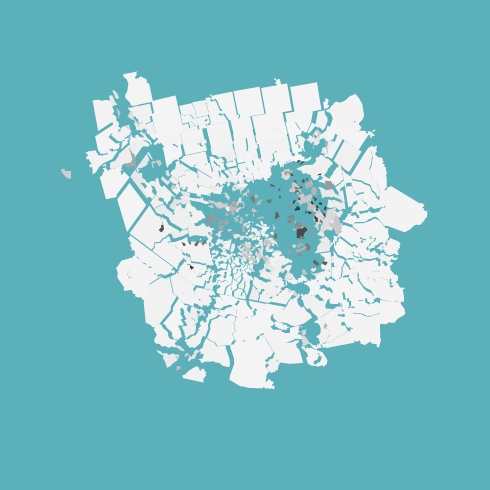
All the Buildings in Manhatten by @taylorbaldwin built with open data: tbaldw.in/nyc-buildings/
3
5
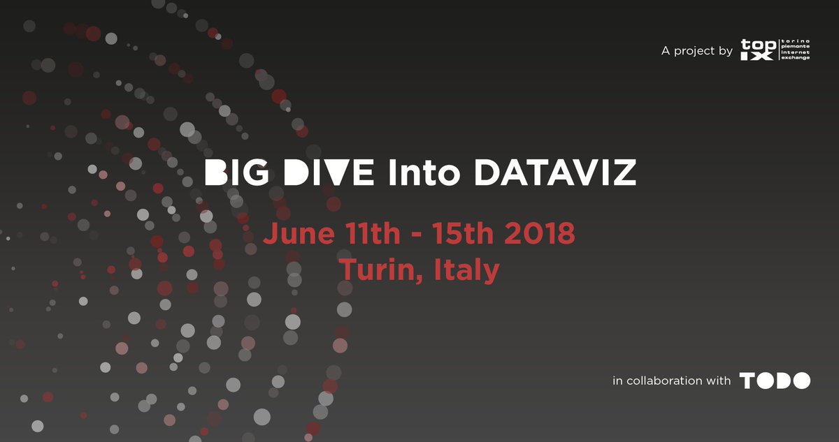
20 Apr 2018
If you'd like to tip your toes into #datavis, you might want to check out this week-long introduction course in Turin in June 2018: bigdive.eu/becomedatascienti…
1