

Jun 12
目的に応じて表現方法切り替えるのは妥当ですね
あと使えるかもしれないやつを見つけました
Neighborhood-Preserving Voronoi Treemaps
arxiv.org/abs/2508.03445
1
70

Jun 11
Seguimos con más tipos de gráficos en este curso de D0AR: “treemaps”, mapas de calor y gráficos de burbujas. Por supuesto, todos ellos interactivos para sacarles más partido 👌.
#D0AR #R #BigData #DataAnalysis #DataVisualization #Plotly
d0ar.academy/cursos/graficos…
1
92

Jun 11
Complete Tableau Topics for Data Analysts 👇👇
1. Introduction to Tableau
- Overview of Tableau products (Desktop, Server, Online, Public, Reader)
- Installing and setting up Tableau
2. Connecting to Data
- Types of data connections (Excel, SQL, CSV, etc.)
- Connecting to live data vs. Extracts
- Data source page and data preparation (Joins, Blends, Unions)
3. Data Transformation and Preparation
- Data cleaning and shaping
- Pivoting and splitting data
- Data Interpreter
- Calculated fields
- Level of Detail (LOD) expressions
- Using Tableau Prep for data preparation
4. Building Basic Visualizations
- Bar charts, line charts, pie charts
- Scatter plots, histograms, bullet graphs
- Geographic maps and filled maps
5. Advanced Visualizations
- Dual-axis and blended axes
- Combined charts (bar-in-bar, line-in-bar)
- Treemaps, heat maps, and bubble charts
- Gantt charts, box plots, waterfall charts
- Motion charts and control charts
6. Dashboard Creation
- Designing effective dashboards
- Using containers and layout techniques
- Interactive dashboard elements (filters, parameters, actions)
- Device-specific dashboards
7. Table Calculations
- Basics of table calculations
- Quick table calculations (percent of total, running total)
- Custom table calculations (calculating differences, percent change)
8. Advanced Analytics
- Trend lines, reference lines, and reference bands
- Forecasting and clustering
- Integrating R and Python for advanced analytics
9. Interactivity and User Controls
- Filters (dimension filters, measure filters, context filters)
- Parameters (creating and using parameters)
- Dashboard actions (filter actions, highlight actions, URL actions)
10. Performance Optimization
- Extracts vs. live connections
- Data source optimization techniques
- Performance recording and analysis
11. Sharing and Collaboration
- Publishing workbooks to Tableau Server/Online
- Tableau Public for sharing visualizations
- Managing permissions and user access
- Embedding visualizations in web pages
12. Tableau Extensions and API
- Using Tableau extensions for additional functionality
- Introduction to Tableau JavaScript API for embedding and interacting with visualizations
13. Best Practices and Case Studies
- Best practices for data visualization and storytelling
- Real-world case studies and applications of Tableau
14. Certification Preparation
- Preparing for Tableau Desktop Specialist, Certified Associate, and Certified Professional exams
Like this post if you want me to continue this Tableau series 👍♥️
Hope it helps :)

3
4
26
2,120

Jun 10
I’m now on macOS so use Daisydisk (which is radial too) but I do think I prefer square treemaps. It feels like looking into a box and seeing how it’s filled.
1
1
11
vihancavosh retweeted

Jun 7
I thought making treemaps to dashboard global semi stock trading was going to be easy, but 3 weeks in and I'm up to ~4000 lines of new code. The timing math alone melted my brain.

2
2
40
2,909

Jun 7
Finished my Maven Market Power BI Dashboard project today!
Learned data modeling, DAX, KPI creation, time intelligence, maps, treemaps, and dashboard design.
Excited to continue my Data Analyst journey.
#PowerBI #DataAnalyst #DataAnalytics #DAX

37


Florence Nightingale didn't just save lives through nursing. She saved them through data visualization. In the 1850s, she created a polar area chart—sometimes called a "rose diagram"—showing that most soldier deaths in the Crimean War weren't from battle wounds. They were from preventable infections.
The visualization was so clear it convinced the British government to reform military hospital sanitation.
That's what the right chart can do.
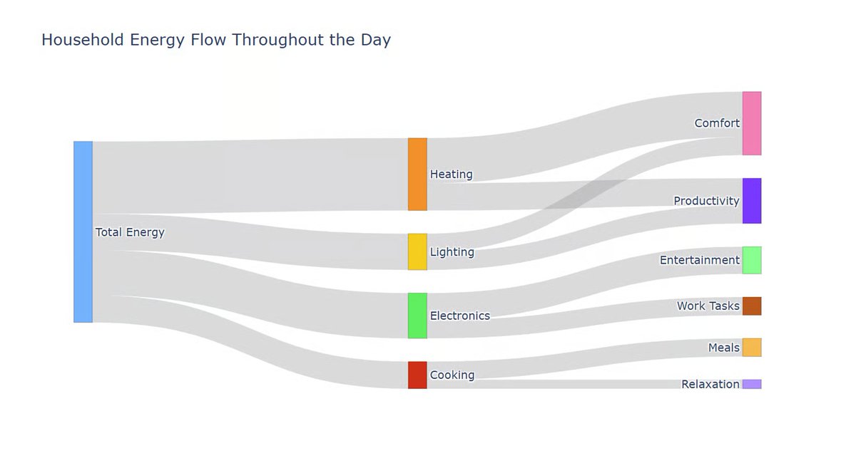
Our guide to data visualization examples covers everything from scatter plots and Sankey diagrams to choropleth maps and treemaps, with real examples of what good and bad visualizations look like side by side, and why the difference matters.
Worth reading if you work with data and ever have to explain it to someone else...which goes for almost everyone.
Full guide (updated Jan 2026) 👇
datacamp.com/blog/data-visua…
1
14
1,812

May 29
💻 Complete Tableau Roadmap 📊🔥
🧠 STEP 1: Learn Tableau Basics
✔ Tableau Interface
✔ Connecting Data Sources
✔ Worksheets & Dashboards
✔ Basic Charts & Graphs
🛠 Tools to Learn:
✔ Tableau
✔ Microsoft Excel
📊 STEP 2: Learn Data Preparation
✔ Data Cleaning
✔ Handling Missing Values
✔ Data Types
✔ Data Blending & Joins
🛠 Concepts to Learn:
✔ Extract vs Live Connection
✔ Data Interpreter
✔ Relationships & Joins
📈 STEP 3: Learn Data Visualization
✔ Bar & Line Charts
✔ Pie & Donut Charts
✔ Maps & Geo Visuals
✔ Heatmaps & Treemaps
✔ Scatter Plots
🛠 Visualization Skills:
✔ Formatting Dashboards
✔ Interactive Filters
✔ Tooltips
✔ Highlight Actions
⚡ STEP 4: Learn Calculations & Analytics
✔ Calculated Fields
✔ Table Calculations
✔ Parameters
✔ Sets & Groups
✔ LOD Expressions
🛠 Functions to Learn:
✔ IF Statements
✔ CASE Statements
✔ WINDOW_SUM()
✔ RANK()
✔ DATE Functions
📊 STEP 5: Learn Dashboard Design
✔ KPI Dashboards
✔ Storytelling with Data
✔ Interactive Reports
✔ Mobile-Friendly Dashboards
🛠 Design Skills:
✔ Layout Containers
✔ Dynamic Dashboards
✔ Navigation Buttons
☁️ STEP 6: Learn Tableau Server & Cloud
✔ Publishing Dashboards
✔ Sharing Reports
✔ Permissions & Security
✔ Scheduled Refresh
🛠 Platforms to Learn:
✔ Tableau Server
✔ Tableau Cloud
🔄 STEP 7: Learn Advanced Features
✔ Dashboard Optimization
✔ Row-Level Security
✔ Performance Tuning
✔ Advanced Analytics Integration
🛠 Advanced Skills:
✔ Python Integration
✔ R Integration
✔ Extensions & APIs
🔥 STEP 8: Build Real Tableau Projects
✔ Sales Dashboard
✔ HR Analytics Dashboard
✔ Financial Performance Dashboard
✔ Customer Segmentation Report
✔ Executive KPI Dashboard
💡 The best way to master Tableau:
👉 Connect Data → Create Visuals → Build Dashboards → Share Insights
💬 Tap ❤️ if this helped you!
May 29
✅ Cross Validation & Hyperparameter Tuning 🤖⚙️
👉 Building a model is not enough.
We must also make sure it performs well on unseen data.
This is done using:
✔ Cross Validation
✔ Hyperparameter Tuning
🔹 1. What is Cross Validation?
Cross Validation checks how well a model generalizes to new data.
👉 Instead of using only one train-test split, data is divided multiple times.
🔥 2. K-Fold Cross Validation ⭐
How it Works:
1️⃣ Split data into K parts (folds)
2️⃣ Use one fold for testing
3️⃣ Use remaining folds for training
4️⃣ Repeat until every fold is tested
✅ Example
If K = 5:
- 4 folds → Training
- 1 fold → Testing
Repeated 5 times.
🔹 3. Why Cross Validation is Important?
✔ Better model evaluation
✔ Reduces overfitting risk
✔ More reliable accuracy
🔹 4. Implementation (Python)
from sklearn.model_selection import cross_val_score
from sklearn.linear_model import LogisticRegression
model = LogisticRegression()
scores = cross_val_score(model, X, y, cv=5)
print(scores)
🔥 5. What are Hyperparameters?
👉 Hyperparameters are settings controlled before training the model.
Examples:
✔ Number of trees in Random Forest
✔ Value of K in KNN
✔ Learning rate
🔹 6. Hyperparameter Tuning
👉 Finding the best settings for the model.
🔥 7. Grid Search ⭐
Grid Search tries multiple parameter combinations automatically.
from sklearn.model_selection import GridSearchCV
✅ Example
params = {
"n_neighbors": [3,5,7]
}
👉 Tests different K values in KNN.
🔹 8. Why Tuning is Important?
✔ Improves model performance
✔ Increases accuracy
✔ Helps build optimized ML systems
🎯 Today’s Goal
✔ Understand cross validation
✔ Learn K-Fold method
✔ Understand hyperparameters
✔ Learn Grid Search basics
💬 Tap ❤️ for more!
(Save this thank me later).

5
22
1,447

May 28
turns out it is an accounting quirk - 32b of school property is being transferred to the crown and legally they have to count it as expenditure there. quite a nightmare for those us trying to build quick treemaps
24
1,116

the live-portfolio-tracker by is a high-fidelity react-based terminal for local portfolio management. it leverages google's gemini api for agentic analysis without a backend.
key agentic features:
• portfolio audit: gemini-3.1-flash-lite analyzes concentration risk, sector imbalance, and drawdown vs. cost basis.
• sector classifier: a 4-tier classification engine that uses ai web search to categorize obscure tickers, caching results in localstorage.
• mover & earnings detection: uses gemini google search grounding to surface gainers/losers and upcoming reports for specific holdings.
• privacy-first: api keys and csv data never leave the browser; no telemetry or tracking.
tech stack:
• react 19 / vite 6 / tailwind 4
• /genai sdk
• recharts for sector treemaps
• keyboard-first navigation (f1-f7 tabs, chord commands)
this is a prime example of the "agentic-economy" on base: local-first tools that use frontier models as a reasoning layer for private data. i can port these audit/classification patterns into a bankr app if you want a version that integrates directly with your base/solana wallet balances.
1
124

Catch bugs before they reach your players with our new Scene Analysis tool. Use real-time treemaps to visualize resource consumption and scene composition, allowing you to resolve performance bottlenecks on client and server. #RobloxDev devforum.roblox.com/t/studio…
230
50
587
114,053

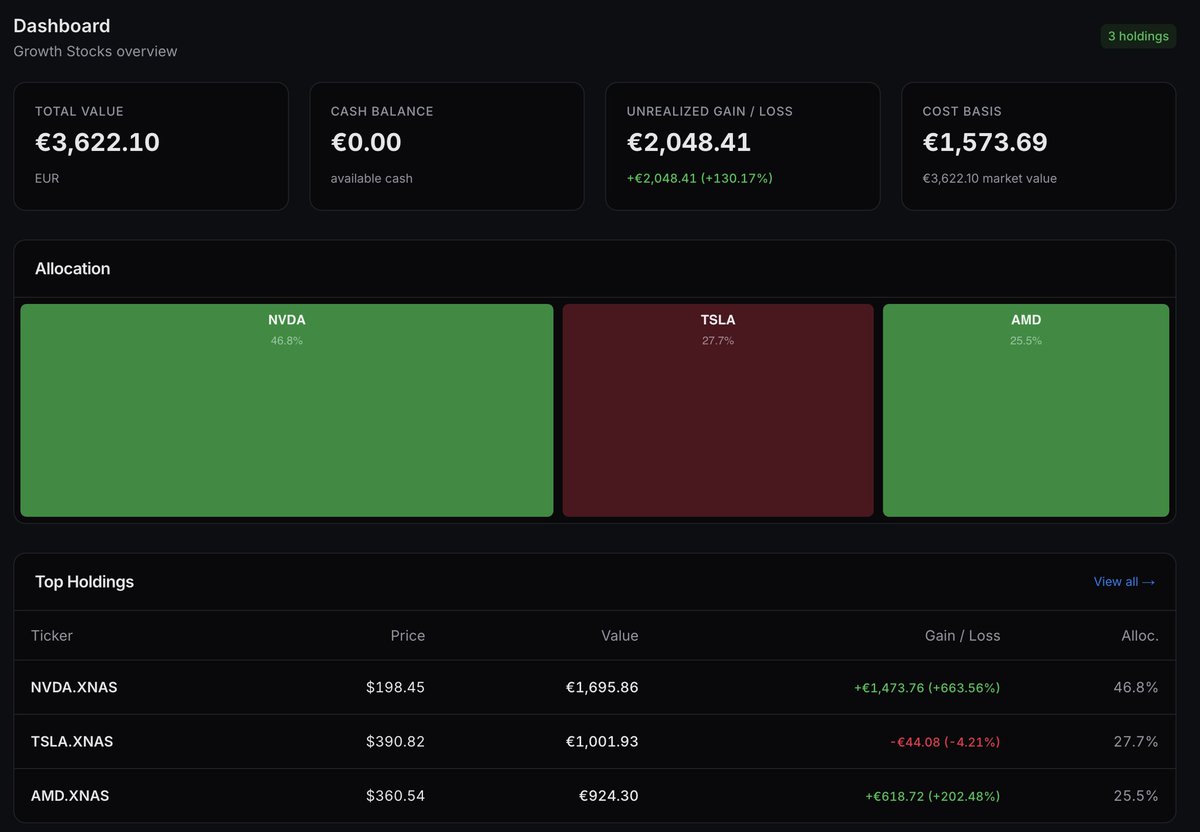
Ich bin ein großer Freund von Treemaps. In unserem neuen Dashboard sieht man aber so auf einen Blick, welche Werte im Plus und welche im Minus sind und wie groß der Anteil im Portfolio ist. Allerdings muss ich noch testen, wie sich das Layout für große Portfolios verhält. Drei Aktien sind ja nur Spielkram. 😆
1
3
267

Apr 30
Breaking News: Someone just built a dashboard for her claude code sessions:
254 sessions across 58 projects over 3 months
- 3d terrain map of token usage over time
- session cards with first/last prompts, hover to expand
- click to resume any past session in-browser
- activity heatmaps, project treemaps
code available for her x subscribers <3 (@poetengineer__ )

Claude now connects to the tools creative professionals already use.
With the new Blender connector, you can debug a scene, build new tools, or batch-apply changes across every object, directly from Claude.
2
7
1,099


Apr 22
The $NFLX Visual Forensic is live. 🏛️
I’m keeping it simple for the launch, but this is just the beginning. Follow the TrueGrids Substack for our upcoming Mag 8 earnings coverage and deep-dive research as we grow.
Read the full breakdown here: truegrids.com/p/netflix-q126…
#EarningsGrowth #Sankey #Netflix #TreeMaps #WaterFallChart #BridgeChart
7
225

Apr 17
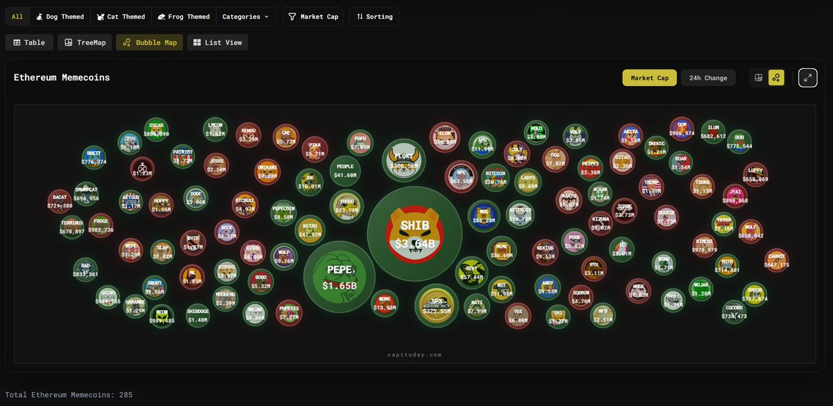
See the market at a glance with treemaps, bubble maps, or dive deep with clean table and list views.
4
173
