
26 Oct 2025
R Data Visualization:
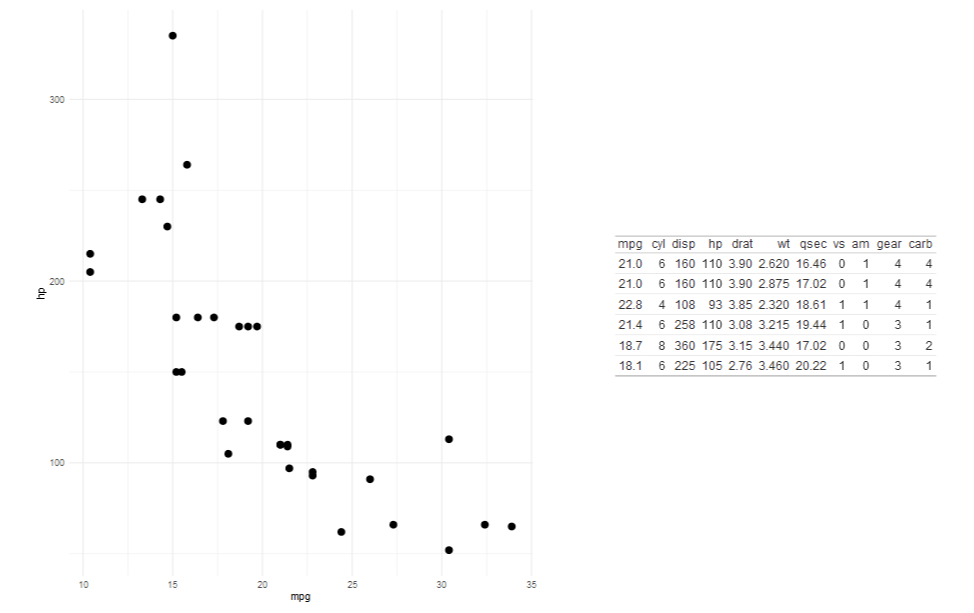
At the most basic level, R’s built-in plot() function is powerful enough to visualize almost anything, even without installing extra libraries.
The plot(x, y) instantly gives a scatter plot. We can add labels, gridlines, colors, legends, and even regression lines in just a few more arguments. For beginners like me, it’s the best way to understand the relationship between data points before diving into complex packages.
Then I stumbled upon ggplot2, and that’s where things really got exciting.
The idea behind ggplot2 is based on the Grammar of Graphics every plot is built layer by layer, just like stacking transparent sheets where each one adds new information.
For Ex:
ggplot(data, aes(x = age, y = salary))
geom_point()
geom_smooth(method = "lm")
labs(title = "Age vs Salary", x = "Age", y = "Salary")
This block of code creates a clean, publication-level scatter plot with a regression line and labels.
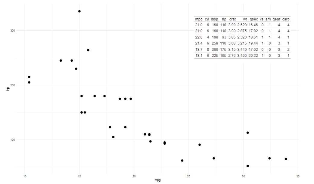
Once I got comfortable, I learned how flexible the aesthetic mappings (aes()) are. You can easily change colors based on a categorical variable, tweak shapes, and even map size or transparency to a numeric variable.
Then I explored the lattice, another thing I came across in R’s visualization library. While ggplot2 focuses on grammar and layers, lattice specializes in conditioning plots visualizing how relationships between variables change across subsets of data.
For example:
xyplot(y ~ x | factor, data = df)
…..this line alone can produce multi-panel graphs automatically split by a factor variable.
Now, once I step into the advanced side of R visualization, I realize just how deep the rabbit hole goes. The integration between ggplot2 and other packages like plotly allows you to make your ggplots interactive with literally one line:
For Ex:
ggplotly(my_plot)
And that's how static plot becomes interactive, with hover effects and zooming, ready for dashboards or web apps.
Then there’s faceting, themes, and custom scales in ggplot2. Themes using theme_minimal(), theme_classic(), or defining our own color gradients with scale_fill_gradient().
Another advanced trick that is very impressive is combining multiple ggplots together using patchwork or cowplot. We can literally create a whole dashboard of multiple plots in one line, aligning them perfectly without messing around with axes or margins.
So that's it, I’ve barely scratched the surface. There’s gganimate for animated plots, ggmap for spatial data, and shiny for building full web dashboards with R visualizations.
I’m still learning every day, but if there’s one thing I’ve realized is that data visualization in R is so easy and simple. It makes me think about data in layers, patterns, and relationships rather than just numbers.
And that’s exactly what makes R so beautiful to learn.
2
5
265

15 Sep 2025
4️⃣ Facilidad para comunicación científica
ggpubr → gráficos listos para publicación con funciones simplificadas.
cowplot → composición elegante de múltiples gráficos en un mismo lienzo.
#DataScience #analytics #stats
1
3
406

5 Jun 2025
📌 Échale un vistazo y dale una nueva vida visual a tus resultados:
👉 maximaformacion.es/blog-cien…
¿Tú ya usas patchwork o sigues luchando con gridExtra y cowplot?
#RStats #DataViz #patchwork #ggplot2 #VisualizaciónDeDatos #DataScience #stats
1
9
803


8 Feb 2025
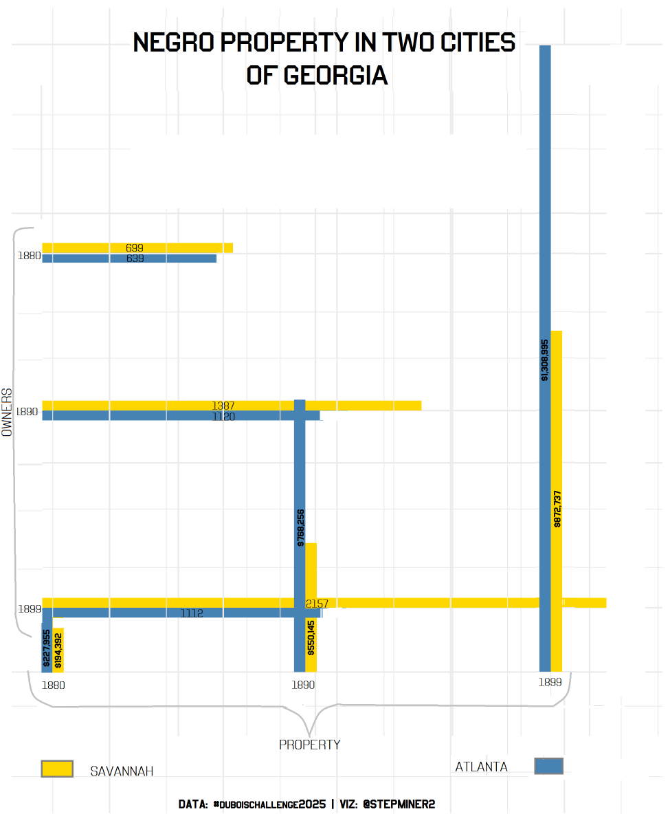
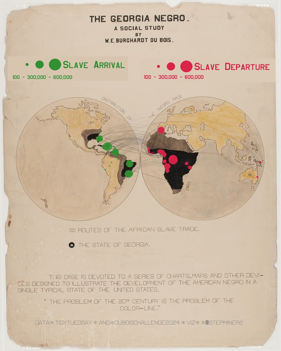
Crafting this chart was no ordinary task! I had to recur to an arsenal of mixed techniques—from ggplot2 to geom_segment, with a touch of magick and cowplot to bring Dubois' vision to life. 📊 #DataViz #duboischallenge2025
1
1
12
348

23 Sep 2024
To develop this site, we make use of #Javascript, #D3, and #RStats packages such as #cowplot and #tidycensus to make our #OpenSource #DataViz. View the code here: github.com/DOI-USGS/vulnerab…
1
1
8
429


13 Aug 2024
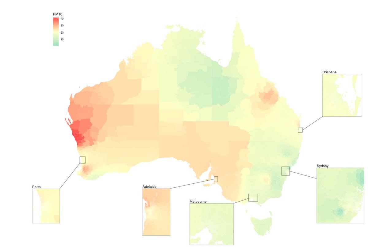
I made this map in R using cowplot, basically manually positioning everything (the insets and the lines). Is there any package out there that has automated this a bit? This took HOURS to get right (and I could honestly spend longer).
7
1
28
8,207

13 Jul 2024
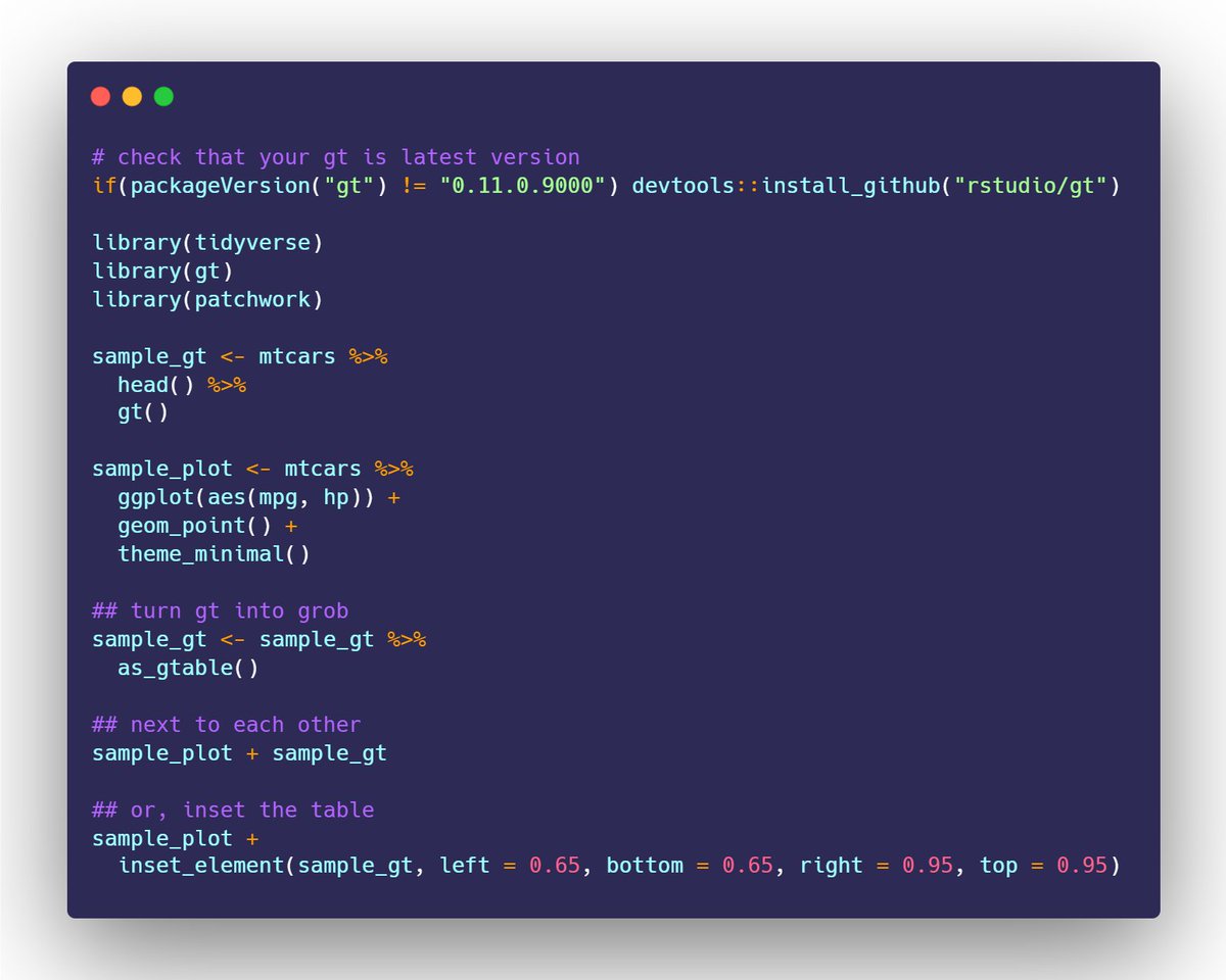
You can w/ the latest dev. version of @gt_package!
as_gtable() turns your gt object into a grob -- which lets it work w/ patchwork, cowplot, etc.
Here are two quick reprexes 👇
13 Jul 2024

Making gt and ggplot play nice together in one viz. is there a way to do it other than turning them into images
1
9
60
12,522

10 Jul 2024
magick::image_read_svg() and cowplot::draw_image()
docs.ropensci.org/magick/ref…
wilkelab.org/cowplot/referen…
2
235

18 Mar 2024
Full code is here if you want to copy and paste.
plot.save <- function(plot = plot,
filename,
width = 10,
height = 10,
add_file = TRUE){
plot <- last_plot()
require(cowplot)
path <- rstudioapi::getSourceEditorContext()$path
if(add_file == TRUE){
plot <- ggdraw(add_sub(plot, path,
size = 4,
x = 0, hjust = 0))
}
ggsave(plot = plot,
filename = filename,
bg = "white",
height = height,
width = width)
}
1
1
4
527
21 Feb 2024
Channeling my inner Dubois with a blend of #RStats magick and cowplot - what a journey! Turns out, map overlays require a steady hand and a spell of patience. I do not give up. To persistence, to wizardry, and to the magic of data visualization! #DuBoisChallenge2024 #Week4 🇭🇹
1
2
13
549


5 Jan 2024
are we still using patchwork or cowplot to compose multipanel plots? or is there something newer & better? #RStats
2
2
5
3,715

19 Dec 2023
#TidyTuesday Top-10 #IMDb TV Series' holiday-season episodes. @theofficetv has the most (6) episodes, the highest rated and most voted episode!
Code🔗tinyurl.com/tidy-hol-episode…
Tools: #rstats #ggplot2 #cowplot
Data Credits: @IMDb @R4DScommunity

368

29 Nov 2023
#30DayMapChallenge 2023 #day29 Population
Kontur data for Ireland Population density and cities 🤩
Tools: #R, {ggspatial}, {cowplot}, {sf},..
#rspatials #rstats #datascience #maps #DataVisualization

ALT Irelans
1
7
513

13 Nov 2023
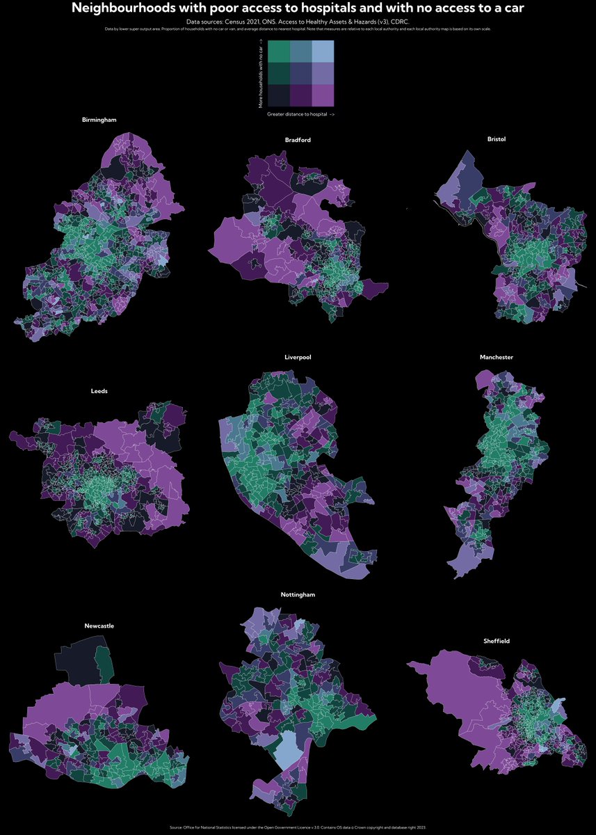
#30DayMapChallenge Day 13:Choropleth. Some #bivariate maps in #rstats using the biscale and cowplot packages showing access to hospitals.

3
279

23 Oct 2023
Hey ya'll check out my latest #dataViz -- fun to take a simple #rstats viz, add cowplot and some silly faces, and end up with a easily #halloween themed result!
23 Oct 2023

#HauntedHydrology
Coldest & deepest of the Great Lakes with a max depth of 1,333ft, Lake Superior is the world’s largest freshwater lake by area.
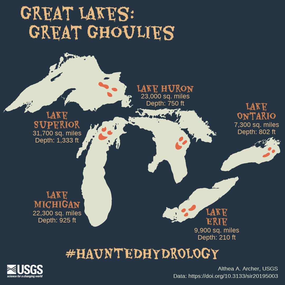
ALT Map of the five Great Lakes with each lake colored off-white on a dark background. Each lake has a ghost's eyes and mouth on them to make them look like ghouls. Title says "Great Lakes: Great Ghoulies" and subtitle says "#Haunted Hydrology." Lake Superior has maximum depth of 1,333 feet and is 31,700 square miles in area, Lake Michigan is 925 feet deep and 22,300 square miles, Lake Huron is 750 feet deep and 23,000 square miles, Lake Erie is 210 feet deep and 9,900 square miles, and Lake Ontario is 802 feet deep and 7,300 square miles. Data can be found at DOI 10.3133/sir20195003.
1
7
549

23 Oct 2023
There's a 100% chance of would have just brute-forced it with `cowplot` and it would be close, but terrible
1
3
80