
Could collaborative multi-agent workflows completely automate data science pipelines?
Earning a strong 7.3 OpenReview score for ICLR 2026, the submission "CoDA: Agentic Systems for Collaborative Data Visualization" addresses a massive pain point in NL2V (Natural Language to Visualization). The paper introduces a collaborative multi-agent architecture designed to process complex datasets and handle automated code refinement.
By shifting the focus from simple, single-prompt charts to structured agent teams, this framework aligns with major milestones in LLM-based software engineering and analytics, such as MetaGPT and AutoGen. It demonstrates how splitting up specialized operations can boost automation benchmarks by up to 41.5%, promising a smoother interface for data analytics.
#ICLR2026 #DataVisualization #MultiAgentSystems #LLM #DataScience

1
5
Bring your ggplot2 visualizations into 3D with rayshader! This extension adds powerful 3D plotting capabilities to R, making it easy to transform standard visuals into interactive and visually engaging data representations.
With rayshader, you can:
✔️ Add Interactive 3D Effects – Customizable lighting and shadows bring new depth to your data.
✔️ Enhance a Range of Data Sets – Apply 3D effects to bar charts, heatmaps, and more.
✔️ Boost Audience Engagement – Present data in an appealing, informative 3D format.
The visualizations shown here are taken from the rayshader package website: rayshader.com/
For more on ggplot2 and its powerful extensions, join my course “Data Visualization in R Using ggplot2 & Friends.”
For more information, visit this link: statisticsglobe.com/online-c…
#RStats #DataAnalytics #R #database #DataViz #DataScience #statisticians #Rpackage #tidyverse #DataVisualization

1
23
594

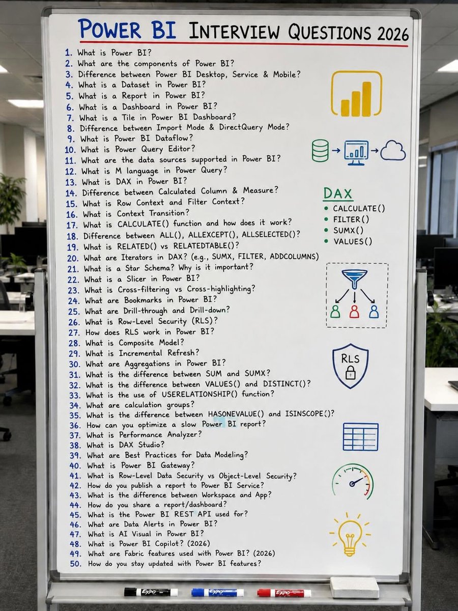
🏆 The Most Asked Power BI Interview Questions (2026)
📊 Power BI interviews aren’t just about knowing the tool—they’re about understanding how data, modeling, and analytics work together.
This collection of 50 frequently asked Power BI interview questions covers everything from foundational concepts to advanced topics that hiring managers often focus on.
✅ Power BI Fundamentals
✅ Power Query & M Language
✅ DAX Functions & Contexts
✅ Data Modeling & Star Schema
✅ RLS & Security Concepts
✅ Performance Optimization
✅ Incremental Refresh & Aggregations
✅ Power BI Service, Fabric & Copilot
🎯 Whether you’re preparing for your first Data Analyst role or aiming for a senior BI position, these questions can help you assess your knowledge and identify areas to improve.
📌 Save this post for future interview preparation.
💬Comment Pandas for pandas interview questions
#powerbi #dataanalytics #businessanalyst #powerbitraining #datavisualization
4
11
72
2,079

📊 Turn weather data into insights.
Real-time weather, forecasts, charts, and analytics — all powered by WeatherAPI. ⚡
#WeatherAPI #DashboardDesign #DataVisualization #DeveloperTools #BuildInPublic #WeatherData
5

Tell me about her using Data terms:
I will start..
She was my VLOOKUP. Always found what i needed, in any table, any sheet. Then one day - value not found 🤣🤣
#dataanalytics #datascience #datajokes #datavisualization #datareporting #dataengineering
2

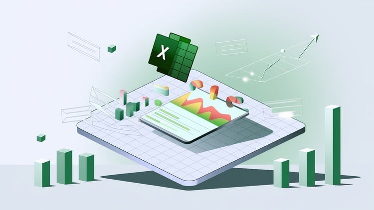
🔧 Tool: Microsoft Excel (PivotTables, PivotCharts)
📊 Dashboard is next
#DataAnalytics #HealthcareAnalytics #Excel #EDA #DataScience #PortfolioProject #DataVisualization #Dashboard #Analytic
7

In today’s data-driven business world, Power BI isn’t just a reporting tool—it’s a complete data intelligence solution for Business Analysts.
youtu.be/STd_IE5CiH4
#PowerBI #BusinessAnalysis #DataVisualization #AdaptiveUS #BusinessAnalyst

3

Security data is useless if it's trapped in complex text logs. Decision-makers need a unified, high-fidelity dark-themed dashboard that visualizes traffic, maps device behavior, and provides clear actionable steps the second a threat emerges.
Clarity is power.
#TechDesign #UX #CyberSecurity #DataVisualization
5

Your data deserves better than spreadsheets.
Choose. Customize. Start — in 3 simple steps.
prime-levels.com
#PowerBI #DataVisualization #PrimeLevels #Dashboard

1

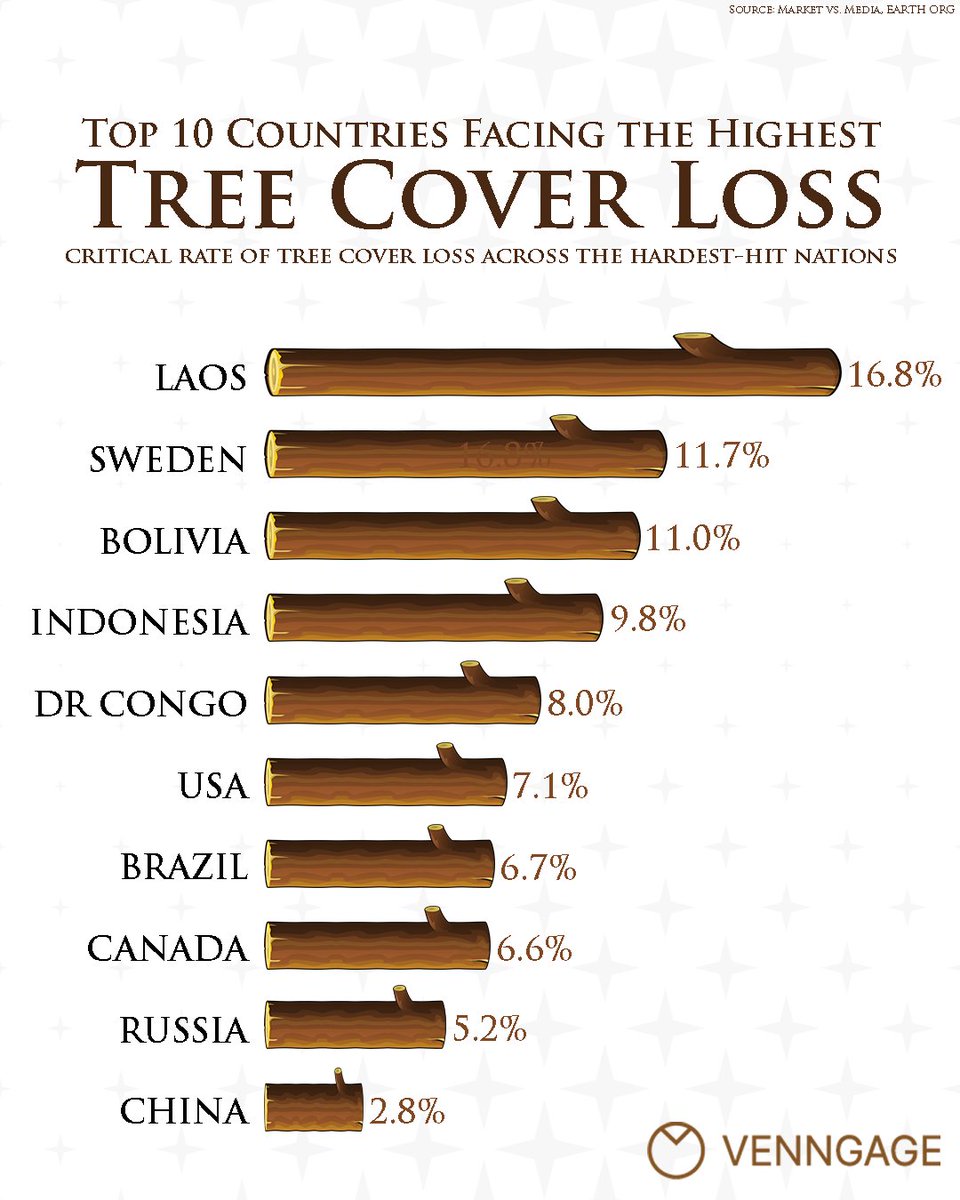
🌳 Where is global tree cover vanishing fastest?
While total deforested acreage often dominates the headlines, looking at tree cover loss by percentage reveals a stark picture for specific regions.
#datavisualization #tree #forest #venngage #infographic
1
33

Watch this revenue race over time!
Featured: China, United States, India, Russia
67 years of data | 12 entities
Full video: youtu.be/MkuFj7B1nJ8
#DataVisualization #BarChartRace #Data

1
7

Data Visualization - Insights at a Glance
Website: infinitylearning.online
FB/IG: @infinitylearningmumbai
X: @InfinityLearnMu
#DataVisualization #DataAnalytics
1
2


A common mistake in reporting is showing everything. More charts don't always mean more insight.
Sometimes a single KPI supported by the right visual tells a stronger story than an entire dashboard full of charts. #PressingData #DataAnalytics #DataVisualization #PowerBI #Excel
2
6

Jun 13
See how your overall view changes as you add more accounts. With a full year of data, you can observe the significant difference percentages make over time. It truly starts to matter. #DataVisualization #AccountManagement
1

Jun 13
Traditionally, visualization and statistical testing are handled in separate steps. This makes the workflow slower and the results harder to present clearly.
With ggstatsplot in R, both are automatically integrated into a single figure. This helps you work more efficiently and makes your results easier to interpret and communicate.
The graphic below demonstrates this using the relationship between living space and property price. Each point represents one observation, and the line shows the overall trend. In addition, the plot automatically includes key statistical information, such as the correlation coefficient, confidence interval, p-value, and sample size.
This way, you can see the data and the corresponding statistical conclusions in one place, which makes your findings clearer and easier to share.
Looking to improve your data visualizations in R? In my course, Data Visualization in R Using ggplot2 & Friends, I cover ggplot2 and tools like ggstatsplot to help you build clear and effective plots. Check out this link for more details: statisticsglobe.com/online-c…
#StatisticalAnalysis #Rpackage #DataViz #DataVisualization #RStats #ggplot2 #coding #Data

1
3
60
1,455

Power BI Mastery: Zero to Hero Data Skills
⏱️ 6.7 hours
⭐ 4.10
👥 51,087
🔄 Sep 2025
💰 $19.99 → 100% OFF
comidoc.com/udemy/power-bi-m…
#PowerBI #DataVisualization #DataScience #udemy

15

…From data wrangling in power query to designing visuals that actually tell a story using power BI.
Every dashboard was a new challenge!
Thank you to @TechSphereAcad @ezekiel_aleke
#DataAnalytics #PowerBI #Excel #Powerquery #Dashboard #DataVisualization #Analytics


8
72
Dynamic Excel Reports for Marketing Analytics
⏱️ 2.7 hours
⭐ 3.77
👥 15,233
🔄 Mar 2025
💰 $17.99 → 100% OFF
comidoc.com/udemy/dynamic-ex…
#Excel #MarketingAnalytics #DataVisualization #udemy
15

Jun 13
and business insights, transforming raw data into meaningful information that supports decision-making.
A big thank you to AnalystLab for providing this practical learning opportunity.
#AnalystLabAfrica #SQL #DataVisualization #internship
1
226