
まっちゃ︎︎🫧🎀/🐰🏰/🍥🐩💯/🐶🎀☁/🩷💛🩵/🐾🌸/🏡🎀 retweeted

Jun 11
とてもご丁寧に
サムネイルの商品はリメイク後のものなので、お求めの際はリンク下段の「NewData」をインストールしてください。
と書いてくださっています!!
NewDataの方を入れてね
分からなかったら天音のあが教えます。
こんな素敵なハートで天使な可愛いペンラ🥹🥹🫶🤍
余りにも最高です
1
7
244

Jun 9
تم الإجابة عليه: دالة التاريخ الجديد في جافا سكريبت تُرجع التاريخ والوقت : (1 نقطة) else if greeting ()hourNow=today.getHours ()Var today=newData ؟ - مع الشرح dlvr.it/TSxjdW
5

Jun 5
#NewData Shows Trump’s Promise to Revive Manufacturing Is Struggling #Trump’s promised “golden age” of #American #manufacturing is collapsing under the weight of its own numbers as factory spending sinks and #jobs disappear, according to humiliating new official government data.
The president swept back into the White House in January 2025 vowing to “supercharge our domestic industrial base,” leaning on aggressive tariffs and arm-twisting to drag companies into building plants on #US. soil. Eighty-four firms duly pledged more than $900 billion to expand American manufacturing. But almost none of it is being built, according to numbers reported by the #FinancialTimes.
The outlet found that private spending on factory construction slumped to $15.2 billion in April—down roughly 16 percent since Trump’s second term began—while 👉77,000 factory jobs have #evaporated over the same stretch. #dailybeast
1
3
95

Time to play CD’s available for purchase as of NOW 🗣️
QR code inside with an unreleased single from me . Use my password “newdata” to unlock after you purchase
Linktr.ee/ripxl 🌐🌐🌐


4
6
261

Apr 11
📊#NewData
Somalia’s 2025 livestock export data, produced by @CentralBankSo is now publicly available. With support from #HoADRIVE, this data improves visibility on export volumes, values, and market flows across.
Visit 🔗stip.gov.so to explore this trade data.
1
4
115

後輩から聞いた。変数名を`data`、`data2`、`newData`、`finalData`って名付けてコード書いてたら、レビューで『これ全部何のデータ?』って聞かれて答えられなかった。1週間後に自分で見ても理解できなかったって。
4
667

Mar 25
変数名つけるのに15分悩んだ結果
data → data2 → newData → finalData → realFinalData → temp
最終的に temp で動いてるの怖すぎる
5
92

#Newdata from our partnership with @RANDCorporation challenge a common narrative ➡️ 68% of #homeschooling parents either currently use or would use public funding — such as ESAs or tax credits — to homeschool their child. Full report: education.jhu.edu/edpolicy/p…

ALT Text that reads, "68% of homeschooling parents either use or would use public funding, Johns Hopkins Homeschool Hub, Johns Hopkins Homeschool Research Lab."
1
2
94

By expanding national wastewater surveillance, these #data support infectious disease epidemiology, early warning, and public health decision-making at scale.
🔗 Read the article: sciencedirect.com/science/ar…
#WastewaterSurveillance #NewData
3
177

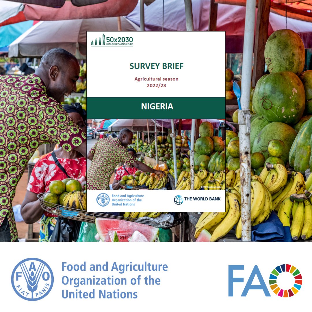
Jan 16
📢#OutNow❗️
@FAOStatistics & @WorldBank brief under @50x2030 presents key insights on land and holding size, crop output and yields, livestock rearing and labour use in Nigeria during ag season 2022/23.
#NewData to inform better policies🌾📊
📘👉openknowledge.fao.org/handle…
9
12
429


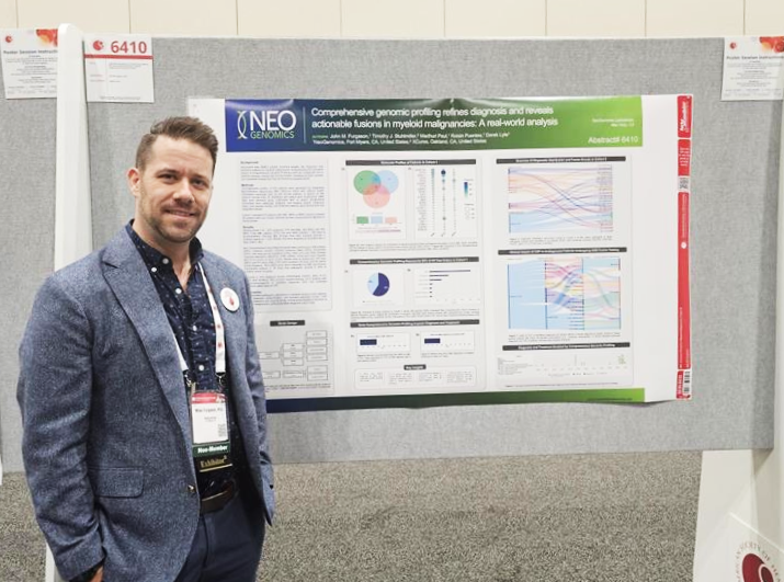
10 Dec 2025
We presented new data at the 67th ASH® Annual Meeting and Exposition! If you didn’t get a chance to learn more during #ASH25, let's schedule a post-meeting discussion: neogenomics.com/about-neogen…
#NewData #Oncology #RWD
2
73

29 Oct 2025
How live collaboration works (like when two people edit the same doc in real time)?
> Client: sends changes → socket.emit('update', { room, newData })
> Server: broadcasts to others → socket.to(room).emit('receive_update', newData)
> Client: receives update & refreshes UI (with a loop guard to prevent re-sending).
That’s the basic loop behind real-time collaboration....
2
52

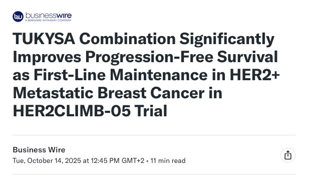
14 Oct 2025
🚨‼️ HER2CLIMB-05 Phase 3 trial shows adding tucatinib to first-line maintenance therapy improves PFS in HER2 metastatic BC #breastonc #clinicaltrials #newdata
14 Oct 2025

NEWS FROM Industry:
HER2CLIMB-05 Update
Source: Pfizer announcement, report by Business wire
buff.ly/27ChwaI
Pfizer announced positive topline results from the Phase 3 HER2CLIMB-05 trial, which evaluated the addition of the tyrosine kinase inhibitor tucatinib to first-line maintenance therapy with trastuzumab and pertuzumab in patients with HER2-positive metastatic #BreastCancer (MBC). The study met its primary endpoint, showing a statistically significant and clinically meaningful improvement in progression-free survival compared with placebo, with a safety profile consistent with known effects of the individual agents.
These findings suggest that incorporating tucatinib into 1L maintenance may further delay disease progression and potentially advance treatment standards for HER2 MBC, a population that continues to face high relapse rates despite current therapies.
awaiting full results!!
@matteolambe @aftimosp @E_de_Azambuja @DrSGraff @jesusanampa @ErikaHamilton9 @double_whammied @stage4kelly @coffeemommy @itsnot_pink @maryam_lustberg @IBCResearch @kevinpunie @nicolobattisti @raalbany @hoperugo @teamoncology @stolaney1 @LoiSher @jamecancerdoc @JavierCortesMD @JaniceTNBCmets @Prof_Nadia_H
#OncoAlertAF
@nataliagandur @acampsmalea @BRicciutiMD
@yekeduz_emre @HHorinouchi @FadiHaddad_MD
@Abdallah81MD @FernandoOnco
@ElisaAgostinett @to_be_elizabeth @bavilima @realbowtiedoc @Erman_Akkus @Lucarecco @GaiaGriguolo @JankovicK
@MarioBalsaMD @DrMirallas @GIMedOnc @OscarTahuahua @UOzkerim @DrRishabhOnco @Onco_Cifu88
3
489

2 Oct 2025
Can AI build a virtual cell? Scientists race to model life’s smallest unit nature.com/articles/d41586-0… - #DwarkeshPatel @dwarkesh_sp, All: #NewData?
The whole thread of running notes on The Vital Question complied in one place: api.omarshehata.me/substack-… & for x.com/hashtag/RealisticVirtu… ?
4
4
63


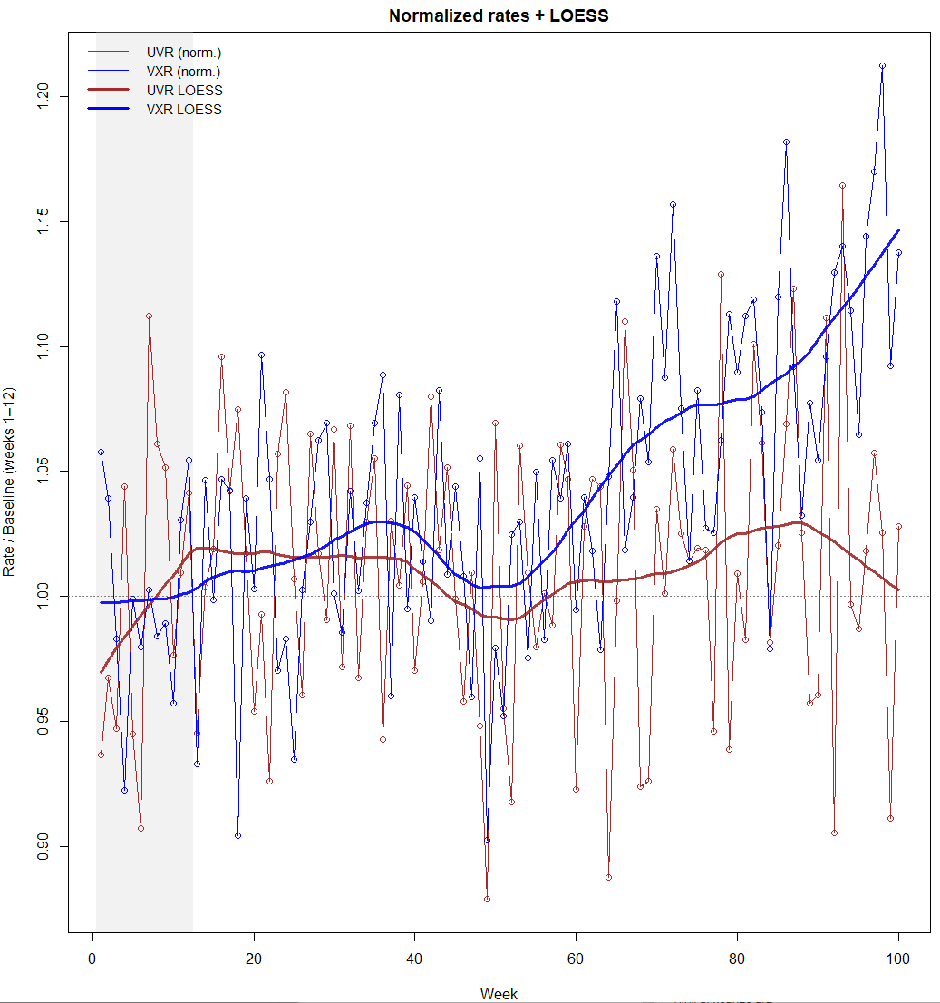
9 Aug 2025
Steve, I think your KCOR method has merit.
I think it would be worth using the "log ratio of LOESS trendlines" to capture the ratio of differences in baseline: (V/Vbase)/(U/Ubase)
Here's a model with random variation between the groups in the first 50 weeks then a steady rise to a 10% increase in mortality over the next 50 weeks. LOESS smooths the variability so is more dynamic than a fixed linear baseline.
R Code below.
uvr <- rnorm(100, 200, 10)
vxr <- rnorm(100, 250, 10) * c(rnorm(50,1,0.02), seq(1, 1.1, length.out = 50))
weeks <- 1:100
# --- plot base series ---
uvr.mean<-mean(uvr[1:12])
vxr.mean<-mean(vxr[1:12])
plot(weeks, vxr/vxr.mean, pch = 21, col = "blue",
xlab = "Week", ylab = "Mortality rate ratio")
lines(weeks, vxr/vxr.mean, lwd = 1, col = "blue")
points(weeks, uvr/uvr.mean, pch = 21, col = "brown")
lines(weeks, uvr/uvr.mean, lwd = 1, col = "brown")
scan()
# 1) baselines and normalization to "ratio-to-baseline"
base_uvr <- mean(uvr[1:12], na.rm = TRUE)
base_vxr <- mean(vxr[1:12], na.rm = TRUE)
uvr_n <- uvr / base_uvr
vxr_n <- vxr / base_vxr
# 2) fit LOESS on the normalized series
span <- 0.25 # tweak as desired (0.2–0.4 is a nice range)
lo_uvr <- loess(uvr_n ~ weeks, span = span, degree = 1, family = "gaussian")
lo_vxr <- loess(vxr_n ~ weeks, span = span, degree = 1, family = "gaussian")
pred_grid <- data.frame(weeks = weeks)
uvr_lo <- predict(lo_uvr, newdata = pred_grid)
vxr_lo <- predict(lo_vxr, newdata = pred_grid)
# 3) ratio of LOESS curves (VXR ÷ UVR). >1 means VXR higher than UVR.
ratio_lo <- vxr_lo / uvr_lo
op <- par(mfrow = c(1, 2), mar = c(4, 4, 2, 1))
## ---- Plot 1: normalized series LOESS for both cohorts ----
plot(weeks, uvr_n, type = "n", ylim = range(c(uvr_n, vxr_n), na.rm = TRUE),
xlab = "Week", ylab = "Rate / Baseline (weeks 1–12)", main = "Normalized rates LOESS")
# shade first 12 weeks
rect(0.5, par("usr")[3], 12.5, par("usr")[4], col = adjustcolor("grey80", 0.25), border = NA)
abline(h = 1, col = "grey50", lty = 3)
# raw points/lines
points(weeks, uvr_n, pch = 21, col = "brown")
lines(weeks, uvr_n, col = "brown")
points(weeks, vxr_n, pch = 21, col = "blue")
lines(weeks, vxr_n, col = "blue")
# LOESS trendlines
lines(weeks, uvr_lo, lwd = 3, col = adjustcolor("brown", 0.9), lty = 1)
lines(weeks, vxr_lo, lwd = 3, col = adjustcolor("blue", 0.9), lty = 1)
legend("topleft",
legend = c("UVR (norm.)", "VXR (norm.)", "UVR LOESS", "VXR LOESS"),
col = c("brown", "blue", "brown", "blue"),
lty = c(1, 1, 1, 1), lwd = c(1, 1, 3, 3), bty = "n", cex = 0.9)
## ---- Plot 2: centered log ratio barplot ----
log_ratio_lo <- log(ratio_lo) # natural log
# symmetric axis limits around 0
ylim_range <- max(abs(log_ratio_lo), na.rm = TRUE)
bar_cols <- ifelse(weeks <= 12, adjustcolor("steelblue", 0.8), adjustcolor("grey60", 0.9))
bp <- barplot(log_ratio_lo, border = NA, col = bar_cols, space = 0.2,
xlab = "Week", ylab = "log(VXR LOESS / UVR LOESS)",
main = "Log ratio of LOESS trendlines",
ylim = c(-ylim_range, ylim_range))
abline(h = 0, col = "grey30", lty = 2) # 0 = equal
legend("topright",
legend = c("Weeks 1–12", "Weeks 13–100"),
fill = c(adjustcolor("steelblue", 0.8), adjustcolor("grey60", 0.9)),
border = NA, bty = "n", cex = 0.9)
par(op)
@canceledmouse @ManDownUnder76 @m_a_n_u______

5
3
18
1,201

7 Jul 2025
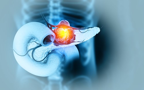
🧬 New data from @Snau_PhD suggest a modest association between alcohol intake 🍺 and increased #PancreaticCancer risk, even among nonsmokers.
🔍 Study led by Pietro Ferrari, MSc, PhD
📄 Details: ascopost.com/news/may-2025/a…
#Oncology #Epidemiology #CancerRisk #NewData
2
998