
4,196 Photos and videos


Profits High
Employment High
Buybacks High
Deferrals High
Debt Service Low
Spreads Low
Taxes Low
Valuations High
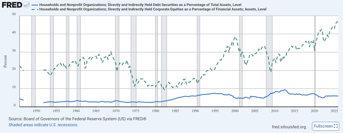
HH Stock Allocation High(est)
US Stock Weight High(est)
2025 seems like its going to be a fun year, but sometime this Presidential term it will all roll over
2
2
37
24,566
rolling my calls down

Cramer calling for crude below $70 in a month.
6
223

nah, the problem is stocks are so overowned

Bonds are very, very underowned.
Be truthful: how many of you have the "40" in the 60/40 portfolio?
1
6
382

no brainer
100x
at a minimum

Spacex will probably sell off like most IPOs after a few weeks, but years from now, this is a no-brainer 100x. it is uniquely positioned for this.
Space mining and industrial operations = potential unlimited market cap.
No other company can talk like this.
3
3
313
on to the next crisis that puts Trump in the center of attention

US, Mexican officials to discuss agriculture, energy as Trump casts doubt on trade deal reuters.com/world/china/us-m…
1
1
1
275
808 retweeted
fun fact... the $QQQ has a realized volatility of 39% over the last 10 days and the index is nearly flat, 0.2%. Since 2015, there are only 4 other times when realized vol is between 35 and 45 and the index return is within /-0.2%.
"violently unchanged" as they say...
3
2
27
4,142
lolwhat?
Jun 15

CBS: The Iranians are saying they're gonna have access to a $300 billion reconstruction fund. True or false?
JD VANCE: That's the sort of things they could have access to so long as they honor their end of the obligation
3
9
858
808 retweeted

He gets it
Jun 15

Most of the SpaceX neocloud analysis changes dramatically if you understand that there's a backwardated curve for compute today.
1
1
77
12,145
so much winning
Jun 14

Initially the plan was that the US blockade would be lifted after 30 days.
Iran demanded that it would be lifted upon signing.
Somehow it’s being lifted 5 days *before* the signing?
6
819
808 retweeted

Jun 14
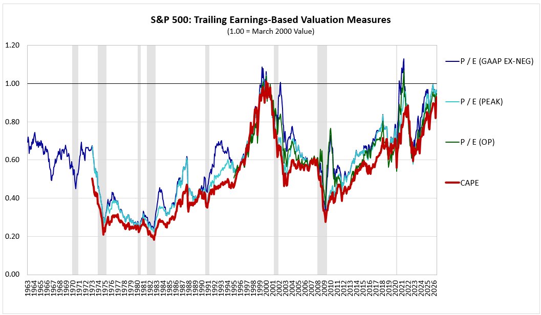
🧵 charts: CAPE and traditional P/E measures
Using a method that accounts for differences in dividend payout ratios, I have the current S&P 500 CAPE (end of May 2026) at 42.3 versus a March 2000 value of 45.6.
Many will immediately dismiss this result as invalid because CAPE is a distorted measure. Yes it is, like all valuation measures, a point that was particularly relevant roughly 10-15 years ago. But the problems with CAPE back then were mostly tied to the fact that there were two huge writedown-heavy recessions in the trailing 10-yr EPS window that were depressing denominator of the measure. Also, there had been a lot of recent earnings growth, which pushes up on the CAPE mathematically (assuming ttm P/E is held constant).
But if you're making a comparison between today and March 2000, you don't have to worry about those distortions. They don't apply. Yes, there's recently been a lot of earnings growth, but that was equally the case back then, so any related distortions drop out. And if you look back 10 years from March 2000, there was only a small, brief recession in the trailing window, with minimal distortive impact--much like today.
The truth is, if you want to claim that this market is approaching or exceeding Tech Bubble excesses, CAPE is one of the WORST measures you could be citing. Simple ttm measures of P/E are all showing the current S&P 500 value closer to the March 2000 value than CAPE! (See the chart below, where a value of 1.00 equals the March 2000 value for each measure. The red line, CAPE, is currently the lowest of them all, showing the biggest discount relative to the 2000 valuation peak, albeit only a small one.)
Additional measures in subsequent tweets.
5
7
63
11,406
808 retweeted

Jun 14
You have to love this… $SPCX
The “facts on $SPAX”
The 2x daily ETF is coming tomorrow. Thank goodness, how would we have managed risk or generated return safely without it?
Below, the table from the prospectus that you always want to look at in one of these products. It maps returns in the underlying versus modeled returns in the lev product based on a vol assumption.
Geometric returns and “vol drag” mean that higher volatility in the underlying will cause the leveraged product to do worse than 2x the return of the underlying. It’s a consequence of the trading strategy getting long the underlying when it rises to an extent that no one conceivably would.
The problem is that no one reads this table or really understands it.
The table includes a 10% vol assumption in the table for your convenience. Wow. There aren’t many 10 vol assets in the world. The SPX is more like a 15 vol. But SPCX might be one? It would mean it was moving around 60bps a day.
25 vol? Still not even close. 50 vol? That’s 3% daily move. Closer, perhaps, over the course of a year, but I still buy that.
50 vol is where an honest table would start. And a 150 vol should be added as well. The results at 150 are shockingly bad. See the second pic below.
Lastly, how does the third table look? Eliminates the ridiculous 10 and 25 vol assumptions.
Please know what you are buying.


7
16
110
24,703
808 retweeted

Jun 14
What am I going to do w now with all my free time, not monitoring the situation? 🌊🛢️
27
2
179
15,328
Happy Birthday, Mr. President
Jun 14

Israeli strike in southern Beirut moments ago
1
6
642
still too high
Jun 14

NEW: Trump’s approval rating hits 28%. The lowest for any president in U.S. history.
1
9
685