
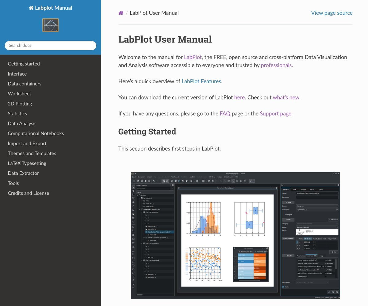
LabPlot is a FREE, secure, open source and cross-platform data visualization and analysis software accessible to everyone and trusted by professionals.
Joined January 2020
- Tweets 243
- Following 0
- Followers 635
- Likes 82
140 Photos and videos


Pinned Tweet


1
2
8
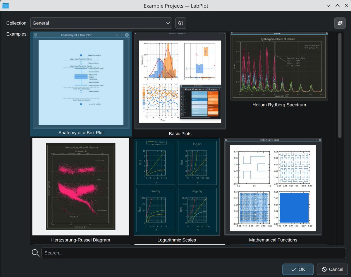
Did you know that #LabPlot (#free, #OpenSource) includes a built-in #library of #DataAnalysis and #DataVisualization example #projects?
Try it now:
1️⃣ Download #LabPlot: labplot.org/download.
2️⃣ File > Open Example.
#Chemistry #Physics #Science #Research #Engineering
ALT Image: Example projects available in LabPlot
1
2
214
We completed our @NGIZero Core funded project!
👉labplot.org/2025/10/04/an-up…
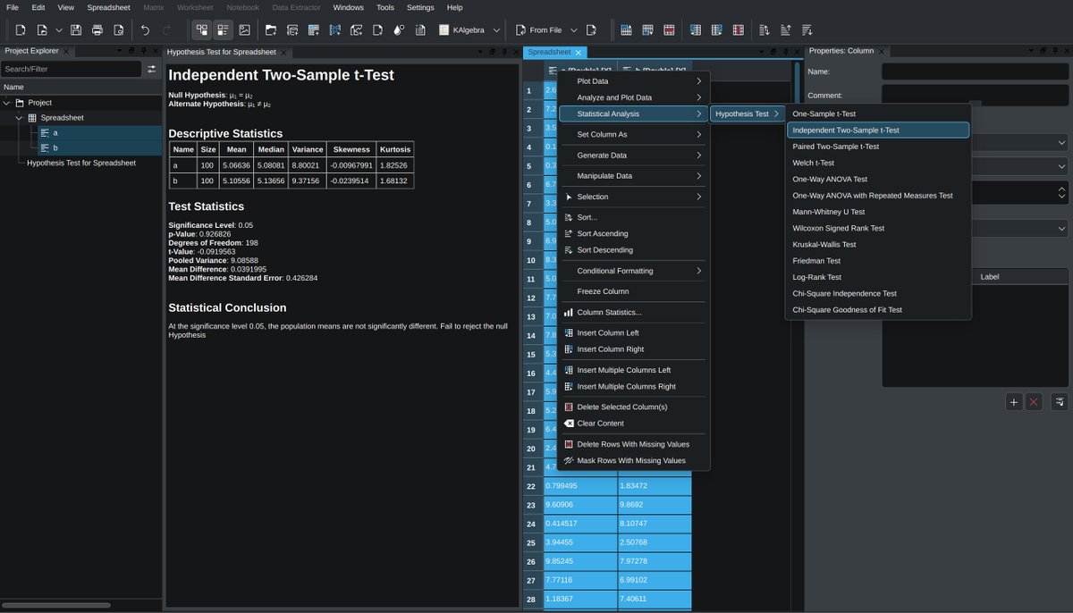
Coming soon to #LabPlot: Python scripting, live data analysis, and a suite of 13 statistical hypothesis tests like t-Tests, ANOVA or Chi-Square.
#OpenSource #Statistics #Python #NGIZero #DataAnalysis
1
2
254


floss.social/@LabPlot | youtube.com/@LabPlot retweeted

2 Sep 2025
LabPlot Tutorial: Professional Data Analysis Made Simple youtu.be/4mCvuO9DYyE?si=pLMu… via @YouTube
1
1
129
floss.social/@LabPlot | youtube.com/@LabPlot retweeted

25 Aug 2025
Yes. But I don't want an area chart, I want an XY chart.
And I want three XY plots. 2 with fills.
I want control of the X-axis and X-data. Excel doesn't let you do this. I'm using LabPlot now.
1
1
106
floss.social/@LabPlot | youtube.com/@LabPlot retweeted

28 Aug 2025
The (Data) Plot Thickens:
You’ve generated a ton of data. How do you analyze it and present it? Sure, you can use a spreadsheet. Or break out some programming tools. Or try LabPlot. Sure, it is sort of like a spreadsheet. But it does more. It has objec… ift.tt/Y7ZnSNG
1
6
225
We’re announcing the 2.12.1 minor patch release of #LabPlot with improvements and bug fixes.
labplot.org/2025/08/18/labpl…
We recommend everybody update to this patch release which is available here:
➡️labplot.org/download
#FOSS #OpenSource #Statistics #DataViz #DataAnalysis
1
1
672


floss.social/@LabPlot | youtube.com/@LabPlot retweeted

26 Jul 2025
Have you used KDE's LabPlot?
1
8
1,881
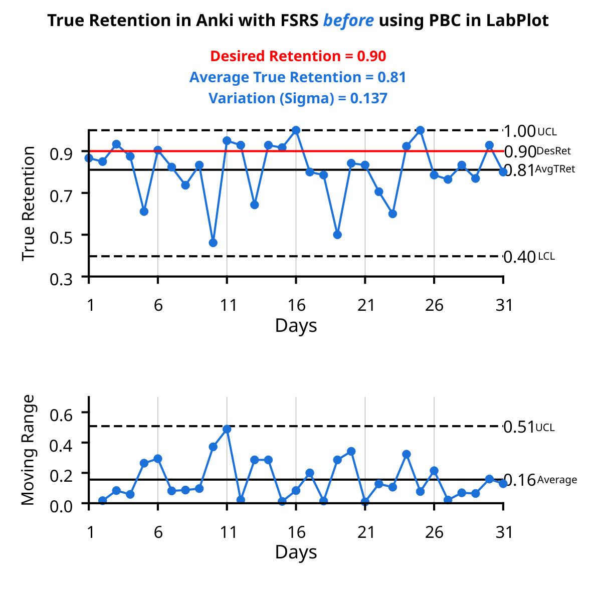
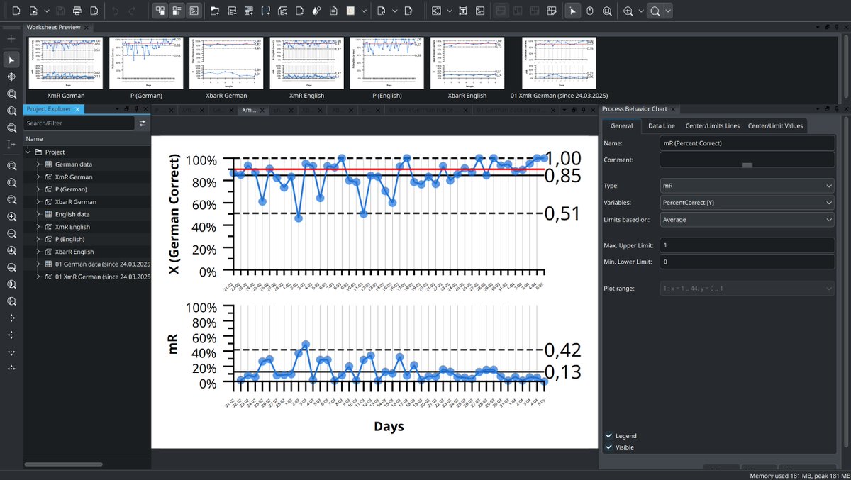
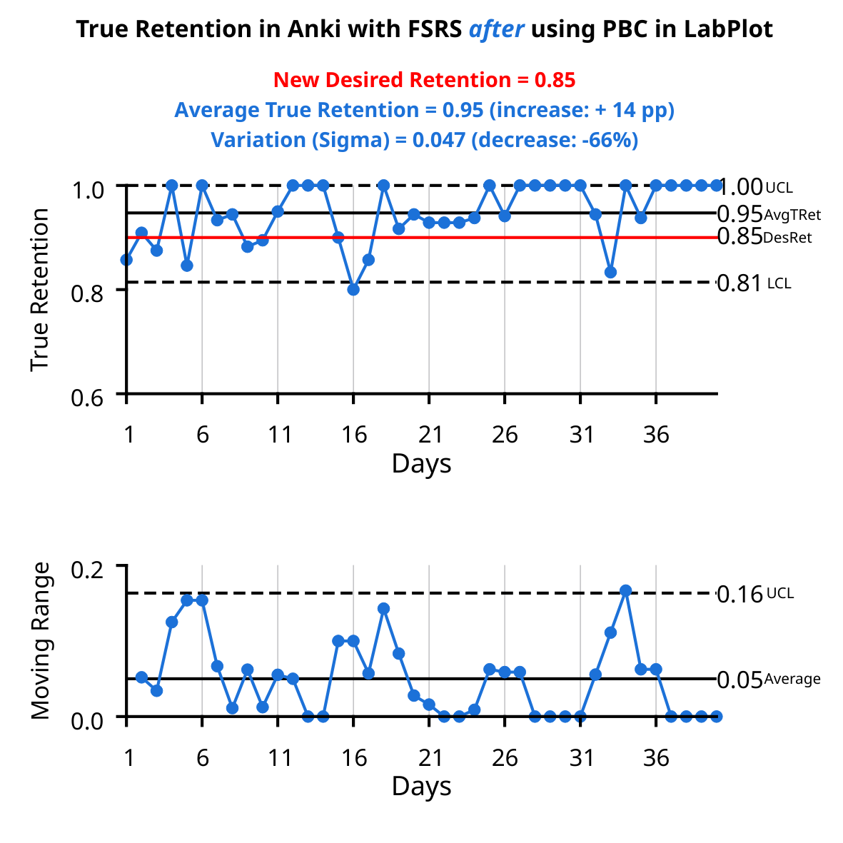
A food for thought: The same algorithm used in #Anki (#FSRS), but two radically different processes. Two #XmR charts made in #LabPlot demonstrate the value of an interaction between Process Behavior Charts and a human mind.
@JarrettYe
#study #learning #SpacedRepetition #SRS
3
3
604
2/ The first XmR chart shows metrics BEFORE a process change (values typical for this process). The second XmR chart shows metrics AFTER the process change. True Retention increased by 14 p.p. (despite reducing Desired Retention to 0.85), and process variation decreased by 66%.
1
127
These gains were achieved despite, not thanks to, the FSRS's operation in Anki. The desired retention was changed to 0.85, and the algorithm was optimized for that target, but True Retention was increased to 0.95.
Any thoughts?
1
145
#LabPlot, the project for #statisticians, #researchers, #scientists, #engineers, #educators and #students, publishes version 2.12 of its #FREE comprehensive #dataAnalysis and #visualization tool.
labplot.org/2025/04/28/labpl…
1
1
5
452
Dear followers,
Starting today, we will be posting our news exclusively on the official LabPlot account here:
➡️floss.social/@LabPlot
We invite everyone to join our community on our Mastodon account!
1
2
125
Improving UX is as important as developing new features.
When duplicating an object in the project explorer, it's now possible in #LabPlot [dev] to place the copy right below the original object.
➡️invent.kde.org/education/lab…
#FreeSoftware #OpenSource #FOSS #DataAnalysis #KDE #UX
1
4
134
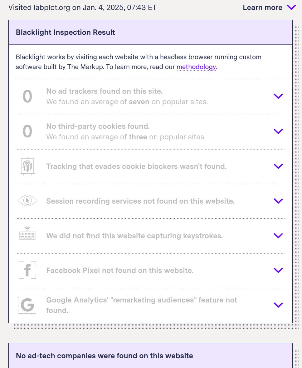
Below is the result of a test conducted on LabPlot's homepage (labplot.org) using Blacklight, a real-time website #privacy inspector.
➡️ themarkup.org/blacklight?url…
#LabPlot #DataPrivacy #InfoSec #FreeSoftware #OpenSource #FOSS
2
108
1
6
200
Dear Open Source Contributors and Users,
Wishing you a joyful and festive Christmas season! We are grateful for your contributions and support. May this holiday bring you peace and happiness.
"Christmas tree" by LabPlot Team CC BY 4.0. #OpenSource #FreeSoftware #KDE #FOSS
1
5
155