
🐍 Make It Pythonic
A one-liner can look smart… until you come back next week and ask:
“What was I trying to do here?” 😅
Instead of writing:
message = "Allowed" if age >= 18 and has_id and not is_banned else "Denied"
✨ Write it the Pythonic way:
can_enter = age >= 18 and has_id and not is_banned
message = "Allowed" if can_enter else "Denied"
The condition is now named.
So the code tells the reader what the rule means, not just how it works.
One line is enough only when one line is clear.
#Python #PythonCode #Coding #Programming #CodeNewbie #100DaysOfCode #Developer #AI #PythonTips

17

Jun 13
🚀 Python (Core Advanced) with AI By Mr. Ashok
📲 Register Now: tr.ee/s56UOz
.
👨🏫 Trainer: Mr. Ashok
📅 Starting on: 15th June @ 08:00 PM IST
🖥️ Mode : Online Training
.
🌐Visit:ashokitech.com/python-full-s…
.
#PYTHON#pythonprogramming #pythoncode #python3

4

Jun 11
📣 Have you checked your inbox yet? 📣
We’ve already sent out the PyCon Colombia 2026 scholarship application results!
Congratulations to everyone who was accepted!
#PyConColombia2026 #Scholarship #PythonColombia #Pythoncode #Pythonconference

41
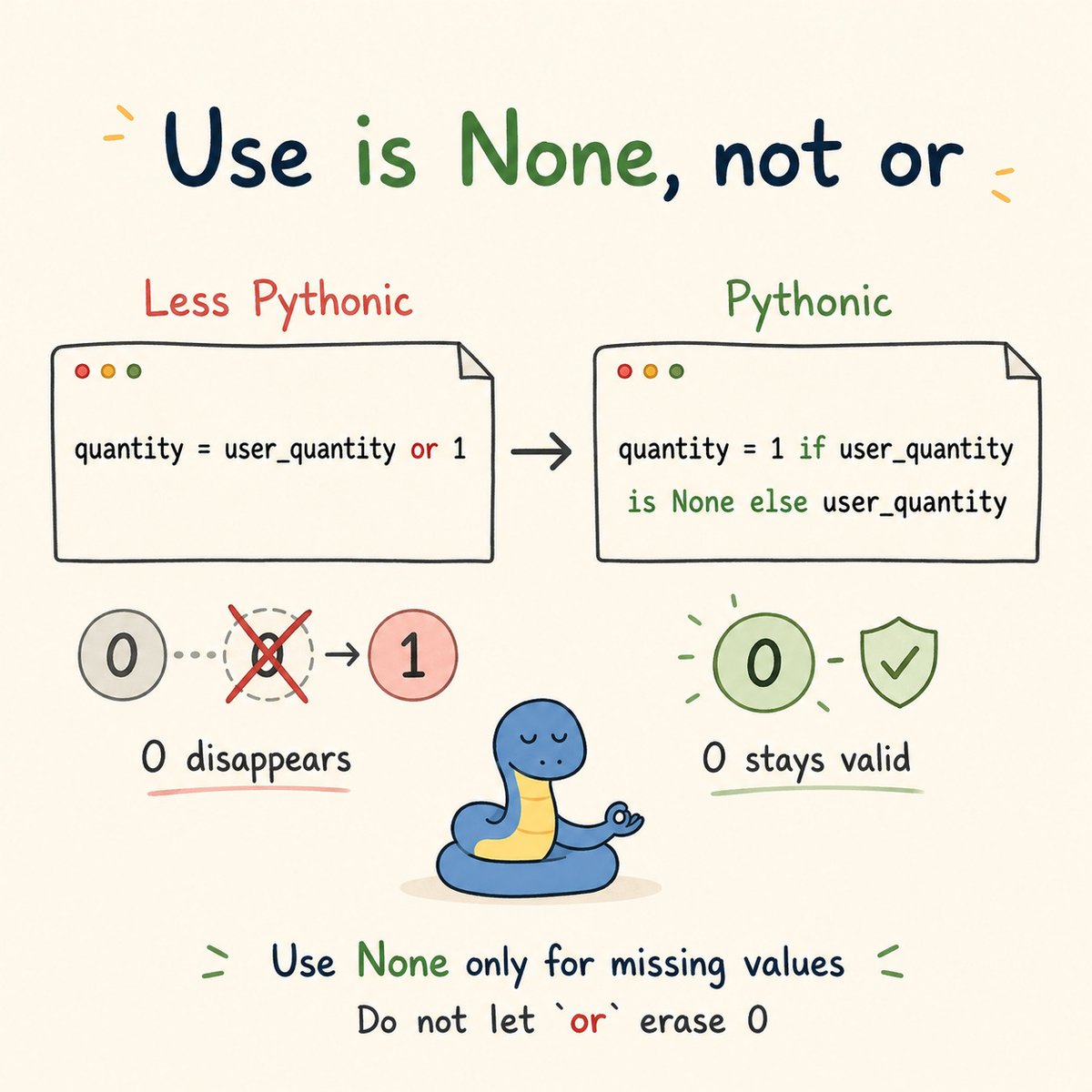
🐍 Make It Pythonic
The or trick looks nice… until a real value disappears.
Instead of writing:
quantity = user_quantity or 1
✨ Write it the Pythonic way:
quantity = 1 if user_quantity is None else user_quantity
If user_quantity is 0, the first version replaces it with 1.
But sometimes 0 is a valid value.
Use is None when you only want a default for missing values.
When 0 is a real answer, do not let or erase it. 🐍
#Python #PythonCode #Coding #Programming #CodeNewbie #100DaysOfCode #Developer #AI #PythonTips
1
29
🐍 Make It Pythonic
A function is easier to read when the invalid cases are handled first.
Instead of writing:
def create_account(email, password):
if email:
if password:
print("Account created successfully")
else:
print("Password is required")
else:
print("Email is required")
✨ Write it the Pythonic way:
def create_account(email, password):
if not email:
print("Email is required")
return
if not password:
print("Password is required")
return
print("Account created successfully")
These are called guard clauses.
They deal with invalid input before the main action begins.
Catch the invalid case first, so the main logic stays simple. 🐍
#Python #PythonCode #Coding #Programming #CodeNewbie #100DaysOfCode #Developer #AI #PythonTips

1
1
26

Who believes that majority of Kenya is rigid when it comes to tech...🤔
#FastAPI
#Python
#PythonDeveloper
#PythonProgramming
#PythonCode
#PythonTips
#Coding
#Programming
#Code
#Coder
#Developer
#SoftwareDeveloper
#SoftwareEngineering
#SoftwareEngineer
6
from idea to design in a few minutes , google stitch antigravity , dm if you want the full playbook.🔥
#FastAPI
#Python
#PythonDeveloper
#AI
#claude
#PythonCode
#PythonTips
#stitch
#Coding
#Programming
#Code
#Coder
#Developer
#SoftwareDeveloper
#AgenticAI
#IndieHacker
33
🐍 Today's Question!
You wrote 10 lines of code... then discovered you could do it in 3 lines.
What does your face do at that moment? 😂✨
👇 Tell us in the comments — we KNOW you've been there! 😅
#Python #PythonProgramming #Coding #CodingLife #Programmer #ProgrammingMemes #ProgrammingHumor #LearnPython #PythonCode #Developer #AI #ArtificialIntelligence #MachineLearning #DeepLearning
1
2
160

May 13
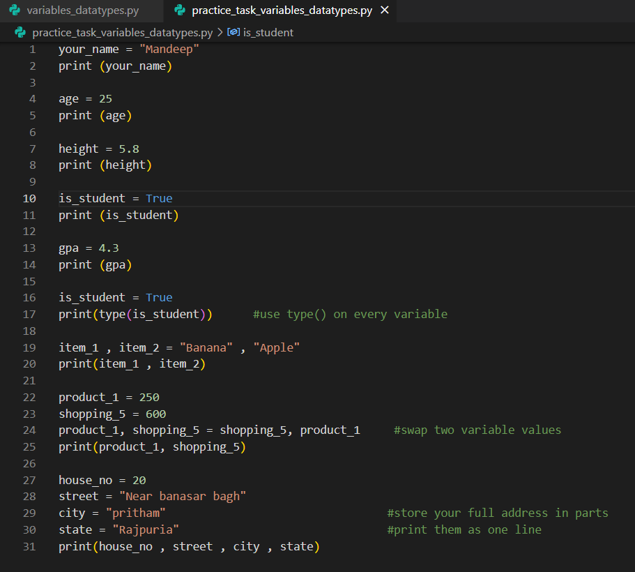
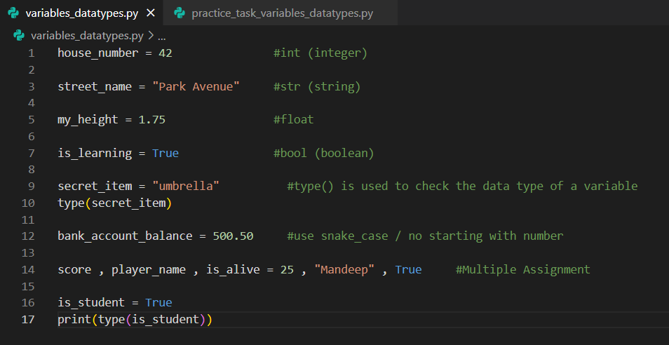
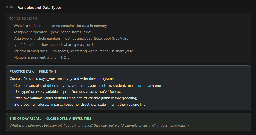
Phase 1 -- Python Core Foundations
Week 1 -- Day 1 - Variables and Data types
Today I learnt variables and completed a practice tasks to using :-
variables / data types
Assignment operator
type() function
variable naming rules
Multiple assignment
#python #coding #development #PythonBackend #pythoncode
3
143
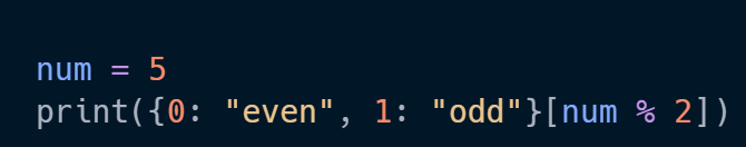
🐍 Python fun
A tiny playful way to check even or odd:
#Python #PythonCode #Coding #Programming #CodeNewbie #100DaysOfCode
1
1
2
287

Apr 16
For today’s project, I want to build a little turtle race game 😂
Where I can guess the color that would win 🏆
Place a bet on my guess 🎰
Wish me luck 🍀
#python #100DaysOfCode #BuildInPublic #LearninginPublic
#Pythoncode
3
105

Feb 17
5 Signs You’re Becoming a More Efficient Data Wrangler in R:
1️⃣ You handle NA values like a pro.
Missing values used to cause panic, but now you know exactly how to deal with them—whether it’s using na.omit(), tidyr::fill(), or writing your own imputation function based on the context of your data.
2️⃣ You know the power of regular expressions.
When it comes to text manipulation, you no longer fear stringr. Instead of manually cleaning strings, you use regex patterns to find, replace, or extract text efficiently, saving time and reducing errors.
3️⃣ You think about memory efficiency.
You’ve started considering the size of your data frames and how to optimize them. Converting character vectors to factors, using data.table for large data sets, and clearing memory when it’s no longer needed are part of your workflow.
4️⃣ You work with date and time effortlessly.
Instead of struggling with date formats, you’re comfortable using the lubridate package. Parsing, formatting, and performing calculations on date and time data have become second nature to you.
5️⃣ You understand the importance of reproducibility.
You no longer write code that only works on your machine. Using R Markdown to document your work, organizing your project folders, and creating scripts that can be run by others without hassle are now part of your habits.
For more data science tips, join my free email newsletter. Take a look here for more details: statisticsglobe.com/newslett…
#RStats #DataAnalytics #datascienceenthusiast #Python #R #pythoncode
9
30
1,416
Feb 15
Some time ago, I stumbled upon a YouTube channel I hadn't discovered before, by Milos Popovic. It's all about crafting stunning maps using R programming! I wanted to spread the word because I believe his tutorials are fantastic. Check it out if you're into data visualization or want to learn something new.
Link to his YouTube channel: youtube.com/@milos-makes-map…
Also, consider subscribing to my free newsletter for ongoing insights into statistics, data science, and programming with R and Python. Learn more: statisticsglobe.com/newslett…
#database #datascienceeducation #Python #pythoncode #RStats

3
45
299
9,757

Gm if you like computer programming art.
My Zebra Art Pattern Project.
#generativeart #creativecoding #pythoncode


1
4
67
Feb 15
Publication bias is a significant issue in scientific research. It occurs when studies with positive or significant results are more likely to be published than those with negative or inconclusive findings. This bias can skew the scientific literature, leading to:
✅ A distorted view of the effectiveness of treatments or the validity of theories.
✅ Overestimation of effects, making treatments appear more effective than they actually are.
✅ Hindrance to the replication of results, which is a cornerstone of scientific integrity.
✅ Impact on policy decisions, leading to potentially misguided policies based on incomplete evidence.
✅ Influence on clinical guidelines, affecting medical practices and patient care.
✅ Future research directions being swayed, as researchers may focus on areas with published positive results, neglecting important but unpublished negative findings.
This visualization from Wikipedia (link: en.wikipedia.org/wiki/Public…) illustrates this issue. It shows a funnel plot of a meta-analysis on stereotype threat and girls' math scores, displaying asymmetry typical of publication bias. This highlights the selective publication of studies with significant findings.
For regular tips on data science, statistics, Python, and R programming, check out my free email newsletter. For more information, visit this link: statisticsglobe.com/newslett…
#Statistical #VisualAnalytics #RStats #database #pythoncode #programmer #datastructure #Python

2
21
55
2,377
Feb 14
5 Signs You're Becoming a Better R Programmer:
1️⃣ You think in functions.
You’ve moved from writing repetitive code to creating reusable functions. You no longer see long scripts but opportunities to create clean, modular code that you can use across multiple projects.
2️⃣ You choose dplyr over base R.
Instead of sticking to loops and apply functions, you are embracing the power of the tidyverse. Chaining operations with the %>% pipe feels natural, and you love how much cleaner and readable your code has become.
3️⃣ You’ve become an ggplot2 wizard.
Instead of sticking to default visuals, you understand the power of customizing your plots. Tweaking colors, themes, and adding custom annotations make your plots tell a story, and you enjoy making data beautiful and easy to understand.
4️⃣ Debugging is your superpower.
You’re no longer frustrated by cryptic error messages or bugs. Instead, you welcome them as challenges and use tools like browser(), traceback(), or even debug() to solve problems step by step. Errors are no longer your enemy—they're a learning opportunity.
5️⃣ You comment your code as if explaining to your past self.
You’ve been in situations where you can’t understand your own code from a month ago, and you’ve learned from it. Now, you write clear comments and document your functions, making it easy for anyone (including your future self) to follow along.
Looking for more data science insights? Check out my free email newsletter.
Take a look here for more details: statisticsglobe.com/newslett…
#database #programmer #RStats #pythoncode #RStudio #Python
3
14
39
1,616
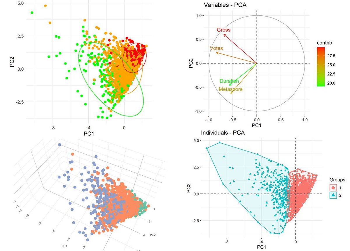
Feb 13
Principal Component Analysis (PCA) is a powerful statistical tool used to simplify complex data sets by transforming them into a set of linearly uncorrelated variables called principal components. This technique is highly beneficial for visualizing your data, especially when dealing with high-dimensional data. Here's why PCA is a game-changer:
✅ Reduces Complexity: PCA helps in reducing the dimensionality of the data while retaining the most informative features. This makes it easier to explore and interpret the underlying patterns in the data.
✅ Improves Visualization: By compressing multiple dimensions into just two or three principal components, PCA allows us to visualize complex data in a 2D or 3D space. This is ideal for spotting trends, clusters, and outliers that may not be obvious in higher dimensions.
✅ Enhances Understanding: The transformation of data to principal components can reveal relationships between variables that are not apparent in the original data. This can lead to better insights and more effective decision-making.
✅ Speeds Up Other Analyses: By focusing on the components that account for the most variance, PCA can speed up other data analysis techniques, reducing computational costs and enabling quicker results.
Looking to explore PCA using R? Enroll in our Statistics Globe online course to boost your data analysis expertise! Learn more: statisticsglobe.com/online-c…
#database #datascienceeducation #Python #pythoncode #RStats
5
43
290
9,584
Feb 8
Using AI in your work? You need to know this!
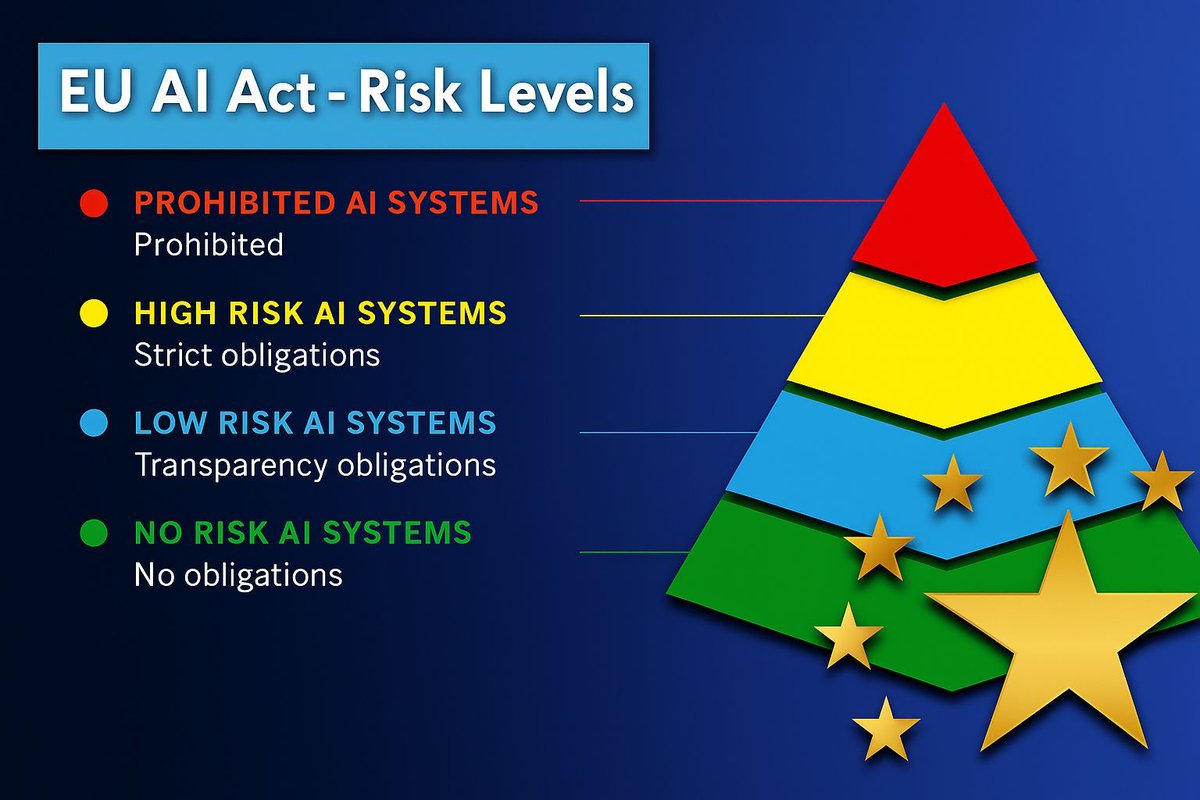
The EU AI Act is the world’s first comprehensive law on artificial intelligence, aiming to ensure AI is safe and trustworthy.
It classifies AI systems into four risk categories:
🔴 Prohibited AI systems – completely banned (e.g., social scoring, manipulative or deceptive techniques)
🟡 High-risk AI systems – subject to strict obligations like risk management, documentation, human oversight, and conformity assessments (e.g., hiring tools, medical devices, law enforcement)
🔵 Limited-risk AI systems – transparency obligations apply; users must be informed when interacting with AI (e.g., chatbots, deepfakes)
🟢 Minimal/no-risk AI systems – no obligations (e.g., spam filters, AI in video games)
Your compliance obligations depend on the risk category, which makes the AI Act important for anyone using data and AI within the EU market.
Do you think this law will change how AI is developed and used in practice? I’d be interested in your opinion.
Learn more: europarl.europa.eu/topics/en…
Stay updated with practical tips on data science and AI by subscribing to my newsletter.
Take a look here for more details: statisticsglobe.com/newslett…
#pythoncode #statisticians #RStats #Python #programmer #Data #datastructure #RStudio
3
14
1,270
Feb 7
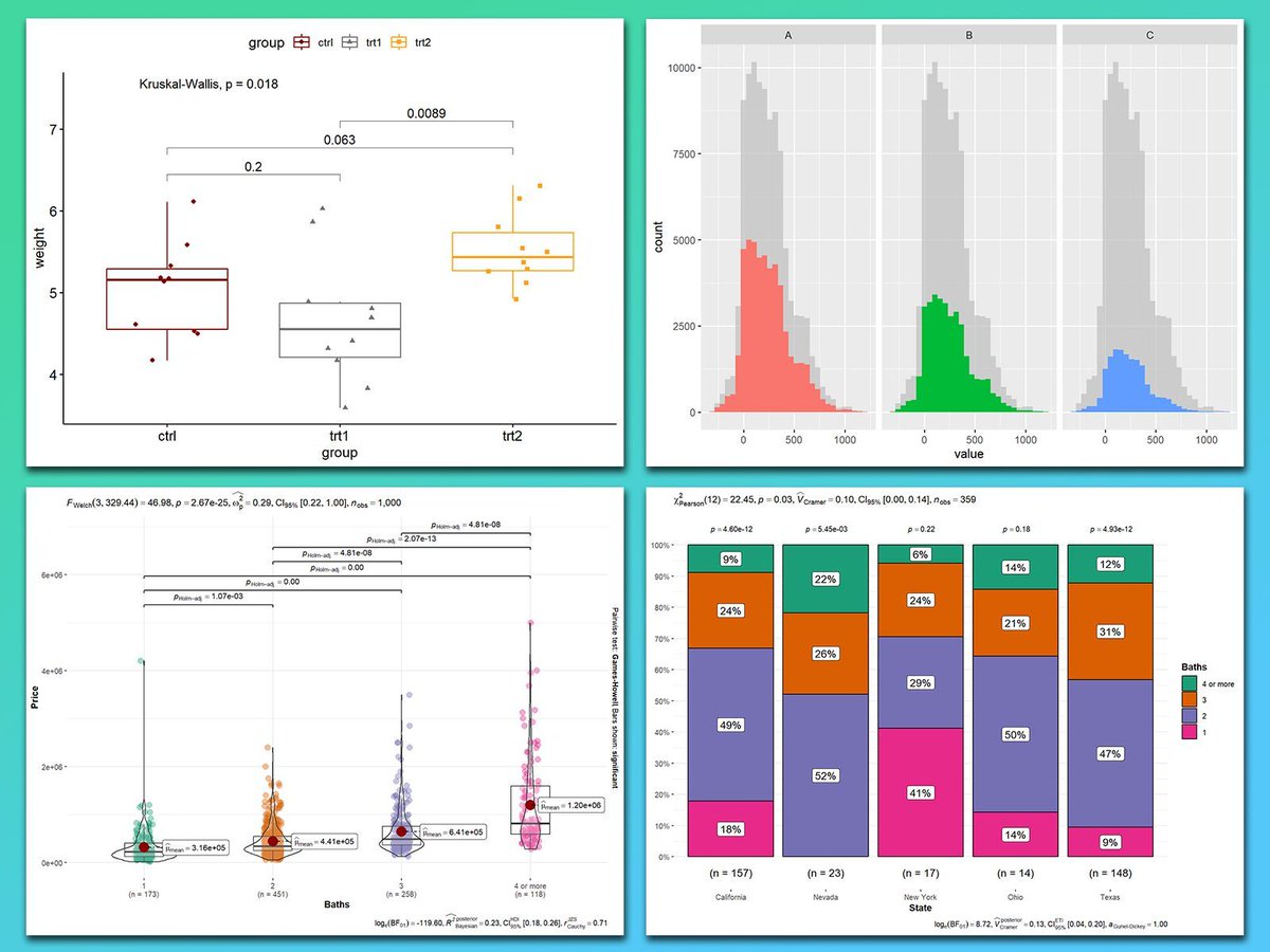
Comparing groups is often one of the main goals in data visualizations. The ggplot2 package in R, along with its powerful extensions, makes it easy to create visualizations that highlight differences, trends, and relationships between groups. Whether you're analyzing means, distributions, or proportions, ggplot2 provides the tools you need for clear and impactful group comparisons.
These are my top 5 packages for visualizing group comparisons in ggplot2:
1️⃣ ggstatsplot: Perfect for adding statistical comparisons directly to your plots. Displays p-values, confidence intervals, and effect sizes seamlessly for group comparisons.
2️⃣ ggpubr: Simplifies comparisons by adding summary statistics (like means and medians) and p-values to boxplots, bar charts, and more.
3️⃣ ggsignif: Adds significance brackets with p-values above boxplots, bar charts, or violin plots, making group comparisons clear and easy to interpret.
4️⃣ gghighlight: Highlights specific groups in crowded plots, letting you focus on key comparisons without losing the context of the full data set.
5️⃣ ggbeeswarm: Adds jittered scatterplots to boxplots or violin plots, allowing you to see the distribution of raw data points within each group for a more detailed comparison.
In the graph shown here, you can see how these packages enhance group comparisons: the top left plot, created with ggpubr, shows statistical comparisons in a boxplot with significance brackets. The top right, created with gghighlight, presents faceted histograms for side-by-side comparisons. Both bottom plots, created with ggstatsplot, combine violin-boxplots with p-values (bottom left) and stacked bar charts with proportions and annotated statistical metrics (bottom right) for clarity.
If you’d like to learn how to create visualizations like these, join my online course, Data Visualization in R Using ggplot2 & Friends. I’ll guide you step-by-step to mastering group comparisons and creating polished visualizations! More information: statisticsglobe.com/online-c…
#statisticsclass #RStats #Python #tidyverse #VisualAnalytics #datastructure #pythoncode
2
20
87
2,646
Feb 6
5 Signs You’re Improving Your Statistical Thinking:
1️⃣ You think in distributions.
You no longer view data as isolated points. Instead, you think in terms of distributions—mean, variance, skewness, and kurtosis. You understand that analyzing these aspects helps uncover the underlying patterns in your data.
2️⃣ You appreciate the value of sampling.
Random sampling and representative data are more than buzzwords to you. You understand the implications of sampling bias, how to design experiments to minimize it, and the impact it can have on the conclusions you draw from your data.
3️⃣ You consider statistical power in your analyses.
Before conducting a study, you think about power and sample size. You know that the probability of detecting an effect when it exists is crucial, and you calculate power to ensure that your tests are meaningful and well-designed.
4️⃣ You use model assumptions to guide analysis.
You don’t blindly apply models to your data anymore. You consider assumptions like normality in linear regression, independence in time series, or homogeneity in ANOVA. Knowing when to transform data, use non-parametric tests, or adjust your model is part of your analytical mindset.
5️⃣ You think beyond correlation to causation.
You know that "correlation is not causation," and you actively seek ways to establish causal relationships. You’re exploring tools like randomized controlled trials, natural experiments, or statistical techniques like propensity score matching to understand real cause-and-effect relationships.
Looking for more data science insights? Check out my free email newsletter. For more information, visit this link: statisticsglobe.com/newslett…
#Data #Statistical #pythoncode #Python #RStats
11
44
1,507