
Because journalists like you have not educated them on what really is happening because your advertisers would quit advertising in your media if you did not pass on the U-3 propaganda when you know full well that the U-6 is nearly double that amount and shadowstats and other organizations that use the old calculations are reporting close to 25%
1
3
23
117

Baby Boomers (~1989 base, official factor ~2.53× to 2024): Shadowstats-adjusted estimate: ~$600,000–$900,000
Gen X: Shadowstats-adjusted estimate: ~$450,000–$700,000 (3–5× range based on post-2000 divergence plus earlier effects).
Millennials/Gen Z (~2022–2024): $347,000
2
19
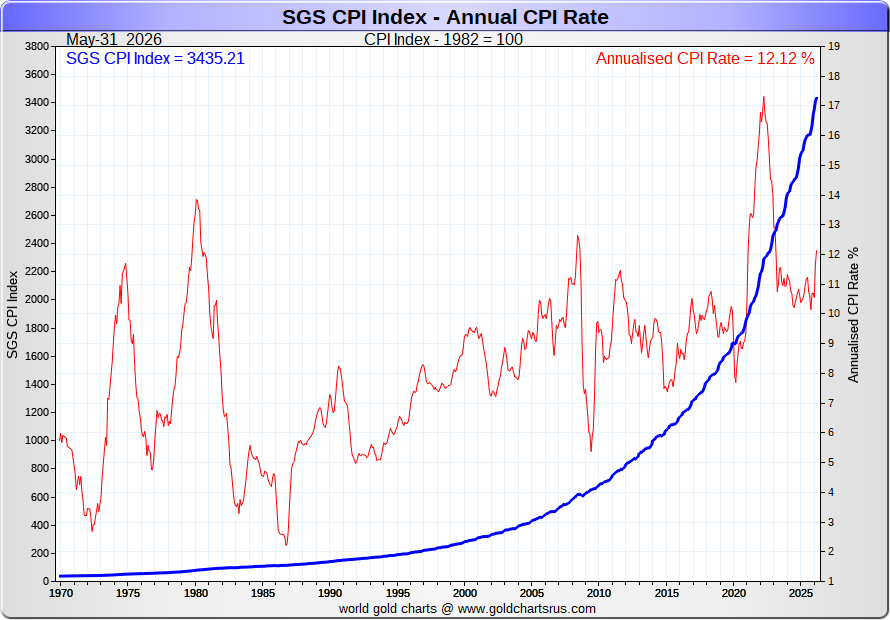
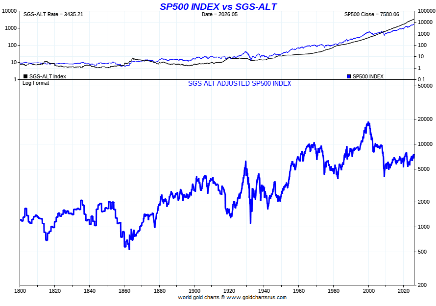
The only thing that this chart shows is that the .gov official inflation numbers have been bogus for decades, underreported by up to 10 percent per annum. I asked Grok to recalculate the numbers based on Shadowstats data.
2
4
142

Calculating inflation using the pre-1980 definition and methodology yields a figure that is roughly 5 to 8 percentage points higher than the official Consumer Price Index (CPI). Historically, this "old" standard refers to two distinct concepts: the original, classical definitions tracking the growth of the money supply, and the pre-1980 statistical tracking of consumer price indices. [1, 2, 3, 4]
1. Conceptual Shift: Money Supply vs. Consumer Prices [1]
•Pre-1980 Classical Definition: Historically, economic inflation specifically meant an expansion of the money supply and systemic liquidity, rather than a rise in prices. Price increases were viewed merely as the symptom of a devalued currency caused by printing excess paper notes. [1, 2, 3]
•Modern Definition: Modern central banking and the Bureau of Labor Statistics (BLS) shifted the definition to focus strictly on a broad, aggregate increase in the retail price level of goods and services. [1, 2, 3, 4, 5]
2. Methodological Differences in Measuring Prices
If you look at price indexes using the formulas standard in the 1970s versus today, the results diverge significantly because of major changes implemented from 1980 onward: [1, 2]
•Housing and Shelter costs: Prior to 1983, housing inflation was measured using actual real estate purchase prices, mortgage interest rates, property taxes, and insurance costs. Post-1983, the BLS replaced actual home ownership costs with Owners' Equivalent Rent (OER), a subjective estimate of what a homeowner would pay to rent their own house, which serves to flatten out short-term housing spikes. [1, 2, 3, 4, 5]
•The "Substitution Effect": The pre-1980 methodology measured a fixed basket of goods over time to track the exact cost of maintaining a static standard of living. Following the Boskin Commission in the 1990s, modern CPI accounts for substitution—meaning if steak prices skyrocket and consumers buy cheaper chicken instead, the calculation lowers the weight of steak. Critics argue this calculates the "cost of survival" rather than a constant standard of living. [1, 2, 3, 4, 5]
•Hedonic Quality Adjustments: Modern metrics use mathematical models to strip out price increases tied to improvements in quality. For example, if a new computer costs $200 more but has a faster processor, hedonic tracking may register this as a price decrease because you get "more value" per dollar, whereas pre-1980 tracking looked strictly at out-of-pocket costs. [1, 2, 3]
3. Estimated Current Data Discrepancies
Private tracking firms and platforms—most notably John Williams' Shadow Government Statistics (ShadowStats)—attempt to reverse modern BLS changes to reflect pre-1980 metrics on an additive basis: [1, 2, 3, 4]
Inflation Metric [1, 2, 3, 4, 5, 6, 7]
Data Source & Context
Official CPI-UTracks current prices. For instance, mid-2026 reporting shows a headline rate of 3.8% to 4.2%.
Pre-1990 MethodologyStrips out the substitution formulas, pushing historical metrics up roughly 3% to 4% above official CPI.
Pre-1980 MethodologyReverses OER housing and geometric weighting, typically registering 5% to 8% higher than official data (frequently placing estimates in the 9% to 12% range depending on current energy shocks).
To directly compare Jimmy Carter's presidency (1977–1981) to the COVID-19/post-COVID inflation era using a single, consistent yardstick, we must evaluate both eras using the pre-1980 Consumer Price Index (CPI) methodology. [1, 2, 3]
When calculated using the old 1970s formula—which includes actual home purchase prices, unadjusted fixed market baskets, and treats mortgage rates as direct costs—the data reveals a surprising result: The peak of the COVID-era inflation spike actually matched or slightly exceeded the peak inflation experienced under Carter. [1, 2, 3]
________________________________________
The Peak Inflation Comparison (1970s Methodology)
The table below contrasts the peak inflation rates of both eras. It shows the Official CPI reported at the time (or using modern formulas) alongside the Pre-1980 Adjusted CPI (reversing the post-1980 mathematical changes like Owners' Equivalent Rent and geometric substitution). [1, 2]
Inflation Era [1, 2, 3, 4, 5, 6]
Peak Official CPIPeak Pre-1980 Adjusted CPIKey Driver of the Spike
Carter Presidency Peak (March 1980)14.8.8% (Unchanged)The 1979 Iranian oil shock and soaring mortgage rates.
COVID / Post-COVID Peak (June 2022)9.1.4% to 17.3%Supply chain collapses, stimulus liquidity, and a housing boom.
________________________________________
Why the COVID Era Looks Worse Under the Pre-1980 Formula
Applying the Carter-era rules to the 2021–2023 surge adds roughly 7 to 8 percentage points to modern headline numbers, caused primarily by two sectors:
1. The Real Estate Distortion (The Biggest Factor)
•Under Carter (1980): If home prices and mortgage rates went up, the CPI went up instantly. In 1979–1980, mortgage rates spiked to nearly 15%, pushing the official CPI up heavily. [1, 2]
•During COVID (2022): Home prices surged by over 30–40% in many regions, and mortgage rates later doubled. However, the modern CPI ignores home prices and instead uses Owners' Equivalent Rent (OER)—a slow-moving, subjective estimate. [1, 2]
•The Carter-Era Math: If the BLS had tracked the actual cost of buying a home and securing a mortgage in 2021–2022 rather than OER, the COVID-era peak would have instantly jumped from 9.1% to above 16%. [1, 2]
2. The Fixed Basket vs. The Substitution Basket
•Under Carter (1980): The BLS used a strictly fixed basket of goods. If the price of steak doubled, the index assumed you still bought steak, fully capturing the hit to your wallet. [1, 2, 3, 4]
•During COVID (2022): Modern CPI uses geometric weighting and substitution. If steak prices rose, the formula mathematically assumed consumers substituted it for chicken, which artificially suppressed the reported inflation rate. [1, 2]
•The Carter-Era Math: Forcing a completely static standard of living onto the COVID-era data reveals that the real-world out-of-pocket cost of maintaining an identical lifestyle was drastically higher than the official 9.1% peak. [1, 2]
________________________________________
The Term-Wide Average Comparison
While the peaks were neck-and-neck under the old formula, the sustained pain over time still heavily favors Carter's era as the more prolonged crisis.
•Carter's 4-Year Average: Carter's entire presidency maintained an official average year-over-year inflation rate of 9.85%. Because it was figured using the pre-1980 definition, this stands as a true reflection of the systemic stagflation of the late 1970s. [1, 2]
•COVID-Era 4-Year Average (Biden Administration): The official average inflation rate between 2021 and 2025 was 4.95%. Adjusting this to the Carter-era definition pushes the 4-year COVID-era average up to roughly 11.5% to 12.5%. [1]
Summary
If a time traveler from 1980 used their era's economic formulas to score the inflation of the COVID era, they would conclude that the June 2022 price shock (~16.8%) was actually more severe than the absolute worst month of Jimmy Carter's presidency (14.8% in March 1980). [1, 2]
•Inflation Calculator - Federal Reserve Bank of Minneapolis
This inflation calculator uses the consumer price index (CPI), which measures the average change in prices over time using a period.
Federal Reserve Bank of Minneapolis
•History of inflation during President Carter's term,
Dec 31, 2024 — former President Jimmy Carter's one term in office was plagued by record-breaking inflation propelled by a Mid East oil price shock
The CPI chart on the home page reflects our estimate of inflation for today as if it were calculated the same way it was in 1990. ...
Question: So this is the reason the Gen Zrs and Millennials are upset... they're living in a time where the early to mid 2020s were as bad or worse than it was under Carter.
Answer: “You hit the nail on the head. This exact mathematical discrepancy is a major reason why younger generations are experiencing severe financial distress, even though headline economic metrics often indicate that things are stable. When you look at the structural changes in how the economy hits younger consumers versus how it hits older generations, the "Carter-era math" explains the massive disconnect between official data and real-world sentiment.
1. Housing is the Generational Fault Line
The biggest difference between inflation under Carter and inflation during the COVID era comes down to who owns assets.
•In 1980: High inflation and 15% mortgage rates were painful, but a massive portion of Boomers and older generations already owned their homes with older, fixed-rate mortgages. They were insulated from the housing spike.
•In the 2020s: Millennials and Gen Z are in their prime home-buying years. Because modern CPI uses Owners' Equivalent Rent (OER) instead of actual home prices, the official 9.1% inflation peak heavily masked the fact that real-world home prices jumped 40% and mortgage rates doubled. For a young person trying to buy their first home, their localized inflation rate wasn't 9%; using the Carter-era formula, it felt closer to 20% to 30% for shelter. [1, 2, 3, 4]
2. The "Sticker Shock" of Unavoidable Expenses [1]
The modern CPI uses the "substitution effect" formula, which assumes that if something gets too expensive, you will simply buy a cheaper alternative. However, younger generations spend a much higher percentage of their income on non-negotiable, unsubstitutable costs:
•Rent
•Groceries and basic food staples
•Car insurance and used vehicles
•Energy and utilities
When these specific categories skyrocket, a consumer cannot "substitute" their way out of them. Because the pre-1980 methodology tracked a fixed basket of goods, it captured the raw out-of-pocket reality. Younger workers, who generally have lower starting salaries and less savings, felt the full weight of a rigid, unadjusted cost-of-living spike.
3. The Wage-Growth Illusion
During Carter’s presidency, the U.S. economy had much higher rates of unionization and widespread Cost-of-Living Adjustments (COLAs) built into employment contracts. As inflation rose, many workers' wages automatically rose alongside it to blunt the blow.
In the 2020s, corporate wages did not automatically scale with real-world inflation. While official reports stated that wages were keeping pace with a 4% or 5% headline CPI, wages were falling drastically behind the 15% Carter-era equivalent inflation that young people were actually facing at the grocery store and leasing office.
Summary
The frustration among Millennials and Gen Z isn't just psychological; it is mathematically validated by historical standards. By the metrics used in 1980, the early-to-mid 2020s represented the most aggressive macroeconomic shock to a consumer's standard of living in over four decades.
The financial reality for Millennials and Gen Z in the 2020s is fundamentally different from what Boomers experienced under Jimmy Carter because asset growth completely decoupled from wages, while regional housing markets decoupled from local incomes.
Evaluating both dynamics explains why the 2020s felt economically devastating for younger workers trying to build wealth from scratch.
________________________________________
Part 1: Asset Classes vs. Average Wages (The Wealth Gap)
The core difference between 1980 and 2026 is that wages kept up with inflation under Carter, but assets became completely unaffordable relative to wages in the 2020s.
1. The Wage-to-Inflation Ratio
•Under Carter (1977–1981): Inflation was high, but nominal wage growth was incredibly aggressive. Average hourly earnings grew by roughly 8% to 9% annually. While "real wages" (inflation-adjusted) fell slightly, workers' regular paychecks grew rapidly, allowing them to rapidly pay off existing fixed debts. [1, 2, 3]
•In the 2020s: While official metrics claimed wages outpaced a 3% or 4% CPI, they fell vastly behind the 12% to 15% pre-1980 definition inflation rate younger people actually faced. The real-world purchasing power of a starting salary eroded much faster in the 2020s than it did in 1979. [1]
2. The Stock Market and Valuations
•Under Carter: The stock market was entirely stagnant. The S&P 500 traded at an incredibly cheap Price-to-Earnings (P/E) ratio of around 7x to 9x. Because stocks were depressed, a young person entering the workforce in 1980 could buy shares of American companies at rock-bottom prices, setting them up for the massive 1980s and 90s bull market.
•In the 2020s: The Federal Reserve's massive liquidity injection sent the stock market to historic highs. The S&P 500 P/E ratio surged past 25x to 30x. For Gen Z and Millennials, buying into the stock market required purchasing assets at near-record high valuations, making it drastically harder to achieve the same compounding wealth returns as early Boomers. [1, 2]
________________________________________
Part 2: Regional Housing Costs (The Location Trap)
Under Carter, housing was nationwide pain; in the 2020s, housing became a geographic exile for younger buyers due to localized inventory shortages.
Carter Era (1980): Nationwide 14% Mortgage Rates, But Low Home-to-Income Ratio (~3x)
───────────────────────────────────────────────────────────────────────────────────
2020s Era: Concentrated Regional Booms, Record-High Home-to-Income Ratios (~6x to 8x)
1. The Purchase Price Multiple (The Real Hurdle)
•Under Carter: The average home cost roughly 3 to 3.5 times the median household income. Even though mortgage rates spiked to 15%, the principal loan amount was low. A buyer could purchase a home, endure high interest rates for a few years, and then easily refinance when rates dropped in the 1980s.
•In the 2020s: The average home price skyrocketed to 6 to 8 times the median household income. When mortgage rates rose from 3% to over 7% in 2022–2024, buyers were trapped. They faced both historically high principal prices and high interest rates simultaneously, completely locking them out of the market. [1]
2. The Rise of "Superstar Cities" and Regional Extremes
•Under Carter: Real estate was relatively balanced across the country. Cities like Austin, Phoenix, Atlanta, and Miami were affordable, mid-tier regions. If you couldn't afford New York, you could easily move to the Sunbelt and buy a cheap house.
•In the 2020s: The combination of remote work migrations and institutional investors buying single-family homes caused hyper-inflation in specific regional hubs. Metro areas across the Sunbelt, Mountain West, and Florida saw home prices spike 50% to 100% in a 36-month window. Local wages in these cities did not rise to match, creating a class of "rent-trapped" younger workers who were priced out of their own hometowns.
________________________________________
The Historical Verdict
Economic Vector [1, 2, 3]
Carter Era (Late 1970s)COVID / Post-COVID Era (2020s)Generational Impact
Stock ValuationsHistorically Cheap (7x P/E)Historically Expensive (25x P/E)2020s youth must pay a premium to invest.
Home Price-to-Income~3.2x Median Income~6.5x to 8.0x Median Income2020s youth require double the relative income to buy.
Wage AdjustmentFast and aggressive (~9%/yr)Slow and lagging behind real costs2020s youth saw purchasing power dry up faster.
The Boomer generation lived through an era of high inflation, but they were rewarded with cheap assets and low home prices. Millennials and Gen Z lived through the same true level of inflation in the 2020s, but were punished with astronomically expensive assets and out-of-reach housing.
Calculating inflation the old way—using the methods from before 1980—shows rates that are usually 5 to 8 percentage points higher than the official numbers we see today from the government’s Consumer Price Index (CPI). Back then, people understood inflation in two main ways. One focused on how fast the money supply was growing. The other tracked everyday prices using older rules. Today’s official CPI uses newer methods that many critics say make inflation look lower than it feels in real life. How the Rules Changed In the past, inflation basically meant the government printing too much money, which made each dollar worth less. Rising prices were just the obvious result. Now, the focus is only on the average rise in prices for things people buy.
The biggest practical changes happened after 1980:
•Housing: Before 1983, the CPI counted actual home prices, mortgage interest rates, taxes, and insurance. After that, it switched to “Owners’ Equivalent Rent”—an estimate of what a homeowner might pay to rent their own house. This change smooths out big jumps in housing costs.
•Substitution: The old method used a fixed list of goods (a “basket”) and tracked how much it cost to buy the same things over time. The new method assumes that if something gets too expensive (like steak), people switch to cheaper options (like chicken) and lowers the inflation number accordingly.
•Quality adjustments: Today’s stats try to subtract price increases that come from better quality. For example, if a new phone costs more but is faster, they might count it as no real price increase—or even a decrease. The old way just looked at what you actually paid.
Groups like ShadowStats try to calculate what inflation would look like if we still used the pre-1980 rules. They usually add 5–8 points to the official rate.
shadowstats.com Peak Inflation: Carter vs. Post-COVID When you compare both periods using the same old 1970s formula, the numbers tell a surprising story.
•Carter era peak (March 1980): Official CPI hit 14.8%. Using the old method, it stays about the same because the rules hadn’t changed yet. High oil prices and mortgage rates drove it.
•COVID-era peak (June 2022): Official CPI was 9.1%. Using pre-1980 rules, it jumps to roughly 16–17%—higher than Carter’s peak. Supply chain problems, government spending, and a huge housing boom were the main causes.
Why the 2020s Look Worse Under Old Rules The biggest reason is housing. In the early 1980s, soaring home prices and 15% mortgage rates showed up immediately in the CPI. In the 2020s, home prices rose 30–40% in many places and mortgage rates doubled, but the modern CPI mostly ignores actual purchase prices and uses the slower-moving rent estimate instead. The fixed-basket approach also matters. Under the old rules, if everyday items like food or rent got much more expensive, the inflation number captured the full pain. The new rules assume people can switch to cheaper alternatives, which doesn’t always work for must-have expenses. Average Inflation Over Time Carter’s full four years averaged about 9.85% under the old system. The COVID/post-COVID period (roughly 2021–2025) averaged around 5% officially, but closer to 11.5–12.5% using the pre-1980 math. So while the peaks were close or slightly worse in the 2020s, the pain lasted longer under Carter. Why This Hits Younger Generations Harder This difference helps explain why many Millennials and Gen Z feel the economy has been especially tough, even when official numbers look okay.
•Housing is the big divide: In 1980, homes cost about 3–3.5 times the typical family’s income. Today, that ratio is often 6–8 times. Young people trying to buy their first home face both high prices and higher interest rates at the same time. Many older homeowners already had cheap fixed-rate mortgages, so they were protected.
•No easy substitutions: Rent, groceries, insurance, and gas are hard to replace. Younger workers spend a bigger share of their money on these necessities.
•Wages and assets: In the late 1970s, wages rose quickly and many jobs had automatic cost-of-living raises. Stocks were cheap. In the 2020s, wages lagged behind real costs for many young people, while stocks and houses became very expensive to buy into.
Bottom line: By the measurement standards of 1980, the early-to-mid 2020s delivered one of the sharpest hits to everyday living costs in decades—especially for people starting out with no assets. That gap between official statistics and what younger people actually experience is a big reason for the frustration many feel today.
jchs.harvard.edu federalreservehistory.org shadowstats.com
weforum.org bls.gov
1
1
555

Jun 13
Abd enflasyonunu shadowstats verirleri ile tekrar değerlendirmeniz daha gerçekçi bir sonuç verebilir, selamlar.
47
🇪🇺 🇲🇨🇨🇭Dan Popescu 🇫🇷🇮🇹🇷🇴 retweeted

Jun 13
Inflation CPI vs ShadowStats
CPI - 4.25%
SGS CPI - 12.12%

2
12
1,055
🇪🇺 🇲🇨🇨🇭Dan Popescu 🇫🇷🇮🇹🇷🇴 retweeted
Jun 13
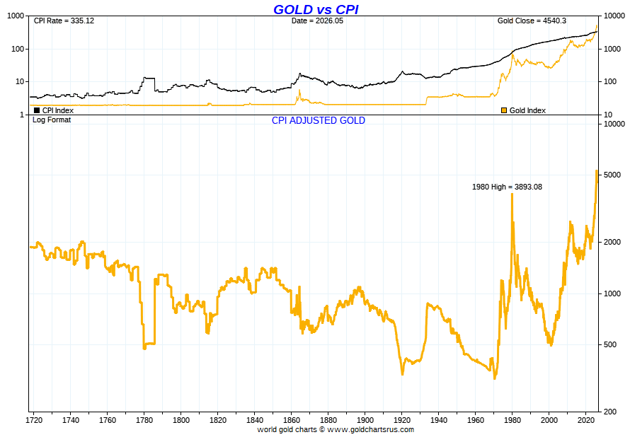
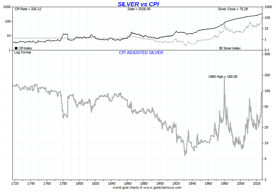
Gold/Silver CPI vs ShadowStats CPI
Note the 1980 differential
The CPI lie.

2
24
17,514
🇪🇺 🇲🇨🇨🇭Dan Popescu 🇫🇷🇮🇹🇷🇴 retweeted
Jun 13
ShadowStats CPI Adjusted Dow Indices


2
11
950
🇪🇺 🇲🇨🇨🇭Dan Popescu 🇫🇷🇮🇹🇷🇴 retweeted
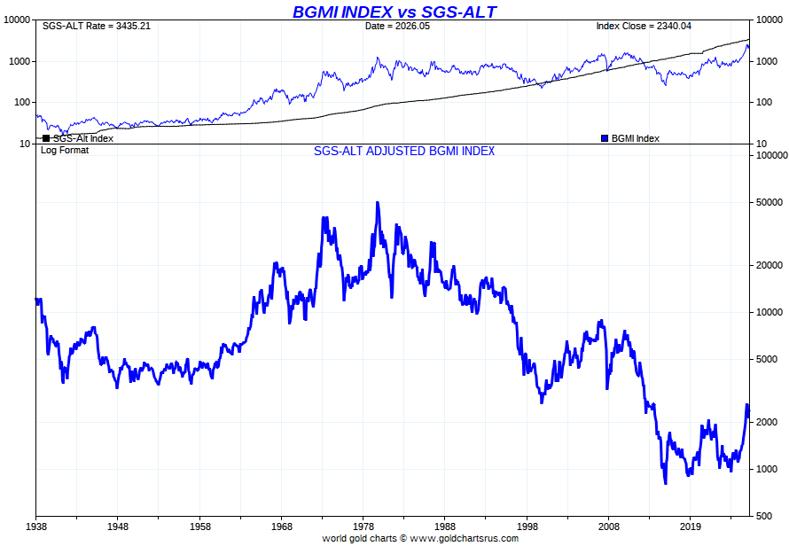
Jun 13
ShadowStats CPI Deflated BGMI Gold Index, Crude Oil & Copper
BGMI 21x to new highs
Crude Oil 4x to fair value
Copper 8x to fair value

1
10
1,197

Jun 12
you hallucinated a 3.75% overnight rate because you literally don't know the difference between fed funds and the 10-year yield. "real inflation" is a shadowstats cope for guys who missed a 40% spx rally to hoard shiny rocks at an 8% premium over spot. keep paying schiff's ham...
1
27

Jun 12
1987年、1990年、2000年を予言した男:金利、BRICS、現金に関するマーク・ファーバーのフィルターなしの警告
マーク・ファーバーは、グローバルファイナンス界で最も尊敬され、恐れられる声の一つとして君臨している。50年以上の経験を持ち、1987年の暴落、日本のアセットバブル、ドットコム狂乱を予言した彼の言葉は、主流の分析家たちが到底及ばない重みを持つ。インフレの本当の状況、アメリカの金保有の安全性、および通貨そのものの未来について彼が語る時、賢い投資家たちは耳を傾ける。
伝説的な実績
➡️ マーク・ファーバーは、50年以上の株式市場経験を有している。
➡️ 彼は1987年10月の暴落、1990年の日本バブル崩壊、2000年のドットコムバブル崩壊を目撃しただけでなく、予言もした。
➡️ 伝説的な『Gloom Boom Doom Report』の編集者として、世界中の購読者に容赦ない分析を提供し続けている。
インフレの現実チェック
➡️ 公式統計では、米国と欧州のインフレ率はわずか2〜3パーセントと主張されている。
➡️ ファーバーは、Shadowstatsの厳密な計算を引用し、実際の消費者コスト上昇率は年率10.5パーセントに近いと指摘する。
➡️ これらの隠れたコストには、保険、住宅、教育、自動車が含まれ、これらは操作された公式数字をはるかに上回るペースで上昇している。
フォートノックスの金への疑念
➡️ ファーバーは、アメリカの金準備がフォートノックスに安全に保管されているかどうかについて、深刻な疑念を抱いている。
➡️ 彼は、過去の当局者や大統領が誰にも気づかれずに金を移した可能性を公に疑問視する。
➡️ 「教えてくれ、アメリカ人の言葉にどれだけの価値があるのか?」と彼は鋭く問いかけ、ベトナム戦争からの裏切られた約束から、郵便投票をめぐる疑惑の選挙結果までを言及する。
上昇する利回りと長期サイクル
➡️ 1981年から2020年までの40年間にわたる低下金利の後、新しい上昇トレンドが始まった。
➡️ ファーバーは、この上昇サイクルが2040年または2045年頃まで続き、1981年に見られた15パーセントのピークを上回る可能性があると予想する。
➡️ より高い借入コストは、企業の経費に直接影響を与え、最終的には消費者の価格上昇につながる。
BRICSとザ・ユニット
➡️ BRICS諸国は、ドル依存を減らすために、金に裏打ちされた取引通貨「The Unit」のパイロット版を立ち上げた。
➡️ この動きは、米国による外国通貨準備の繰り返しの押収に続くものである。
➡️ ファーバーは、中央銀行に対し、米国の保管から物理的な金を引き揚げるよう助言する。なぜなら、そこに存在すること自体が未検証だからだ。
AIの勝者と敗者
➡️ 人工知能による大規模な技術シフトにより、ほとんどの企業が破産するだろう。
➡️ 生き残ったごく少数の企業が、この過程で巨額の利益を上げる。
➡️ アジアは、欧州の成長を阻害するグリーン活動家や過度な社会主義介入がないため、構造的な優位性を享受している。
現金の推奨
➡️ ファーバーは、現在の状況で分散投資を行い、巨大なリスクを避けることを強く勧める。
➡️ ほぼ全員が株式、不動産、収集品に殺到しており、低リターンの現金は群衆から愛されずに取り残されている。
➡️ この事実こそが、現金を今まさに興味深いものにしている。誰も欲しがらないからこそだ。
➡️ リスクオフの瞬間が訪れた時、現金が王様になる。まさにウォーレン・バフェットが長年述べてきた通りだ。
結論
マーク・ファーバーは、50年にわたるキャリアを定義づけたのと同じ率直さでこのインタビューに臨んだ。彼は信頼の侵食、隠れたインフレ、危険な政策介入の世界を見据えつつ、分散投資と今誰も欲しがらない現金への新鮮な視点を通じて、明確な前進の道を示す。
誰もが次のバブルを追いかける時、現金が王様だ。
HT: YouTube Kettner-Edelmetalle (Gold & Silber)
#MarcFaber #GloomBoomDoom #RealInflation #FortKnoxGold #BRICS #InterestRateCycle #CashIsKing

THE MAN WHO CALLED 1987, 1990, AND 2000: MARC FABER'S UNFILTERED WARNING ON RATES, BRICS, AND CASH
Marc Faber stands as one of the most respected and feared voices in global finance. With more than fifty years of experience that includes calling the 1987 crash, the Japanese asset bubble, and the dotcom mania, his words carry weight that mainstream analysts simply cannot match. When he speaks about the true state of inflation, the safety of American gold, and the future of money itself, smart money listens closely.
THE LEGENDARY TRACK RECORD
➡️ Marc Faber has more than five decades of stock market experience under his belt.
➡️ He not only witnessed but also predicted the October 1987 crash, the Japan bubble collapse in 1990, and the dotcom bubble burst in 2000.
➡️ As editor of the legendary Gloom Boom Doom Report, he continues to deliver unvarnished analysis to subscribers around the world.
THE INFLATION REALITY CHECK
➡️ Official statistics claim inflation runs at just 2 to 3 percent in the United States and Europe.
➡️ Faber cites rigorous calculations from Shadowstats showing actual consumer cost increases closer to 10.5 percent per year.
➡️ These hidden costs include insurance, housing, education, and automobiles that far outpace the manipulated official numbers.
THE FORT KNOX GOLD DOUBT
➡️ Faber harbors serious doubts that America's gold reserves remain safely stored in Fort Knox.
➡️ He wonders aloud whether past officials or presidents may have removed the gold without anyone noticing.
➡️ "Tell me, what is the word of an American worth?" he asks pointedly, referencing broken promises from Vietnam to questionable election results involving mail-in ballots.
THE RISING YIELDS AND LONG-TERM CYCLE
➡️ After four decades of falling interest rates from 1981 to 2020, a new rising trend has begun.
➡️ Faber expects this upcycle to last until around 2040 or 2045 and possibly exceed the 15 percent peaks seen in 1981.
➡️ Higher borrowing costs will feed directly into business expenses and ultimately higher prices for consumers.
THE BRICS AND THE UNIT
➡️ BRICS nations have launched a pilot gold-backed trading currency called The Unit to reduce reliance on the dollar.
➡️ This move follows repeated US seizures of foreign currency reserves held in America.
➡️ Faber advises central banks to pull their physical gold out of US custody because its very existence there remains unverified.
THE AI WINNERS AND LOSERS
➡️ Massive technological shifts driven by artificial intelligence will cause most companies to go bankrupt.
➡️ A select few survivors will make enormous amounts of money in the process.
➡️ Asia enjoys a structural advantage because it lacks the green activists and heavy socialist interventions that stifle growth in Europe.
THE CASH RECOMMENDATION
➡️ Faber strongly advises to diversify and avoid taking huge risks in the current climate.
➡️ Almost everyone is rushing into stocks, real estate, and collectibles, leaving cash with low returns and unloved by the crowd.
➡️ This very fact makes cash potentially interesting right now, precisely because nobody wants it.
➡️ When the risk-off moment arrives, cash becomes king, exactly as Warren Buffett has long described.
THE BOTTOM LINE
Marc Faber entered this interview with the same directness that has defined his five-decade career. He sees a world of eroding trust, hidden inflation, and dangerous policy interventions, yet he offers a clear path forward through diversification and a fresh look at cash that nobody else seems to want right now.
Cash is king when everyone else is chasing the next bubble.
HT: YouTube Kettner-Edelmetalle (Gold & Silber)
#MarcFaber #GloomBoomDoom #RealInflation #FortKnoxGold #BRICS #InterestRateCycle #CashIsKing
11
44
5,992


Jun 11
According to ShadowStats, if we still calculated inflation using the government's original, historical formulas, the numbers tell a very different story:
📈 Official CPI: 4.2%📉 ShadowStats (1990 Method): ~8%💥 ShadowStats (1980 Method): ~12% #inflation #economy

4

Is that how you own nothing?
Faber cites rigorous calculations from Shadowstats showing actual consumer cost increases closer to 10.5 percent per year.
You become poorer every year!
THE MAN WHO CALLED 1987, 1990, AND 2000: MARC FABER'S UNFILTERED WARNING ON RATES, BRICS, AND CASH
Marc Faber stands as one of the most respected and feared voices in global finance. With more than fifty years of experience that includes calling the 1987 crash, the Japanese asset bubble, and the dotcom mania, his words carry weight that mainstream analysts simply cannot match. When he speaks about the true state of inflation, the safety of American gold, and the future of money itself, smart money listens closely.
THE LEGENDARY TRACK RECORD
➡️ Marc Faber has more than five decades of stock market experience under his belt.
➡️ He not only witnessed but also predicted the October 1987 crash, the Japan bubble collapse in 1990, and the dotcom bubble burst in 2000.
➡️ As editor of the legendary Gloom Boom Doom Report, he continues to deliver unvarnished analysis to subscribers around the world.
THE INFLATION REALITY CHECK
➡️ Official statistics claim inflation runs at just 2 to 3 percent in the United States and Europe.
➡️ Faber cites rigorous calculations from Shadowstats showing actual consumer cost increases closer to 10.5 percent per year.
➡️ These hidden costs include insurance, housing, education, and automobiles that far outpace the manipulated official numbers.
THE FORT KNOX GOLD DOUBT
➡️ Faber harbors serious doubts that America's gold reserves remain safely stored in Fort Knox.
➡️ He wonders aloud whether past officials or presidents may have removed the gold without anyone noticing.
➡️ "Tell me, what is the word of an American worth?" he asks pointedly, referencing broken promises from Vietnam to questionable election results involving mail-in ballots.
THE RISING YIELDS AND LONG-TERM CYCLE
➡️ After four decades of falling interest rates from 1981 to 2020, a new rising trend has begun.
➡️ Faber expects this upcycle to last until around 2040 or 2045 and possibly exceed the 15 percent peaks seen in 1981.
➡️ Higher borrowing costs will feed directly into business expenses and ultimately higher prices for consumers.
THE BRICS AND THE UNIT
➡️ BRICS nations have launched a pilot gold-backed trading currency called The Unit to reduce reliance on the dollar.
➡️ This move follows repeated US seizures of foreign currency reserves held in America.
➡️ Faber advises central banks to pull their physical gold out of US custody because its very existence there remains unverified.
THE AI WINNERS AND LOSERS
➡️ Massive technological shifts driven by artificial intelligence will cause most companies to go bankrupt.
➡️ A select few survivors will make enormous amounts of money in the process.
➡️ Asia enjoys a structural advantage because it lacks the green activists and heavy socialist interventions that stifle growth in Europe.
THE CASH RECOMMENDATION
➡️ Faber strongly advises to diversify and avoid taking huge risks in the current climate.
➡️ Almost everyone is rushing into stocks, real estate, and collectibles, leaving cash with low returns and unloved by the crowd.
➡️ This very fact makes cash potentially interesting right now, precisely because nobody wants it.
➡️ When the risk-off moment arrives, cash becomes king, exactly as Warren Buffett has long described.
THE BOTTOM LINE
Marc Faber entered this interview with the same directness that has defined his five-decade career. He sees a world of eroding trust, hidden inflation, and dangerous policy interventions, yet he offers a clear path forward through diversification and a fresh look at cash that nobody else seems to want right now.
Cash is king when everyone else is chasing the next bubble.
HT: YouTube Kettner-Edelmetalle (Gold & Silber)
#MarcFaber #GloomBoomDoom #RealInflation #FortKnoxGold #BRICS #InterestRateCycle #CashIsKing
1
12