EXCITING NEWS - A DEEP DIVE INTO NUMBERS AND DATA
Back in February (25th, to be exact), I received my admission into the Master of Science in Financial Engineering (MScFE) programme at @worldquantu, WorldQuant University (WQU), Washington D.C., USA.
For those unfamiliar with WQU: it is one of the very few fully-funded, DEAC-accredited online universities in the world offering a graduate-level degree in Financial Engineering, completely free of tuition. Students are selected through a competitive Quantitative Proficiency Test, and the programme builds world-class skills across financial markets, econometrics, derivative pricing, stochastic modelling, machine learning in finance, portfolio management, risk management, and more.
Classes started the first week of April, and honestly? It has been A LOT. The rigour is real. But so is the growth.
I'm currently in the first course, MScFE 560: Financial Markets, covering trading, pricing, hedging, asset classes (equities, derivatives, FX, ETFs, crypto, commodities), and risk fundamentals.
I want to be transparent: I'm not yet calling myself a fully matriculated MScFE student, that milestone requires successfully completing the first two courses with an 80% cumulative average. But I believe in documenting the journey honestly, from the very beginning.
To WQU, thank you. Tuition-free doesn't mean low quality. The depth of the curriculum, the calibre of the instructors, and the global community of learners you've built is extraordinary. I don't take this opportunity lightly.
On the data analytics side: I've had to slow down on pending Data Analytics projects and courses to give this programme the focus it demands. I'll pick those back up during breaks. The quantitative skills from this programme and my Data Analytics work are deeply complementary.
This is the long game. And I'm playing it.
📌 Screenshot of admission attached.
It can only get better 💪
#MScFE #WorldQuantUniversity #FinancialEngineering #QuantitativeFinance #DataAnalytics #LearningInPublic #NigerianInFinance #emycodesanalytics

1
1
3
121

Mar 19
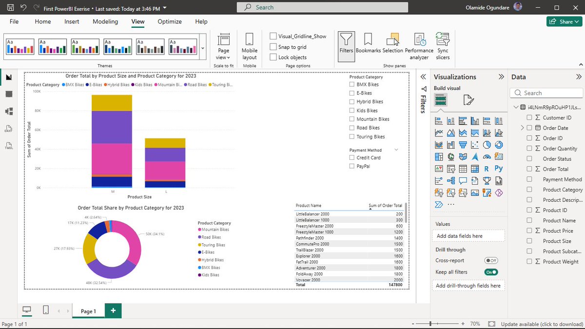
Today, I created my first Power BI Desktop dashboard in the Coursera course (Adventure Works sales dataset)
Built interactive slicers for Product Category & Payment Method, a stacked column chart (Order Total by Product Size, legend=Product Category), a donut chart showing Total Order share by Product Category, and a table showing Product Name and Sum of Order Total.
Seeing the data come alive with filters and cleaner visuals is exciting, way better than plain Excel charts! This is hands-on practice for the volunteer tracking system I'm improving at the organization I support. As always, handwriting the steps, relationships, and basic measures for solid retention.
Massive thanks to @Coursera via @MTNNG Skills Academy for free access, game-changer solid courses!
One dashboard at a time. Still building. 💪
Fellow beginners in Power BI: What's the first visual or feature that clicked for you and made you go "wow, this is powerful"?
#EmyCodesAnalytics #PowerBI #DataVisualization #AdventureWorks #FirstDashboard #ExcelToPowerBI #DataAnalytics #LearningInPublic #MTNSkillsAcademy #Coursera #BuildingInPublic
ALT PowerBI Dashboard
2
67
Mar 19
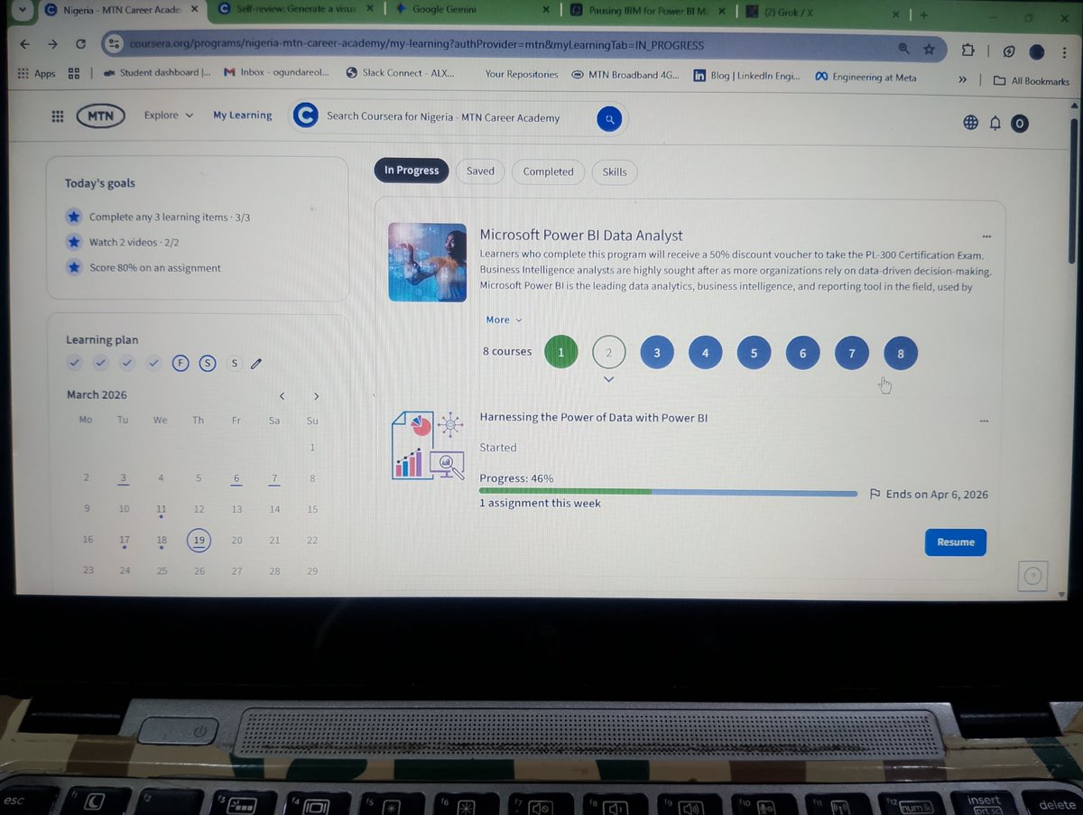
Yesterday I paused my IBM Data Analyst Professional Certificate to go deep into @Microsoft Power BI.
The organization I volunteer with runs heavily on Excel, where I already built an automated tracking system that handles ETL KPI calculations in the background (more on that soon 👀). The visuals it generates work, but they’re not visually appealing enough in Excel.
Since everything is spreadsheet-based, mastering Power BI (Desktop, Service, Mobile) is the best way to deliver cleaner, more insightful dashboards and solve real problems at work.
My plan is to complete the modules, apply the skills directly to our data challenges, then return to IBM with much stronger visualization skills.
As usual, I’m handwriting every step, DAX formulas, and logic flows for better retention, I will share my progress here as I go.
Courses via @Coursera through @MTNNG Skills Academy, massive thanks to MTN for the free premium access!
One intentional pivot at a time. Still building. 💪
Fellow data folks, when do you pause one course/track to double down on a more urgent/practical skill (like switching from Excel visuals to Power BI)?
Drop your stories or thoughts below, I'd love to hear how you decide! 👇
Thank you 😇!
#EmyCodesAnalytics #PowerBI #DataVisualization #ExcelToPowerBI #DataAnalytics #LearningInPublic #MTNSkillsAcademy #Coursera #BuildingInPublic
1
2
99
Mar 18
AUTOMOBILE SALES ANALYTICS: DECODING THE RECESSION MYTH (1980–2023) 🏎️📉
Following my certificate post, I want to dive into the technical core of the final exam project for the IBM Data Visualization with Python course. Using a historical dataset provided by IBM and Coursera, I engineered an interactive dashboard to answer a critical question: How does an economic recession fundamentally restructure the automobile market?
It turns out, recessions don't just reduce sales—they completely rewire them.
THE CORE INSIGHT: STRUCTURAL MARKET SHIFTS
Through deep-dive Exploratory Data Analysis (EDA) and reactive dashboarding, I uncovered that the impact of a recession is structurally unequal across vehicle segments:
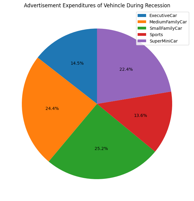
1. The Luxury Collapse vs. Utility Resilience: Executive and Sports vehicles are the first to fall, suffering a severe volume drop of approximately 75 percent compared to non-recession averages. These are discretionary purchases that disappear the moment economic uncertainty hits. Conversely, SuperMiniCars act as staple goods, showing the highest demand retention as consumers shift toward necessity.
2. Strategic Ad Spend: Manufacturers don't just cut budgets; they redirect them. The data reveals that manufacturers concentrated their remaining ad spend on SuperMini and Small Family segments during downturns. They moved resources toward products with inelastic demand, ensuring every dollar spent was fighting for a sale that was actually still possible.
3. The Unemployment Trigger: My analysis surfaced a critical Macro Stress threshold. Sales remain remarkably stable until the unemployment rate hits the 4 to 5 percent mark. Once that threshold is crossed, demand for premium segments doesn't just dip—it accelerates into a sharp decline.
THE ENGINEERING: A TWO-MODE INTERACTIVE ENGINE
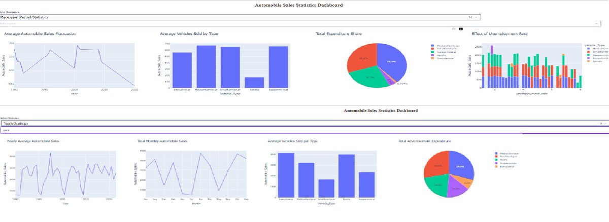
Using Dash and Plotly, I built a system that allows an analyst to toggle between two distinct realities:
a) Recession Period Statistics: Aggregating 40 years of downturn data (from 1980 to the 2020 COVID impact) to visualize the shape of decline and macro-stress sensitivity.
b) Yearly Statistics: Zooming into within-year seasonality, surfacing consistent demand peaks in April and December.
TECHNICAL HIGHLIGHT:
One of the most vital parts of the build was the callback logic. I programmed the Year dropdown to intelligently disable itself during recession analysis. This prevents logically invalid queries—a small but vital UX decision that ensures the analyst stays focused on the story, not the tool.
DOCUMENTATION AND ANALYSIS
The full information, including a step-by-step analytical breakdown and technical documentation of this project, is hosted in my GitHub repository. I believe data is most powerful when it serves as a clear, honest bridge between raw numbers and strategic growth. This project proved that understanding the logic on paper makes the implementation in the notebook second nature.
I am curious to hear from other analysts: When visualizing long-term historical trends, how do you handle Black Swan events like 2008 or 2020 so they don't skew your baseline growth analysis?
Explore the full project documentation and repository here:
github.com/emycodesanalytics…
Connect with me on LinkedIn:
linkedin.com/in/emycodesanal…
(c) EmyCodes Analytics | 2026
#EmyCodesAnalytics #IBMDataAnalyst #DataVisualization #Python #DashPlotly #DataScience #DataAnalytics #LearningInPublic #EconomicAnalysis #InteractiveDashboard #GitHub #Coursera #Matplotlib


Mar 17

Just wrapped up Data Visualization with Python from @IBM on @Coursera.
This one really tested me. My body hasn't been cooperating, low energy days, heavy moments where moving forward felt impossible. Progress was slow and uneven, and doubt crept in more than once. But I kept showing up, however I could;
If I couldn't fly, I ran.
If I couldn't run, I walked.
If I couldn't walk, I crawled.
Whatever it took, I kept moving. 💪
That carried me through, one small lab, one handwritten note, one concept at a time. IBM's hands-on "practice what you learn" style turned the struggle into real understanding.
What hit home? How different libraries each bring something unique: Matplotlib for control and basics, Seaborn for elegant stats, Folium for interactive maps, Dash for building reactive apps. It's all about picking the right tool to let data tell its story clearly. I'm proud I didn't quit.
Grateful for the growth born from the hard parts. Still here, still pushing, still learning.
(Only attaching the certificate for this post, full visuals from the project code/setup/portfolio link coming in the next tweet!)
How do you keep momentum when life pushes back? Your stories lift me, share below. 😇
#EmyCodesAnalytics #IBMDataAnalyst #DataVisualization #Python #LearningInPublic #KeepMoving #Persistence #DataAnalytics@

ALT data visualization
3
92
Mar 17
Just wrapped up Data Visualization with Python from @IBM on @Coursera.
This one really tested me. My body hasn't been cooperating, low energy days, heavy moments where moving forward felt impossible. Progress was slow and uneven, and doubt crept in more than once. But I kept showing up, however I could;
If I couldn't fly, I ran.
If I couldn't run, I walked.
If I couldn't walk, I crawled.
Whatever it took, I kept moving. 💪
That carried me through, one small lab, one handwritten note, one concept at a time. IBM's hands-on "practice what you learn" style turned the struggle into real understanding.
What hit home? How different libraries each bring something unique: Matplotlib for control and basics, Seaborn for elegant stats, Folium for interactive maps, Dash for building reactive apps. It's all about picking the right tool to let data tell its story clearly. I'm proud I didn't quit.
Grateful for the growth born from the hard parts. Still here, still pushing, still learning.
(Only attaching the certificate for this post, full visuals from the project code/setup/portfolio link coming in the next tweet!)
How do you keep momentum when life pushes back? Your stories lift me, share below. 😇
#EmyCodesAnalytics #IBMDataAnalyst #DataVisualization #Python #LearningInPublic #KeepMoving #Persistence #DataAnalytics@
ALT data visualization
1
1
4
181
Mar 16
DATA VISUALIZATION WITH PYTHON: ADVANCED VISUALS & GEOSPATIAL DATA (PART 3) ✍️📊
Following my deep dive into Matplotlib, I have spent the last few days mastering the more specialized tools in the IBM Data Analyst track. This phase is where the "art" of data storytelling really meets technical execution. As usual, I have spent my nights handwriting these steps and logic into my lesson notes (check the attached pictures) to ensure the syntax sticks.
Here is the breakdown of the advanced tools I have been building muscles with:
WAFFLE CHARTS & WORD CLOUDS
These are incredible for dashboards. I learned that unlike R, Waffle Charts are not a default part of Python’s standard libraries, so you have to manually define the proportions and tile counts.
Word Clouds (or Tag Clouds) work on a simple but powerful logic: the more a specific word appears in your source data—be it a speech or a database—the bigger and bolder it appears in the visual. It is a fantastic way to identify key themes in textual data at a glance.
PLOTTING WITH SEABORN
I have transitioned into Seaborn for more statistically-driven visuals. I am currently documenting:
a) Regression Plots: Visualizing the relationship between variables with a built-in line of best fit.
b) Box Plots: Essential for identifying outliers and understanding the distribution across different categories.
c) Count Plots: A cleaner way to show the frequency of categorical data.
GEOSPATIAL DATA WITH FOLIUM
This is a game-changer. I am learning how to visualize geospatial data by creating interactive maps.
a) Maps with Markers: I practiced looping through coordinates (like crime data in San Francisco) to add individual markers that pop up with specific labels when clicked.
b) Choropleth Maps: These are thematic maps where areas are shaded in proportion to a statistical variable (like population density). It requires a GeoJSON file to define the boundaries, but the result is a professional, intuitive way to show how data varies across a region.
MY TAKEAWAY
Moving from static bar charts to interactive Folium maps feels like a massive leap. Handwriting the logic for "tiles-per-category" in a Waffle Chart or the "location=[lat, long]" for a map has forced me to understand the structure of the data before I even try to plot it.
I have attached the charts and graphs I generated during this phase to showcase the transition from my notes to live visuals.
I am curious, for those who use Python for mapping—do you prefer Folium for its interactivity, or do you stick to libraries like Geopandas for more static, academic reporting?
Connect with me on LinkedIn: linkedin.com/in/emycodesanal…
Live Portfolio: github.com/emycodesanalytics…
(c) EmyCodes Analytics | March 9, 2026
#EmyCodesAnalytics #DataVisualization #Python #Seaborn #Folium #WaffleChart #WordCloud #GeospatialData #LearningInPublic #IBMDataAnalyst #HandwrittenCode #DataAnalytics

1
1
3
71
Mar 16
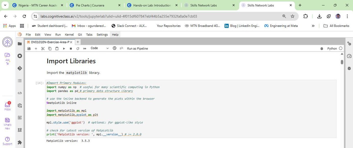
DATA VISUALIZATION WITH PYTHON: MASTERING MATPLOTLIB (PART 2) ✍️📊
After wrapping up the Model Development phase, I have spent the last few days diving deep into the Data Visualization with Python module of the IBM Data Analyst Professional Certificate. I have learned that effective visualization is not just about calling a function; it is about the coder's ability to manipulate the underlying libraries to tell a specific story.
I will be honest, Python visualization depends entirely on the coder's deep understanding of specific libraries. It is not just about making things look pretty; it is about knowing how to paint with code. To ensure I truly own the syntax, I have continued my practice of highlighting key points and handwriting chunks of code. From transposing dataframes to setting up axes, writing it by hand has been my secret weapon for retention. I have compiled these notes into a PDF to document my progress from raw data to visual insights (shared on my LinkedIn account).
THE TWO FACES OF MATPLOTLIB
A major takeaway from my notes is the distinction between the two ways we interact with Matplotlib:
a) The Scripting Layer (Pyplot): This is the procedural interface using import matplotlib.pyplot as plt. It is highly efficient for quick exploration and generating standard plots with minimal code. It is great for when you need to see a trend quickly.
b) The Artist Layer (Object-Oriented): This is where the real control happens. By using fig, ax = plt.subplots(), I can treat every element of the chart as an individual object. This allows for granular, surgical control over line styles, markers, and labels—essentially moving from generating a chart to professional data storytelling.
BUILDING THE PLOTTING MUSCLE
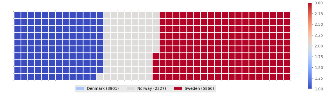
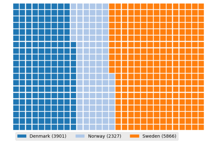
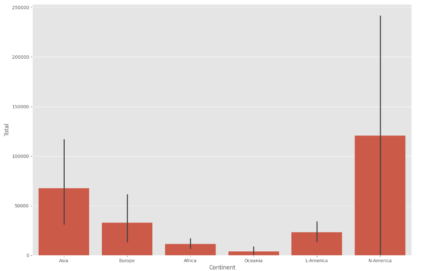
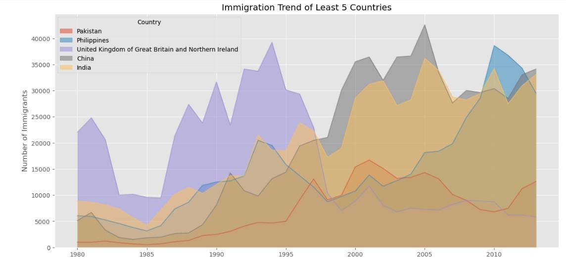
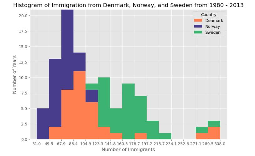
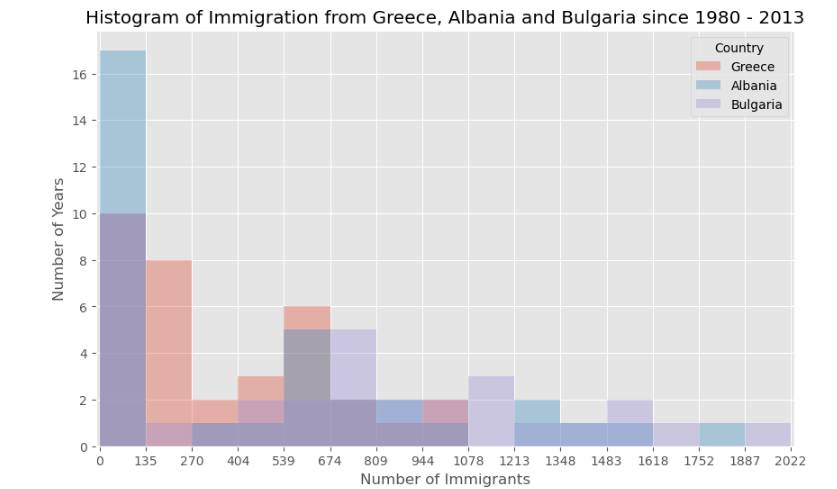
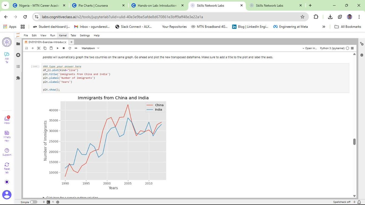
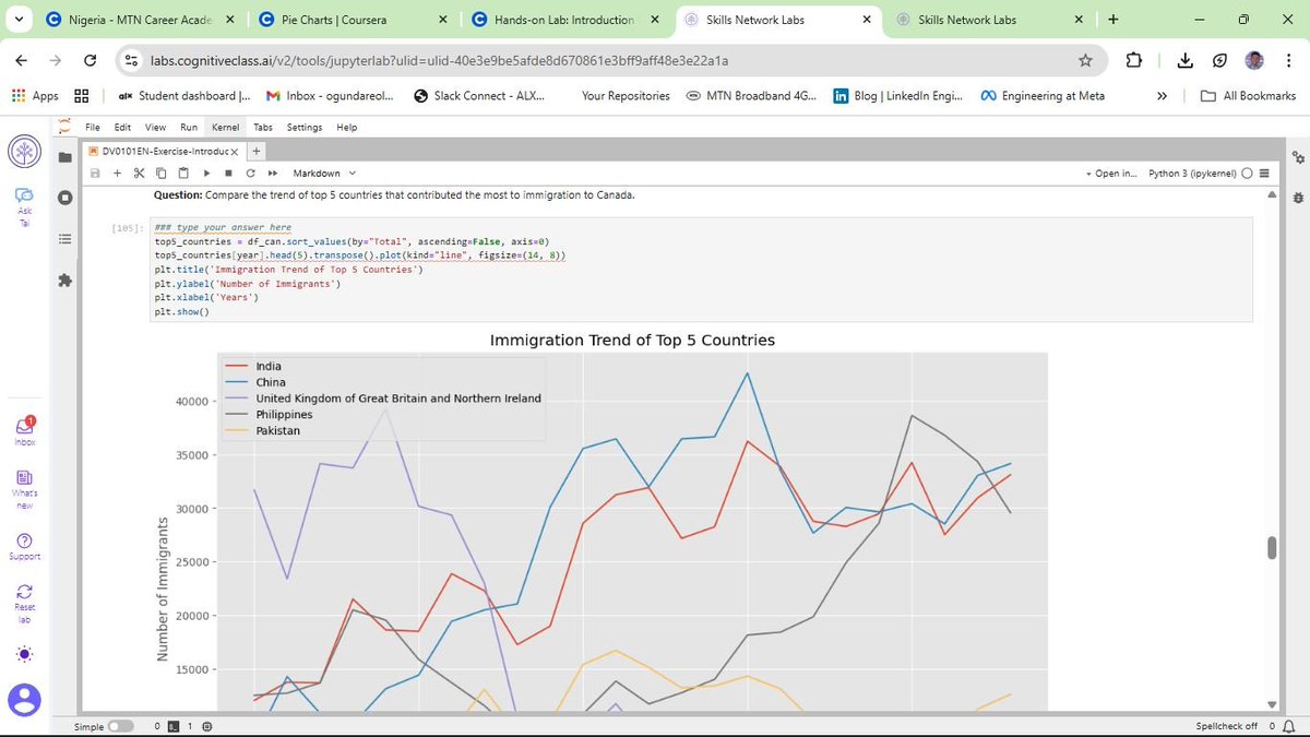
Using the United Nations dataset on Canadian Immigration (1980-2013), I have moved past the basics to master several key visualization types:
a) Line Plots: Perfect for tracking the 33-year immigration trends of specific countries. I practiced using markers, markersize, and custom line styles to make data points distinct and readable.
b) Area Plots: I explored both stacked and unstacked versions. Using the alpha parameter for transparency was key to ensuring that overlapping data remained visible and professional.
c) Histograms: These allowed me to visualize the frequency distribution of immigrants, helping to identify common volume ranges across different years.
d) Bar Charts: I implemented both vertical and horizontal charts. Horizontal bars (kind=barh) proved especially useful for maintaining readability when dealing with longer country names.
This post is dedicated to showcasing the charts and graphs I have created so far using Matplotlib. Seeing the transition from pen and paper to a fully rendered chart in Jupyter is incredibly rewarding. If you can understand the logic on the page, the implementation in the notebook becomes second nature.
I am curious to hear from other data analysts in the community about their experience. When you first started with Matplotlib, did you find the Scripting layer or the Artist layer more intuitive for your specific workflows? Also, what are your favorite tricks for making complex charts more readable?
Connect with me on LinkedIn: linkedin.com/in/emycodesanal…
Live Portfolio:
github.com/emycodesanalytics…
© EmyCodes Analytics | March 4, 2026
#EmyCodesAnalytics #DataVisualization #Python #Matplotlib #HandwrittenCode #LearningInPublic #IBMDataAnalyst #DataScience #DataAnalytics #Pandas #MatplotlibArtist #CertificationJourney #2026Goals

1
1
2
56
Mar 16
DATA VISUALIZATION WITH PYTHON 📊
Following my completion of the Data Analysis module, I have officially started the next phase of the IBM Professional track: Data Visualization with Python.
I will be honest, Python visualization is a different kind of beast. It depends entirely on the coder's deep understanding of specific libraries. It is not just about making things look pretty; it is about knowing how to manipulate the tools to tell the right story.
To keep my retention high, I have stuck to my winning formula: highlighting key points and handwriting chunks of code. This "manual" approach is helping me build the muscle memory needed to navigate libraries like Matplotlib, Pandas, and Numpy effectively.
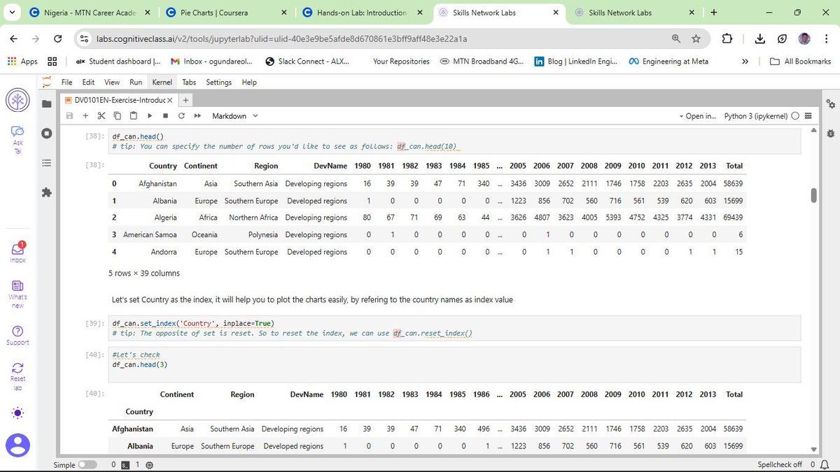
DATASET IN FOCUS: CANADIAN IMMIGRATION (1980 - 2013)
For this lab, I am working with the United Nations dataset on international migration flows to Canada. Using a cleaned version of this data, I am learning how to transform raw numbers into meaningful trends.
CURRENT PROGRESS: BUILDING THE BASICS
So far, I have moved beyond just learning the theory. I am actively coding and documenting the following:
a) Line Plots: Perfect for showing the trend of immigration over the years.
b) Area Plots: Useful for visualizing the cumulative total of immigration from different countries.
c) Histograms: Helping me understand the frequency distribution of the number of new immigrants.
d) Bar Charts: Great for comparing the total number of immigrants from different countries during specific timeframes.
MY TAKEAWAY
Visualizing data is where the analysis truly comes to life. It is one thing to calculate a mean; it is another to see it represented in a way that anyone can understand. I am still building my "plotting muscles," but the pen-and-paper method is ensuring that every line of code I type in Jupyter is backed by real understanding.
Connect with me on LinkedIn: linkedin.com/in/emycodesanal…
Live Portfolio: github.com/emycodesanalytics…
© EmyCodes Analytics | Feb 23, 2026
#EmyCodesAnalytics #DataVisualization #Python #Matplotlib #Pandas #LearningInPublic #IBMDataAnalyst #HandwrittenCode #DataScience
1
1
2
32
Mar 16
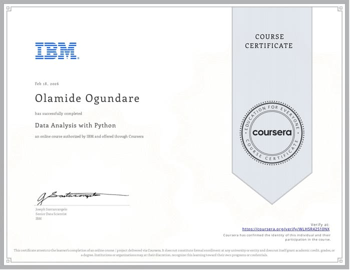
MILESTONE UNLOCKED: IBM DATA ANALYSIS WITH PYTHON COMPLETED!
I am excited to share that I have officially completed the Data Analysis with Python course as part of my IBM Data Analyst Professional Certificate track!
This wasn't just about getting a certificate; it was about a deep, 16-day (and beyond) commitment to mastering the "why" behind the code. By returning to the basics and handwriting my logic, I’ve built a foundation that I truly own—from initial Data Wrangling to complex Model Refinement using Ridge Regression and Grid Search.
WHAT I’VE MASTERED IN THIS PHASE:
a) Model Development: Building Simple, Multiple, and Polynomial Regression models to understand variable relationships.
b) Evaluation: Using R-Squared and Mean Squared Error (MSE) to quantitatively prove model accuracy.
c) Refinement: Implementing train-test splits, Cross-Validation, and Ridge Regression to prevent overfitting and ensure real-world reliability.
d) Visualization: Leveraging Seaborn and Matplotlib to "see" the data through regression, residual, and distribution plots.
THE "EMYCODES" METHODOLOGY:
Documentation has been my greatest teacher. If I can't write it on paper, I don't run it in Jupyter. This journey has taught me that slowing down to internalize the engineering is the fastest way to grow as a Data Analyst.
WHAT'S NEXT?
With this module in the bag, I am moving forward to the next stage of the IBM Professional track. The journey from pen and paper to production-level analytics continues!
Connect with me on LinkedIn: linkedin.com/in/emycodesanal…
View my progress on GitHub: github.com/emycodesanalytics…
© EmyCodes Analytics | Feb 22, 2026
#IBM #DataAnalytics #Python #Certification #LearningInPublic #EmyCodesAnalytics #ModelDevelopment #Statistics #DataScience #HandwrittenCode
ALT emycodes_cert
1
3
56
Mar 16
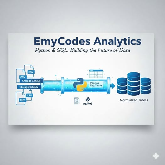
THE DATA BRIDGE - BUILDING AN ETL PIPELINE WITH PYTHON & PANDAS - PART 2
In my previous post, I talked about the difference between "Flat Land" (Excel) and "Relational Cities" (SQL). But how does an analyst actually move data from one to the other without losing integrity? Welcome to the ETL Pipeline, the "engine room" of any professional data project. For my Chicago Public Data Analysis, I utilized Python as the primary engineer to handle the Extract, Transform, and Load process.
Here is how I built that bridge:
What is ETL?
1️⃣ EXTRACT: I started with raw, isolated CSV files (Census, Schools, and Crime data). Using Pandas, I extracted these files into Data Frames, a high-performance, in-memory environment where Python can manipulate data with lightning speed.
2️⃣ TRANSFORM: Raw data is rarely "SQL-ready."
- Cleaning: I used Pandas to handle missing values and ensure columns were correctly formatted.
- Schema Alignment: I ensured that the COMMUNITY_AREA_NUMBER across all three datasets was consistent so the future SQL JOINs would be seamless.
- Preparation: This is where we ensure the data types align with the database "Blueprint" (DDL) before the final load.
3️⃣ LOAD: This is the final move. Using the sqlite3 library and the to_sql method, I pushed the cleaned, structured DataFrames into a local .db file, effectively transforming them into Normalized Tables.
Why use Python for this instead of just importing into SQL?
While many databases have "Import Wizards," using a Python script offers Reproducibility and Scalability:
- Automation: If new data is released, I don't have to manually click "Import" again. I just run my script, and the pipeline handles the rest.
- Programmatic Control: Python allows for complex transformations, like regex cleaning or data type casting—that are often more efficient than performing them in pure SQL.
- The sqlite3 Jupyter Edge: By using ipython-sql (SQL Magic), I created a unified environment where I could switch between Python’s manipulation power and SQL’s relational logic in one notebook.
The "Process" isn't just about the final chart; it's about the integrity of the pipeline. A project like the Chicago Public Data investigation proves that a great analyst is part Architect (designing the database) and part Engineer (building the ETL bridge). When you master both, you don't just "report" on data, you own the entire lifecycle of the insight.
I’m currently documenting these processes in the EmyCodes Lab. If you're a recruiter or a fellow developer, let’s talk about how clean pipelines lead to better business decisions!
Full Python Script & SQL Queries: github.com/emycodesanalytics…
Connect: linkedin.com/in/emycodesanal…
#EmyCodesAnalytics #Python #Pandas #ETL #DataPipeline #SQL #Jupyter #IBMDataAnalyst #FirstPrinciples #DataAnalytics
© EmyCodes Analytics | Feb 16, 2026
ALT emycodes_analytics
1
3
75